Front-of-package labelling consumer research and consultation
Health Canada conducted a series of consumer studies and an online Nutrition Symbol Consultation to inform the front-of package labelling regulations. In 2016, preliminary consumer feedback was obtained on an initial set of front-of-package symbols through focus group testing conducted across Canada. This public opinion research explored consumer preferences on the front-of-package labelling approach, symbol size and symbol location to ensure the proposed front-of-package system is quick and easy for consumers to notice and understand. For more information, see the “Consumer Opinions of “High in” Front of Pack Labelling Strategies” report.
In winter 2018, Health Canada conducted an online study to evaluate front-of-package labelling regulatory specifications that would best facilitate consumer awareness, understanding, appraisal and use of front-of-package labelling. Specifications included the symbol size, symbol location, Health Canada attribution within the symbol, and proximity of other nutrition information to the symbol. Consumers were shown products with front-of-package labelling in either the proposed or more flexible specifications. They then completed a range of timed shopping tasks. For more information, see the “Consumer Research on Front-of-Package Nutrition Labelling” report.
At the same time, Health Canada conducted consumer research in a grocery store setting. This study evaluated the efficacy of the proposed front-of-package nutrition labelling in helping consumers make informed food choices to reduce intakes of saturated fat, sugars and sodium. Consumers were shown products with either current labelling (no front-of-package) or one of four front-of-package symbols and then were asked to complete various shopping tasks. This study also explored differences in efficacy between the four proposed front-of-package nutrition symbol designs. For more information, see the “Efficacy of “High in” Nutrient Specific Front of Package Labels — A Retail Experiment with Canadians of Varying Health Literacy Levels” publication.
All consumer research was conducted using a health literacy lens to ensure that all people living in Canada, including those challenged with understanding and using nutrition label information, can successfully use front-of-package labelling to make healthier food choices and identify foods high in nutrient of public health concern.
In Winter 2018, Health Canada also conducted an online Nutrition Symbol Consultation to explore consumer preferences of the four proposed front-of-package nutrition symbol designs. For more information, please order a copy of the topline report.
Figure 1 - Text Description
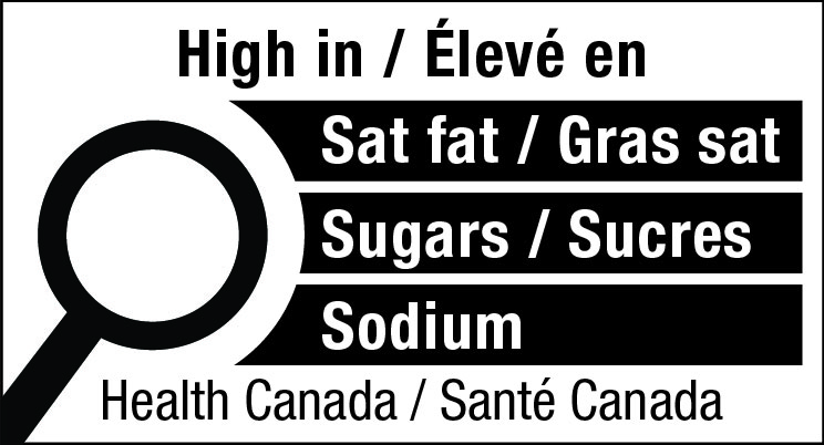
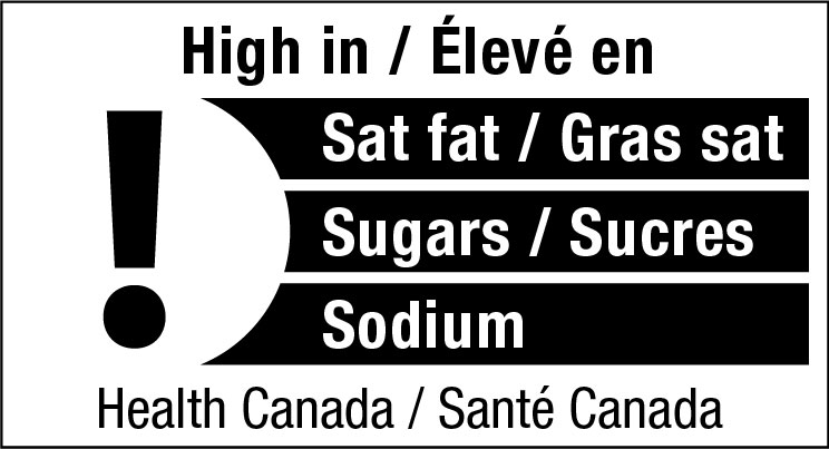
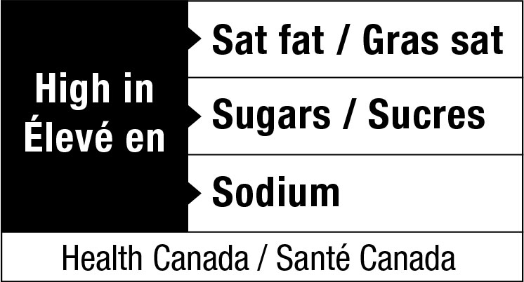
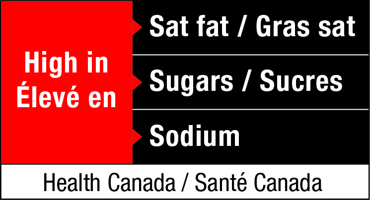
This figure shows 4 bilingual front-of-package nutrition symbol designs side-by-side, labeled a, b, c and d.
The first symbol labeled a shows the magnifying glass nutrition symbol design for the principal display panel that indicates that a prepackaged product is high in saturated fat, sugars and sodium. This symbol is bilingual, with the English text shown first, followed by the French text. There is a white rectangular box outlined by a thin black line. At the top of the box is a heading composed of the words “High in” followed by a forward slash and the words “Élevé en” in black, bold, lower case letters, except that the first letter of the words “High” and “Élevé” are in upper case. Under the heading is a left-justified black magnifying glass with three bars stacked to its right. There is a small amount of white space between the magnifying glass and the left side of the three bars. This left side forms a concave curve that follows the curvature of the magnifying glass. There is a small amount of white space between each bar, as well as between the right side of the bars and the thin black line that outlines the box. The first bar is black and contains the words “Sat fat” followed by a forward slash and the words “Gras sat.” in white, bold, lower case letters, except that the first letter of the words “Sat” and “Gras” are in upper case. The second bar is black and contains the word “Sugars” followed by a forward slash and the word “Sucres” in white, bold, lower case letters, except that the first letter of each word is in upper case. The third bar is black and contains the word “Sodium” in white, bold, lower case letters, except that the first letter is in upper case. Centred at the bottom of the box are the words “Health Canada” followed by a forward slash and the words “Santé Canada” in black, lower case letters, except that the first letter of each word is in upper case.
The second symbol labeled b shows the exclamation point nutrition symbol design for the principal display panel that indicates that a prepackaged product is high in saturated fat, sugars and sodium. This symbol is bilingual, with the English text shown first, followed by the French text. There is a white rectangular box outlined by a thin black line. At the top of the box is a heading “High in” followed by a forward slash and the words “Élevé en” in black, bold, lower case letters, except that the first letter of the words “High” and “Élevé” are in upper case. Under the heading is a left-justified black exclamation point with three bars stacked to its right. There is a small amount of white space between the exclamation point and the left side of the three bars. This left side forms a concave curve. There is a small amount of white space between each bar, as well as between the right side of the bars and the thin black line that outlines the box. The first bar is black and contains the words “Sat fat” followed by a forward slash and the words “Gras sat” in white, bold, lower case letters, except that the first letter of the words “Sat” and “Gras” are in upper case. The second bar is black and contains the words “Sugars” followed by a forward slash and the word “Sucres” in white, bold, lower case letters, except that the first letter of each word is in upper case. The third bar is black and contains the word “Sodium” in white, bold, lower case letters, except that the first letter is in upper case. Centered at the bottom of the box are the words “Health Canada” followed by a forward slash and the words “Santé Canada” in black, lower case letters, except that the first letter of each word is in upper case.
The third symbol labeled c shows the black rectangle nutrition symbol design for the principal display panel that indicates that a prepackaged product is high in saturated fat, sugars and sodium. This symbol is bilingual, with the English text shown first, followed by the French text. There is a rectangular box outlined by a thin black line. Inside is a black rectangle in the left third part of the symbol. Centered in this black rectangle are two lines of text. The words “High in” appear on the first line and the words “Élevé en” appear on the second line in white, bold, lower case letters, except that the first letter of the words “High” and “Élevé” are in upper case. Three stacked white bars of the same size extend out from the right side of the black rectangle to the end of the rectangular box. Between each of the bars is a thin black line. A little black triangle extends from the black rectangle into each of the three white bars. The first bar is white and contains the words “Sat fat” followed by a forward slash and the words “Gras sat” in black, bold, lower case letters, except that the first letter of the words “Sat” and “Gras” are in upper case. The second bar is white and contains the words “Sugars” followed by a forward slash and the word “Sucres” in black, bold, lower case letters, except that the first letter of each word is in upper case. The third bar is white and contains the word “Sodium” in black, bold, lower case letters, except that the first letter is in upper case. Below the black rectangle and the third white bar there is a thin white rectangle that spans the length of the rectangular box. Centered in this rectangle are the words “Health Canada” followed by a forward slash and the words “Santé Canada” in black, lower case letters, except that the first letter of each word is in upper case.
The fourth symbol labeled d shows the red rectangle nutrition symbol design for the principal display panel that indicates that a prepackaged product is high in saturated fat, sugars and sodium. This symbol is bilingual, with the English text shown first, followed by the French text. There is a rectangular box outlined by a thin black line. Inside is a red rectangle in the left third part of the symbol. Centered in this red rectangle are two lines of text. The words “High in” appear on the first line and the words “Élevé en” appear on the second line in white, bold, lower case letters, except that the first letter of the words “High” and “Élevé” are in upper case. Three stacked black bars of the same size extend out from the right side of the red rectangle to the end of the rectangular box. Between each of the bars is a thin white line. A little red triangle extends from the red rectangle into each of the three black bars. The first bar is black and contains the words “Sat fat” followed by a forward slash and the words “Gras sat” in white, bold, lower case letters, except that the first letter of the words “Sat” and “Gras” are in upper case. The second bar is black and contains the words “Sugars” followed by a forward slash and the word “Sucres” in white, bold, lower case letters, except that the first letter of each word is in upper case. The third bar is black and contains the word “Sodium” in white, bold, lower case letters, except that the first letter is in upper case. Below the red rectangle and the third black bar there is a thin white rectangle that spans the length of the rectangular box. Centered in this rectangle are the words “Health Canada” followed by a forward slash and the words “Santé Canada” in black, lower case letters, except that the first letter of each word is in upper case.


