
Visibility guidelines for Prairies Economic Development Canada (PrairiesCan)
View the print-friendly version: PDF (2.07 MB)
Introduction
The Government of Canada is committed to providing transparent information to Canadians about expenditures for its programs and services. Prairies Economic Development Canada (PrairiesCan) shares this commitment to inform Canadians in Alberta, Saskatchewan and Manitoba – where its services are located – to ensure transparency about programs and how the department spends public funds.
As such, proper acknowledgement must be given to PrairiesCan for the projects and activities that the department funds, which include:
- PrairiesCan’s grants and contributions programs
- PrairiesCan’s joint programs and investments with the three Prairie provinces, municipalities and other partners
- Activities undertaken by partners in the Prairies Business Service Network (PBSN)
This guideline provides direction for the use of PrairiesCan identity in accordance with the Policy on Communications and Federal Identity, and outlines expectations for use of PrairiesCan graphic identifiers when acknowledgement is required.
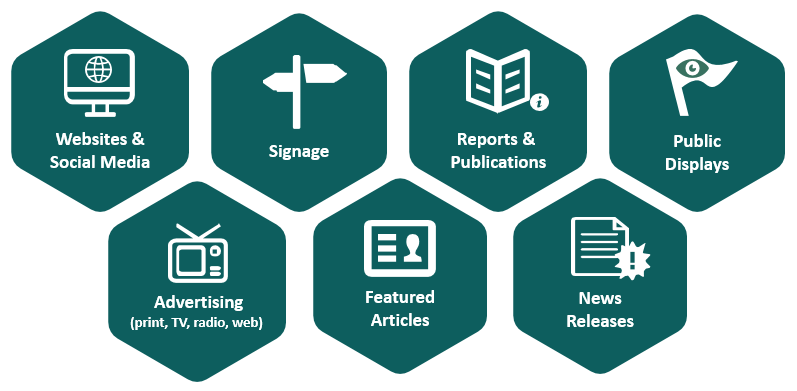
Promotional materials
Materials that communicate or promote projects or initiatives undertaken with support from PrairiesCan must acknowledge this support. These materials may include:
Why these guidelines matter
These guidelines ensure our federal identifiers are applied correctly and consistently within all communications, on all platforms, and through all media.
By following these guidelines when using the PrairiesCan identifiers, you help us increase our credibility, enhance our authority and, most importantly, make PrairiesCan more worthy of trust in the eyes of Canadians and those we serve in Alberta, Saskatchewan, and Manitoba.
Federal government identifiers
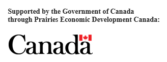
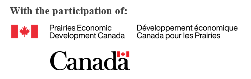
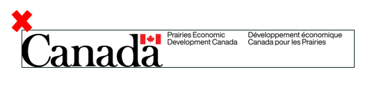
The PrairiesCan’s signature consists of the Canada flag symbol and the department’s applied title in both official languages. It is commonly referred to as the Federal Identity Program (FIP) signature.
English FIP signature
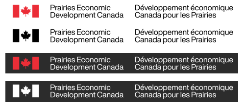
French FIP signature
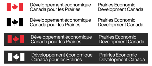
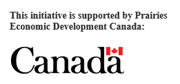
The Canada wordmark is the global symbol of the Government of Canada.

Rules for acknowledgment
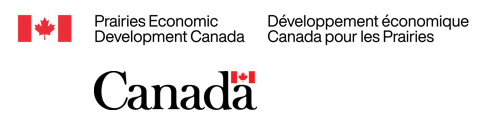
For proper acknowledgement, the use of federal government identifiers, specifically the PrairiesCan FIP signature and the Government of Canada wordmark, is mandatory.
The Canada wordmark must be used whenever the PrairiesCan FIP signature is used.
Option 1

Option 2
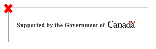
When federal identifiers are used, they are generally to be accompanied by an acknowledgement line so it is clearly understood that the materials are not a Government of Canada product.
The Canada wordmark must be used whenever the PrairiesCan FIP signature is used; however, it is acceptable to use an acknowledgement line with the Government of Canada wordmark only (i.e., omit the PrairiesCan FIP signature).
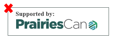
Sample Acknowledgement Lines
- “This initiative (or project or campaign) is supported (or supported in part) by Prairies Economic Development Canada”
- “Supported by: Prairies Economic Development Canada”
- “Community Futures (insert location) is part of the Prairies Business Service Network, supported by Prairies Economic Development Canada”
- “This initiative is supported by the Government of Canada through Prairies Economic Development Canada”
Examples

Alternatively, it is permissible to use the following phrases on one line, with the PrairiesCan FIP signature and the Canada wordmark placed below:
- Supported by:
- Proudly supported by:
- In partnership with:
- With the participation of:
- With the support of:
Examples

Presentation of federal identifiers
Only authorized versions are to be used and can not be altered in any way.
Identifiers are to be displayed in generous open space as two distinct elements.
Identifiers should not appear on anything but a solid, high-contrast background.
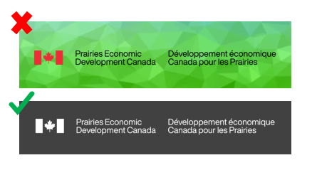
Identifiers may not form part of a headline, phrase, or sentence.
For English materials, the FIP signature used should have the English title first.

For French materials, the French title should come first on the FIP signature.

The Canada wordmark must be slightly (visibly) larger than the FIP signature and, if presented in stacked form, the Canada wordmark must align with the department name text on the left.

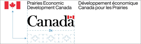
As a general rule, federal graphic identifiers appear at either the top or bottom of an item (be it signage, website, print advertisement or report cover).

Website
All web ads (banner ads, pop-up ads or other) should reference the support of PrairiesCan with an acknowledgement line and the Canada wordmark if space permits.
“Prairies Economic Development Canada (PrairiesCan)” text or the PrairiesCan FIP signature is to be hyperlinked to PrairiesCan’s website at www.canada.ca/en/prairies-economic-development.html, and the Government of Canada wordmark is to be hyperlinked to the Canada site, www.canada.ca
Radio
For radio advertising, a tag line such as "Proudly supported by Prairies Economic Development Canada" must be included at the conclusion of the spot.
Example: “The (xx project or fund) is funded by the Government of Canada through Prairies Economic Development Canada.”
Conditions
The FIP signature and Canada wordmark are trademark protected and may only be used with permission.
All communications must accurately reference that the project or program is being funded or supported by Prairies Economic Development Canada (PrairiesCan).
All uses of PrairiesCan and Government of Canada identifiers must be reviewed and approved by PrairiesCan’s Communications Branch prior to publication.
Contact
Please contact a PrairiesCan office to request the federal identifiers needed, for more information and guidance in the usage of the identifiers, or for review and approval of said identifiers in use.
- Service locations directory
- Toll free: 1 (888) 338-9378
Wait, what is this then?
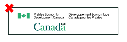
You may have noticed these new design elements appearing in some of PrairiesCan’s communications materials, including presentations and social media posts.

While these elements have been created to help PrairiesCan establish itself as a new regional development agency and enhance it’s brand awareness and visual identity, they cannot be used as replacements for the PrairiesCan FIP signature and Canada wordmark.

The Inside Story Behind PrairiesCan’s Visual Identity
The PrairiesCan visual identity has meaning. Explaining it can be broken down into the following parts:
PrairiesCan wordmark
The interplay between bold and light text within the same font family is modern and eye-catching. The bold part specifically intends to highlight our dedication to the Prairies.
Hexagonal graphic element
The hexagonal shape is inspired by the honeycomb pattern found within beehives. Like bees within a beehive, each person at PrairiesCan plays an integral part in working alongside teammates, proponents and community members to collectively and collaboratively build the Prairies economy.
The upward arrow within the icon represents forward motion, momentum and inclusive economic growth.
Colours
The blue, green and turquoise colour pallet was inspired by a common natural landscape seen throughout the Prairie Provinces.
For PrairiesCan staff: use of PrairiesCan’s visual identity is outlined in PrairiesCan’s Departmental Branding Guidelines.