
Residential wood combustion, particulate matter 2.5 sampling project, Whitehorse: chapter 3
3. Results and Discussion
3.1 Meteorology
Meteorological data from the study period is shown in Figures 3 and 4(a, b, c). Temperatures remained below freezing for most of the sampling campaign, with an average of -12°C at the two sites. Average temperatures at the airport were -18.2, -16.0 and -9.9 for January, February and March, respectively, making it a slightly colder winter than the 30-year period from 1971 to 2000 (-17.7°C, -13.7°C and -6.6°C for January, February and March, respectively).
Figure 3: Hourly Temperature Data During the Sampling Period
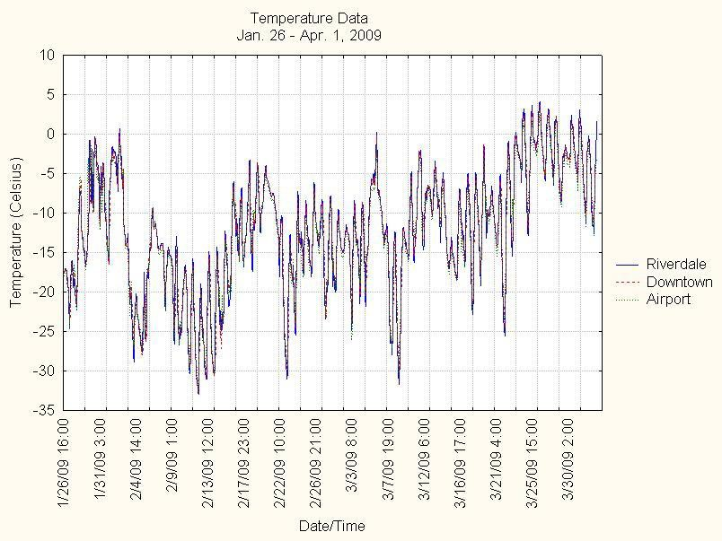
Figure Description
Figure 3 is a line graph showing the hourly temperature measurements for the Downtown, Riverdale and Whitehorse airport locations for the period of the study. It begins on January 26, 2009 and continues until April 1, 2009. The y-axis shows temperature in degrees Celsius and ranges from -35 to 10. Temperatures at the three locations are very close throughout the study and range from -33 degrees to 4 degrees. There was a period of approximately 1 week of sustained colder temperatures (less than -15 degrees) in early to mid-February and a period of approximately 1 week of sustained warmer temperatures (above -10 degrees) in late March.
Wind roses show similar distribution of wind directions at the two sampling sites, with the winds generally following the topography of the Yukon River Valley. The Downtown site had a higher frequency of stronger winds than Riverdale, which is more sheltered by the escarpment. Downtown, having a primarily south, and to lesser extent south- southeast, wind contribution, could be impacted by emissions in Riverdale. Similarly, Riverdale, having a significant northwest and north-northwest wind contribution could be impacted by emissions from the downtown core. Whitehorse Airport shows a similar wind vector distribution to the Downtown site but with a higher predominance of winds from the south. This site, being atop the escarpment, is not as affected by the local topography.
Figure 4 : Wind Roses for the Sampling Period for: Downtown (a), Riverdale (b) and (c) Whitehorse Airport
(a)
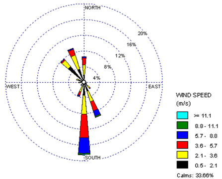
(b)
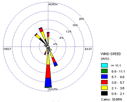
(c)
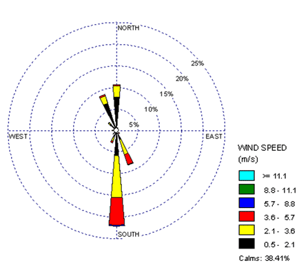
Long Description
Figure 4 is a collection of three wind roses (a, b, and c) each corresponding to a different sampling site: Downtown, Riverdale, and Whitehorse airport, respectively. Each rose has spokes, whose orientations indicate the direction from which the winds are blowing, and whose length indicates the frequency of wind coming from a particular direction. The spokes are also separated into colours. The colours of each spoke represent the strength with which winds are blowing. The colours are black (0.5-2.1 m/s), yellow (2.1-3.6 m/s), red (3.6-5.7 m/s), blue (5.7-8.8 m/s), green (8.8-11.1 m/s), and cyan (>= 11.1 m/s). There is also another category for “calm” winds, which are winds with speed less than 0.5 m/s and are not displayed on the rose. Approximately 30% of the winds at each location are classified as calm winds.
- The downtown wind rose shows winds predominantly blowing from the south, with these winds making up nearly 20% of the total wind frequencies. The south and south-southeast spoke are the only ones that have wind speeds reaching the green section, indicating that the strongest winds also blow from these directions. The south-southeast, north, north-northwest and northwest contributions each make up approximately 8% of the total.
- The Riverdale rose shows similar wind direction distribution as the downtown rose, but the wind speeds are significantly lower. None of the spokes exceed “red” speeds. At this site, the southern winds represent approximately a 15% contribution, while the northwest, north-northwest and south-southeast make up approximately 13%, 10% and 10%, respectively.
- The Airport site shows southerly winds are dominant , making up ~22% of the total contribution. The other directions represented are north, north-northwest and south-southeast, with each one contributing approximately 8 to 10% of the total. Like Riverdale, the airport wind speeds are lower than downtown, with only the southern winds having a negligible blue section and the others having mainly black and yellow sections.
3.2 PM2.5 Results
3.2.1 Measured PM2.5
All PM2.5 and OC/EC concentration results are shown in Table 1. Several sampling events were missed or had to be discarded due to inclement weather and sampler problems. Average/median concentrations were 7.7/6.4 µg/m3 (n=18) and 10.2/7.1 µg/m3 (n=12) at the Downtown and Riverdale sites, respectively. Higher concentrations at Riverdale are likely the result of lower wind speeds and presumably closer proximity to wood smoke sources, although such a detailed emission inventory was not undertaken as part of this study. A partial PM2.5 mass reconstruction at the Riverdale site shows that, on average (n=12), carbon made up the bulk of the PM2.5 mass, with OC contributing 55% and EC contributing 7%. The remaining 38% would be made up of atoms associated with OC as well as inorganic species.
Overall, PM2.5 concentrations ranged from 1.6 µg/m3 to a maximum of 31.3 µg/m3 (Riverdale on February 11). The City of Whitehorse and Yukon Territory do not have air quality standards or objectives in place for PM2.5. The Canada-wide Standard for 24-hour average PM2.5 is 30 µg/m3, based on the 98th percentile, averaged over 3 consecutive years, while British Columbia has established a 24-hour average PM2.5objective of 25 µg/m3 and an annual average objective of 8 µg/m3. For comparison, average January to March PM2.5 concentrations for a selection of interior B.C. cities and towns are shown in Table 2.
| Date | PM2.5 (µg/m3) |
PM2.5 (µg/m3) |
OC (µg/m3) |
EC (µg/m3) |
|---|---|---|---|---|
| 2009 | Downtown | Riverdale | Riverdale | Riverdale |
| nd = no data | ||||
| 1/24 | 2.4 | 1.6 | 0.5 | 0.1 |
| 1/27 | 6.3 | 7.1 | 5.8 | 0.9 |
| 1/30 | 2.2 | 1.6 | 0.6 | 0.1 |
| 2/2 | 1.7 | nd | 1.1 | 0.1 |
| 2/5 | 13.5 | nd | 12.1 | 1.5 |
| 2/8 | 6.9 | nd | 8.0 | 1.4 |
| 2/11 | nd | 31.3 | 18.5 | 2.4 |
| 2/14 | nd | 19.9 | 12.5 | 1.2 |
| 2/17 | 21.0 | nd | 18.8 | 2.3 |
| 2/20 | 11.3 | nd | 9.3 | 1.0 |
| 2/23 | 15.3 | nd | 15.3 | 2.2 |
| 2/26 | 1.9 | nd | 1.5 | 0.1 |
| 3/1 | 12.8 | nd | nd | nd |
| 3/4 | 12.0 | 12.5 | 7.2 | 0.8 |
| 3/7 | 5.4 | 9.8 | 5.5 | 0.5 |
| 3/10 | 6.3 | 7.2 | 4.1 | 0.4 |
| 3/13 | 6.5 | 7.0 | 4.2 | 0.7 |
| 3/16 | 2.0 | 2.0 | 0.7 | 0.1 |
| 3/19 | 5.0 | 6.0 | 4.2 | 0.4 |
| 3/22 | 6.9 | 21.9 | 11.6 | 1.0 |
| Avg. | 7.7 | 10.2 | 7.4 | 0.9 |
| s.d. | 5.4 | 8.6 | 6.0 | 0.8 |
| Location | PM2.5 (µg/m3) |
|---|---|
| GoldenFootnote1 | 10.2 |
| Kelowna | 5.7 |
| Prince George | 9.8 |
| Quesnel | 8.7 |
| Williams Lake | 8.2 |
PM2.5 results from this study are higher than typically found at the Whitehorse NAPS site for the January to March period (see Figure 1). A comparison between PM2.5 measurements taken Downtown (filter-based) with the NAPS site (TEOM) was made for the nine sampling days where there were concurrent data available (Figure 5). The correlation is poor, with the filter-based sampler generally reading higher. It is difficult to make conclusions based on a small data set; however, the different locations are likely a factor (see Figure 2). Although both sites are located in the downtown core, the NAPS station is adjacent to the river and may sample cleaner river-channeled winds relative to the Downtown site, which was located approximately 500 m away. An additional causative factor could be that TEOMs read lower than filter-based samplers in cold winter locations due to the loss of volatile particulate matter (Allen et al., 1997; Dann et al., 2006). Coincidentally, the NAPS station will be moved to a new downtown site in 2011, one block from the Wood Street Annex.
Figure 5: Correlation of PM2.5 Results for Downtown Site (filter based) and NAPS Site (TEOM)
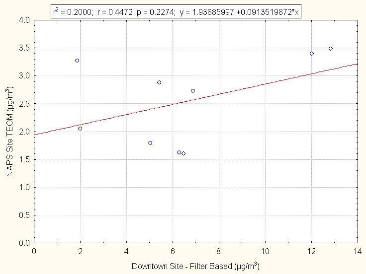
Figure Description
Figure 5 is a scatter plot detailing the correlation between the Downtown sampling site and the NAPS site. The two sites use different detection methods for PM2.5. The x-axis of the graph shows the measured PM2.5 concentrations at the Downtown site (which is filter-based) while the y-axis shows the concentration at the NAPS site (TEOM-based). The ranges for the x- and y- axes are 0-14 and 0-4 µg/m3, respectively. The 9 points representing the coincident sampling points are plotted on this graph and a linear regression is applied, with the various attributes of the regression being shown in a small legend above the graph. The filter-based method generally provides higher results than the TEOM method, and the correlation is relatively poor (r2 = 0.2000).
3.2.2 Modelled PM2.5
To estimate the 24-hour average concentrations of PM2.5 throughout the sampling period, a simple linear regression model was used to relate 24-hour average black carbon data, measured by the aethalometer at Riverdale, to daily average PM2.5 concentrations measured at the two sites (Figures 6a, 6b). One outlier point (where the standard residual was greater than 2σ) was removed for each regression. The regressions show a good fit, with r2 values of 0.93 and very low statistically significant p values for both Downtown and Riverdale.
Figure 6: Black Carbon-PM2.5 Correlation at Downtown (a) and Riverdale (b)
(a)
(b)
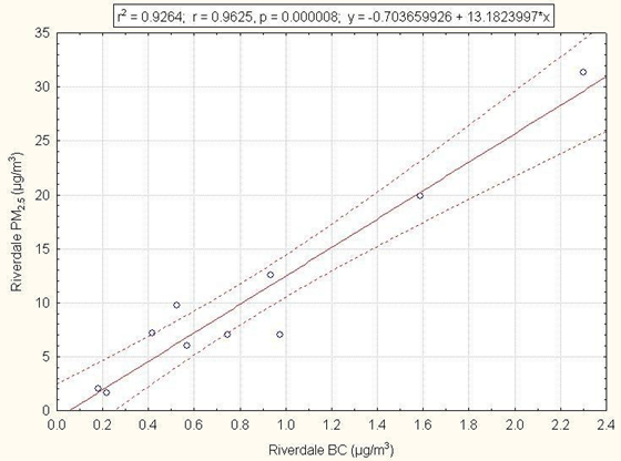
Figure Description
Figure 6 is made up of two scatter plots. The two graphs have identical layouts, but represent the different locations, with Figure 6a representing the Downtown site and Figure 6b representing the Riverdale site. The x-axes of the graphs are labelled “Riverdale BC” and represent the black carbon measurements taken by the aethalometer at the Riverdale site. The y-axes of the graphs are labelled Downtown PM2.5 and Riverdale PM2.5 and show concentrations in µg/m3. The ranges of the x-axes of the two graphs a and b go from 0.0 to 2.6 and 0.0 to 2.4, respectively, while the y-axes go from 0 to 22 and from 0 to 35, respectively. A simple linear regression model is applied to both graphs to relate the concentrations of black carbon measured by the aethalometer at Riverdale to the concentrations of PM2.5 measured at the two sampling sites. The correlation is shown to be very good in both cases (r2 = 0.93).
Assuming a consistent linear relationship between Riverdale black carbon and PM2.5 at both sites throughout the study period and within the range of black carbon measured, daily average PM2.5 concentrations can be predicted from the linear regression, from January 27 to March 31. Predicted values and associated 95% confidence intervals along with the observed values are shown in Figure 7. It can be seen that there are five days at Riverdale where PM2.5 is predicted to have exceeded the value of the Canada-wide Standard, all occurring during a nine-day period in February, with a maximum predicted PM2.5 concentration of 41.7 µg/m3 (95% CI = 33.1-47.4) on February 13. At the Downtown site, the maximum was predicted to be 25.4 µg/m3 (95% CI = 22.5-28.3), also on February 13.
Figure 7: Predicted and Observed 24-hour Average PM2.5Concentrations at Downtown and Riverdale (error bars on predicted values are 95% confidence intervals)
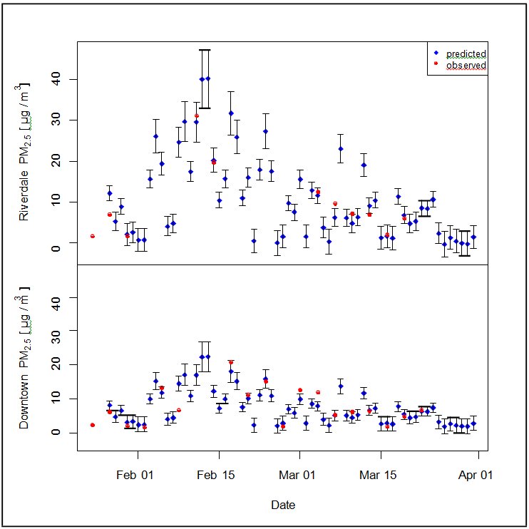
Figure Description
Figure 7 is a collection of scatter plots, one for each sampling location. The x-axis shows the date and ranges from the beginning of the study until the end (Jan 26-Apr 1, 2009). The two y-axes are labelled “Downtown PM2.5” and “Riverdale PM2.5”, and both have ranges of 0-45 µg/m3. There are two different points, explained by a legend. Blue points are predicted PM2.5 concentrations based on measured black carbon concentrations and the regression model determined in Figure 6, while the red points are actual measured PM2.5 concentrations. The error bars on the blue points represent 95% confidence intervals. The largest predicted values at both sampling sites took place on February 12th and 13th, which are dates when there were no measured data available
3.3 Source Apportionment of PM2.5
3.3.1 Wood Smoke Markers
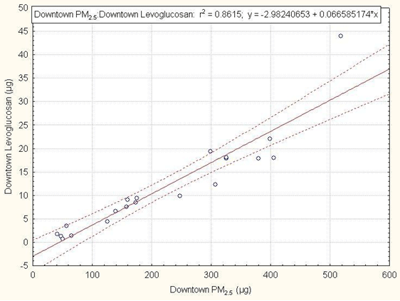
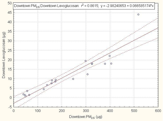
All levoglucosan and 14C results are shown in Table 3. Average concentrations of levoglucosan were 453 and 754 ng/m3 at Downtown and Riverdale, respectively, but varied widely from sample to sample, as the concentration of PM2.5 varied substantially over the course of the study. Ratios (% w/w) of levoglucosan to PM2.5were 4.7 ± 1.6 and 6.0 ± 2.4 (avg. ± s.d.) at Downtown and Riverdale, respectively, indicating a slightly higher wood smoke contribution at Riverdale. Note that to allow for more data points in calculating the ratios, damaged filters were included, as it was assumed that the ratio between PM2.5 and levoglucosan mass would not be affected. Correlations of levoglucosan to PM2.5 mass at both sites are shown in Figure 8. A stronger correlation for the Riverdale site (r2 = 0.96) indicates that there is less variability in source contribution here compared to the Downtown site (r2 = 0.86), which is expected to have more contribution from traffic and heating from commercial buildings.
| Date | Levoglucosan (ng/m3) |
Levoglucosan (ng/m3) |
Levo:PM2.5 (% w/w) |
Levo:PM2.5 (% w/w) |
Fraction of Modern Carbon (fM) |
Min. Wood Smoke (%) | Max. Wood Smoke (%) |
|---|---|---|---|---|---|---|---|
| 2009 | Downtown | Riverdale | Downtown | Riverdale | Riverdale | Riverdale | Riverdale |
| nd = no data | |||||||
| 1/24 | 50 | 16 | 2.1 | 1.0 | nd | nd | nd |
| 1/27 | 249 | 604 | 4.0 | 8.6 | 0.85 | 61 | 73 |
| 1/30 | 135 | 31 | 6.1 | 1.9 | nd | nd | nd |
| 2/2 | 74 | nd | 4.3 | 9.2 | nd | nd | nd |
| 2/5 | 741 | nd | 5.5 | 5.7 | 1.00 | 76 | 91 |
| 2/8 | 370 | nd | 5.4 | 5.4 | 0.91 | 67 | 81 |
| 2/11 | nd | 2344 | 4.7 | 7.5 | 1.01 | 77 | 93 |
| 2/14 | nd | 1599 | 5.5 | 8.0 | 1.01 | 76 | 92 |
| 2/17 | 1781 | nd | 8.5 | 8.8 | 1.01 | 77 | 93 |
| 2/20 | 731 | nd | 6.5 | nd | 0.98 | 73 | 88 |
| 2/23 | 678 | 1314 | 4.4 | 5.8 | 0.97 | 74 | 89 |
| 2/26 | 49 | nd | 2.6 | nd | 0.88 | 62 | 74 |
| 3/1 | 714 | nd | 5.6 | nd | nd | nd | nd |
| 3/4 | 480 | 672 | 4.0 | 5.4 | 0.92 | 67 | 81 |
| 3/7 | 258 | 544 | 4.8 | 5.6 | 0.95 | 69 | 83 |
| 3/10 | 357 | 373 | 5.7 | 5.2 | 0.93 | 65 | 79 |
| 3/13 | 312 | 382 | 4.8 | 5.5 | 0.87 | 61 | 73 |
| 3/16 | 26 | 22 | 1.3 | 1.1 | nd | nd | nd |
| 3/19 | 177 | 399 | 3.5 | 6.6 | 0.92 | 65 | 78 |
| 3/22 | 336 | 1701 | 4.9 | 7.8 | 1.01 | 76 | 92 |
| Avg. | 453 | 724 | 4.7 | 6.0 | 69.7 | 84.0 | |
| s.d. | 411 | 752 | 1.6 | 2.4 | |||
Figure 8: Levoglucosan-PM2.5 Correlation at Downtown (a) and Riverdale (b)
Figure 8: Levoglucosan-PM2.5 Correlation at Downtown (a) and Riverdale (b)
(a)
(b)
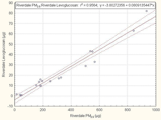
Figure Description
Figure 8 shows two scatter plots that display the correlation between levoglucosan and PM2.5 at each location. Figure 8a represents the Downtown measurements while Figure 8b represents the Riverside measurements. The x-axes of the two graphs are labelled “Downtown PM2.5” and “Riverdale PM2.5”, respectively. The y-axes are similarly labelled “Downtown levoglucosan” and “Riverdale levoglucosan”. The ranges of graphs a and b are 0 to 600 and 0 to 1000 µg, respectively, for the x-axes and -5 to 50 and -10 to 90 µg for the y-axes, respectively. A linear regression is applied to both graphs as an indicator of the correlation between PM2.5 and levoglucosan at the two locations. The r2 values for graphs a and b are 0.86 and 0.96, respectively.
The fraction of modern carbon (fm) results as determined by the University of Arizona Accelerator Mass Spectrometry Facility are shown in Table 3. Due to high uncertainties at low filter loadings, sample filters having less than 100 µg of carbon were not included. While there can be several sources of modern carbon particulate in addition to wood smoke, such as cooking, cigarette smoke and secondary biogenic aerosols, it can be assumed that the former two are negligible compared with wood smoke in Whitehorse. The average OC:EC ratio was 8.9 in this study, indicating that secondary organics were present (Ward et al., 2006); however, it is likely a reasonable assumption that at temperatures typical of the sampling period, the biogenic contribution to secondary aerosol formation is low. One uncertainty associated with using the 14C method for source apportionment is the need to determine the theoretical fraction of modern carbon that should be present in wood typically burned in Whitehorse. 14C levels in the atmosphere have varied over time, peaking in 1965 due to nuclear testing and declining since then (Ward et al., 2006). The fraction of modern carbon found in trees, which incorporate 14C through respiration of CO2, therefore will be dependent on the age of the wood. In calculating the contribution of wood smoke shown (Table 3), the laboratory used annual atmospheric 14C levels over the last 130 years. The minimum and maximum % wood smoke were determined from calculations using average atmospheric values of 14C for the last 5, 10, 20, 30, 40, 50, 60, 70, 80, 90, 100, 110, 120 and 130 years. Given that the range of age of the dead wood harvested in the southern lakes area for fuel wood in Whitehorse is 60 to 120 years (K. Price, pers. comm., 15 Jan. 2010), this calculation should provide a reasonable estimate of wood smoke contribution for this study. Wood smoke contribution ranged from 61% to 93%, with an average range of 70-84%. It is expected that in the wintertime in Whitehorse, the dominant source of wood smoke is RWC. The only other source of wood combustion is industrial/commercial wood boilers; however, these units are relatively few in number and are not expected to be a significant source of wood smoke relative to RWC, particularly in Riverdale.
The results of this study are in relatively close agreement with earlier studies in Riverdale in which chemical mass balance modelling showed that RWC constituted 90% of particulate mass, results that were confirmed with 14C analysis, showing that nearly all aerosol carbon was from modern sources (McCandless, 1984). Results are also in close agreement with the most recent emission inventory for Whitehorse, which estimated that 82% of PM2.5 is attributable to wood combustion for heating (Senes, 2008), although this number is projected to be higher for the winter season.
Table 4 shows levoglucosan concentration and source apportionment results for some recent studies in western North America. Results from the current study are comparable to results from a study in Golden, B.C., which determined the wood burning contribution to PM2.5 using positive matrix factorization modelling. It is expected that wood burning conditions in Golden would be similar to those in Whitehorse. In addition, both the Golden and Prince George studies used the same laboratory for levoglucosan analysis as the current study, making results directly comparable.
| Study Location | [Levoglucosan] (ng/m3) (avg ± sd) |
[Levo]/[PM2.5] (%) (avg ± sd) |
Wood burning Contribution to PM2.5 | Reference |
|---|---|---|---|---|
| Golden, B.C.1.1 | 1020 ± 478 | 5.1 ± 1.1 | 74%a | Jeong et al., 2008 |
| Prince George, B.C.2 | 255 ± 249 | 1.6 ± 0.9 | 24%b | STI, 2008 |
| Seattle, WA3 | 227 ± 155 | 2.2 ± 1.2 | 23%c | Onstad and Simpson, 2008 |
| Libby, MT4 | 2840 ± 860 | 10 | 82%d 78-82%e |
Ward et al., 2006 |
| Whitehorse, Y.T. Downtown |
453 ± 411 | 4.7 ± 1.6 | - | This study |
| Whitehorse, Y.T. Riverdale | 724 ± 752 | 6.0 ± 2.4 | 70-84%f | This study |
3.3.2 Aethalometer Black Carbon
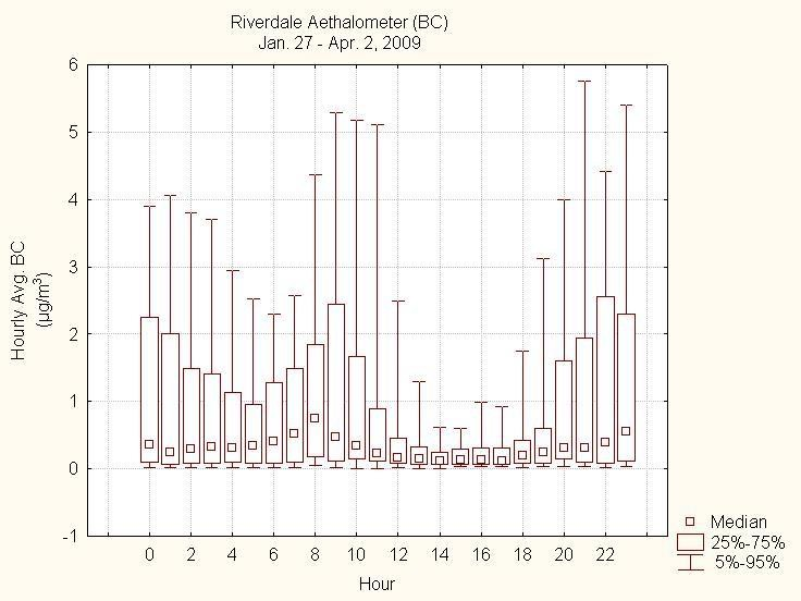
Five-minute average aethalometer black carbon and UV minus black carbon data from Riverdale for the duration of the study are shown in Figure 9. Concentrations of black carbon ranged from 0 to 8.6 µg/m3, with an average of 0.9 µg/m3 and a median of 0.2 µg/m3. Black carbon results correlated well with the co-located filter-based EC results (r2 = 0.94). It can be seen that UV-black carbon is greater than 0 much of the time, particularly during black carbon peaks, indicating that the driving factor of high black carbon concentrations is wood smoke. Diurnal and weekly concentration patterns are also indicative of wood smoke source (Figures 10 and 11). Both the diurnal black carbon and UV-black carbon show a pattern that is typical of home heating with concentrations rising in the early morning as residents start up their wood stoves, falling off in the late morning through the afternoon and rising again in the early evening. The daily black carbon shows lower concentrations on Friday and Saturday, presumably due to residents being out of the house more on these evenings. If there was a significant traffic impact at this site, one would expect Saturday and Sunday concentrations to be lower.
Figure 9: Aethalometer Data at Riverdale
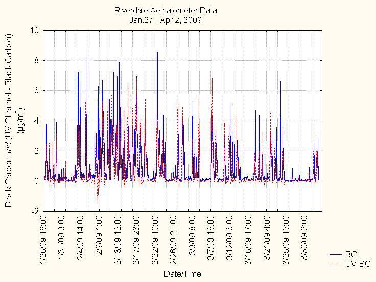
Figure Description
Figure 9 is a line graph showing 5 minute average black carbon concentrations and UV channel minus black carbon concentrations as measured by the Aethalometer as two overlaid traces, in blue and red, respectively. The x-axis is labelled with the dates of the study and goes from January 27 to April 2, 2009. The y-axis is labelled “Black Carbon and (UV Channel - Black Carbon)” and the range of this axis is from -2 to 10 µg/m3. The “UV Channel - Black Carbon” line tracks the “Black Carbon” quite closely and is frequently above 0.
Figure 10: (a) Diurnal Aethalometer BC and (b) UV-BC data from Riverdale
(a)
(b)
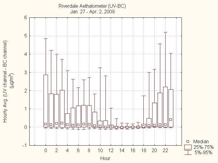
Figure Description
Figure 10 comprises of figures 10a and 10b, two box and whisker plots that show hourly Black carbon and UV-BC data, respectively. The y-axes of the two are in units of µg/m3 and have a range of -1 to 6. The boxes represent the 25th to 75th percentile data, the whiskers the 5th and 95th percentile data and the square represents the median. (a) The median black carbon levels show a clear trend of increasing from early morning until 9 am, then decreasing until midafternoon (3pm), at which point they again increase into the evening. The median values never increase beyond 1 µg/m3 for any of the hours, but the 95th percentile data exceeds 5 µg/m3 during both the morning and evening peaks. (b) The UV-BC results show a similar trend to the BC values with higher levels through the evening and then again in the early morning hours.
Figure 11: Weekly Aethalometer Black Carbon Data from Riverdale
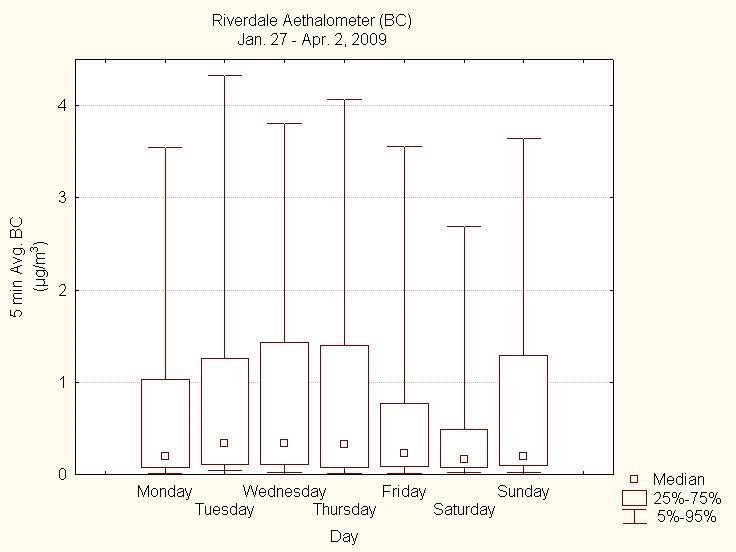
Figure Description
Figure 11 is a box and whisker graph showing the daily average of BC measurements at Riverdale separated by day of the week. The x-axis represents the days of the week, while the y-axis represents the value of 5-minute Black Carbon reading averages, in µg/m3. The boxes represent the 25th to 75th percentile data, the whiskers the 5th and 95th percentile data and the square represents the median. While the median values do not vary greatly, remaining well below 0.5 µg/m3, the 75th and 95th percentile data concentrations are clearly lower on Saturday and to a lesser extent, on Friday.
3.4 Episode analysis
Meteorological data from the five days having the highest PM2.5 as predicted by linear regression modelling with black carbon data (Section 3.2.2) at Riverdale are summarized in Table 5. These days are characterized by having average to well-below-average daily average temperatures and low daily average wind speeds. The mixing heights and ventilation index, calculated using data generated from Environment Canada’s GEM-Regional forecast model at the time of daily maximum temperature, are also low on these five days, creating ideal conditions for accumulation of wood smoke in the Whitehorse area (note: Ventilation Index values from 0 to 33 are categorized as “Poor,” 34 to 54 as “Fair” and 55 to 100 as “Good” ventilation). RWC contribution at Riverdale determined on two of the days is higher than average, indicating again that this source can be an important factor in causing higher PM2.5 concentrations.
| Date | PM2.5 (µg/m3) |
PM2.5 (µg/m3) |
Temperature (°C) |
Temperature (°C) |
Temperature (°C) |
Wind Speed (m/s) |
Wind Speed (m/s) |
Wind Speed (m/s) |
Modelled Mixing Height (m) | Modelled Ventilation Index | Wood Smoke (%) |
|---|---|---|---|---|---|---|---|---|---|---|---|
| 2009 | DT | RD | DT | RD | YXY | DT | RD | YXY | YXY | YXY | RD |
| DT = Downtown; RD = Riverdale; YXY = Whitehorse Airport | |||||||||||
| 2/9 | 19 | 31 | -19.8 | -19.9 | -20.5 | 0.5 | <0.5 | <0.5 | 182 | 14 | Not determined |
| 2/11 | 19 | 31 | -24.1 | -24.1 | -23.8 | 0.7 | 0.5 | 1.0 | 184 | 21 | 77-93 |
| 2/12 | 25 | 41 | -27.0 | -26.6 | -27.1 | 0.5 | <0.5 | 0.0 | 174 | 14 | Not determined |
| 2/13 | 25 | 42 | -24.1 | -24.3 | -23.6 | 0.8 | 0.7 | 1.4 | 138 | 20 | Not determined |
| 2/17 | 20 | 33 | -12.2 | -12.2 | -12.5 | 0.6 | 0.5 | <0.5 | 127 | 12 | 77-93 |
Over the course of this study, there were 14 days having similar meteorological conditions, which appear to be conducive to elevated PM2.5 (daily average temperature at YXY <10°C, daily average wind speed at YXY <1.5 m/s and poor ventilation at YXY) Riverdale black carbon concentrations on these 14 days ranged from a minimum of 0.73 µg/m3 to a maximum of 3.11 µg/m3, corresponding to predicted PM2.5 concentrations of 10.3 µg/m3 (95% CI = 7.0-10.8) to 41.7 µg/m3 (95% CI = 33.1-47.4) at Riverdale and 6.9 µg/m3 (95% CI = 6.0-7.8) to 25.4 µg/m3 (95% CI = 22.5-28.3) at Downtown. For the months of January, February and March, there were 24 days where these meteorological conditions were met, compared with 12 days over the same period in 2008 and 7 days over the same period in 2010.
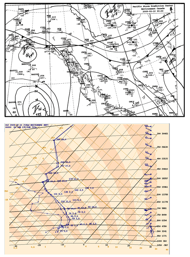
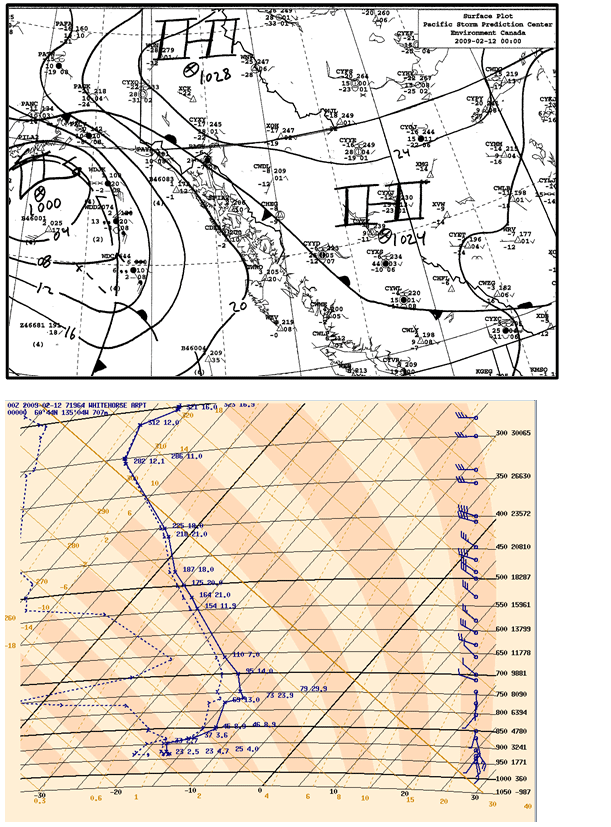
Figures 12a, b, c, d and e show the surface weather maps over northwestern Canada and the temperature soundings from Whitehorse Airport (YXY) at 4 p.m. local time for the five days listed in Table 5. Soundings show the existence of surface-level temperature inversions on all five days, leading to the stable conditions observed that would further explain the high predicted PM2.5 values. Observations from February 11, 12 and 13 show the presence of a strong stable ridge of cold arctic air and a particularly strong surface- level inversion. February 9 and 17 show a different synoptic pattern; however, strong winds from the southwest and west at 500 mb height on these days could be causing subsidence as air flows over the coastal mountain range, which would lead the observed surface-level inversions, and stable conditions.
Figure 12 (a, b, c, d and e): Environment Canada Surface Weather Maps and Temperature Sounding Data
(a) February 9 at 4 p.m.
(b) February 11 at 4 p.m.
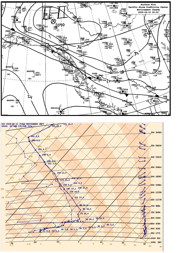
(c) February 12 at 4 p.m.
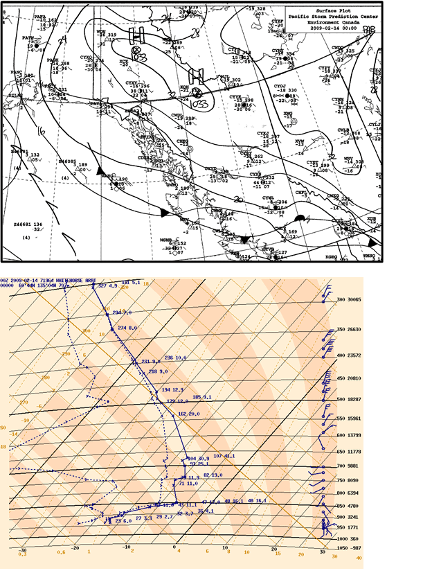
(d) February 13 at 4 p.m.
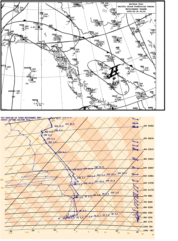
(e) February 17 at 4 p.m.
Figure Description: Figure 12 (a, b, c, d and e): Environment Canada Surface Weather Maps and Temperature Sounding Data
Figure 12 contains five sets of figures. Each set is made up of a surface weather map and a temperature sounding plot from the Whitehorse airport. The five sets of figures are from the five days with the highest predicted PM2.5 levels. Each of the sets of data is from at 4pm local time on the respective day. The surface weather maps display the northwestern portion of Canada, including British Columbia, the Yukon, Alberta, and some of the Northwest Territories; the soundings show the existence of surface level temperature inversions on all five days. Observations from February 11th, 12th and 13th show the presence of a strong stable ridge of cold arctic air and a particularly strong surface level inversion. February 9th and 17th show a different synoptic pattern but have with strong winds from the southwest and west at 500mb height.