Federal Identity Program Manual
Note to reader
This manual is in the process of being replaced by the Design Standard for the Federal Identity Program. During the transition, some sections of the manual will remain in effect; however, the following sections have been replaced by the design standard effective November 19, 2021:
- 1.1 Design: Symbols, typography, signatures, colour (October 1990)
- 5.1 Advertising: Corporate identity guidelines (March 1989)
- 5.2 Published material: Corporate identity guidelines (July 1990)
These sections are also identified as “Archived.” Information identified as archived is provided for reference, research or recordkeeping purposes.
Table of Content
- Introduction
- Overview
- Stationery
- Motor Vehicles
- Signage
- Marketing
 The FIP Manual is issued under the authority of the FIP policy and applies to institutions subject to the Federal Identity Program Policy. All institutions, including those not subject to the policy in full, must nevertheless comply with FIP requirements concerning the use and display of the official symbols of the Government of Canada.
While navigating through this site you may wish to print excerpts or entire volumes. Select "Complete FIP Manual (PDF)" from the lower left side menu to access bilingual PDF files of each volume of the FIP Manual. By using these file to printing hardcopy you will minimize paper usage and maximize image quality.
Important Updates
Volumes of the FIP Manual are posted on this web site in their original published form. Since their publishing (1987-1996), several events have occurred that require specific mention. Additionally, reference may be made in the FIP Manual to documents or government policies which have since been since superseded by other documents.
1. Coat of Arms modified in 1994
The Coat of Arms, also known as the Arms of Canada, was modified in 1994. The modified version supersedes the former design of the Coat of Arms. In all instances where the Coat of Arms is displayed, institutions must ensure the correct version is used.
2. Standard for Primary identification sign modified 1996
Modifications to the primary identification signs affect the top band or blade. The modified standard requires the use of a light grey blade on top equal to the bottom blade, and bear a FIP signature consisting of a red flag symbol with the accompanying title in black. The new standard is to be applied on all new signs and whenever existing signs are being replaced or refurbished. All institution should use the standing offer described below to ensure all signage conforms to FIP requirements.
Overview
1.0 Management Guide to Corporate Identity
FIP Manual,
Introduction
The Federal Identity Program (FIP) policy makes each institution responsible for managing its corporate identity within the framework of the government-wide policy and standards. This guide is intended to shift FIP from a compliance/coordination function to one that is management and results oriented. This new approach not only reflects the transition generated by the Government Communications Policy, IMAA (Increased Ministerial Authority and Accountability) and Public Service 2000, but indicates also the growing importance of corporate identity management in institutions that undergo fundamental change in corporate culture.
Corporate identity encompasses much more than symbols and design, it is central to corporate communications and should be part of an institution's management function. This guide outlines the principles of corporate identity and relates them to a public sector institution. It is intended to clarify government policy on the management of corporate identity and to point out links with service to the public. Furthermore, the guide describes how federal institutions can express their own visual identity within the framework of the Federal Identity Program.
Applicable publications
This section of the FIP Manual should be used with the following policies:
Communications volume, Treasury Board Manual
- Government Communications Policy
- Federal Identity Program Policy
Corporate Identity
Concept and purpose
The concept of corporate identity and its management evolved over the last 50 years, and programs are now in place in most large organizations in the private as well as the public sector. Generally defined as a management technique for communicating an organization's unique characteristics in a memorable manner, corporate identity is based on the premise that key publics must perceive an organization clearly and accurately if management objectives are to be achieved.
It can be said that every organization, regardless of size, has a corporate identity, and it can be either formal or informal. The question is whether an organization manages its corporate identity in the most effective and purposeful manner possible.
The function of management is to ensure that all corporate communications reflect the organization and its goals in a consistent and positive manner, reinforcing each other. In the public sector this means corporate identity management based on public policy and service to the public, and consistent with an institutions strategic communications plans.
An identity program is not a "quick fix" to a problem of corporate communications, nor should it be seen as a cosmetic that can represent something the institution is not. In developing an identity one must examine the institution's past, its present situation and where it wants to be. It involves long-range planning and represents an integral part of corporate strategy. Designing a corporate identity is the most complex of graphic design activities and it is essential to obtain the support of senior management both for its creation and its maintenance.
The fundamental idea behind a corporate identity program is that everything the institution does, everything it owns, every service it provides, should project a clear idea of what the institution and its goals are. Managing identity is taking a comprehensive view of an institution's activities, how these are being identified and how the public perceives the institution.
How it is communicated
An institution's corporate identity is expressed in numerous ways, both explicitly and implicitly. When considering identity in a broad sense, the term corporate image is often used. It deals with the general impression of an institution held by various publics, interest groups, including employees, and it touches virtually all aspects of an institution's activities. Corporate image is constantly being communicated internally and externally and its sources can be classified as follows:
- Nomenclature
- The titles used for the institution, its branches and divisions, as well as the words used to identify programs, services and offices; it includes the titles of personnel.
- Organization
- The hierarchy of an institution; the degree of relationship between the institution and organizational entities.
- Graphic elements
- The symbols, logotypes, corporate signatures, typestyles, formats and colours; all forms of visual communication.
- Formal statements
- Statements emanating from the institution and intended to clarify its mission, objectives or uniqueness for both internal and external publics.
- Formal recognition
- Awards, certificates and citations presented by the institution.
- Continuous media
- Stationery, calling cards, forms, signage, facilities (interior and exterior), vehicle identification.
- Transient media
- Published material, audio-visual productions, exhibits, advertising, public relations, special events, speeches and presentations.
The publics
Although corporate identity focuses on communications with the public, it applies equally to internal communications. An institution would appear confused if clients and employees were to receive different messages. This means that all information material for both external and internal use should clearly convey the institution's corporate identity. The design of this material expresses an institution's personality, its unique identity.
Corporate identity of the Government of Canada
For a public administration as diverse and decentralized as the Government of Canada, the FIP serves as a major unifying element. It promotes visual coherence and helps the public to recognize federal programs and to distinguish them from those of other levels of government. By establishing a visual link between the majority of federal institutions (see note below), the Program also gives public servants a sense of identity as employees of the Government of Canada.
The framework established by FIP policy is intended to maintain a coherent corporate identity of the government as a whole, while at the same time providing scope to individual institutions when expressing their identity.
The framework of FIP consists of:
- three corporate symbols (Coat of Arms, flag, "Canada" wordmark);
- use of the two official languages;
- approved titles of institutions;
- general rules on signatures, typography, colours;
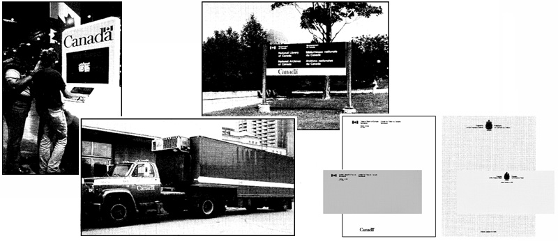
- design standards for key applications (stationery, signage and vehicle markings).
Fields of applications such as advertising, published material, forms, audio-visual productions, expositions, as well as personnel identification, are subject to the general rules on corporate identity but their design is at the discretion of each institution.
Note: Exceptions are institutions that have been specifically exempted from FIP policy or are excluded in view of their legal status.
The government's signature
The "Government of Canada" signature has a broad range of applications, including items intended for government-wide use, activities involving two or more institutions, and facilities occupied by several government institutions. The signature is also used to identify certain boards, councils and committees, and to convey government sponsorship of shared-cost programs (e.g. those involving a provincial or territorial government).
Service to the public
Identification, recognition and access are aspects of both corporate identity and service to the public. The clear and consistent identification of an institution helps the public to find and access programs and services. This means applying corporate signatures and organizational titles in a coherent manner and ensuring that the identification is functional and user oriented. Integral to the government's policy on corporate identity and service to the public is the principle of presenting the two official languages with equal prominence. Design standards help to ensure a uniform presentation of the two languages.
Making connections
When making an enquiry, citizens contact the government by telephone, mail, or in person and use different sources of information in the process. Such sources include telephone directory 'blue pages", government and private sector directories and indexes, departmental information services, public libraries, Reference Canada (the government's telephone referral service), constituency offices, as well as government publications, advertisements and forms.
The process of making an enquiry can be complex and frustrating because many people don't know which department or agency (or which level of government) is responsible for the program or service they are seeking. In view of the complexity of the federal administration, its dynamics and the multitude of sources of information, a systems approach assists the public when making enquiries. Such an approach entails the consistent use of corporate signatures, titles, keywords, abbreviations and addresses, and involves cross-referencing and indexing. An institution's corporate identity program can provide key elements when designing public enquiry mechanisms.
When developing sources of information or establishing enquiry mechanisms, institutions should ensure they are functional and meet the needs of the public rather than satisfy bureaucratic prerogatives. Government programs and services should be identified and described by using plain language, a functional design approach and a simple, consistent style.
Government signage
Signage is a concrete example of how service to the public can be enhanced through communications systems and design standards. The FIP signage system is designed to help people find a government facility and locate a particular service or office within. Comprised of primary identification signs, directory boards, directional and locational signs, the system is being applied in federal buildings, regional and district offices, employment and immigration centres, passport offices, customs and taxation offices, ports of entry, health services facilities, schools, museums, passenger terminals and national parks.
The FIP signage system promotes functional communications and the use of plain language. A comprehensive set of graphic symbols, based on national and international standards, forms part of the system. It includes symbols related to health, safety, public facilities and services, as well as the symbol that indicates services in both official languages.
In summary, the signage system provides a uniform visual link among federal institutions and assists the public in recognizing and using government programs and services.
Managing an institution's corporate identity
The management of corporate identity involves the initial phase of selecting a name and adopting a signature and the ongoing activity of implementation.
The need to manage corporate identity is now well recognized. Studies of both the private and public sector indicate that organizations known for innovative management share similar characteristics:
- they create a clear link between corporate strategy, internal and external communications and the management of corporate identity;
- they recognize visual identity and design as a management tool and use if in a planned and coherent manner
- they demonstrate leadership and excellence in their services and products and communicate it clearly and consistently;
- their corporate identity conveys a sense of purpose that is expressed to both employees and clients; and
- they see their corporate identity as an important asset that must be prized and developed.
In summary, the purpose of managing corporate identity is to achieve clear and effective identification of all activities, consistent with strategic plans for communicating programs. An institution's identity should convey a sense of purpose, quality and integrity. It is a task that requires the full support of senior management and the active involvement of those concerned.
Nomenclature
An institution's title is key to its identity. The words used help to define and position the institution. The selection of a title is one of the most important decisions and requires the approval of ministers (see FIP policy).
A title that can be communicated effectively and be remembered readily represents a distinct advantage in communications with the public. Choosing a title also means positioning the organization in relation to others. Ideally, a name should be distinctive and not share similarities. For example, when an estimated 5,000 organizations have titles beginning with the word "Canadian", it is evident that recognition can be difficult.
Applied titles
FIP policy requires institutions to adopt an approved title for use in their signature. Referred to as "applied titles", these names have a dual purpose: to express the function or nature of the institution to the public and to identify it as an institution of the Government of Canada. The requirement for applied titles stems from the development of FIP policy in the mid-seventies when existing legal titles were often long and sometimes convoluted. There was no intent, however, to perpetuate the need for both legal and applied titles when naming new federal institutions. This means that legislation establishing the institution should refer to a title that meets the criteria of FIP policy. Similarly, certain departments have made reference to their applied title while amending their Act, thus eliminating the need to distinguish between legal and applied titles.
Based on the criteria set out in the policy, these are examples of applied titles:
- Forestry Canada
- Agriculture Canada
- Communications Canada
- Department of Finance Canada
- Energy, Mines and Resources Canada
- lndustry, Science and Technology Canada
- Medical Research Council of Canada
- National Archives of Canada
- Public Works Canada
- Statistics Canada
- Tourism Canada
The applied titles, legal titles and abbreviations of government organizations are listed in "Titles of federal organizations", issued by the Treasury Board Secretariat as Appendix C of the FIP policy. Here is an example:
Health and Welfare Canada (HWC) Department of National Health and Welfare
Titles of programs and services Referred to as ''service titles'', these are names that identify an organizational unit, program or service and that appear in conjunction with the title of the parent organization. Their creation is at the discretion of each institution. The English and French titles should be developed in parallel and certain principles should be observed when determining the wording. A title should:
- be as brief as possible to promote effective communication;
- begin with a key word and avoid the repetition of words or concepts used in the title of the parent organization;
- respect the linguistic usage in both official languages; and
- not contain an abbreviation or ampersand (&).
Naming a program or service should be done in context with the institution's title. When words (or concepts) such as Canadian, Canada, Government, Federal or National are conveyed by the institution's title, it would be redundant to repeat them in the service title. To achieve brevity, the omission of terms that reflect an organization's structure may be considered (e.g. Administration, Office, Branch or Division). These terms describe an organization's hierarchy but may be of little significance to the public that relies on key words to locate and gain access to services. The example indicates how a title may be modified for purposes of the signature:
Environment Canada
Canadian Parks Service

Abbreviations
Symptomatic of a bureaucracy, abbreviations are part of its nomenclature. Critics refer to them as alphabet soup because few abbreviations are distinct identifiers or have the potential of becoming widely known. Nevertheless, it would be unrealistic to dismiss them from government communications because they provide a convenient "shorthand". To ensure an abbreviation is understood, it should always appear in the context of the full title.
Corporate signatures
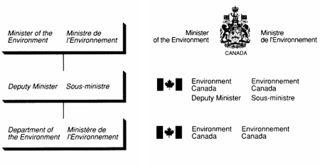
An organization's structure is expressed through its corporate signatures. In that sense, the "Government of Canada" signature is the universal identifier, whereas ministers, senior officials, departments, branches, agencies, boards, commissions and programs are identified by distinct signatures. The example indicates the relationship between organisational structure and corporate signatures.
Development
Signatures are developed for new institutions or programs, or an existing signature may be modified to meet changing requirements. Institutions may have several variants of their signature, a feature common among departments that are decentralized or that manage a variety of programs and services. The creation of a signature should be based on a clear understanding of the institution's corporate structure, its goals and, of course, the communications objectives. Government programs can be identified by different means, e.g. by a signature that identifies the program together with the parent institution and conveys organizational structure, or by a signature that identifies the program as a separate entity without reference to the parent institution. The different means provide flexibility when linking corporate identity with an organization's communications strategy.
A signature must be functional. The key is to determine a title that best reflects management objectives, is meaningful to the public and communicates the information clearly.

Content and form
The creation of a signature involves words and typography. It is a process that is verbal and visual and consists of arranging, organizing and designing. The goal is to express a signature in typographic terms; to strengthen the significant, or to make the important stand out against the less important. Generally, there are different options to present a signature and these should be compared when choosing the final design.
Short versions
To meet special requirements, some institutions may need to adopt a short version of their applied title. Short versions are effective when viewing conditions or space restrictions call for a concise signature. For example, the Canadian Coast Guard uses the brief title Coast Guard when identifying its fleet; and Employment and Immigration Canada uses the title Immigration Canada when identifying activities related to immigration only. Institutions that create a short version of their title should register it in the FIP policy.
Dynamics of corporate identity
Public recognition of an institution is achieved and reinforced through the consistent application of its corporate signature. While continuity and uniformity are important factors of corporate identity, it is also clear that corporate identity and visual communications are dynamic and therefore subject to changes in corporate culture and strategy.
Managing corporate identity means flexibility to respond to new strategies while at the same time preserving the institution's permanent values. Any modification should be carefully analyzed and planned.
Quality and integrity
Managing corporate identity also means being responsible for its quality and integrity. The full recognition value of a corporate identity depends on good quality reproduction which should be monitored in all applications (e.g. forms, published material, motor vehicles, signs and directory boards).
The integrity of an institution's corporate identity can be undermined if the use of other symbols is not controlled. FIP policy restricts the use of other symbols, including those intended for government wide use.
Visual Identity
An institution's visual identity is expressed in many ways and is much broader than corporate identity. The purpose of managing an institution's visual identity is to ensure that corporate goals are visualized and communicated effectively. It is based on the premise that decisions on the design of corporate communications should not be made in isolation. In that sense corporate identity and visual identity have similar objectives.
The corporate "look"
Institutions can make their visual communications more effective and coherent by establishing a corporate "look". This means developing a visual identity for those applications not subject to FIP design standards. The need to take such an approach varies from organization to organization and is at the discretion of each institution. A project that defines an institution's visual identity will require the support and approval of senior management and should come under the responsibility of the corporate identity manager.
The benefit of using a systems approach to make visual communications more coherent has been recognized by federal institutions with major publishing programs or significant investments in facilities or equipment. Some institutions developed simple guidelines while others are using comprehensive manuals; among these are: Canadian Coast Guard; Canadian International Development Agency; Emergency Preparedness Canada; National Archives of Canada; National Research Council Canada; Statistics Canada; Supply and Services Canada; and Transport Canada.
Development
Generally, graphic standards establish corporate colours, typefaces, layouts or formats and most often apply to the design of published material. Outlined below is a suggested best practices approach.
Key to developing graphic standards is the design brief that defines the project. It requires research into past practices of designing and producing published material, defining the objectives and writing the actual brief. The design brief should establish a firm understanding of the project, its scope, objectives and restraints. It should provide management with a document that can be used throughout the development phase and against which design proposals can be compared.
A brief that defines the design and presentation of published material should address the following aspects: nature of the information or subject matter; program objectives; communications strategy and corporate identity; user publics; official languages; budget; production; marketing; distribution; and sales. In addition, the design brief should state any objectives related to government-wide priorities (e.g. environmental protection).
Once the most effective design solution has been determined and approved by the institution, all design requirements should be translated into a set of guidelines or standards. Intended for the various specialists involved (e.g. editors, planners, designers, typesetters, printers) the guidelines become a practical tool in the design and production process.
Ideally, graphic standards should create a framework or structure without limiting the creative process. Because visual communications and design are dynamic, a proper balance should be struck between firm rules and guidelines that allow flexibility and encourage innovation.
Advice and assistance
Each institution has named an official (referred to as FIP Coordinator) to manage its corporate identity. All enquiries regarding the guidelines should be routed through the FIP Coordinator of the institution.
The Administrative Policy Branch of Treasury Board Secretariat provides policy interpretation and advice on all aspects of corporate identity management and information design. Such advice includes the development of a visual identity within the framework of FIP but tailored to meet an institution's communications objectives.
Definitions
For easy reference, certain terms established for FIP purposes are included here.
- Application:
- the act of applying FIP design standards or general rules to an object (e.g. a sign, a vehicle).
- Applied title:
- the approved name used in the signature to identify an institution, program or activity. See also legal title, service title.
- "Canada" wordmark:
- the global identifier of the government; it consists of the word "Canada" with the Canadian flag over the final "a".
- Design standard:
- the approved rules on the use of design elements outlined in the FIP policy. They prescribe elements such as shape, size, layout, colour, typography and use of symbols.
- Field of application:
- the gamut of items that bear the identifying elements of FIP, e.g. stationery, vehicles, signs.
- Legal title:
- the name that appears in the enabling legislation (act), proclamation, Order in Council, or other instrument used to create a branch of government. (See also applied title.)
- Service title:
- the name that identifies an organizational unit, program, service or activity, and for purposes of a signature appears with the applied title of the parent institution. (See also applied title, legal title.)
- Signature:
- the combination of a symbol and a title. (Also referred to as the corporate signature.)
Bibliography
Included here are selected titles on the management of corporate identity and design. Additional references, including corporate identity manuals of other government organizations, may be consulted in the reference library of the Federal Identity Program at the Treasury Board Secretariat.
- Bernsen, Jens (ed.), Design Management in Practice, European/EEC Design Editions, Danish Design Council, Copenhagen, 1987.
- Blackburn, Bruce, Design Standards Manuals, National Endowment for the Arts, US. Government Printing Office, Washington, DC., 1977, (44 pp.).
- Blake J., A management guide to corporate identity, Council if Industrial Design, London, 1971.
- Editions du Centre Georges Pompidou, Images d'utilité publique, Paris, 1988, (151 pp.).
- Gerstner, Kari, Compendium for Literates, MIT Press, Boston, 1974, (180 pp.).
- Gorb, Peter (ed.) Design Talks, London Business School, The Design Council, London, 1988, (311 pp.).
- Gorb, Peter (ed.), Living by design, The partners of Pentagram, Lund Humphries Publishers Ltd., London, 1978, (300 pp.).
- Heude, Rémi-Pierre, L'image de marque, Éditions Eyrolles, Paris, 1989, (186 pp.).
- Hurlburt, Allen, The design concept, Watson-Guptill Publications, New York, 1981, (157 pp.).
- Leblond, Jean-Claude, Gouvernement du Québec - une nouvelle image de marque, Antennes, numéro 13-14, 1979, pp. 44-49.
- Mollerup, Per, The Corporate Design Programme, European/EEC Design Editions, Danish Design Council, Copenhagen, 1987, (117 pp.).
- Murphy, J. and Rowe, M., How to Design Trademarks and Logos, North Light Books, Cincinatti, Ohio, 1988, (144 pp.).
- Nakanishi, Motoo, Corporate Design Systems, PPC International, Inc., New York, 1985, (125 pp.).
- Olins, Wally, The Corporate Personality, An inquiry into the nature of corporate identity, Mayflower Books Inc., New York, 1978, (215 pp.).
- Olivetti, Design Process, Olivetti 1908-1978, Ing. C. Olivetti & Ca., Italy, 1979, (278 pp.).
- Selame, Elinor, The Company Image: building your identity and influence in the marketplace, John Wiley & Sons, Inc., 1988, (230 pp.).
- Simpson, Maria (ed.), Corporate Identity: Name, Image and Perception, Conference Board Report No. 898, The Conference Board, Inc., New York, 1987, (46 pp.).
- Schmittel, Wolfgang, Corporate design, ABC Edition, Zurich, 1984, (168 pp.).
- Wurman, Richard S., Information Anxiety, Doubleday, New York, 1989, (356 pp.).
Appendix A
Federal Identity Program
Background

As with corporate identity programs generally, the Federal ldentity Program (FIP) is based on the use of corporate symbols applied in conjunction with organizational titles. The corporate signatures serve to identify institutions as part of the Government of Canada rather than as separate, independent entities. The origins of the government's corporate identity can be traced to the following events.
1921 The Canadian Coat of Arms was adopted by royal proclamation and introduced on government stationery. The colours red and white were declared to be Canada's official colours.
1965 The Canadian flag was adopted by royal proclamation. The maple leaf was confirmed as an official national symbol.
1969 The Official Languages Act was proclaimed, establishing the principle of equality of English and French.
1969 The Task Force on Government Information reported that the government was failing to make its presence known and that important federal programs were being carried out without the public being aware of their sponsorship.
In its report "To know and be known', the Task Force observed that organizations did not project a uniform, clearly identifiable image as functional parts of the same government. Many organizational titles failed to distinguish clearly public from private, or federal from provincial. Furthermore, through the use of different and uncoordinated symbols - many of very poor design - each organization identified itself as a separate entity.
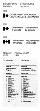
1970 The creation of the Federal ldentity Program was announced in the House of Commons. Standardization and clear identification of federal activities were cited as main objectives. Information Canada, a new agency, was made responsible to develop and implement the program.
1974 Treasury Board approved the first policy guidelines that included the use of the two official languages and a management system for the development and implementation of the program.
1976 Following the demise of Information Canada, the Treasury Board Secretariat was given responsibility for FIP.
1978 Treasury Board issued a comprehensive policy and design standards.
During the 80s, FIP underwent several reviews that resulted in changes to the use of symbols. In 1980 the "Canada" wordmark was established as the global identifier of the government. In 1987 the federal emblem (bar and maple leaf) was replaced by the Canadian flag. This means that the Coat of Arms, the flag, and the "Canada" wordmark are now the corporate symbols of the government.
Objectives
The program's policy objectives are:
- to enable the public to recognize clearly federal activities by means of consistent identification;
- to improve service to the public by facilitating access to programs and services;
- to project equality of status of the two official languages, consistent with the Canadian Charter of Rights and Freedoms (1982) and the Official Languages Act (1988);
- to ensure effective management of the federal identity consistent with government-wide priorities, and to achieve savings through standardization;
- to promote good management practices in the field of corporate identity and information design.
Rationale
Although not prepared for that purpose, the rationale for FIP was well expressed in the 1981 report of the Parliamentary Task Force on Federal-Provincial Fiscal Arrangements. The following statement could apply to all aspects of federal identity:
"...spending without federal presence is not just frustration for the politician, it is also a denial of the citizen's right to see the government's work and to judge it. When the federal role is not evident, it cannot be assessed. Visibility involves a search for the chance to take the credit, but at the same time, a willingness to shoulder the blame. As politicians, therefore, we reject the simplistic view that a concern for visibility is no more than public relations for its own sake. Answerability of federal MPs to the public is the other side of the coin from accountability of ministers to Parliament, and a government that is not visible cannot be answerable".
In summary, federal programs, services and contributions should be recognizable to the public in order for the government to be accountable. From a practical point of view, FIP represents an important aspect of service to the public. The program's guidelines are based on the use of plain, non-bureaucratic language, functional graphic design and a systems approach in identifying government services.
Scope
The Federal Identity Program is considered to be one of the largest corporate identity programs undertaken by a national government. An estimated 18,000 facilities, 16,000 government vehicles, and a multitude of forms, stationery items, published material and advertisements are identified in accordance with FIP guidelines. The program is being applied by over 100 federal institutions in all regions of Canada as well as abroad.
A global viewpoint
An aspect worth noting is the relationship between the visual identity of the government and that of the century. The report to the 1969 Task Force on Government Information first referred to this aspect. The report said:
'A great deal of the responsibility for the image of a country rests with government. There are scores of ways in which government is instantly recognized. They range from the flag and the appearance of government buildings the stationery and letterheads, advertisements, insignia on government vehicles and so on. Abroad, the distinction between government and Canada merges into a single image". The report called it "l'image Canada".
In 1988 this concept was addressed at an international design exhibition at the Centre Pompidou in Paris. Under the theme "Images d'utilité publique", the exhibition examined how the state and public authorities and organizations communicate with people and how information design directly affects the functioning and quality of society. The Federal ldentity Program was among the case studies from different countries that demonstrated national, civic and cultural visual identities. Internationally, the Program is well recognized among corporate identity and design consultants.

1.1 Design: Symbols, typography signatures, colour Archived
This section has been archived on the Web
Information identified as archived is provided for reference, research or recordkeeping purposes. The text that is struck out below has been replaced. Information is now available in the Core elements and How to present the official symbols sections of the Design Standard for the Federal Identity Program.
FIP Manual,
Introduction
The symbols and signatures of the government should be presented in a consistent and uniform manner. These guidelines and design standards describe the use of symbols, typefaces, signatures and colours, and are intended to assist all those involved in designing or applying signatures.
This edition of “Design”, which supersedes the version, includes new guidelines for signatures that identify a program or service (compound signatures), as well as information on electronic formats to reproduce symbols and signatures.
Applicable publications
This guide should be used with the following policies and guidelines:
Communications Volume, Treasury Board Manual
- Chapter 1, Government Communications
- Chapter 2, Federal Identity Program, and its Appendices
- Official languages
- Application schedules
- Titles of federal organizations
Federal Identity Program Manual
- 1.0 Management guide to corporate identity
Scope
These guidelines and design standards describe the use of the government’s corporate symbols, standard typefaces, signatures and colours. They apply to federal institutions using either the Coat of Arms or the flag in their signature.
Enquiries
Each institution has named an official (usually referred to as FIP Coordinator) to manage its corporate identity. All enquiries should be routed through the official designated by the institution.
Enquiries about the guidelines and design standards should be directed to:
Federal Identity Program
Administrative Policy Branch
Treasury Board Secretariat
Corporate symbols
The Coat of Arms, the flag and the “Canada” wordmark are the corporate symbols of the government (Fig. 1). Their consistent application helps to project the Government of Canada as a coherent, unified administration.
- Coat of Arms
-
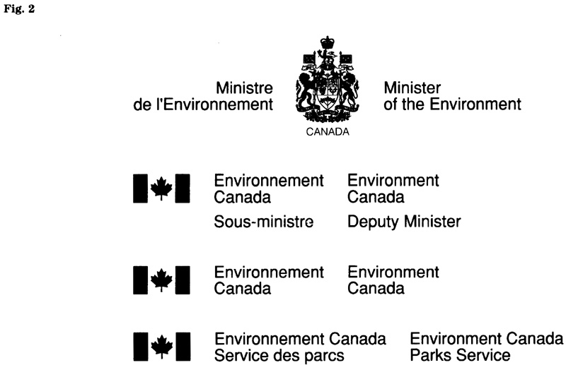
The Coat of Arms is used to identify ministers and their offices, parliamentary secretaries, institutions whose heads report directly to Parliament, as well as institutions with quasi-judicial functions. When applied in the context of the Federal Identity Program (FIP), the Coat of Arms is always used with a bilingual title.
- Flag symbol
-
The flag symbol is used to identify all departments, agencies, corporations, commissions, boards, councils, and other federal bodies and activities, unless they are authorized to be identified by the Coat of Arms. When applied in the context of FIP, the symbol is always used with a bilingual title.
For purposes of the FIP slight modifications were made to the flag, particularly to the stem of the maple leaf.
- “Canada” wordmark
-
Referred to as the global corporate symbol of the government, the wordmark is used always in association with the appropriate signature.
The wordmark has an established relationship between the elements which may not be altered in any way. Its letter forms originated from the typeface Baskerville but were modified for purposes of the wordmark. This means that the design of the wordmark is unique and an appropriate master is required for reproduction.

Use of other symbols
In cases where another symbol is used in conjunction with the corporate symbols of FIP, care should be taken to ensure a clear, uncluttered display of the federal identity. The FIP policy does not permit the use of other symbols on standard applications (stationery, signage and vehicle markings).
Signatures, general
A signature is the combination of a symbol and a title. The symbol is either the Coat of Arms or the flag (as appropriate) and the title, in both official languages, identifies an institution, program or individual (Fig. 2).
To achieve uniformity of all signatures, the size and spatial relationships between symbol and typography are specified.
Titles
The approved titles of institutions are listed in “Titles of federal organizations” (see Appendix C of the FIP policy).
For titles occupying more than one line, the words should be arranged in logical groupings or reading phrases, and an attempt should be made to achieve visual balance between the two language columns. A typographic layout is often a compromise between concerns for logical line breaks and the need for a pleasing presentation. Generally, an institution adopts one signature layout and uses it consistently. Nevertheless, different layouts may be used to meet special needs (e.g. a one-line as opposed to a two-line signature, or a variation in the way the lines are broken).
Standard typefaces
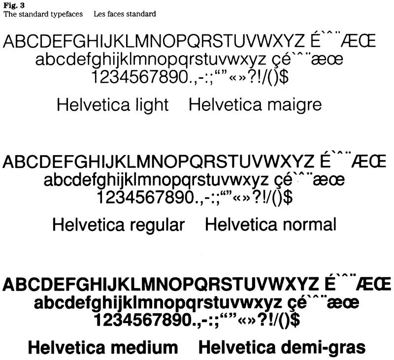
A consistent typography is fundamental to corporate identity, and three faces from the Helvetica type family have been adopted for purposes of the FIP. They were chosen for their versatility, excellent legibility and contemporary design.
The three typefaces (Fig. 3) are designated Helvetica light, regular and medium throughout this manual. When specifying a typeface, it should be noted that these are not standard designations. For instance, the three faces are also referred to as Helvetica 45, 55 and 65 respectively. Since the designations used by industry vary, the type specimens shown here should be examined for comparison with specimens shown in the catalogues of suppliers.
The use of the standard typefaces is mandatory for all signatures. Helvetica is also specified for words accompanying the signature in applications that are subject to design standards, e.g. stationery, signage and vehicle markings.
Although slight variations from the illustrated specimens are acceptable for individual items, care should be taken to avoid the mixing of composition from different sources on any one item. Variations in the letter forms are noticeable when typesetting from different suppliers or a variety of composition equipment is combined.
Signage typeface
This typeface was developed for purposes of the government’s signage system as well as vehicle markings. Details on the design of the signage typeface and its spacing system are provided in section 4.5 of this manual.
General rules
The rules for presenting a signature are:
- Use of upper and lowercase characters;
- Use of accents with uppercase as well as with lowercase letters in the French text;
- Use of appropriate line breaks when a signature is to be typeset in more than one line (i.e. an effort should be made to break the lines into reading phrases avoiding articles or prepositions at the end of a line and to achieve a visual balance between the two language columns);
- Ampersands (&) may not be used in a signature.
Specifications
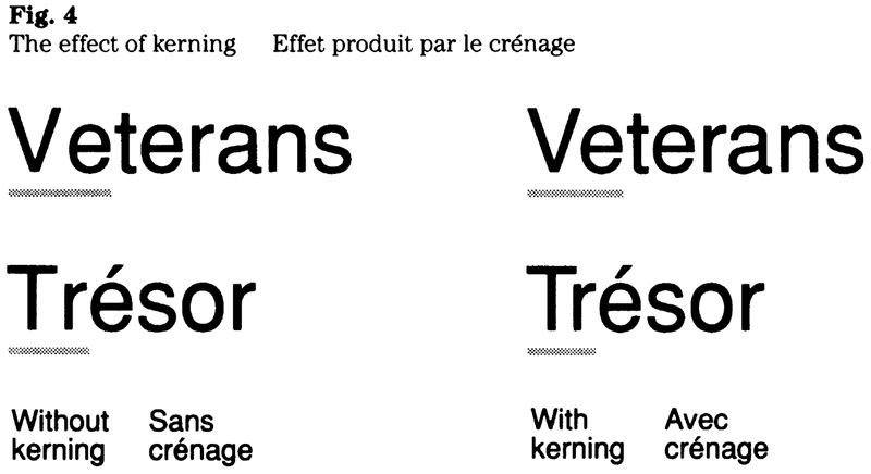
The basic specifications for signatures are: upper and lowercase, solid, normal spacing between letters, with selective kerning applied to awkward combinations of letters.
To compensate for different viewing conditions, variations from normal spacing between letters may be required when signatures are set in large type sizes (display type) or are intended for audio-visuals, posters or outdoor advertising. Selective kerning should be used in all cases to improve letter-fit and to enhance visual appearance (Fig. 4).
Quality of typesetting
The quality level for the typesetting of signatures is specified as “Prestige”, which is defined in the Supply and Services Canada publication Typesetting Quality Levels (latest issue, 1987).
Signature incorporating the Coat of Arms
Government institutions that use the Coat of Arms in their signature have discretion to choose between two presentations, the symmetrical or the asymmetrical layout. For functional reasons, the asymmetrical layout is recommended for applications such as signage and vehicle markings.
The layout specifications for signatures used on ministerial stationery are described in section 2.1 of this manual.
Layout in typographic measures
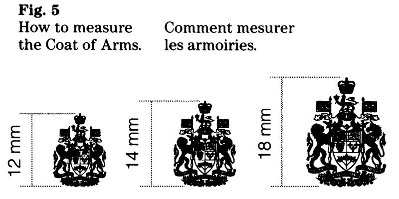
For both the symmetrical and the asymmetrical layout the relationship between the size of the type and the size of the Coat of Arms is as follows: 6 and 7 point type with a 12 mm Coat of Arms; 8 and 9 point type with a 14 mm symbol; 10 and 11 point type with an 18 mm symbol. The sizes of the Coat of Arms are based on its height, measured in millimetres (Fig. 5).
Symmetrical layout
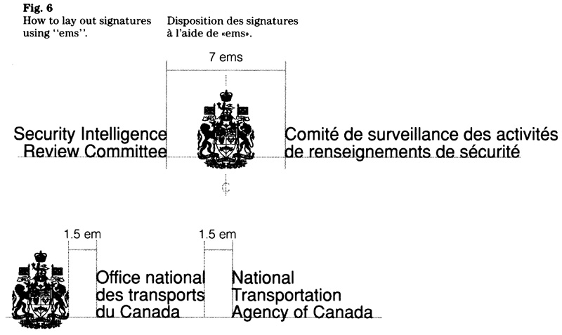
The bilingual title appears on either side of the Coat of Arms. Depending on its length, a title may be laid out in one, two, or three lines. The lowest line of the type is horizontally aligned with the tip of the shield in the Coat of Arms. The left-hand column is set flush right, while the opposite column is presented flush left. The two columns are separated by a space of 7 ems of the type size being used. The Coat of Arms is centred in that space (Fig. 6).
Asymmetrical layout
The bilingual title appears to the right of the Coat of Arms. Depending on the length of the title and the horizontal space available, a title may be laid out in one, two or three lines. The lowest line of the type is horizontally aligned with the tip of the shield in the Coat of Arms. Both columns are set flush left. The space between the Coat of Arms and the left-hand column, and the space between the language columns is 1.5 em of the type size being used (Fig. 6).
Layout in “x”
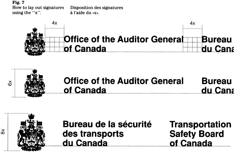
The asymmetrical layout is used for the signature. Titles may be laid out in one, two or three lines. All measurements are based on the x-height of the character size being used. The size relationship between the Coat of Arms and the type should be based on the number of lines being used. The object is to establish a good visual balance between symbol and typography. This principle is reflected by the examples shown (Fig. 7), where the two-line signature has a ratio of 1:6 and the three-line signature a ratio of 1:8. For example, the design of a two-line signature using a ratio of 1:6 and an x-height of 10 mm would require a Coat of Arms measuring 60 mm.
As a general rule, signatures require a space of 4x between the Coat of Arms and the left-hand column, and between the two language columns. The minimum space is 3x.
Signature incorporating the flag
Described here is the basic layout for signatures incorporating the flag. The bilingual title appears to the right of the flag symbol. Two-line signatures are most common; for lengthy titles, a three-line signature is used (Fig. 8).
Design standards apply to the size and spatial relationships between symbol and typography. Signatures for printed applications are specified using typographic measurements (point and em). Signatures for signs or vehicle markings are specified in millimetres with respect to character size; the layout measurements are expressed in number of “x”.
Layout in typographic measures
The size relationships between symbol and typography and the standard spaces are as follows.
Two-line and three-line signatures: The ratio between the type size and the height of the flag symbol is 1:1.7. For example, a signature set in 12 point type requires a symbol which is 20 points in height (Fig. 9). Table 1 shows the type size with the corresponding height of the symbol. The measurements are in points.
One-line signature: The ratio between the type size and the height of the flag symbol is 1:1.5. For example, a signature set in 12 point type requires a symbol which is 18 points in height (Fig. 10). Table 2 shows the type size with the corresponding height of the symbol. The measurements are in points.
Horizontal alignment: The base of the symbol and the base line of the type are aligned horizontally as indicated in Figures 9 and 10.
Standard spaces: As a general rule, the space between the symbol and the left-hand column, as well as between the language columns is 1.5 em of the type size being used (Fig. 11).
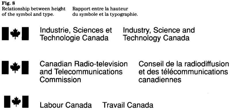
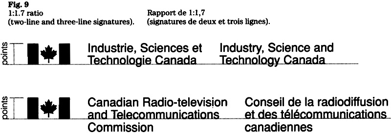

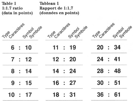
Table 1: 1:1.7 Ratio (data in points) - Text version
| Type | Symbol |
|---|---|
| 6 | 10 |
| 7 | 12 |
| 8 | 14 |
| 9 | 15 |
| 10 | 17 |
| 11 | 19 |
| 12 | 20 |
| 14 | 24 |
| 16 | 27 |
| 18 | 31 |
| 20 | 34 |
| 24 | 41 |
| 28 | 48 |
| 30 | 51 |
| 36 | 61 |
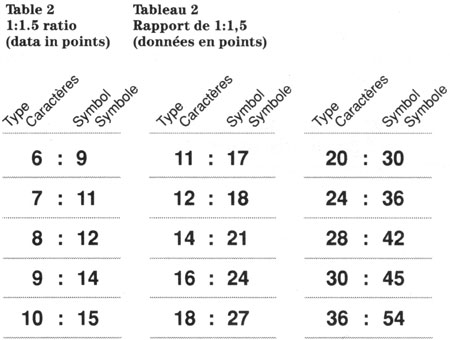
Table 2: 1:1.5 Ratio (data in points) - Text version
| Type | Symbol |
|---|---|
| 6 | 9 |
| 7 | 11 |
| 8 | 12 |
| 9 | 14 |
| 10 | 15 |
| 11 | 17 |
| 12 | 18 |
| 14 | 21 |
| 16 | 24 |
| 18 | 27 |
| 20 | 30 |
| 24 | 36 |
| 28 | 42 |
| 30 | 45 |
| 36 | 54 |
Layout in “x”
The size relationships between symbol and typography and the standard spaces are as follows.
Two-line and three-line signatures: The ratio between the character size and the height of the flag symbol is 1:3.4. For example, a signature using a character size of 20 mm requires a symbol which is 68 mm (or 3.4x) in height (Fig. 12). Table 3 shows the character size with the corresponding height of the symbol. The measurements are in millimetres.
One-line signature: The ratio between the character size and the height of the flag symbol is 1:3. For example, a signature using a character size of 25 mm requires a symbol which is 75 mm (or 3x) in height (Fig. 13). Table 4 shows the character size with the corresponding height of the symbol. The measurements are in millimetres.
Horizontal alignment: The base of the symbol and the base line of the type are aligned horizontally as indicated in Figures 12 and 13.
Standard spaces: As a general rule, a space of 4x between the symbol and the left-hand column as well as between the language columns is used. The minimum space is 3x (Fig. 14).
Flag symbol (modified)
Users of large signatures should note that a modified version of the symbol was developed to compensate for irradiation, an optical effect whereby white elements appear to spread into surrounding dark areas. The modified version is used for all large signatures that appear in white on a dark background, e.g. signs. (See “Enquiries”.)
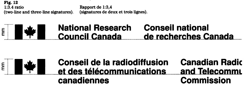

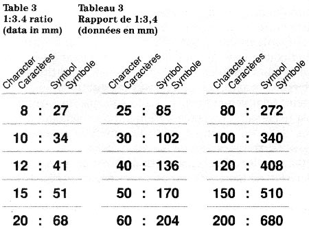
Table 3: 1:3.4 ratio (data in mm) - Text version
| Type | Symbol |
|---|---|
| 8 | 27 |
| 10 | 34 |
| 12 | 41 |
| 15 | 51 |
| 20 | 68 |
| 25 | 85 |
| 30 | 102 |
| 40 | 136 |
| 50 | 170 |
| 60 | 204 |
| 80 | 272 |
| 100 | 340 |
| 120 | 408 |
| 150 | 510 |
| 200 | 680 |
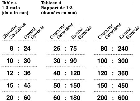
Table 4: 1:3 ratio (data in mm) - Text version
| Type | Symbol |
|---|---|
| 8 | 24 |
| 10 | 30 |
| 12 | 36 |
| 15 | 45 |
| 20 | 60 |
| 25 | 75 |
| 30 | 90 |
| 40 | 120 |
| 50 | 150 |
| 60 | 180 |
| 80 | 240 |
| 100 | 300 |
| 120 | 360 |
| 150 | 450 |
| 200 | 600 |

Compound signatures
This guideline was developed in view of a growing demand for signatures that identify an institution’s programs or services. Various factors should be considered when developing a compound signature and assessing options. The process involves arranging, organizing and designing, and has the following goals:
- to express organizational titles in typographic terms;
- to make distinctions by creating emphasis;
- to establish a logical order;
- to develop both language versions in parallel.
The key is to determine a signature that best reflects management objectives, is meaningful to the public and communicates the information clearly.
Factors to be considered
Structure, contrast and layout are factors that determine the design of compound signatures. There are no ready-made formulas for layout and typographic treatment; on the contrary, each signature should be designed to meet its own unique set of requirements. It is a typographical task and means selecting a satisfactory compromise between the demands of logic and appearance.
Structure
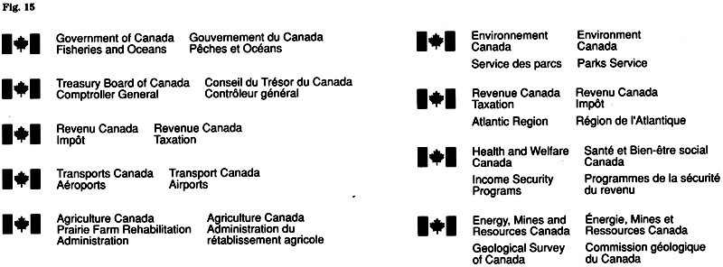
A signature should be structured to show the proper relationship between titles, e.g. those of the parent organization and the organizational component. The component title normally starts on a new line and may be linked to the title of the parent organization. Usually, titles are linked when it involves a major component, when the titles are relatively short, or when a compact layout is required. A signature’s structure will also convey the relationship between titles. For instance, the use of a space generally indicates a subordinate rank. The length of titles or the number of levels to be identified are additional factors that affect a decision to link or to space out titles (Fig. 15).
Contrast
Contrast has the effect of a signal, it helps the reader to perceive and comprehend information quickly. In typographic terms, contrast means the use of different typefaces (weights) or different type sizes. The contrasting values create emphasis where appropriate and help the reader to make distinctions.
Using different typefaces
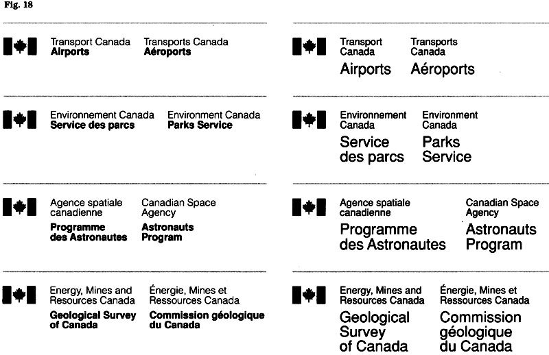
Contrast may be created by combining either Helvetica light with Helvetica medium, or Helvetica regular with Helvetica medium (Fig. 16). A variety of factors such as size, method of reproduction, colour, and type of application should be considered when deciding which typefaces to combine. A combination of Helvetica light with medium provides the greatest contrast, of course.
Using different type sizes
Contrast may be created by combining two different type sizes (Fig. 17). A variety of factors such as length of titles, signature layout, legibility, and type of application will determine the proper combination of sizes. As a general rule, a ratio of 1:1.5 up to 1:2 is recommended. The object is to create a suitable contrast while maintaining balance.


Spacing
The insertion of space between titles serves as a visual cue. The principle is to create distinction between titles while maintaining the overall unity of the signature. The guideline examples indicate that only a small amount of space is needed. See Figures 15, 18 and 19.
Unity and simplicity
When creating a compound signature, care should be taken to limit the mix of typographic elements and the number of organizational levels represented. The object is to identify a program or service, not to convey an institution’s hierarchy or organizational structure. Because a compound signature is generally intended to highlight a program, the emphasis should be on that title. Different means of creating contrast are shown in Figure 18.
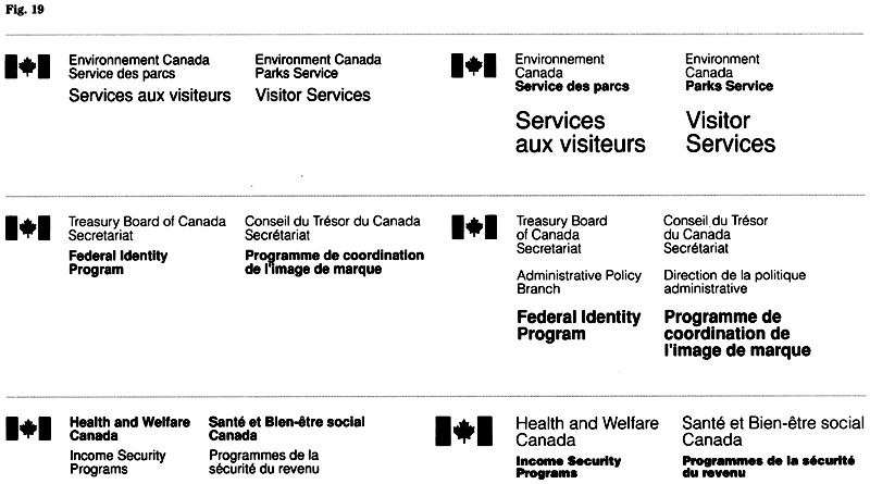
All signatures should convey a sense of unity and simplicity , notwithstanding a mix of typographic elements. This means the contrast should not be so strong that one element dominates to an extent that the balance is upset, nor should the typography become too complex. Therefore, it is suggested to create contrast by mixing either typefaces or type sizes, not both. Figure 19 compares simple designs with solutions that appear overly complex.
“Government of Canada” signature
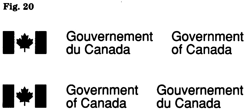
This universal signature of the government (Fig. 20) has a broad range of applications. They include items intended for government-wide use, activities involving two or more institutions, as well as facilities occupied by several government institutions. The signature is also used to identify certain boards, councils and committees, and to convey government sponsorship of shared-cost programs (e.g. those involving other governments).
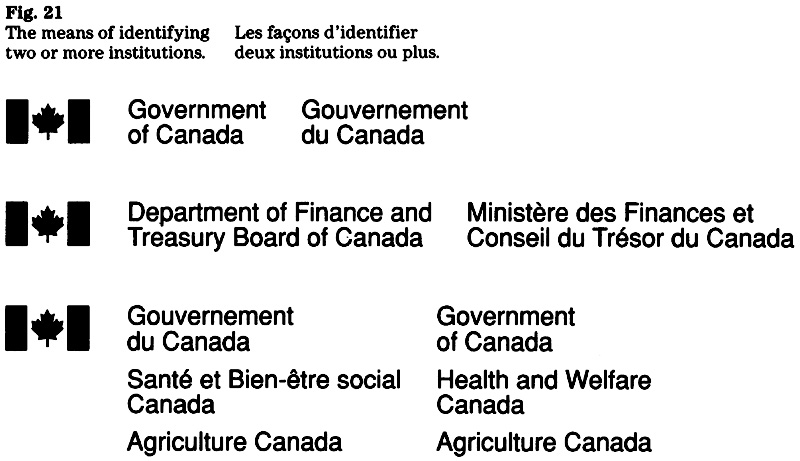
Identifying two or more institutions
When several institutions cooperate on a project, their involvement can be identified in a number of ways. The object is to achieve identification that is brief, avoiding the display of separate signatures each one having a flag symbol. The methods are (Fig. 21):
- the “Government of Canada” signature is presented alone, while the institutions are referred to elsewhere (e.g. on the title page of a publication);
- the titles are connected with the conjunction and to form a two, three or four-line signature;
- the titles are preceded by the “Government of Canada” signature.
“Canada” wordmark
In view of the many fields of application of the “Canada” wordmark, two weights and a range of sizes are in use.
Two versions
The two versions of the wordmark (Fig. 22) are intended for different viewing conditions. In general, the fields of application are as follows:
- regular-weight for printed material;
- medium-weight for signage, and markings for motor vehicles, aircraft and watercraft.
Standard sizes
A range of sizes has been selected for each of the versions of the wordmark and are used for applications subject to design standards (stationery, signage, vehicle markings). For reasons of consistency, these sizes are also recommended for other fields of application.
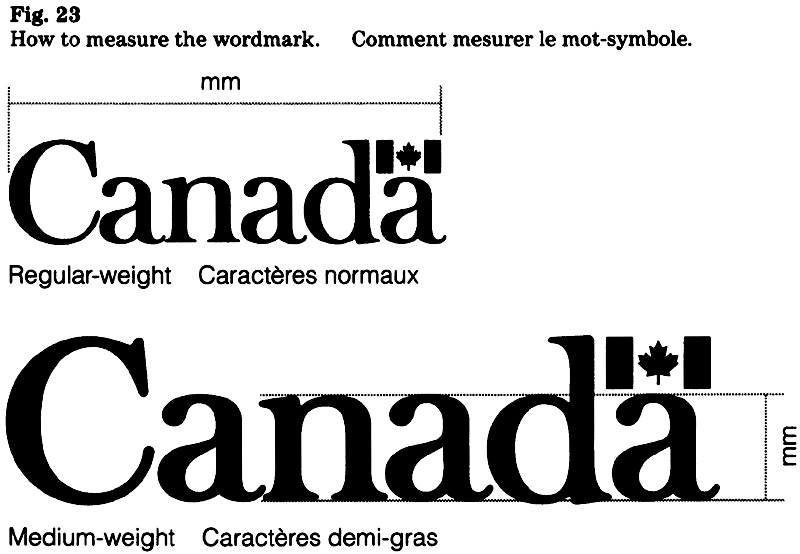
Regular-weight wordmark
The sizes are based on the length of the wordmark, measured from the left edge of the “C” to the right edge of the flag (Fig. 23).
The standard sizes are: 20, 23, 25, 30, 35, 40, 45, 50 and 60 mm.
Medium-weight wordmark
The sizes are based on the x-height, measured on the “n” as shown (Fig. 23).
The standard sizes are: 20, 40, 60, 80, 100, 120, 140, 160, 180, 200, 220 and 240 mm.

Presenting the signature and wordmark
The following rules are fundamental to corporate identity and should be observed when presenting the signature and wordmark.
Visual criteria
To ensure the integrity of corporate signatures and symbols the following criteria apply:
- they may not be altered in any way (see note);
- they should be displayed in generous open space, free from close association with any interfering or distracting elements;
- they may not appear on a visually conflicting background;
- when presenting the signature and wordmark, they should be displayed as two distinct elements;
- the wordmark may not form part of a headline, phrase or sentence.
Note: Exceptions are variations in the layout of a signature, e.g. number of lines, line breaks, and space between columns.
Relative size and position
The relative size and position of the signature and the wordmark are specified for applications that are subject to design standards. Guidance for other fields of application is provided in the appropriate section of this manual.
The “Canada” wordmark has been defined as the dominant symbol of the federal identity; this aspect should be reflected when presenting the wordmark.
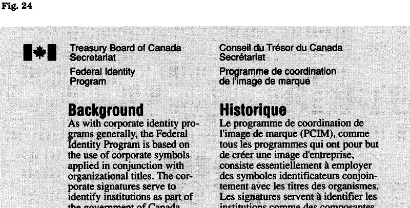
Signature and text layout
When a signature appears with text in a bilingual, side by side format, the space between the two columns in the signature may be adjusted to achieve alignment with the right-hand column of text. This columnar layout of signature and text is used for FIP applications which are subject to design standards, and is recommended for other applications where a side by side, bilingual format is used (Fig. 24).
Colours
Colour is an important aspect of the federal identity and is used consistently for key applications (stationery, and signage and vehicle markings). The design standards on colour are based on one or more of the following goals:
- to enhance the effectiveness of the corporate identity;
- to achieve cost savings through standardization;
- to conform with national standards, where applicable.
For fields of applications that are not subject to design standards, the choice of colour is discretionary. Nevertheless, certain principles concerning colour and contract should be observed.
Principles
The basic colours of the government’s corporate identity are FIP red, black and white. The flag in the signature and wordmark appears in FIP red, while the type is rendered in black. Notwithstanding this rule, there is much flexibility when using other colours for the signature and “Canada” wordmark.
The principles are:
- to ensure sufficient contrast with the background; and
- to use for both flag and type.
A digression from these principles can be appropriate when creating special effects. Examples are cut-out letters for displays or blind-embossing.
Colour specifications
Where applicable, colour specifications are provided in the appropriate sections of this manual (e.g. stationery). For easy reference, the information concerning FIP red is brought together here.
Federal Identity Program red
Two means are used to specify FIP red:
- by referring to a product that is available commercially (e.g. Sinclair and Valentine, No. RL163929/0); or
- by stating a particular number in a colour reference system (e.g. CGSB 509-211).
Printing ink colours: The following inks meet the requirements for FIP red (see note): General Printing Ink, No. 0-712; Inmont Canada Ltd., No. 4T51577; Rieger Inks No. 25564; or Sinclair and Valentine, No. RL163929/0
Note: To test consistency in the reproduction of FIP red, reflection density measurements should be made on a McBeth Model No. 1155 SP1 (or equivalent) densitometer. Reflection density using Wratten 58 (green) filter should be not less than 0.80 and not greater than 1.10 density units.
Paint colours: Specifications for FIP red should refer to the colour CGSB 509-211 which is shown in CGSB 1-GP-12, Standard Paint Colours. Swatches of this colour may be purchased from the Canada Communication Group, Publishing, of Supply and Services Canada.
Weather-resistant product: A special, weather-resistant product has been approved for exterior primary signs where it is used for the red flag in the wordmark. This 3M product is referred to as cast-in “tomato” red vinyl No. 180-13.
When using FIP red for other applications that are subject to weathering, the use of this product is recommended.
Reproduction of symbols and signatures
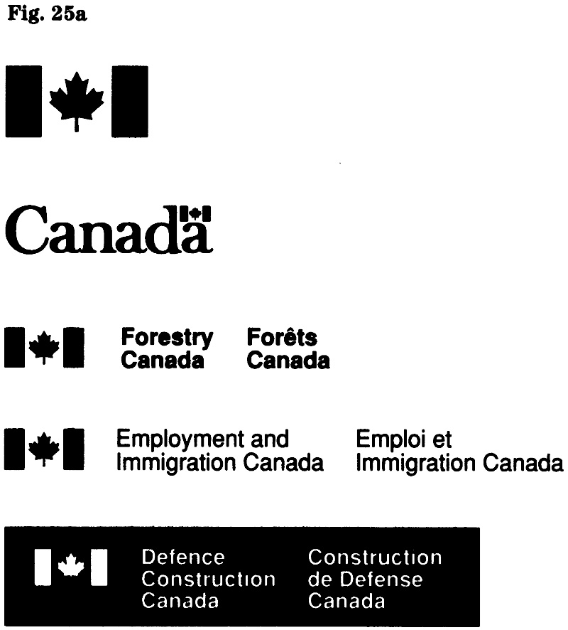
Quality
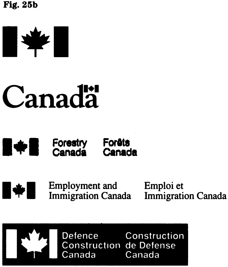
The use of good masters (reproduction proofs or electronic versions) is essential to maintaining quality. Reproductions should always appear sharp, well-defined, and without distortion (Fig. 25a). A concern for quality helps to build and maintain the full recognition value of the signature and wordmark. The examples show signatures and symbols that were altered, distorted, or redesigned; such substitutes are unacceptable (Fig. 25b).
Where applicable, the following Supply and Services Canada publications should be consulted:
- Typesetting Quality Levels (latest edition, 1987);
- Quality Levels for Printing (latest edition, 1988).
Reproduction proofs
All institutions have been provided with a set of proofs that include commonly-used sizes:
- Coat of Arms, 12 to 24 mm
- Flag symbol for signatures of 6 to 12 Pt
- “Canada” wordmark, 20 to 30 mm
- “Canada” wordmark, 35 to 60 mm
For larger sizes of the symbols, or for special needs, contact the Federal Identity Program. The office keeps the original artwork of the symbols as well as reproduction proofs.
“Government of Canada” signatures
Proofs of signatures in a range of weights and point sizes are available upon request. Contact the Federal Identity Program.
Procurement of institutional signatures
Each institution is responsible for the procurement of its signatures and will find it convenient to maintain a supply of signatures in the sizes and weights commonly needed; any requirements from within the institution or by suppliers (e.g. advertising agencies or design studios) can then be met. For reference purposes, weights and point sizes should be indicated on the type proof.
Electronic Formats
The flag symbol and the “Canada” wordmark are available in Encapsulated PostScript (EPS) files. They can be used in most popular publishing software applications (e.g. Quark Xpress, Aldus Pagemaker, Ventura Publisher, WordPerfect) running on platforms such as IBM PC and compatibles or Macintosh. Users should consult the manual for the particular software to determine how EPS files may be used.
Federal institutions may wish to establish their own library of graphic elements required for their corporate identity and suited to their particular computer environment. When undertaking such a project, institutions should ensure they have current information concerning FIP design standards and electronic formats, and may contact the Federal Identity Program.
Technical advice on the creation of electronic files is available from the Text and Image Processing Centre, Printing Services, Supply and Services Canada.
Glossary
For easy reference, certain terms established for purposes of the Federal Identity Program are included here.
- applied title
- The approved name used in the signature to identify an institution, program or activity.
- base line
- An imaginary line on which the bottoms of capital letters rest.
- “Canada” wordmark
- The global identifier of the government; it consists of the word “Canada” with the Canadian flag over the final “a”.
- compound signature
- The combination of a symbol and more than one title.
- design standard
- The approved rules on the use of design elements outlined in the FIP policy. They pertain to aspects such as size, layout, colour, typography and use of symbols.
- em
- A unit of linear measurement for which the width varies according to the type size in use, e.g. 10 point em is 10 points wide.
- normal letterspacing
- The letterspacing values allotted by the typefont designer or the manufacturer of the typesetting equipment.
- pica
- A unit of measurement used in typography: approximately 4.2 mm.
- point
- A unit of measurement used in typography: approximately 0.35 mm; abbreviated “pt”; 12 points equal 1 pica.
- reproduction proof
- A sharp and well-defined photo-print or clean type proof in dense black colour, used for image transfer onto offset plates, engravings, etc.
- selective kerning
- The selective reduction of space between certain typeset character combinations; the rest of the setting retains normal letterspacing. When applied to awkward letter combinations (e.g. Te, Av), kerning improves visual letter-fit and overall letter-spacing uniformity and legibility of a word, line or block of type.
- service title
- The name that identifies an organizational unit, program, service or activity, and for purposes of a signature appears with the applied title of the parent institution.
- signature
- The combination of a symbol and a title. (Also referred to as the corporate signature.)
- solid
- Type matter without any additional spaces between lines; it is said to be “set solid”.
- weight
- In typography, the degree of blackness of a typeface.
- “x”
- A unit of measurement used in signage: the square of the x-height of the character size. x-height: The height of the central portion of lowercase letters, exclusive of ascenders and descenders, i.e. the height of w,x,z. It is used to identify character sizes in signage.
1.2 Message: Identification of programs and services
FIP Manual,
Introduction
Messages that identify services or inform about programs appear in many applications of the FIP. These messages play an important role in helping the general public gain access to government services.
This section is intended to clarify FIP policy as it applies to the identification of programs and services, including the use and presentation of the official languages. It should be used with Chapter 470, “Federal Identity Program” of the Administrative policy manual.
To help users of the FIP Manual to develop an appropriate version of a message in each official language, certain rules of style and usage have been included in this section. These rules were prepared in consultation with the Translation Bureau, Department of the Secretary of State of Canada.
Plain and simple
Government programs and services should be identified in plain language that clearly describes their purpose. Messages should meet the needs of the public. Therefore they should be brief, and should not describe organizational hierarchies. Functional identification is user-oriented. Organizational identification on the other hand, primarily serves a bureaucracy.
The need for guidelines was identified following a review of the message content in FIP applications such as forms, advertising, paid announcements, and signage. The review showed a preoccupation with bureaucratic concerns and a failure to identify programs and services clearly to the public. It also revealed errors in the text and a disregard for the standards of style and usage of each official language.
The purpose of these guidelines is to clarify government policy and to explain how it can be implemented.
Scope
Guidelines are provided on the creation and presentation of messages in both official languages. Such messages identify government programs and services, and generally include titles, addresses or other information needed by the public.
The fields of application for these messages include stationery, calling cards, forms, public notices, advertising and signage.
Directly related is the use of titles and addresses in a telephone directory (e.g. blue pages) or an index to federal programs and services. The use of service titles may also affect telephone answering.
Objectives
The guidelines on the creation and presentation of messages are based on these objectives:
- to facilitate access to federal programs and services;
- to promote consistency and clarity in the writing and presentation of both official languages;
- to promote the functional identification of government services;
- to assist effective communication in applications where messages must be concise.
Responsibilities
Each government organization is responsible for the content and the linguistic quality of texts in both official languages. To ensure that messages are correct in every respect, organizations should provide appropriate controls.
Identification: a systems approach
Coherent messages are the basis of systematic identification. On a visual level, the FIP provides coherence through the consistent use of graphic elements; on a verbal level, the applied title identifies an organization in a consistent manner.
Managing a system
Messages that identify programs and services form an important part of an organization’s corporate identity. Generally, it is the FIP coordinator who maintains an overview of all the applications of an organization’s corporate identity and who can best advise on messages that identify services. Messages must be clear and consistent to meet the needs of the public. The modes of contact by the public vary and may include personal contact in an administrative setting or a field situation, or contact by mail or telephone.
Identification of government services
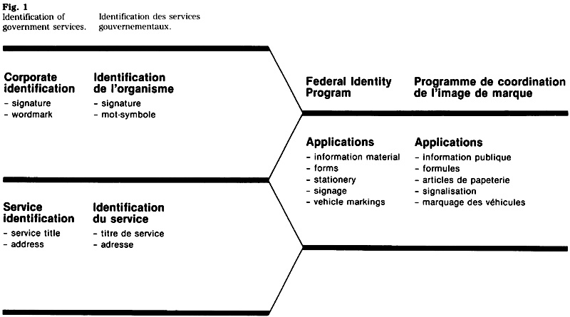
The relationship between corporate and service identification should be evaluated. The term “corporate identification” means the identity as expressed by an organization’s signature, “Canada” wordmark, standard typeface, and specific colours and layout. Generally, the corporate identification is supplemented by a message that is specific to a particular service or location
Access to government services
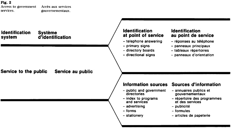
The interaction between information provided in advance and the identification provided at the point of service should be assessed. It is an analysis of the process people use to find and gain access to government programs and services (Fig. 2).
Message: Who needs to know?
Messages must be ‘tuned” to the receiver, the public. To produce an effective message, the author must know the nature of the particular public and its needs for information. To help the public to find and gain access, a user-centered approach is needed. Messages referring to a government service should be consistent wherever they appear, in advance of, or at the point of service.
Information provided in advance
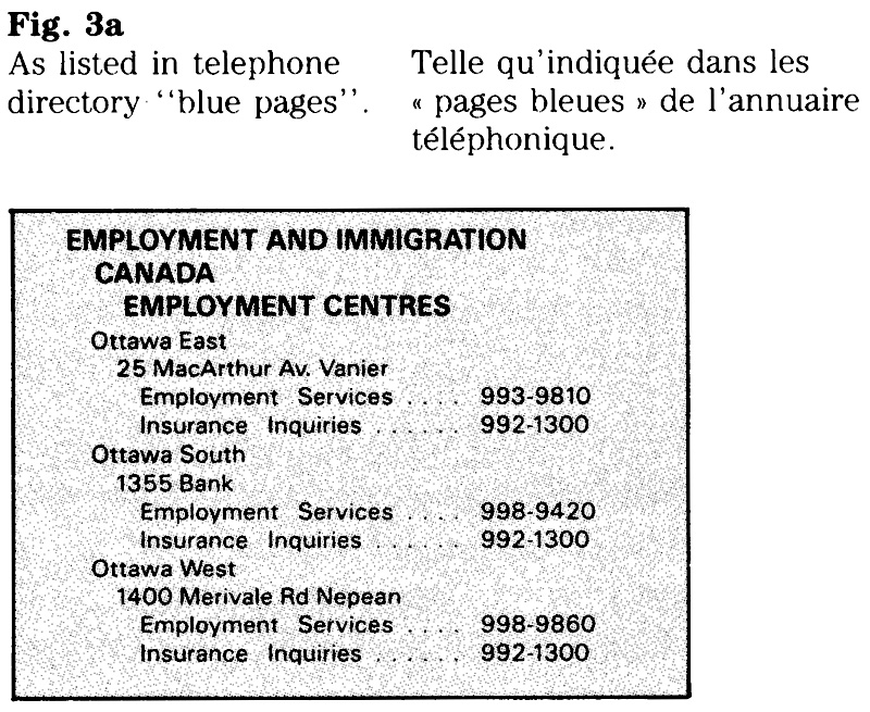
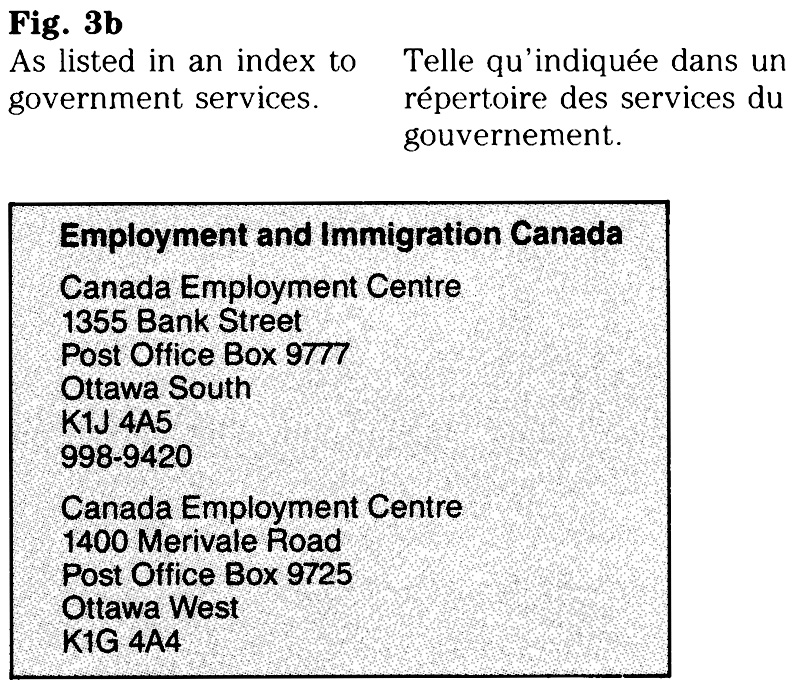
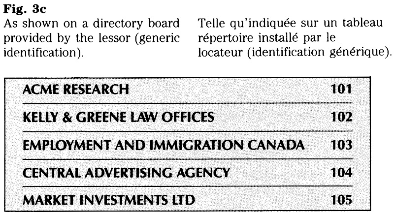
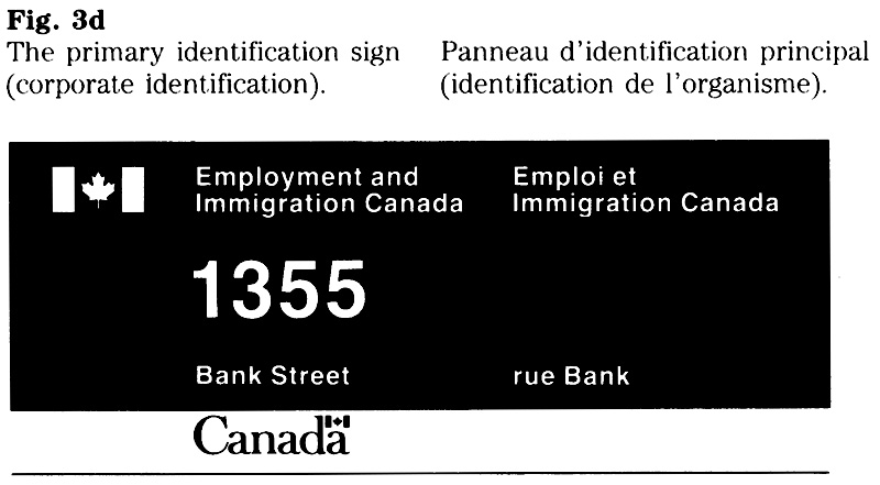
Much of the advance information available to the public is found in sources such as telephone directory “blue pages”. Other advance information is provided by federal organizations in the form of printed material or advertisements. Within an identification system, the terms used and the type of message provided in advance should be reflected at the point of service. For example, the title or address listed in the “blue pages” should appear on a sign identifying the location of the service; the name of a service appearing on a sign should be used when referring to this service in a brochure and when answering the telephone in the office providing this service (Fig. 3).
Fig. 3 Identification of an organization in various listings on the primary sign.
Service titles
These are names that identify an organizational unit, program or service and appear in conjunction with the signature of the parent organization. Establishing these titles is the function of the corporate identity manager, and organizations are encouraged to review their existing titles in terms of the criteria set out below.
Titles should be applied consistently throughout an organization. This is most important for titles that are used in communications with the public. Organizations with regional operations should establish these titles centrally to achieve uniformity throughout all regions. A service title should respect the following criteria:
- be as brief as possible to promote effective communication;
- begin with a key word and avoid the repetition of words or concepts used in the title of the parent organization;
- respect the linguistic usage in both official languages; and
- not contain an abbreviation or ampersand (&).
Brevity
The need to use these titles in applications where messages must be concise (e.g. signs, directories) should be a prime consideration. Certain words may be redundant: Canadian, Canada, Government, Federal or National. Similarly, certain general terms that reflect an organization’s structure may be avoidable: Administration, Office, Branch or Division. These terms reflect an organization’s hierarchy and are often of little significance to the general public which relies on key words to locate and gain access to services.
Assisting the ultimate user
The creation of an acronym should not be the sole consideration when determining a service title. A hypothetical example would be the title “Board of Industrial Development (BID)” as opposed to “Industrial Development Board (IDB)”. The latter does not produce an acronym, but it does start with the key word “Industrial”, an obvious advantage in alphabetical listings. (It is recognized that a similar use of key words probably would not be feasible when creating a French title.)
Abbreviations: language of codes
A service title should not contain an abbreviation. It would be unrealistic however, to dismiss the need for abbreviations in government communications. For those who create them and use them regularly, abbreviations form a convenient “shorthand”, but for the public they represent a language of codes that is at best difficult to decipher and at worst incomprehensible. Messages directed at the public should not contain acronyms or abbreviations unless they appear in the context of the full title.
Message: editing and design
Editing and design both give meaning and form to a message. The transition from the first draft or layout to the final communication is a process of arranging, organizing, and in many cases rephrasing. The choice of words, of spatial relationships and of expressive graphic elements results in meaningful and purposeful communications. An objective review takes place during the process of drafting and designing.
The process: verbal and visual
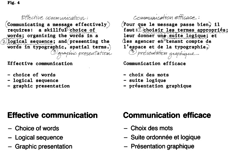
Throughout this section, the guidelines and examples deal with words and typography, or content and form. The task of combining these elements is a good deal more than an arrangement of the message on, for example, a sign. Communicating a message effectively requires methodology. This includes:
- skillful choice of words;
- organization of the words into a logical sequence;
- presentation of the words in typographic, spatial terms.
The first and second aspects are verbal and the responsibility of the editor; the last is visual and involves the designer. All three are interrelated and the thought processes and goals are identical: to give meaning to a message, to strengthen its significance, to make the important stand out against the unimportant. A message presented in “tone-of-voice” typography reflects the relative importance of verbally expressed thoughts; it gives impact to a communication (Fig. 4).
Equally important are an understanding of the conditions under which the message is to be received and an awareness of its continuity with related information. This points to the need for coordination and the importance of editing and design: to transcribe the available information into words; to project these in a dynamic form; and to help achieve a communication that is easy to understand.
Official languages: side by side
When presenting the two official languages in a side by side format, care must be taken to achieve equivalence in both content and appearance. The following guidelines deal with the process of combining English and French texts in a bilingual layout.
Equivalence
The policy (Chapter 470) requires a message to be equally complete in each official language and to correspond in all respects.
To achieve equivalence in both content and number of lines, a revision of the original text may be required. This could include segmenting the text into main and secondary messages, or rephrasing.
Choosing the line breaks
Messages that are to be presented in more than one line should be broken into readable phrases. Articles and prepositions at the end of a line should be avoided. In addition, an attempt should be made to provide a visual balance between the two language columns. Although a visual balance is generally achieved by using the same number of lines for each language, compromises may have to be made to avoid one language column of three or more lines, each consisting of one word only (Fig. 5).
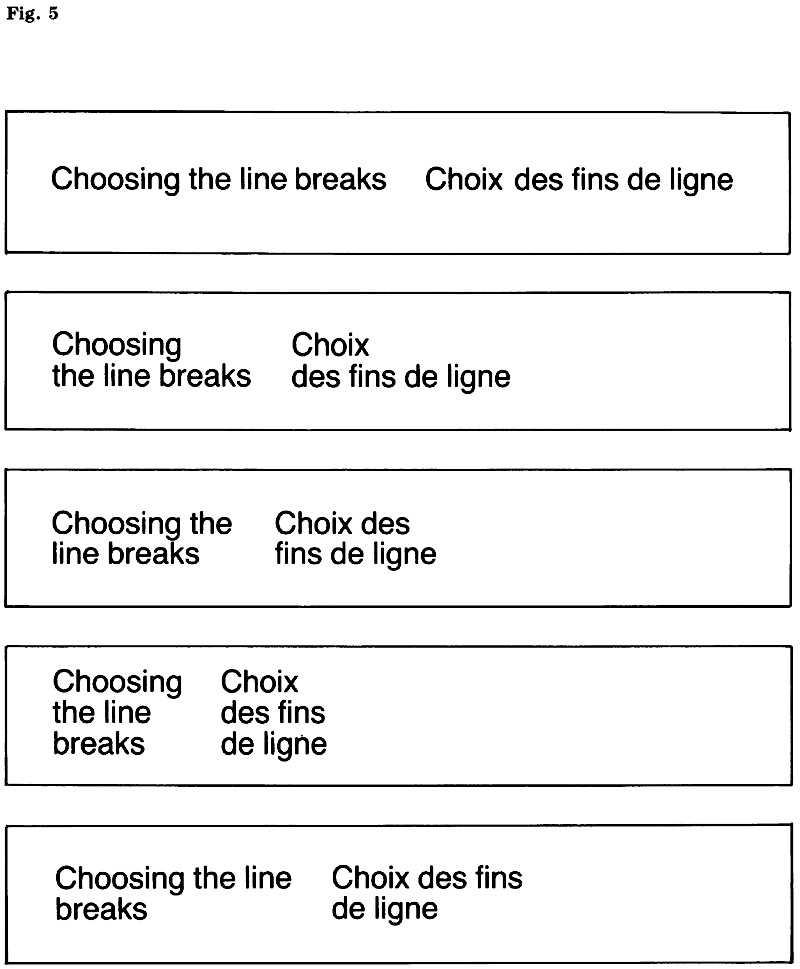
Message elements common to both languages
Many messages include an element that is common to both official languages, e.g. a geographical name or street name that may not be translated, a Street number, an expression of time, a distance, or a directional arrow.
Depending on its context within the total sign message, a common element may be presented in several ways:
- Where a common element forms the main message (or an important part of the total message), it should be emphasized in relation to the remaining text. In such cases, a repeat of the common element in the right hand column may be redundant. The examples show the effect of different character sizes and how a common element should be emphasized (Fig. 6).
- Where an element is common to both official languages but does not require emphasis in the context of the message, the common element should appear in each language column of the sign.
Use of proper names requiring a qualifying term
Where a message includes a proper name or other noun requiring a qualifying term, both the noun and its qualifier must appear in each language column. Proper names should be presented as in Jackson Building / Immeuble Jackson, and not run together as in Immeuble Jackson Building. (See also “Names of buildings, structures and sites”.)
Similarly, where a proper name is normally accompanied by a qualifying term, it should not be “bilingualized” by omitting the qualifying term. For instance, a word indicating the type of thoroughfare (Street, Avenue, Boulevard) may not be deleted from an address.
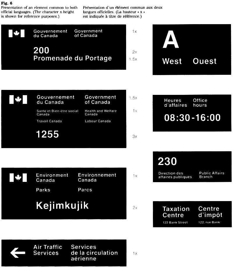
Addresses: functional and concise
Addresses appear on letterheads, envelopes, calling cards, forms, advertisements and signs. The address may be required for mailing purposes, to allow contact in person, or both. The following guidelines are intended to promote the use of functional identification and, wherever possible, to limit the amount of text that an address contains. In the case of mailing addresses, the requirements of the Canada Postal Standards must be met and are reflected here.
General considerations
Careful consideration should be given to the use or purpose of an address: Is all the text essential? Is some information non-essential but useful? Are certain details redundant? A concise address is easier to transcribe and more efficient for mail processing. Generally, an address consists of:
- functional identification (service title, title of an individual, applied title); and
- geographic identification (room or floor numbers, building name, street address, place name, province or territory, and postal code).
An address may be shortened by determining whether it includes:
- Non-essential information, such as a building name where the street address provides adequate information, or a room or floor number where the signage system serves to indicate specific locations;
- Redundant information, such as the name of an organizational unit that expresses the hierarchy but serves no purpose in identifying the location.
Commonly used terms
To assist users of this manual in developing an English and French version of an address, the terms most commonly used have been included in Appendix A of this section.
Mailing addresses
The following pertains to printed return addresses for items such as envelopes, letterheads, forms and calling cards. For locations outside the National Capital Region an address generally consists of the applied title which appears in the signature, plus:
- service title, if required;
- area identification (e.g. floor, building name), if required;
- street address, P.O. box number and station, if required;
- place name, province or territory (or country): and
- postal code.
Examples of typical addresses are shown below (Fig. 7).
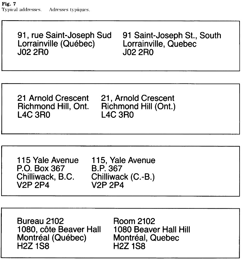
Addresses for the National Capital Region (NCR)
Centralized mail processing for NCR locations identified by a “K1A” postal code makes the use of a street address, building name or area identification redundant. A return address generally consists of the applied title which appears in the signature, plus:
- service title, If required;
- place name, province (or country); and
- postal code.
Note:
Printed return addresses for offices located in Quebec using a “K1A” postal code should show the actual place name, not ‘Ottawa”.
The following examples show the presentation of addresses in both official languages, optional use of a bilingual address and layout options (Fig. 8).
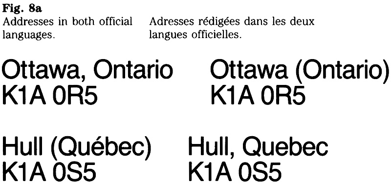
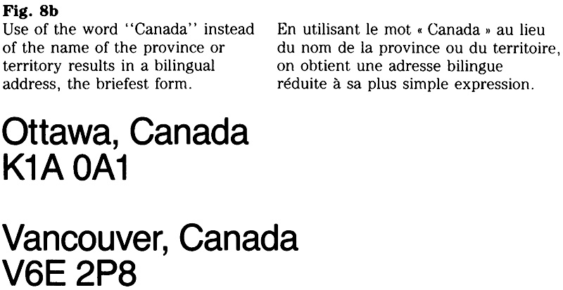

Return envelopes, Business Reply Mail
When both official languages are used for such items, the preprinted mailing address should be presented as illustrated (Fig. 9). The service title (if required) and the applied title shall appear in both official languages. The remainder of the address should appear in the official language of the majority of the population in that province or territory. Generally, the upper left corner of the face of the mail piece is reserved for the return address of the sender.
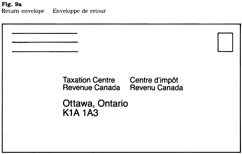
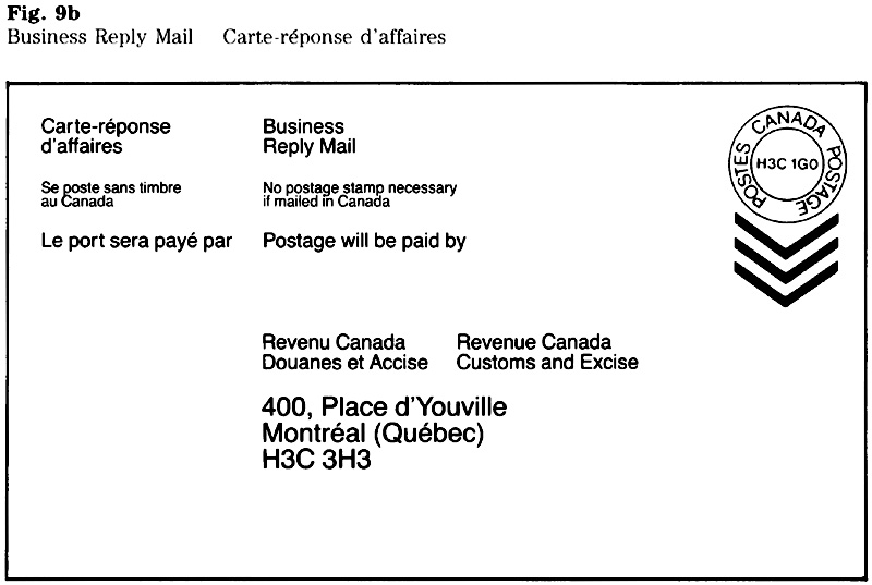
Sign communications
Visibility, legibility, readability and comprehension have an effect on the communications value of a sign. Described here are aspects of message content, readability and comprehension.
Principles
Several factors make sign communications distinct from most other media. The following principles apply when determining a message:
- Brevity: maximum of five units of information per language;
- Clarity despite brevity;
- Familiarity of words (short, familiar words help comprehension);
- Equivalence in meaning of texts in each of the official languages;
- Context: much of the meaning of a sign is derived from the environment, and therefore self-explanatory;
- Logic in the sequence of the message elements;
- Distinction between main and secondary message;
- Consistency within a signage system;
- Impact of a sign on its environment.
The following guidelines and examples show how these principles should be applied.
Primary identification signs
In general, primary signs that identify services provided directly to the public should contain functional information about the location, the service offered, or both. A message may vary depending on the type of facility or site, its location, the services provided, and the type of occupancy, single or shared.
Determining the message
When determining a message, the following questions should be asked:
- What is the most effective method of helping the public to locate the facility and gain access to the services offered?
- What information is available to the public about the address of the location or services provided (e.g. listings in telephone directory “blue pages” or an index to federal programs and services)?
- What information is implied in the context of the environment and would appear redundant as part of the message (e.g. a place name)?
- Should a service title, an address, a building or place name, or a combination of these be used?
- What limitations are imposed by sign dimensions, placement, and therefore message length?
- Is an advance sign required and should the message be segmented to appear on separate, successive signs?
- Should part of the text be emphasized to distinguish the main message and what is the effect on reading distances?
Generally, there are a number of options when determining the message content. The process from initial draft (Fig. 10) to a number of layout options is described below (Fig. 11).
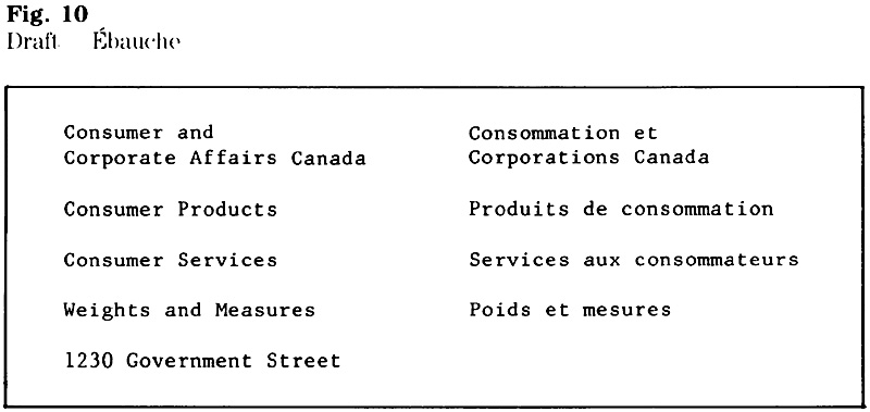
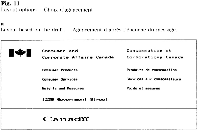
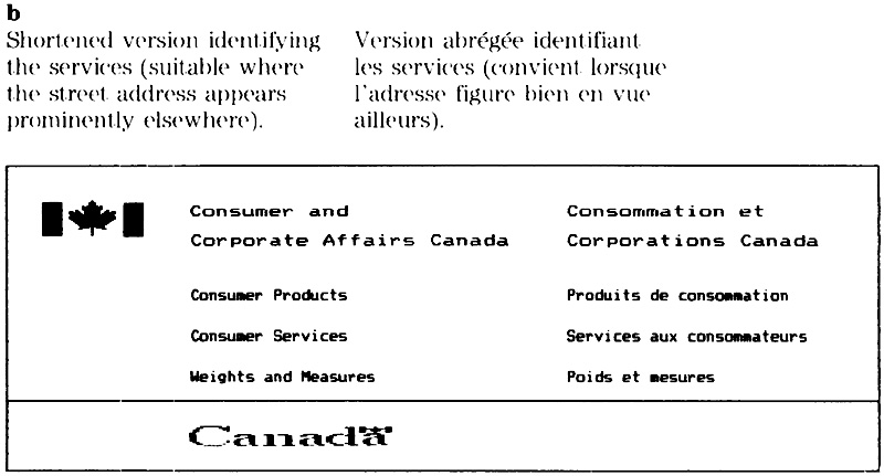
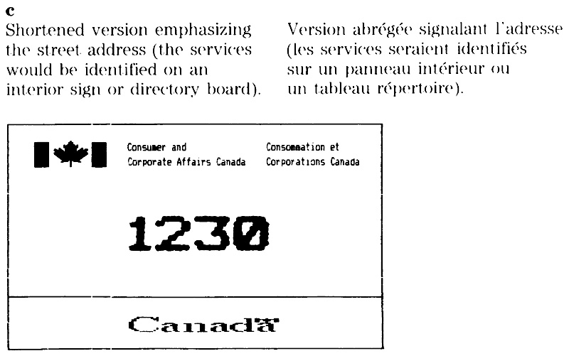
Identifying the service
Service titles should be used where a description of the services offered or the functions performed appears to be more effective than a message pertaining to the location. Service titles are often used to identify single occupancy facilities or sites (Fig. 12).
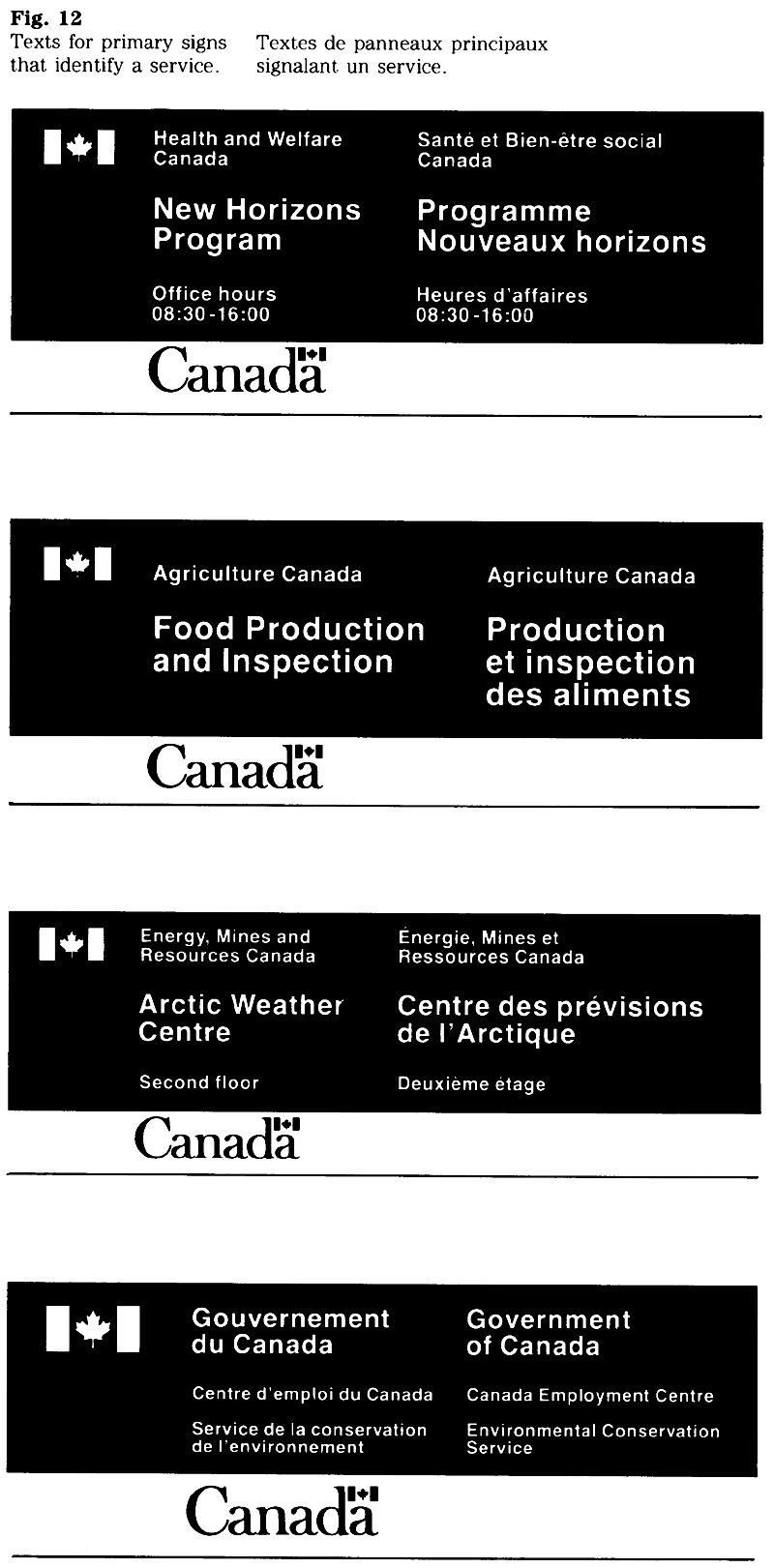
Identifying the location
In many instances, a message pertaining to the location of a facility is recommended, and this applies in particular to multi occupancy buildings. A visitor looking for a particular location normally searches for an address, a building or place name and seeks confirmation on a sign identifying the destination. A decision on whether to include the street address or the building name should be based on what information is provided through existing signs other than FIP signage (a street number, a building name) and how visible these other signs are in relation to the location of the primary identification sign. Normally, the message should complement rather than repeat information that appears elsewhere.
It may be helpful to include the street address on the primary sign, if the location is generally known by the address, i.e. the number (Fig. 13). However, in cases where the street number appears prominently near the entrance, a repeat on the primary sign may be redundant.
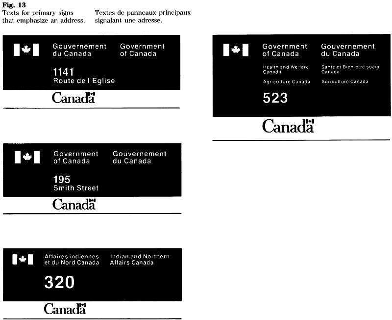
Use of a place name may be essential to identify sites such as airports or parks. Conversely, it may be redundant to include a place name with a function or a service title. Examples are messages such as “Peterborough Public Wharf” or “Winnipeg Regional Office”; in the context of a sign, a distinction between other wharves or other regional offices is normally not required (Fig. 14).
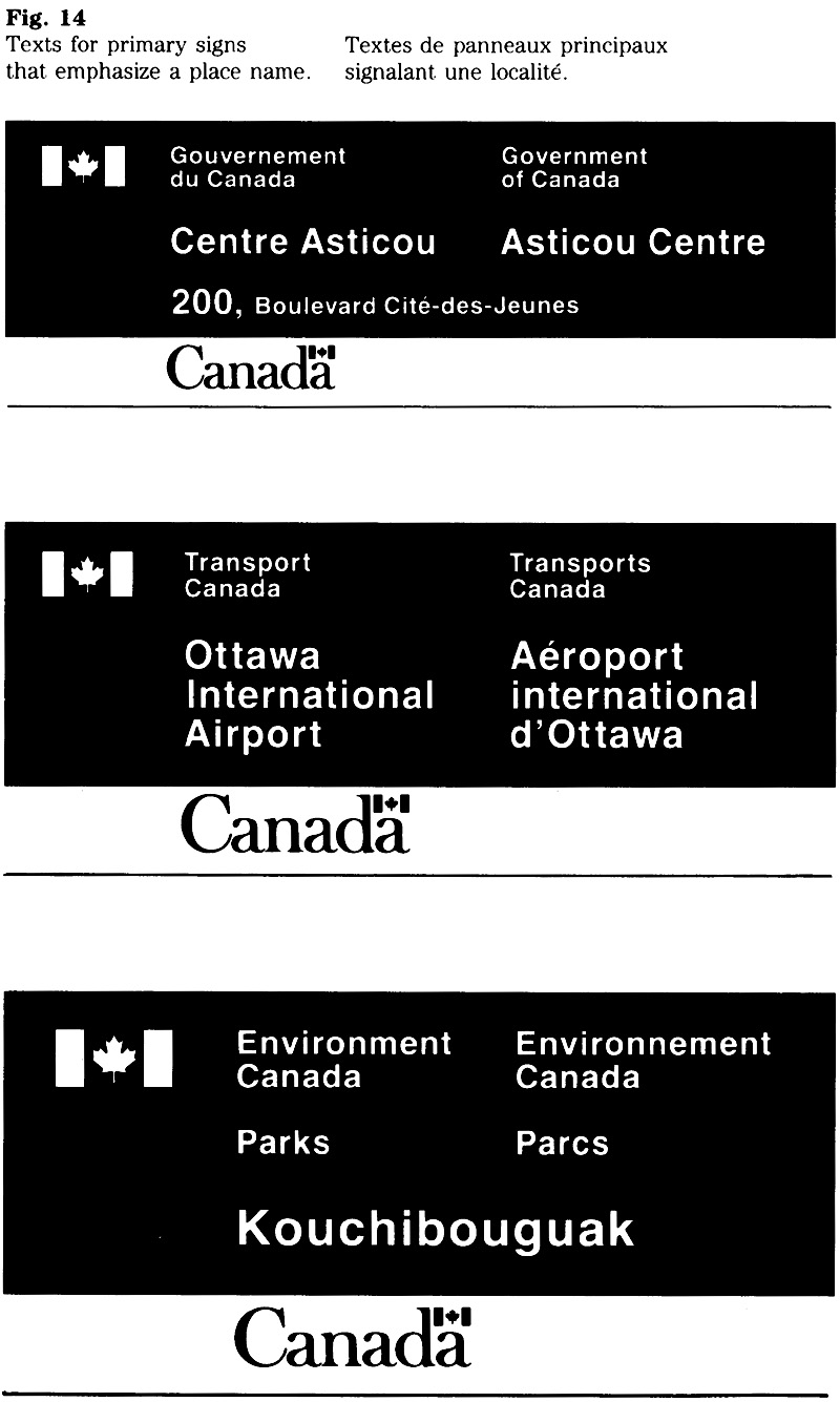
The use of building names on primary signs is subject to the following considerations:
- Any Crown-owned building or other structure that has been named after a person shall be identified by that name on the primary sign.
- Any names (other than those described under (a) above) that appear in the form of architectural lettering or on commemorative plaques can be considered as distinct from the functional and corporate identification provided by signs. Repeating such a name on the sign may not be required.
- General terms such as “Federal Building” or “Government of Canada Building” are not recommended for primary signs. These terms may be redundant in the context of the federal signature and wordmark.
- Special considerations apply to the use of names of leased buildings. Apart from any other requirements governing the use of names, it should first be determined whether the name of the building should be used at all.
To identify the location, the street address rather than the building name is recommended. In fact, in many instances, the name appears already on the face of the building, and therefore should not be included on the primary sign. An exception to this rule would be a case where the name is essential to identify a location clearly, such as a number of separate units or entrances of a building complex (e.g. as in the case of “Place de Ville, Tower A” in the National Capital Region).
Directory boards
Messages on a directory board complement the primary sign by listing the organizations, programs or services and their location within a facility (Fig. 15).
Analyzing the needs
A multi storey building may require a main directory board at the entrance with secondary boards at internal traffic junctions such as elevator lobbies. The main board provides general information on the occupants, and details are listed on the secondary board. An analysis is required to determine;
- What information is required most frequently by visitors?
- What information must appear on the main board and what information should be provided at internal traffic junctions?
- What is the most suitable sequence for the listing?
Message content
The text for a directory board should be concise and descriptive. Listings should begin with a key word to facilitate access. A directory board is not an organization chart and terms describing the hierarchy may often be avoided without loss of clarity. For example, listings such as “Health and Safety” or “Education, Training and Development” may not need to be qualified by a word such as Branch, Division or Section.
Titles of officials may appear on a directory board if it is an operational requirement. For example, the main directory board may identify the office of deputy minister or other senior official and list the names of programs and services; the titles of other officials would appear on the secondary board, as required.
Message organization and sequence
The length or complexity of the text and the operational requirements should be considered when determining the most effective order of the listing. The sequence may be arranged by:
- frequency of use by the public;
- area (e.g. beginning with the ground floor or the top floor);
- an organization’s hierarchy (e.g. beginning with the title of a senior official or the main organizational unit); or
- alphabetical order (for each official language).
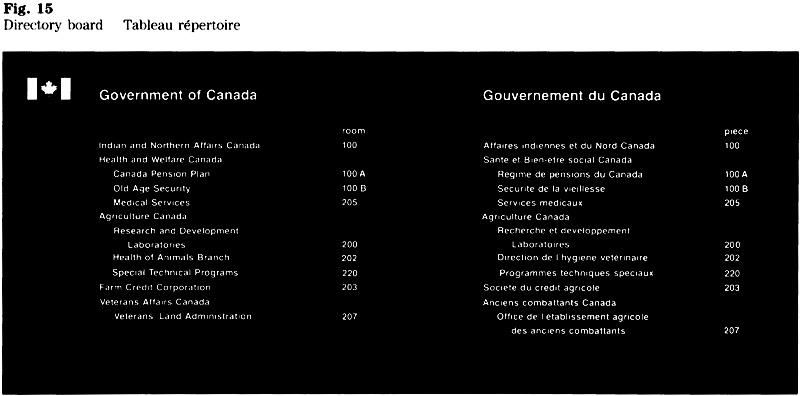
Operational signs
These signs supplement the information provided by the primary identification sign or directory board and form part of the signage system (Fig. 16).
Operational signs indicate the location of service, identify an area. provide information or direction, or identify the occupant of a room or work station (name plate). See section 4.3 for additional examples of these signs.
Project signs
These signs provide on site information about government programs or projects (Fig. 17). The message on such a sign should be a clear and concise statement that tells the public about the nature of the program or project and, where applicable, the level of the government’s contribution.
The message, and the terminology used, should be meaningful to the local population. The text should not refer to government instruments, agreements or organizational units, unless they have special meaning for the public.


Official languages: style
Certain rules of style pertain to applications of the FIP in general and are brought together here to assist in the preparation of messages. It is beyond the scope of this section to treat the subject in depth, and readers should consult standard reference books for comprehensive information. A list of suggested titles is shown in the “Bibliography”.
Titles
The applied titles of federal organizations and the official titles of ministers are listed in Appendix A “Titles of organizations” of Chapter 470.
Abbreviations
In general, abbreviations should not be used in applications of the FIP except where space is limited, such as on calling cards. Consult Appendix A of this section for the abbreviated form of terms commonly used in addresses.
For the official initialisms and acronyms of federal organizations, consult Appendix A of Chapter 470.
Accents
French texts shall include all orthographical signs required by words (i.e. accents on both upper and lower case characters, cedilla, diaeresis). As a temporary measure, this rule does not apply to certain computer-generated texts where it is not yet technically feasible.
Capitalization
Questions on the use of capitals often arise from certain distinctions between English and French usage. In French usage, the same rules apply whether the words in question occur in a prose text or in a title or heading. In English usage, the rules for capitalization within prose passages differ from those for titles, headings or inscriptions. In the latter case initial capitals are used not only for the first word but also for all other words except articles (a, an, the), prepositions, and conjunctions.
In the English part of FIP applications, the capitalization rule for headings or for prose texts may be used. However, once a method has been chosen, it should be applied consistently throughout (e.g. within the same system of signs). The examples show the effect when applying either of the two methods (Fig. 18).
Punctuation
The rules of punctuation differ in English and French in certain respects. The typical differences relevant to FIP applications are described briefly below. A more comprehensive treatment of these and other rules of punctuation may be found in the style guides listed in the “Bibliography”.
Quotation marks
To indicate a quotation, English uses these symbols “ ”, whereas French usage requires these « ». (Fig. 19).
Writing an address
The following rule applies to a place name lowed by the name of a province or territory. In French, the name of the province or territory is enclosed in parentheses, while a comma is used in English to set off the name (Fig. 20).
Writing of compound proper names
In English, a space is normally used between proper names, whereas French usage gene; a hyphen. The appropriate convention should be followed when writing the names of provinces, cities, streets and buildings in FIP applications.
Points of the compass
The following rule applies to addresses in FIP applications. When the east, west, north, south are used with a street should appear with initial capitals. In both French addresses the cardinal point appear name of the street (Fig. 21).


Dates
The all numeric form of dating is concise and may be particularly appropriate on documents that are presented in both official languages.
The format recommended is in accordance with CAN/CSA Z234.4 76 (Canadian Standards Association) and ISO 2014 (International Organization for Standardization). The standards prescribe the all numeric writing of dates in descending order: year, month, day.
The year, month and day are separated by either a space or short dash as illustrated (Fig. 22).
Time of day
On documents, notices and signs presented in both official languages, it may be desirable to use the 24 hour system for representing time of day.
The recommended method is in accordance with CAN/CSA Z234.4 76 (Canadian Standards Association) and ISO 3307 (International Organization for Standardization).
The hour is represented by a two digit number ranging from 00 up to 23 (or 24), and the minute and second are represented by a two digit number ranging from 00 up to 59. The colon is used as separator between hour and minute and between minute and second, as illustrated (Fig. 23). As required, time of day may be expressed in hours and minutes only.
Note:
The instant of midnight should be represented (when seconds are included)as either 24:00:00, the end of one day, or 00:00:00, the beginning of the next day, according to circumstances.
Time duration
The internationally recognized symbols of time, h for hour, min for minute and s for second should be used when expressing a measured time duration (Fig. 24).
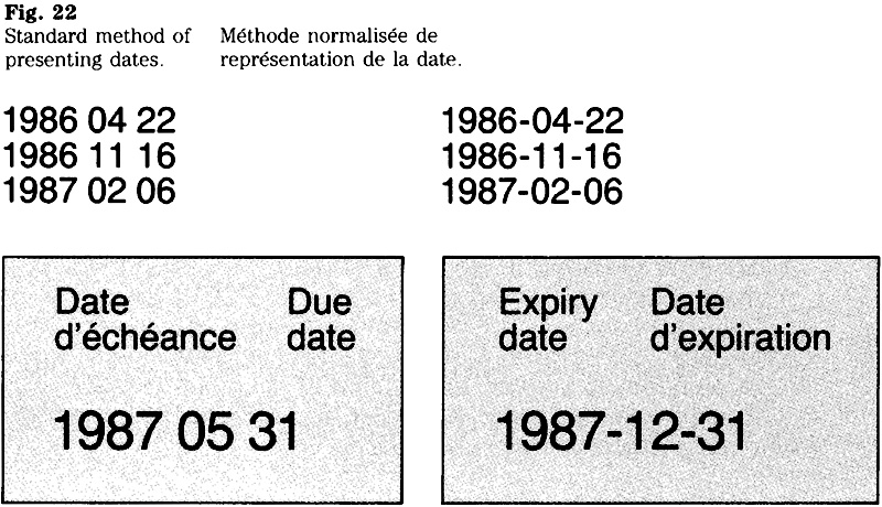
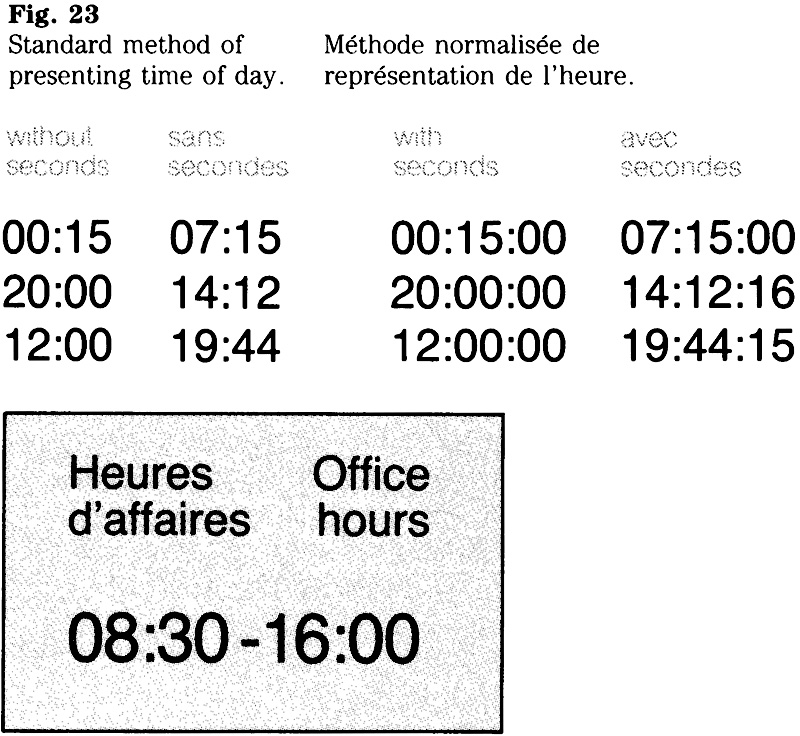
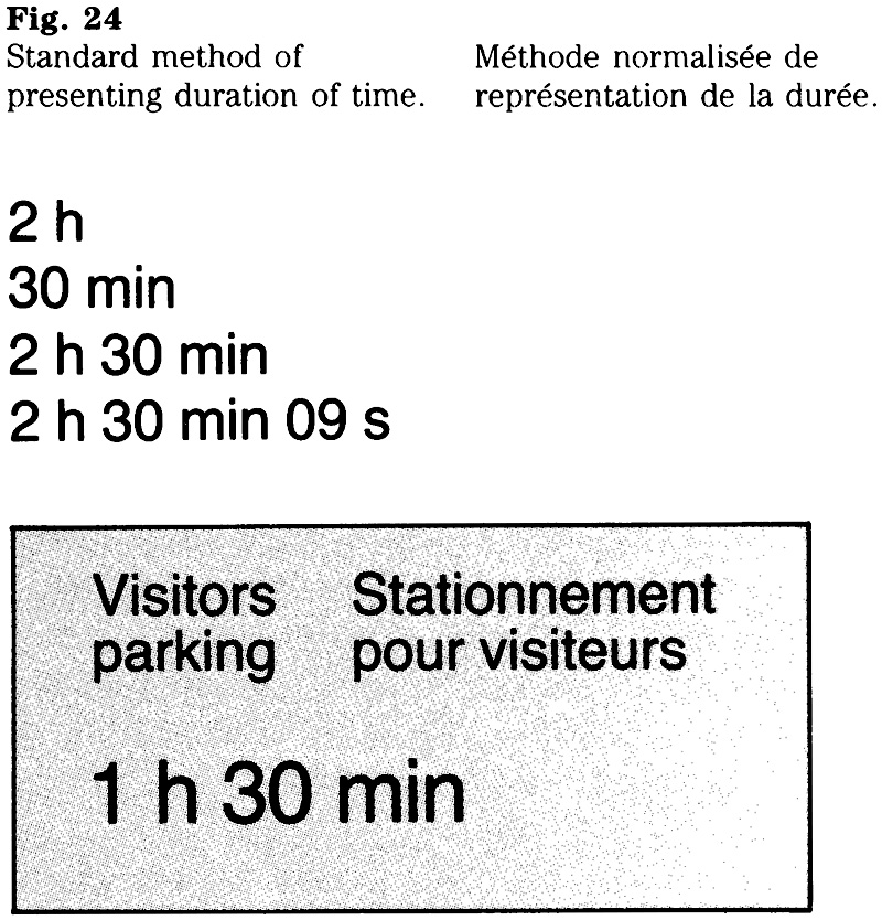
Official languages: use of names
The use of names for buildings, sites and streets as well as geographical names is described below. Certain rules shall be observed when developing an appropriate version in each official language of a message containing such a name.
All inquiries about terminology related to names or their translations should be directed to the Terminology Directorate, Department of the Secretary of State of Canada.
Names of buildings, structures and sites
The principles set out below are intended to clarify FIP policy on the use of the official languages in names for Crown owned buildings, structures or sites. These principles apply to the naming of all Crown owned real property. Where possible, they should also be observed when selecting a name for a building to be leased by the Crown with an option to purchase.
Use of the official languages when selecting a name
The following guidelines apply to all new names for Crown owned buildings, structures or sites. The selection of a name must take into account that a version in either official language is required. Before adopting a name, careful consideration should be given to its various components, including the way it will reflect the equivalence of the two official languages.
When selecting a name, it is important to be aware of the distinction between its “generic” and “specific elements. For example, in the name Jackson Building, the word Building is a “generic” element, whereas Jackson represents the “specific” element (the equivalent in French being, in this case, Immeuble Jackson). Normally, only “generics” have a version in either official language, since the “specific” component usually consists of a proper noun that cannot or must not be altered. Thus, a reliable way of ensuring that either official language is reflected in at least part of a name, is to include in it a “generic” component that has a counterpart in the other official language.
The following are among the more commonly-used “generics” for buildings and sites: in English, Building, Tower, Complex, Centre, Place, and Square; in French, Immeuble or Édifice (see below), Tour, Complexe, Centre, and Place.
Theoretically, it is possible to devise names for buildings or sites that are entirely “specific”, i.e. they contain no true “generic” or they do not necessarily lend themselves to a straightforward reformulation in the other official language. (L’Esplanade Laurier and Les Terrasses de la Chaudière, names of buildings found in the National Capital Region, may be viewed as examples.) However, when naming a Crown-owned building or site, there should be compelling reasons for a federal organization to select a name that does not reflect both official languages in some acceptable manner.
Translation of the word “building”
The character of a particular structure determines whether the term “building” should be rendered in French by the word “immeuble” or by “edifice”. Generally, the term “immeuble” is used for all urban, multi storey buildings used for administrative, commercial or residential purposes. The word “edifice” should be reserved for buildings significant for their architectural style and size, or for buildings that are representative or characteristic of the purpose that they serve, such as the Supreme Court or Parliament Buildings.
Street names
Described here are cases where certain terms of an address may or may not be translated, depending on whether the term forms part of the official name or not.
Generally, a term indicating a type of public thorough fare such as Street, Avenue, Boulevard, or rue, avenue, boulevard, should be translated into French or into English, as the case may be, except in cases where the term forms part of the official name of the thoroughfare.
When the French terms Avenue (1re, 2e, etc.), Belvédère, Carrefour, Centre Chaussée, Chemin, Côte, Cour, Cours, Faubourg, Mail, Montée, Principale, Promenade, Quai, Rang (1er, 2e, etc.), Rue (1re, 2e, etc.), Place and Terasse are part of the official name of the thoroughfare, they should not be translated.
Similarly, when the English terms Avenue (1st, 2nd, etc.), Centre, Circle, Court, Crescent, Drive, Garden, Main, Parkway, Range, Road, Square, Street (1st, 2nd, etc.) and Terrace are part of the official name of the thoroughfare, they should not be translated.
Inquiries about the official name of a public thorough-fare should be directed to the appropriate municipality.
Geographical names
The federal government’s position with respect to geographical names is that their official form is the one adopted by the provincial, territorial or federal authority in whose jurisdiction the entity lies and endorsed by the Canadian Permanent Committee on Geographical Names.
For the purposes of the federal government, some geographical names have official forms in both English and French, including some geographical entities of Pan Canadian significance listed in Treasury Board Circular 1983-58.
Inquiries regarding the translation of geographical names should be addressed to the Terminology Directorate, Department of the Secretary of State of Canada.
Names of provinces and territories
The official translation of the name of a province or territory shall be used as applicable. (See Appendix A.)
Names of other governments or institutions
Where the name of another government or an institution is to be included in a message presented in a side by side bilingual format, that name may be in French or English, or both, as required by the other government or the institution concerned.
Bibliography
The Canadian Style: a guide to writing and editing.
The Department of Secretary of State of Canada.
Toronto: Dundurn Press Ltd. 1985.
The Chicago Manual of Style.
13th ed. rev. and expanded, Chicago:
University of Chicago Press 1982.
White, Jan V. Editing by design.
New York: R.R. Bowker Co., 1974
Note:
For additional references see the bibliographies of the works cited above.
Appendix A – Commonly used terms
The following list is intended to promote consistent terminology in both official languages.
Entries appearing in the light typeface indicate the abbreviated form or, as the case may be, whether the term should be written in full in all instances. Generally, abbreviations should be used only where space is very limited, such as on a calling card.
| English |
French |
|---|---|
Alberta Alta. |
Alberta Alb. |
Apartment Apt. |
appartement app. |
Avenue Ave. |
avenue av. |
Boulevard Blvd. |
boulevard boul. |
British Columbia B.C. |
Colombie-Britannique C. B. |
Building Bldg. (see note) |
Immeuble imm.; édifice |
County County |
Comté cté |
East E. |
Est E. |
Floor Floor |
étage étage |
Honourable, The The Hon. |
honorable, L’ L’hon. |
Level Level |
niveau niveau |
Manitoba Man. |
Manitoba Man. |
Member of Parliament M.P. |
Membre du Parlement député |
New Brunswick N.B |
Nouveau-Brunswick N.-B. |
Newfoundland Nfld. |
Terre-Neuve T.N. |
North N. |
Nord N. |
Northwest Territories N.W.T. |
Territoires du Nord-Ouest T.N.O. |
Nova Scotia N.S. |
Nouvel1e-Écosse N.-É. |
Ontario Ont. |
Ontario Ont. |
Post Office Box P.O. Box |
boîte postale b.p.; case postale c.p. |
Prince Edward Island P.E.I. |
Ile-du-Prince-Édouard I.P.É. |
Privy Councillor P.C. |
Membre du Conseil privé c.p. |
Quebec Que. |
Québec Qc |
Right Honourable, The The Rt. Hon |
très honorable, Le Le très hon. |
Road Rd. |
chemin ch. |
Room Rm. |
bureau bureau; porte porte |
Rural Route R.R. |
route rurale r.r. |
Saskatchewan Sask. |
Saskatchewan Sask. |
South S. |
Sud S. |
Station (postal facility) Stn. |
succursale (postale) succursale |
Station (scientific research facility) Stn. |
station (établissement de recherches scientifiques) station |
Street St. |
rue rue |
Suite Suite |
porte (pour ensemble de bureaux) porte |
West W. |
Ouest O. |
Yukon Territory Y.T. |
Territoire du Yukon T.Y. |
Note:
The distinction between the terms “édifice” and “immeuble” is described under “Names of buildings, structures and sites”.
Stationery
2.1 Stationery: Ministers, parliamentary secretaries and their offices
FIP Manual (Interim Guide),
Introduction
This document sets out the basic requirements and design standards for stationery items used by ministers, secretaries of state, parliamentary secretaries, and their offices. The revised FIP Manual section 2.1, Stationery will be available shortly.
Coat of Arms signature

Relationships between type size, Coat of Arms and "Canada" wordmark
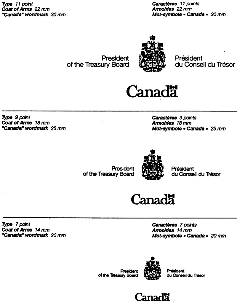

Table 1: Relationships between type size, Coat of Arms and "Canada" wordmark - Text version
| Type Size | Height of Coat of Arms | Length of “Canada” Wordmark |
|---|---|---|
| 10 and 11 point | 22 mm | 30 mm |
| 8 and 9 point | 18 mm | 25 mm |
| 6, 7 and 8 point | 14 mm | 20 mm |
Letterheads
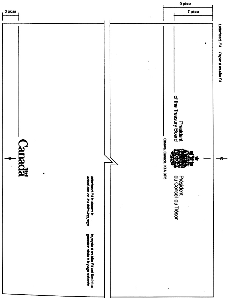
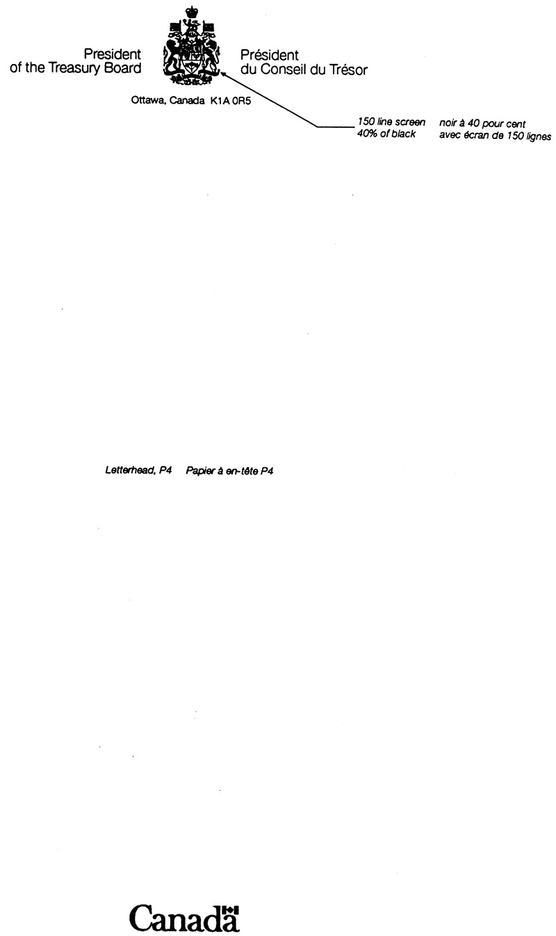
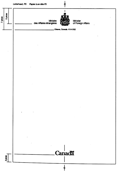
Envelopes
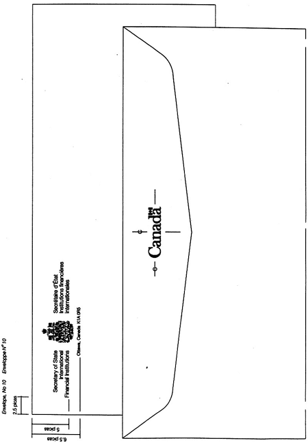
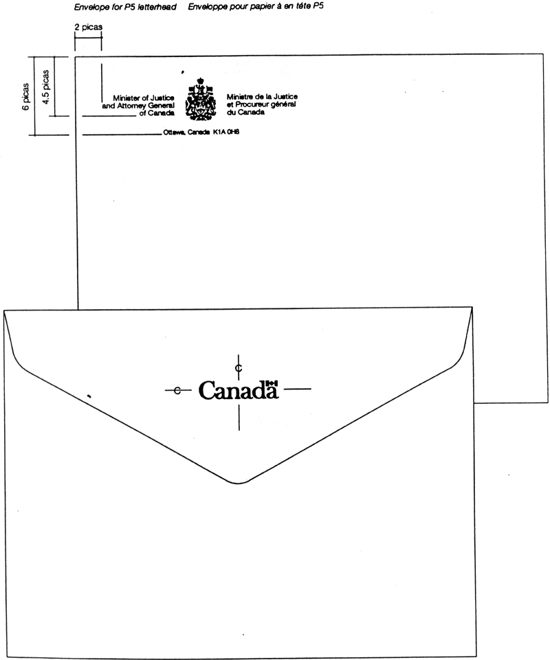
Notepaper
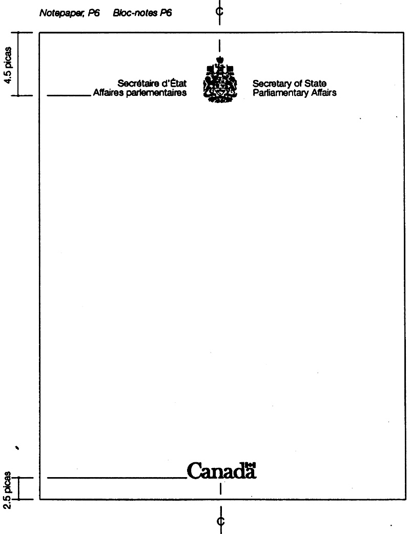
Complimentary slips and cards
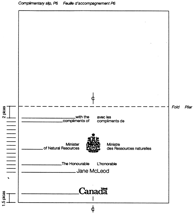
Calling Cards
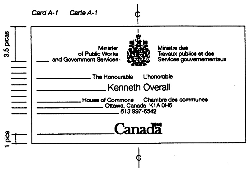
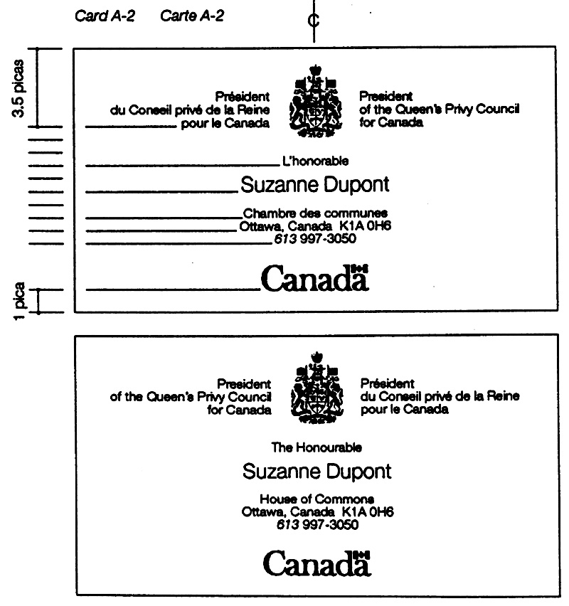
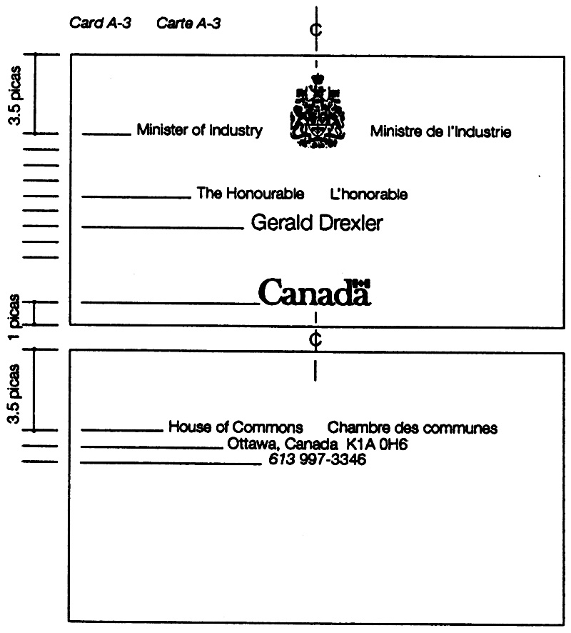
Specification summary A
| Item |
Paper |
Ink colours |
Quality levels |
|||
|---|---|---|---|---|---|---|
|
|
|
Grade and Grammage |
|
|
|
|
Table Notes
|
||||||
Letterhead, P4 |
21.5 x 28.0 |
polar glacier |
Evolution 50 laser finish 90 g/m2 |
40% screen of black using 150 line screen Text: black Wordmark: black with FIP red flag |
prestige |
prestige |
Second page, P4 |
21.5 x 28.0 grain long |
polar glacier |
Evolution 50 laser finish 90 g/m2 |
No printing |
NA |
NA |
Letterhead, P5 (or folded to P5 from P4) |
14.0 x 21.5 grain long |
polar glacier |
Evolution 50 laser finish 90 g/m2 |
40% screen of black using 150 line screen Text: black Wordmark: black with FIP red flag |
prestige |
prestige |
Envelope, No. 10 |
white |
recycledtable note 2 ** envelope paper 90 g/m2 |
Coat of Arms: 40% screen of black using 150 line screen Text: black Wordmark: black with FIP red flag |
prestige |
prestige |
|
Envelope for P5 letterhead |
11.4 x 14.9 |
white |
recycledtable note 2 ** envelope paper 90 g/m2 |
40% screen of black using 150 line screen Text: black Wordmark: black with FIP red flag |
prestige |
prestige |
Notepaper, p6 |
10.7 x 14.0 |
polar glacier |
Evolution 50 laser finish 90 g/m2 |
40% screen of black using 150 line screen Text: black Wordmark: black with FIP red flag |
prestige |
prestige |
Compli- |
10.7 x 14.0 (when flat) |
White |
Either table note 3***
89 g/m2 |
40% screen of black using 150 line screen Text: black Wordmark: black with FIP red flag |
prestige |
prestige |
Compli- |
10.7 x 7.0 |
white |
New Life opaque cover 216 g/m2 |
40% screen of black using 150 line screen Text: black Wordmark: black with FIP red flag |
prestige |
prestige |
Calling card |
9.0 x 5.0 |
white |
New Life opaque cover 216 g/m2 |
40% screen of black using 150 line screen Text: black Wordmark: black with FIP red flag |
prestige |
prestige |
Specification summary B
| Item |
Paper |
Ink colours |
Quality levels |
|||
|---|---|---|---|---|---|---|
|
|
|
Grade and Grammage |
|
|
|
|
Table Notes
|
||||||
Letterhead, P4 |
21.5 x 28.0 |
white |
Either table note 2 **
89 g/m2 |
40% screen of black using 150 line screen Text: black Wordmark: black |
inform- |
prestige |
Second page, P4 |
21.5 x 28.0 grain long |
white |
Either table note 3 ***
89 g/m2 |
No printing |
NA |
NA |
Letterhead, P5 (or folded to P5 from P4) |
14.0 x 21.5 grain long |
white |
Either table note 3 ***
89 g/m2 |
40% screen of black using 150 line screen Text: black Wordmark: black |
inform- |
prestige |
Envelope, No. 10 |
white |
recycledtable note 3 *** envelope paper 90 g/m2 |
40% screen of black using 150 line screen Text: black Wordmark: black |
inform- |
prestige |
|
Envelope for P5 letterhead |
11.4 x 14.9 |
white |
Recycledtable note 2 ** envelope paper 90 g/m2 |
40% screen of black using 150 line screen Text: black Wordmark: black |
inform- |
prestige |
Notepaper, p6 |
10.7 x 14.0 |
polar glacier |
Either table note 3 ***
89 g/m2 |
40% screen of black using 150 line screen Text: black Wordmark: black |
inform- |
prestige |
Compli- |
10.7 x 14.0 (when flat) |
white |
Either table note 3 ***
89 g/m2 |
40% screen of black using 150 line screen Text: black Wordmark: black |
inform- |
prestige |
Compli- |
10.7 x 7.0 |
white |
Guardian opaque cover 216 g/m2 |
40% screen of black using 150 line screen Text: black Wordmark: black |
inform- |
prestige |
Calling card |
9.0 x 5.0 |
white |
Guardian opaque cover 216 g/m2 |
40% screen of black using 150 line screen Text: black Wordmark: black |
inform- |
prestige |
2.2 Stationery: Departments, agencies and corporations
FIP Manual,
Introduction
This section sets out the general requirements and design standards for stationery used by departments, agencies, and corporations. It should be used with Chapter 470, “Federal Identity Program” of the Administrative Policy Manual, and the key sections of the FIP Manual (1.1 and 1.2). Section 1.2 also provides advice on the wording and presentation of addresses.
Note: Because of space limitations, the layouts are shown reduced in size. However, any dimensions given are in the actual size.
Applicable publications
The following publications are referred to in this section. Reference to these publications is to the latest issues.
Canadian General Standards Board (CGSB) standards or specifications:
- CAN/CGSB-9.60M, Paper Sizes for Correspondence
- 6.11, Envelopes, Mailing Standard Flats
- 6.100M, Paper, Letterhead
- 6.101M, Envelopes, Mailing
- 6.102M, Form, Printed, Complimentary Slip
- 6.103M, Form, Printed, Complimentary Card
- 6.104M, Form, Printed, Calling Card
- 6.112M, Paper, Notepaper
The publications listed above may be obtained from the Canadian Government Publishing Centre, Supply and Services Canada.
Publication issued by Canada Post Corporation:
- Canada Postal Standards
Publications issued by Supply and Services Canada:
- Print Quality Levels
- Envelope Quality Levels
- Typesetting Quality Levels
- Generic Identification of Paper and Paperboard Brandnames
These publications are available from Canadian Government Printing Services, Supply and Services Canada.
Scope
Guidelines and standards set out the requirements for the design and production of stationery items for use by departments, agencies, and corporations identified by the federal signature.
These items include letterheads and envelopes, standard flat envelopes, notepaper, complimentary slips and cards, and calling cards.
Stationery: control and use of titles
The control of stationery items is at the discretion of each organization. To serve operational needs, stationery items may include pre-printed information as described and illustrated in this section (e.g. a service title, an address). However, controls are usually required to prevent the proliferation of many different items that have to be produced and stocked. Treasury Board policy (Chapter 470) restricts the use of titles as set out below.
Titles on letterheads, envelopes and notepaper
Only deputy ministers, assistant deputy ministers, or positions of equivalent status may be identified on these items, and then only by title and not by name.
Items with restricted use
P5 letterheads and white envelopes described in this section are for use only by deputy ministers, assistant deputy ministers, or positions of equivalent status.
Signature, titles and wordmark
Except for short titles where the use of a one-line signature may be feasible, a two line signature is applied (Fig. 1). Section 1.1 of this manual sets out the size relationships between symbol and typography and the rules on the layout of signatures.
Service titles
To serve operational needs, a title which identifies an organizational unit, program or service may be used in conjunction with the signature of the parent organization. Service titles shall appear as illustrated (Fig. 2).

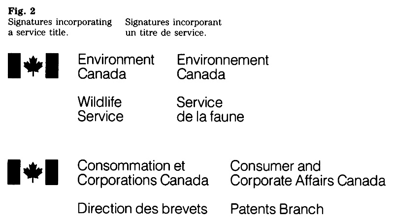
Titles of individuals
Subject to the policy on the use of titles of individuals on letterheads, envelopes and notepaper, they shall appear as illustrated (Fig. 3).
“Canada” wordmark
The wordmark shall be used on all items and as specified in this section. The regular weight of the wordmark applies throughout (Fig. 4).
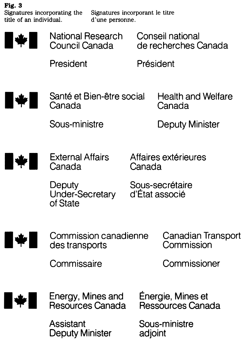

Design standards
The design of all stationery items described in this section has been standardized. There should be no variation from these designs and specifications without prior consultation with the Administrative Policy Branch of Treasury Board Secretariat.
The formats have been designed to project a consistent visual image of the government and, where applicable, to conform to the Canada Postal Standards.
Typeface
Helvetica light is used on all stationery except for standard flats, where Helvetica regular is specified. Shown here are the sizes and weights of type applicable to the items described in this section (Fig. 5).
Typesetting
Typesetting of the signature and any accompanying text shall be in upper and lowercase, solid, normal spacing between letters, with selective kerning applied to awkward combinations of letters.
Care should be taken to avoid the mixing of typeset composition from different sources on any one layout. (For example, variations in stroke width may be noticeable.) The typesetting must meet the quality level shown in the “Summary” at the end of this section.
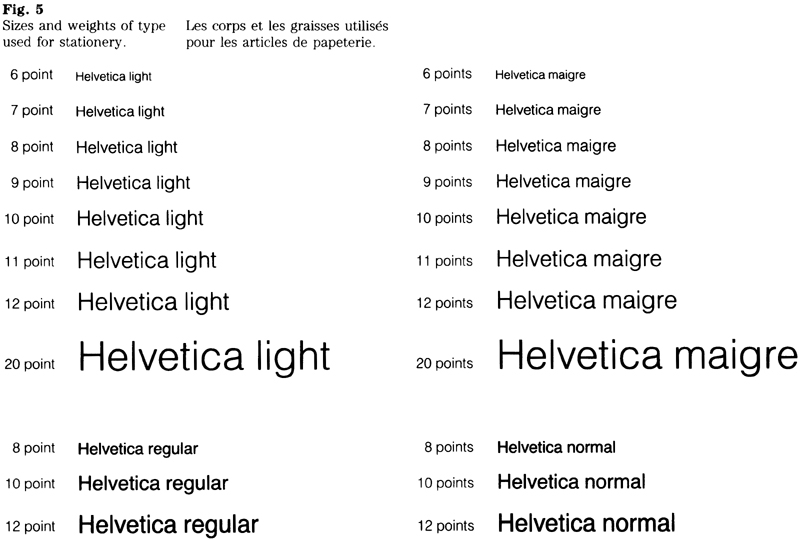
Layouts
The layouts are based on typographic grids or dimensions that are shown in the figure for each item. The space between the flag symbol and the left-hand column, as well as between the left-hand and right-hand columns, is 1½ em of the type size being used. The space between the language columns is measured from the end of the longest line of the left-hand column to the beginning of the right-hand column. A blank line is used between the signature and any following text (Fig. 6).
For most items, a choice of type sizes is provided to accommodate signatures or texts of varying length. Principles of good typographic practice should be applied when determining the layout, i.e. line length, line endings, and type size where applicable (see also Section 1.1, “Design”).
Use of type sizes
Table 1 shows which type sizes are combined on an item. For example, 9/7 is used to indicate a 9 point signature with a 7 point address.
| Type sizes |
||
|---|---|---|
| Table 1 |
Signature/address |
wordmark |
Notepaper, complimentary slip and card |
7/6, 8/7 or 9/8 |
25 mm |
P5 letterhead and envelope |
7/6 or 8/7 |
25 mm |
P4 letterhead and No. 9 envelope |
9/7 or 10/8 |
30 mm |
Standard flats |
10/8 or 12/10 |
40 or 45 mm |
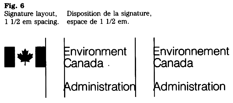
Paper sizes
The National Standard of Canada CAN/CGSB-9. 60M, Paper Sizes for Correspondence applies. Sizes covered by this standard are designated P4 and P5 for letterhead paper, and P6 for notepaper and complimentary slips.
Paper sizes in this section are specified in metric measurements. Table 2 shows these measurements and the sizes which they replace.
| Sizes |
||
|---|---|---|
| Table 2 |
cm |
inches |
P4 letterhead |
21.5 x 28.0 |
8 1/2 x 11 |
P5 letterhead |
14.0 x 21.5 |
5 1/2 x 8 1/2 |
P6 notepaper and complementary slip |
10.7 x 14.0 |
4 1/4 x 5 1/2 |
Complimentary card |
10.7 x 7.0 |
4 1/4 x 2 3/4 |
Calling card |
9.0 x 5.0 |
3 1/2 x 2 |
Envelope No. 9 |
10.2 x 22.9 |
4 x 9 |
Envelope for P5 letterhead |
11.4 x 14.9 |
4 1/2 x 5 7/8 |
Note: Sizes for complimentary cards and calling cards are not covered by a standard at present. The sizes for these items have been determined in view of their possible future inclusion in the National Standard.
Colours
The colours of both paper and ink are specified for each item (see the detailed descriptions).
Ink colours
The standard colours are: Federal Identity Program (FIP) red, black, and reflex blue.
The following inks meet the requirements for FIP red:
- General Printing Ink, No. 0-712
- Inmont Canada Ltd., No. 4T51577
- Monarch Inks, No. 62539/0
- Sinclair and Valentine No. RL163929/0
Recommended typing format
The recommended format for letterheads is the full block style, with minimum punctuation (Fig. 7). While it is recognized that this format may not be appropriate for all correspondence, its use is recommended for the following reasons:
- the asymmetrical design of the federal signature is complemented by the full block style;
- it saves typing time; and
- it assists in the standardization of training procedures.
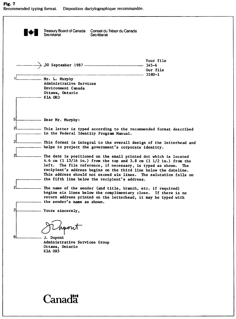
The vertical position of the elements on a letterhead is not critical; however, it is recommended that the date line be placed on the printed alignment mark (dot). Nevertheless, when window envelopes are used, it follows that standardized vertical spacing must be employed.
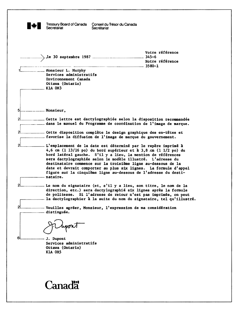
To conform to the Canada Postal Standards, the address on plain No. 9 envelopes should be typed commencing at the printed alignment mark (dot) which is located 5.9 cm (2 5/16 inches) from the top and 3.8 cm (1 1/2 inches) from the left edge of the envelope. This address should not exceed six lines (Fig.8).

Letterheads
The illustrations and specifications for letterheads include the following elements whose use is optional: return address, file indicators, alignment mark indicating the position of the dateline, and fold marks.
Letterhead, P4 (Fig. 9)
Size: 21.5 X 28.0 cm
Typesetting: Helvetica light; 9 point signature with 7 point return address, or 10 point signature with 8 point return address; a blank line (equivalent to the type size of the signature) separates the signature from the return address.
File indicators: 6 point Helvetica light italics.
Alignment mark indicating position of the dateline: dot, 1 point in size.
Fold marks: 0.25 pt hairline, 1 pica in length.
Wordmark: 30 mm.
Paper:
- For use by deputy ministers, assistant deputy ministers, or positions of equal status: No. 2 bond, white, 75 g/m2 or 90 g/m2 (as specified).
- For general use: No. 7 bond, white, 60 g/m2, 75 g/m2 or 90 g/m2 (as specified).
Ink colours: FIP red for the flag symbol and the flag in the wordmark; black for the type.
Reproduction: offset (litho).
CGSB specification: 6.100M.
Airmail letterhead, P4 (Fig. 9)
Size: 21.5 X 28.0 cm
Typesetting: Helvetica light; 9 point signature with 7 point return address, or 10 point signature with 8 point return address; a blank line (equivalent to the type size of the signature) separates the signature from the return address.
File indicators: 6 point Helvetica light italics.
Alignment mark indicating position of the dateline: dot, 1 point in size.
Fold marks: 0.25 pt hairline, 1 pica in length.
Wordmark: 30 mm.
Paper: airmail bond, light blue, 38 g/m2.
Ink colours: reflex blue.
Reproduction: offset (litho).
CGSB specification: 6.100M.
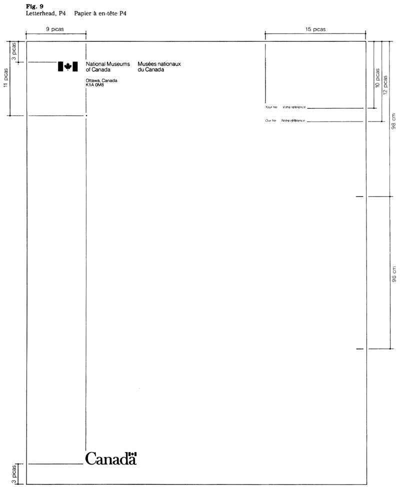
Letterhead, P5 (Fig. 10)
Size: 14.0 x 21.5 cm (This letterhead may be a folded P4 sheet or a single unfolded sheet as shown).
Typesetting: Helvetica light; 7 point signature with 6 point return address, or 8 point signature with 7 point return address; a blank line (equivalent to the type size of the signature) separates the signature from the return address.
Wordmark: 25 mm.
Paper: for use by deputy ministers, assistant deputy ministers, or positions of equal status: No. 2 bond, white, 75 g/m2 or 90 g/m2 (as specified).
Ink colours: FIP red for the flag symbol and the flag in the wordmark; black for the type.
Reproduction: offset (litho)
CGSB specification: 6.100M.
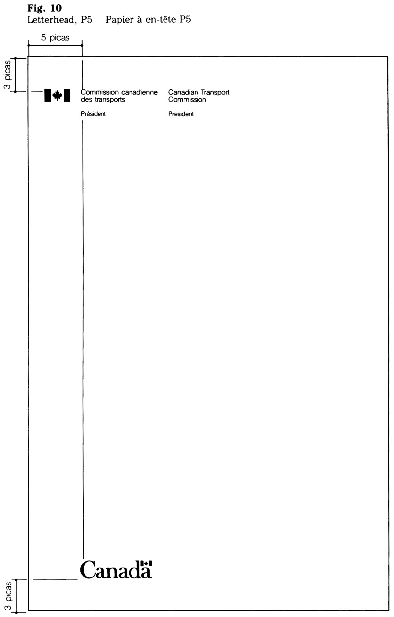
Envelopes
For reasons of space, only the No. 9 correspondence envelope is described here. Users of No. 10 envelopes should apply the same specifications as are shown for the No. 9 envelope.
The position of the signature and return address on envelopes has been calculated to be compatible with postal requirements(see Canada Postal Standards for details).
Window envelope, No. 9 (Fig. 11)
Size: 10.2 x 22.9 cm
Typesetting: Helvetica light; 9 point signature with 7 point return address, or 10 point signature with 8 point return address; a blank line (equivalent to the type size of the signature) separates the signature from the return address.
Wordmark: 30 mm.
Paper: golden kraft, 75 g/m2.
Ink colour: black.
Reproduction: offset (litho) or letterpress.
CGSB specification: 6.101M.
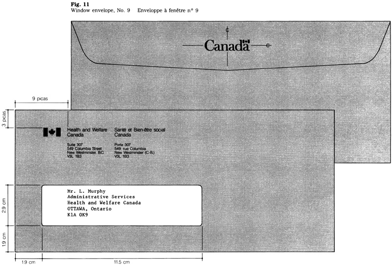
Kraft envelope, No. 9 (Fig. 12)
Size: 10.2 x 22.9 cm
Typesetting: Helvetica light; 9 point signature with 7 point return address, or 10 point signature with 8 point return address; a blank line (equivalent to the type size of the signature) separates the signature from the return address.
Alignment mark indicating position of the typewritten address: dot, 1 point in size.
Wordmark: 30 mm.
Paper: golden kraft, 75 g/m2.
Ink colour: black.
Reproduction: offset (litho) or letterpress.
CGSB specification: 6.101M.
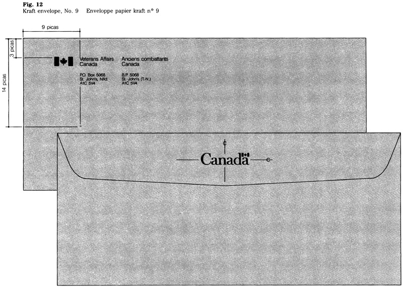
White envelope, No. 9 (Fig. 13)
Size: 10.2 x 22.9 cm
Typesetting: Helvetica light; 9 point signature with 7 point return address, or 10 point signature with 8 point return address; a blank line (equivalent to the type size of the signature) separates the signature from the return address.
Alignment mark indicating position of the typewritten address: dot, 1 point in size.
Wordmark: 30 mm.
Paper: for use by deputy ministers, assistant deputy ministers, or positions of equal status: No. 2 bond, white, 75 g/m2 or 90 g/m2 (as specified).
Ink colours: FIP red for the flag symbol and the flag in the wordmark; black for the type.
Reproduction: offset (litho) or letterpress.
CGSB specification: 6.101M.
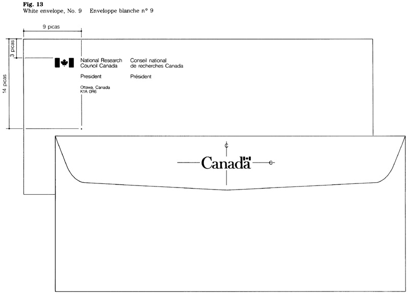
Envelope for P5 letterhead (Fig. 14)
Size: 11.4 x 14.9 cm
Typesetting: Helvetica light; 7 point signature with 6 point return address, or 8 point signature with 7 point return address; a blank line (equivalent to the type size of the signature) separates the signature from the return address.
Alignment mark indicating position of the typewritten address: dot, 1 point in size,
Wordmark: 25 mm.
Paper: for use by deputy ministers, assistant deputy ministers, or positions of equal status: No. 2 bond, white, 75 g/m2 or 90 g/m2 (as specified).
Ink colours: FIP red for the flag symbol and the flag in the wordmark; black for the type.
Reproduction: offset (litho) or letterpress.
CGSB specification: 6.101M.
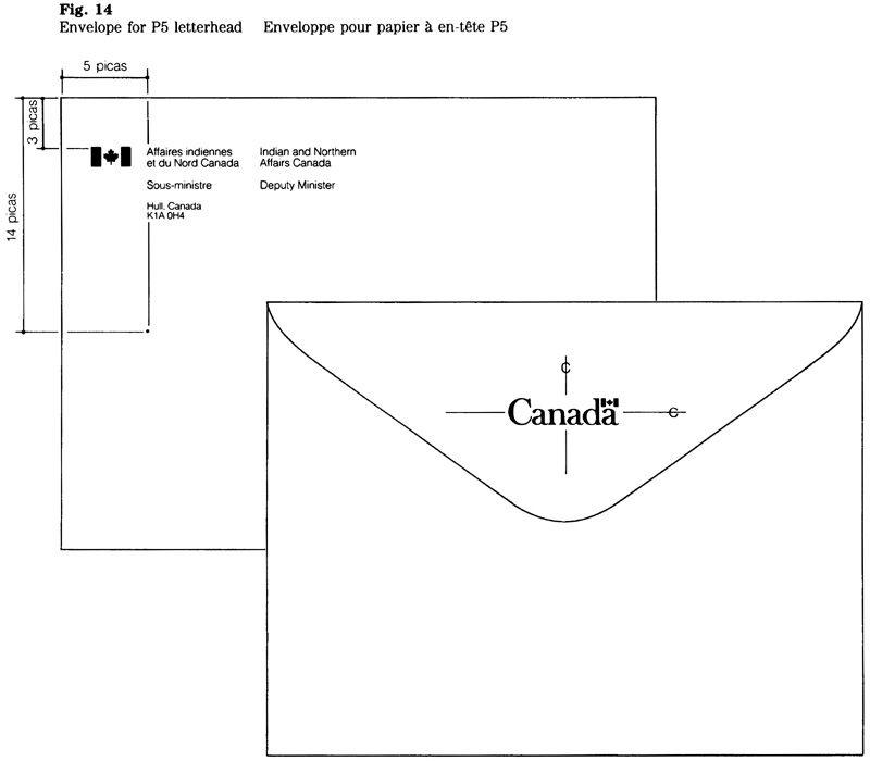
Airmail envelope, No. 9 (Fig. 15)
Size: 10.2 x 22.9 cm
Typesetting: Helvetica light; 9 point signature with 7 point return address, or 10 point signature with 8 point return address; a blank line (equivalent to the type size of the signature) separates the signature from the return address; 20 points for the words “Air Mail Par avion”,
Alignment mark indicating position of the typewritten address: dot, 1 point in size.
Wordmark: 30 mm.
Border: the design consisting of sloping bars appears on the front and back of the envelope. It should not extend more than 0.6 cm from the edges of the envelope.
Paper: airmail envelope, light blue, 60 g/m2.
Ink colour: reflex blue.
Reproduction: offset (litho) or letterpress.
CGSB specification: 6.101.M
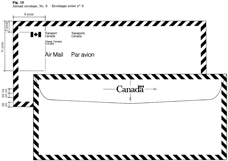
Envelopes, standard flats
These envelopes are rectangular in profile and may be used for mailing large size documents. Their size may exceed 15.2 cm (6 inches) in height and 19.0 cm (7 1/2 inches) in width but shall not exceed 27.0 cm (10 5/8 inches) in height and 38.0 cm (15 inches) in width.
The type sizes referred to in the specifications should be used relative to the size of the envelope; i.e. a 10 point signature with 40 mm wordmark are used for the smaller sizes and a 12 point signature with 45 mm wordmark for the larger. All printing shall appear parallel to the longest dimension of the envelope.
Standard flats (Fig. 16)
Size: various.
Typesetting: Helvetica regular; 10 point signature with 8 point return address, or 12 point signature with 10 point return address; a blank line (equivalent to the type size of the signature) separates the signature from the return address.
Wordmark: 40 or 45 mm.
Paper: golden kraft; 75 g/m2 for envelopes that do not exceed 19.0 x 27.0 cm; and 90 g/m2 for envelopes larger than 19.0 x 27.0 cm.
Ink colour: black.
Reproduction: offset (litho) or letterpress.
CGSB specification: 6.11M.
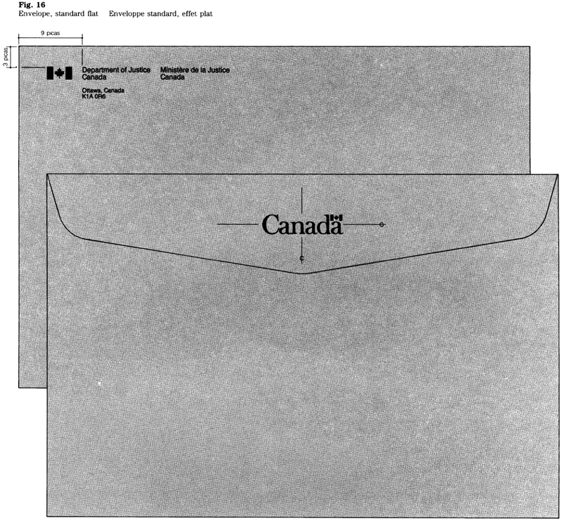
Notepaper
Notepaper, P6 (Fig. 17)
Size: 10.7 x 14.0 cm
Typesetting: 7, 8 or 9 point Helvetica light; the largest type size possible should be used, but no type should extend beyond a 3 pica margin at the right edge of the paper.
Wordmark: 25 mm.
Paper: No. 7 bond, white, 60 g/m2, 75 g/m2 or 90 g/m2 (as specified).
Ink colours: FIP red for the flag symbol and the flag in the wordmark; black for the type.
Reproduction: offset (litho).
CGSB specification: 6.112M.
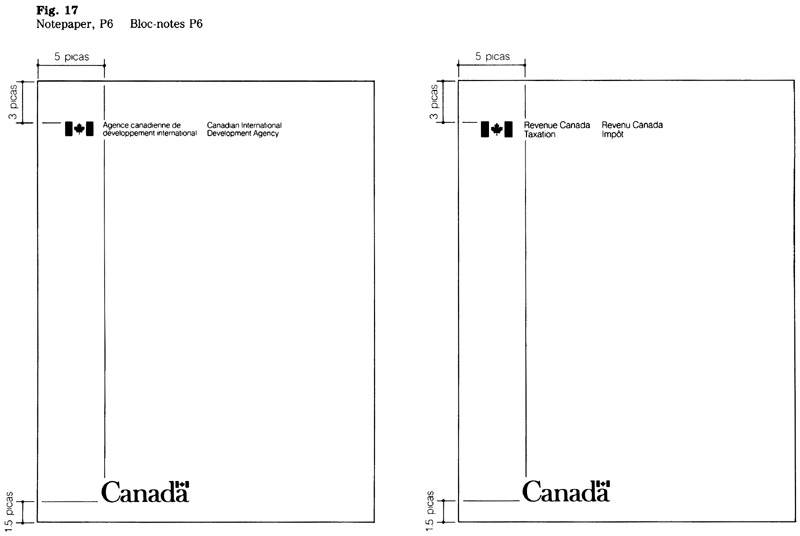
Complimentary slips and cards
The format for general use provides space for the sender’s signature. The inclusion of names, titles addresses by pre-printing is optional (see the examples)
Complimentary slip, P6 (Fig. 18)
Size: 10.7 x 7.0 cm when folded (10.7 x 14.0 cm when flat).
Typesetting: Helvetica light; 7, 8 or 9 point for signature and text (except as below); the largest type size possible should be used, but no type should extend beyond a 3 pica margin at the right edge of the paper.
Name: 12 point.
Letters following the name (e.g. degrees or memberships): 10 point.
Return address: 6, 7 or 8 point (this size should be 1 point smaller than the size used in the signature).
Wordmark: 25 mm.
Paper:
-
For use by deputy ministers, assistant deputy ministers, or positions of equal status: No. 2 bond, white, 75 g/m2 or 90 g/m2 (as specified).
-
For general use: No. 7 bond, white, 60 g/m2, 75 g/m2 or 90 g/m2 (as specified)
Ink colours: FIP red for the flag symbols and the flag in the wordmark; black for type.
Reproduction: offset (litho).
CGSB specification: 6.102M.
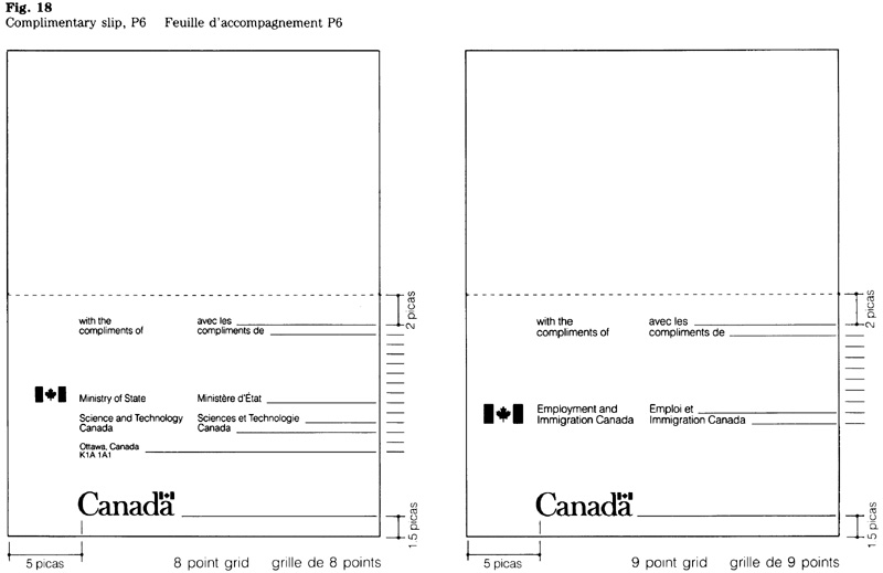
Complimentary card (Fig. 19)
Size: 10.7 x 7.0 cm
Typesetting: Helvetica light; 7, 8 or 9 point for signature and text (except as below); the largest type size possible should be used, but no type should extend beyond a 3 pica margin at the right edge of the paper.
Name: 12 point.
Letters following the name (e.g. degrees or memberships): 10 point.
Return address: 6, 7 or 8 point (this size should be 1 point smaller than the size used in the signature).
Wordmark: 25 mm.
Paper: stationery bristol, premium, bright-white, kid finish, 230 g/m2.
Ink colours: FIP red for the flag symbol and the flag in the wordmark; black for the type.
Reproduction: offset (litho).
CGSB specification: 6.103M.
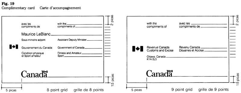
Calling cards
General requirements
In addition to the federal signature and the wordmark, a calling card bears the individual’s name and title or function. Optional information includes: address, telephone and telex numbers, cable address, university degrees, decorations, professional memberships and the like.
Choice of cards
Four types of cards have been designed, offering a choice in the presentation of the two official languages and accommodating texts of varying length. Users may choose one of these types depending on their requirements. The four types (F-1, F.2, F-3 and F-4) are shown in Fig. 20. A detailed description of each type is set out below.
Some individuals need calling cards only occasionally. For them, it is more economical for an organization to hold a stock of cards which supply the general information and have a blank space for the user’s name. The user would, at need, add his or her name by hand or by typewriter.
Technical requirements
Sizes:
- Cards F-1, F-2 and F-3: 9.0 x 5.0 cm;
- Card F-4: 9.0 x 5.0 cm when folded (9.0 x 8.6 cm when flat).
Layout:
The layout is based on a grid of typographic measurements. The three grids are intended to accommodate texts of varying length. Normally the 7 point grid is suitable but 6 or 8 point grids may be used for longer or shorter text. Any one of the grids may be used with each type of card; generally, the largest possible type size should be selected, subject to a minimum margin of 1.5 pica at the right edge of the card.
Normally, each block of information (e.g. title, address, and telephone number) should be separated by one blank line. However, to save space, the blank line between address and telephone number may be omitted.
Typesetting: Helvetica light; 6, 7 or 8 point, according to the length of the text.
Name: 11 point.
Letters following the name (e.g. degrees or memberships): 9 point.
The telephone area code is set in italics.
Wordmark: 23 mm.
Paper:
-
Cards F-1, F-2 and F-3: stationery bristol, premium, bright-white, plate finish, 219 g/m2.
-
Card F-4: No. 1 offset paper, white, 178 g/m2.
Ink colours: FIP red for the flag symbol and the flag in the wordmark; black for the type.
Reproduction: offset (litho).
CGSB specification: 6.104M.
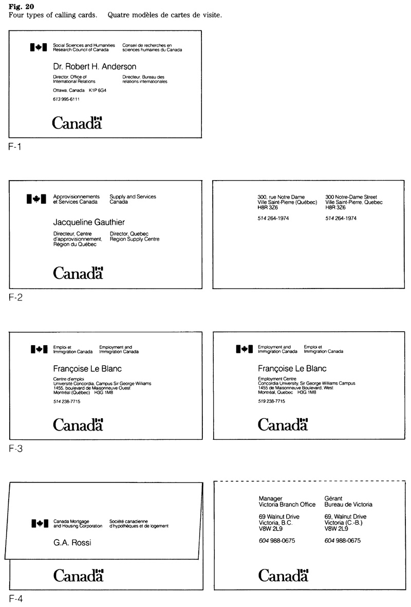
Card F-1
This card is printed on one side only, presenting the languages side by side. To contain all of this on one side, the text must be concise could use a minimum number of lines; e.g. the could appear on the same line as the place the blank line preceding the telephone number could be omitted (Fig. 21).
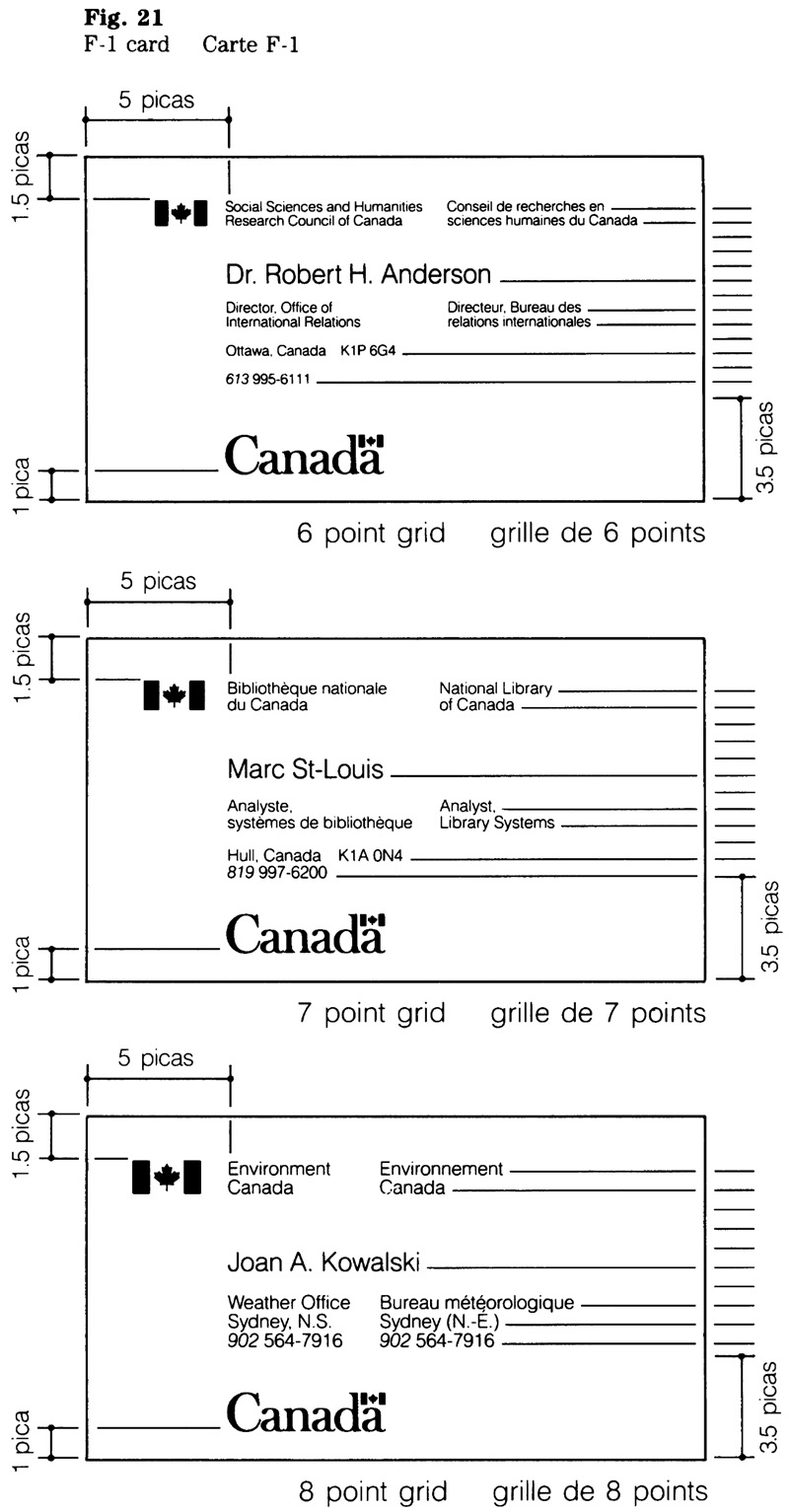
Card F-2
This card is printed recto-verso, with the two official languages appearing side by side. The face of the card bears the federal signature, the name and the title of the individual and the “Canada” wordmark. The reverse of the card bears the optional information (Fig. 22).
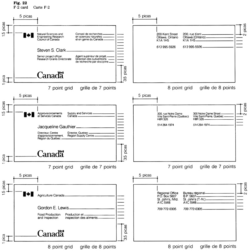
Card F-3
This card is printed recto verso. Both sides bear the bilingual federal signature and the “Canada” wordmark. The English text appears on one side and the French text on the reverse of the card. The order by the official languages in the signature is determined by the language of the text used on each side (Fig. 23).
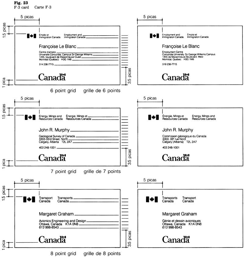
Card F-4
This folded card serves a dual purpose, i.e. a calling card or a name tag. The two official languages appear side by side. The federal signature and the individual’s name are printed on the cover of the card. The “Canada” wordmark and the text are printed on the inside. Generally, the individual’s title is printed on the inside of the card; if specifically requested, the title may be place below the name on the cover (Fig. 24).
This calling card format is also suitable to accommodate braille.
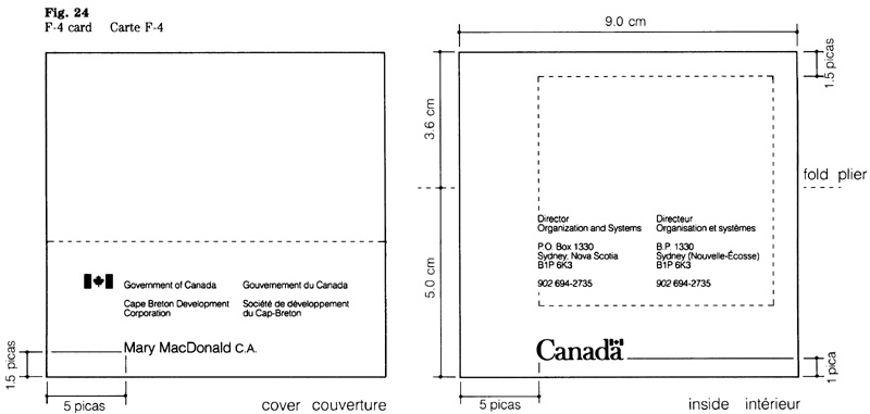
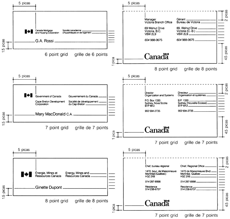
Special symbols or messages
Symbols
Chapter 470 sets out the policy on the use of special symbols. When authorized in accordance with that policy, a special symbol may be applied on the back of envelopes in the manner illustrated (Fig. 25).
Messages
FIP policy prohibits the printing of special symbols on stationery items such as letterhead and notepaper; however, a brief message may be included in support of a major program or event. When such a message has been adopted, it may be applied on a letterhead in the manner illustrated (Fig. 26).
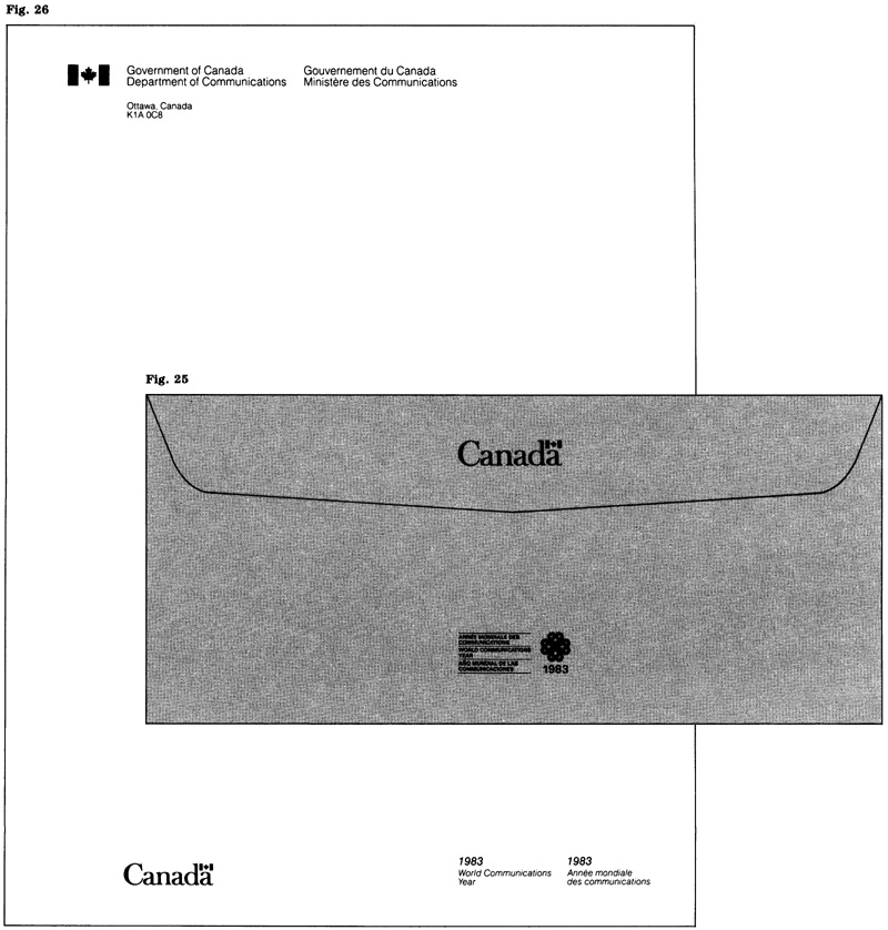
Reproduction and supply
Printing Technical advice is available from Canadian Government Printing Services, Supply and Services Canada.
Reproduction should only be made from reproduction proofs. The symbols and the typography shall appear sharp and well-defined, without distortion. For the level of print quality that is to be specified, see the “Summary”.
Source of supply
Advice on the procurement of typesetting and printing is available from Canadian Government Printing Services, Supply and Services Canada.
Summary
| Summary |
Paper |
Ink |
Quality levels |
|||||
|---|---|---|---|---|---|---|---|---|
| Size (cm) |
Colour |
Grade and grammage |
Colours |
Printing |
Typesetting |
|||
Table Notes
Note: Information on paper grades is contained in the publication “Generic Identification of Paper and Paperboard Brandnames”. For details on quality levels see the publications “Print Quality Levels”, “Envelope Quality Levels” and “Typesetting Quality Levels”. All are published by Supply and Services Canada. Reference to these publications is to the latest issues. |
||||||||
Letterhead, P4 |
21.5 x 28.0 |
white |
No. 2 bond, 75 g/m2 or 90 g/m2table note 1 * |
FIP red & black |
inform- |
prestige |
||
Letterhead, P5 |
14.0 x 21.5 |
white |
No. 2 bond, 75 g/m2 or 90 g/m2table note 1 * |
FIP red & black |
inform- |
prestige |
||
Airmail letterhead, P4 |
21.5 x 28.0 |
light blue |
airmail bond, 38 g/m2 |
reflex blue |
inform- |
prestige |
||
Kraft envelope, No. 9 |
10.2 x 22.9 |
golden kraft |
kraft envelope, 75 g/m2 |
black |
office |
inform- |
||
White envelope. No. 9 |
10.2 X 22.9 |
white |
No. 2 bond, 75 g/m2 or 90 g/m2table note 1 * |
FIP red & black |
inform- |
prestige |
||
Envelope for P5 letterhead |
11.4 x 14.9 |
white |
No. 2 bond, 75 g/m2 or 90 g/m2*table note 1 * |
FIP red & black |
inform- |
prestige |
||
Airmai1 envelope, No. 9 |
10.2 x 22.9 |
light blue |
airmail envelope, 60 g/m2 |
reflex blue |
inform- |
prestige |
||
Standard flats |
various |
golden kraft |
kraft envelope, 75 g/m2 and 90 g/m2 |
black |
office |
inform- |
||
Notepaper, P6 |
10.7 x 14.0 |
white |
No. 7 bond, 60 g/m2, 75 g/m2 or 90 g/m2 |
FIP red & black |
inform- |
prestige |
||
Complim- |
10.7 x 14.0 (when flat) |
white |
No. 2 bond, 75 g/m2 or 90 g/m2* |
FIP red & black |
inform- |
prestige |
||
Complim- |
10.7 x 7.0 |
bright-white |
stationery bristol, premium, kid finish, 230 g/m2 |
FIP red & black |
inform- |
prestige |
||
Calling cards |
9.0 x 5.0 |
bright-white |
stationery bristol, premium, plate finish, 219 g/m2 |
FIP red & black |
inform- |
prestige |
||
F-1, F-2 and F-3 |
9.0 x 8.6 |
white |
No. 1 offset paper, 178 g/m2 |
FIP red & black |
informationaltable note 2 ** |
prestige |
||
Motor Vehicles
3.1 Motor Vehicles: Requirements for markings
FIP Manual,
Introduction
This guideline explains how government policy on the identification of motor vehicles should be applied. The guidelines and design standards are intended to assist all those involved in ordering, designing, fabricating and procuring vehicle markings.
Applicable publications
This section should be used with the following policies or guidelines:
Communications volume, Treasury Board Manual
- Chapter 1, Government Communications Policy
- Chapter 2, Federal Identity Program
Federal Identity Program Manual
- Section 1.0, Management guide to corporate identity
- Section 1.1, Design
Standard markings
Standard markings have been established to ensure consistency and uniformity in the identification of all government vehicles (Fig. 1). Described here is the system of markings that is intended to meet the different operational requirements and to simplify procurement.
Markings for safety purposes
Certain vehicles require markings to enhance safety. Referred to as safety markings, they increase the visibility of a vehicle. The decision to use safety markings is at the discretion of the institution operating the vehicle.
Generally, safety markings consist of chevron (or similar) striping at the rear of the vehicle, and may include horizontal stripes on both sides of the vehicle. In view of different practices and requirements, these guidelines do not include specifications for such markings.
Other external markings
Decals bearing messages unrelated to corporate identity should not appear in close proximity to the signature and wordmark. Therefore, fleet numbers or similar identifiers should be applied elsewhere on the vehicle to avoid visual conflict.
Purpose
An estimated 16,000 vehicles are operated by institutions subject to FIP. The uniform identification of these vehicles helps the public in recognizing federal activities. The use of standard markings has this purpose:
- to project the corporate identity of the government;
- to identify the institution operating the vehicle;
- to indicate the vehicle’s function, as required.
Vehicle identification also serves to highlight ownership and assists in ensuring accountability on the part of operators. Each institution is responsible for determining the requirement for vehicle identification in accordance with government policy and these guidelines.
Scope
Guidelines and standards set out the requirements for the design, fabrication and placement of vehicle markings. The purpose of these markings is to identify government motor vehicles operated within Canada. The signature and the “Canada” wordmark are the principal elements of vehicle markings.
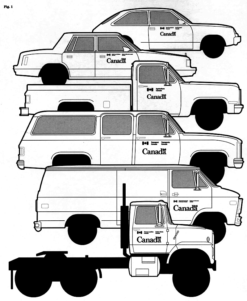
Application
The markings apply to all government (owned or leased) on-road vehicles, with the exception of vehicles on short-term leases and those that have been exempted (see below).
Identification of leased vehicles
Vehicles on long-term leases (90 days and over) should bear standard markings consistent with the design standards. To identify vehicles on short-term leases, institutions will find it practical to employ temporary instead of the more permanent, standard markings. (See “Temporary identification” for details.)
Exemptions
When an institution finds it is inadvisable to use external markings on a particular vehicle, it may authorize an exemption.
Identification of other mobile equipment
Institutions that operate vehicles or equipment designed for off-road use (e.g. all-terrain vehicles, snowmobiles, boats, construction or maintenance equipment) should assess the requirement for markings on the basis of the principles set out in this guide. The method of identifying such equipment is at the discretion of the institution concerned.
Roles and responsibilities
The roles and responsibilities for implementation are outlined in FIP policy; those pertaining to vehicle identification are indicated below.
Supply and Services Canada (SSC) is responsible for:
- providing markings to clients directly from SSC or through its approved sources of supply;
- ensuring that the markings are in accordance with FIP design standards and applicable CGSB (Canadian Government Standards Board) standards;
- preparing a layout of the proposed markings and providing a copy to the client for approval, if required;
- providing the client with a firm cost quotation for fabricating the markings, if applicable;
- delivering the markings within the time periods established (see “Standards of service”);
- providing clients with order forms, price lists, and installation instructions to facilitate procurement and installation.
Each institution operating government (owned or leased) motor vehicles is responsible for:
- managing the identification of vehicles as part of the corporate identity function;
- determining the requirements for markings with respect to operational needs and in accordance with FIP policy and guidelines;
- procuring all vehicle markings from SSC or, if special arrangements were made with SSC, from SSC approved sources; and
- arranging for the installation of markings in accordance with FIP guidelines.
Corporate identity management
The identification of vehicles should be based on functional and operational requirements, and reflect the corporate goals of the institution. Vehicles that are used for the delivery of government programs and services represent a significant aspect of an institution’s identity. It follows that vehicle identification should be a function of corporate identity management.
In addition to meeting functional requirements, the uniform identification of an institution’s vehicle fleet can also help to project a coherent visual identity. Various methods can be employed to create a distinctive appearance. One method is the adoption of a uniform fleet colour, and a number of institutions are now using a specific colour for that purpose. Another method consists of a graphic device that has a distinct relationship with the markings (e.g. a band in a contrasting colour). Similarly, an institution may use markings in a colour other than the standard black or white. For example, silver-grey instead of white markings could be adopted to create a distinctive appearance for a fleet made up of dark-coloured vehicles.
Implementation
The design standards and guidelines set out here are effective immediately; however, to minimize conversion costs, they should be implemented gradually as follows:
- all new vehicles at the time of acquisition; and
- any existing vehicles that require new markings following re-painting.
Note: Some institutions may presently hold stocks of markings that do not conform to the revised design standards set out here. Such stocks should be replaced as soon as operationally feasible.
Definitions
For purposes of these guidelines the following definitions apply:
- Markings
-
refers to pressure-sensitive decals bearing the graphic elements, i.e. the signature of an institution, the “Canada” wordmark, a service title, or a term identifying the vehicle’s function.
- Motor vehicles
-
includes passenger cars, cargo vehicles, and special purpose vehicles.
- Substrate
-
refers to a surface on which the markings can be applied.
Design standards
Symbols and typeface
To ensure consistency and visual coherence, vehicle markings are subject to design standards. These standards cover the flag symbol, the Coat of Arms, the “Canada” wordmark, as well as the typeface and layout of the signature. The three corporate symbols are described in detail in Section 1.1, “Design”.
The FIP signage typeface is used for all signatures and accompanying text such as service titles. Details on this particular typeface, including its spacing system, are set out in Section 4.5, “Signage typeface”.
The medium-weight version of the “Canada” wordmark is used for all vehicle markings. See Figure 8.
Signature layout
Described here is the layout of the most commonly used signature, one consisting of the flag symbol and two lines of type. In case of a very short signature, users may prefer a one-line signature instead, and should refer to Section 1.1 for details on the layout.
Layout specifications
Measurements pertaining to the signature layout are based on the “x”, the unit of measurement used to indicate space between the elements. The size relationships between symbol and typography and the spacing standards for a two-line signature are as follows.
Ratio between flag and typography: The ratio between the character size and the height of the flag symbol is 1:3.4 (Fig. 2).
Horizontal alignment: The base of the symbol and the base line of the type are aligned horizontally (Fig. 2).
Spacing standards: The space between the symbol and the left-hand column, as well as between the language columns is 3x (Fig. 2).
When a service title is included, the space between signature and service title is 2x (Fig. 3).
Signature incorporating the Coat of Arms
A number of institutions use the Coat of Arms in their signature. For technical details on the layout of signatures incorporating the Coat of Arms see Section 1.1.


Determining the requirements
All markings described here appear on both sides of the vehicle. Before the design or procurement of markings can proceed, specific requirements should be determined.
Language requirements
Under FIP policy, the order of the official languages in the signature is based on the location of the home base of the vehicle concerned. Thus, French appears to the left on vehicles based in Quebec, and English to the left on vehicles located in the other provinces and the territories.
The order of the official languages in the signature and in any accompanying message is the same on both the driver’s and the passenger’s side of a vehicle.
Operational requirements
The design of markings is influenced by factors related to a vehicle’s function and operational requirements.
Identifying a vehicle’s function
The function of certain vehicles (e.g. ambulances, search and rescue vehicles) should be clearly indicated. Normally, this requires markings specifically designed for the vehicle (Fig. 4). This means determining the relative size, placement and use of colour to ensure an effective relationship between the different components (function identifier, signature, wordmark).
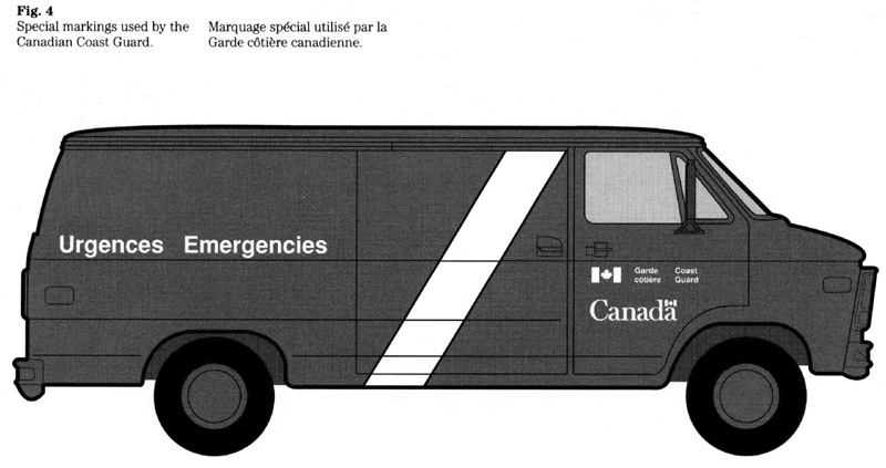
A vehicle’s function can also be indicated by means of a service title. Such a title is used in conjunction with the signature and should be as concise as possible (Fig. 5).
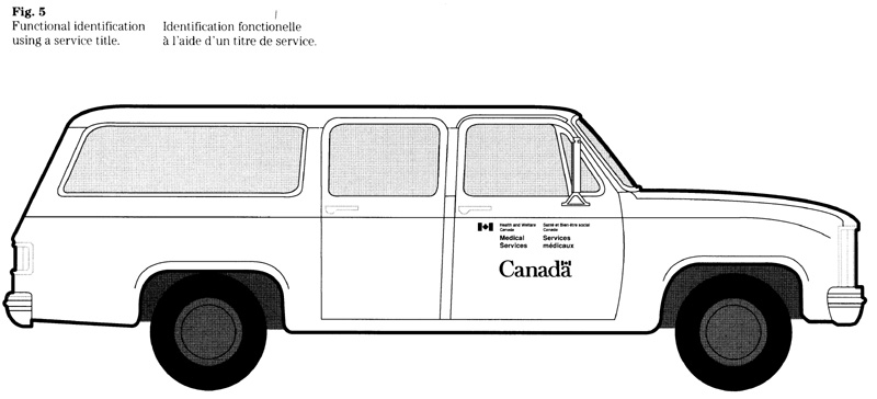
Aspects of visibility
Different functions and operational requirements of government vehicles call for different degrees of visibility. Factors such as vehicle colour, size and colour of markings, and whether or not safety markings are used, will affect the visibility of a vehicle.
Certain vehicles (e.g. ambulances) require a high degree of visibility to ensure they are easily detected and recognized. It follows, that such vehicles need markings that stand out and that should be larger in relation to those used for regular service vehicles.
Institutions should assess the use of retro-reflective materials when specifying markings for vehicles that require night-time visibility.
Ensuring proper fit of the markings
A vehicle’s overall appearance is enhanced by markings of the proper size. To ensure a good fit when installed, the size of markings should be based on the space available on the particular vehicle.
A range of sizes has been established to accommodate signatures varying in length. The standard sizes are intended to meet general requirements for the common vehicle types.
Other sizes are used to meet specific requirements (e.g. markings for a special purpose vehicle, or for a particular fleet).
Colour and contrast
The colour of a particular vehicle determines the colour of markings. For reasons of standardization, black or white is used for the majority of markings.
General applications: Either black or white markings are used to contrast with the body colour of the particular vehicle. The choice between black or white is based on the best contrast that can be obtained. The illustration is intended to assist in the selection (Fig. 6).
Markings appearing on a stripe: Generally, when applied on a white stripe, the markings should be in red and black as follows:
- red flag in the signature and red flag in the “Canada” wordmark;
- black characters in both the signature and the “Canada” wordmark.
Specifications: For black or white markings, reference should be made to the appropriate number shown in Canadian Government Standards Board (CGSB) standard 1-GP-12, Standard Paint Colors. The numbers are: black 512-201; white 513-201.
A special weather-resistant product should be specified for those elements of the markings that are to appear in red (i.e. the flag). It is referred to as 3M cast in “tomato” red vinyl No. 180-13.
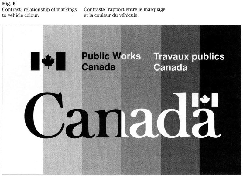
Safety markings
A decision to apply safety markings is at the discretion of the institution operating the vehicle. Generally, these markings consist of chevron (or similar) striping at the rear of the vehicle, and may include horizontal stripes on both sides. Because the horizontal stripe represents an integral part of vehicle identification and usually serves as substrate for the signature and wordmark, the recommended ratio between the width of the stripe and the size of the markings is referred to under “Special requirements”.
Temporary identification
As stated in the “Introduction”, temporary instead of the more permanent, standard markings are used to identify a vehicle on short-term lease. The design of a temporary device should conform to the general requirements on the use of the signature and “Canada” wordmark. The size, colour, and material of such devices are at the discretion of the institution concerned.
For purposes of temporary identification, a device such as a placard is displayed on the vehicle. To meet the intent of FIP policy, the device should be clearly visible to the public. Figure 7 indicates how this may be done.
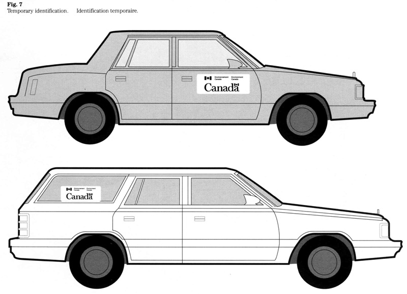
Selecting the markings
Described here is the system of markings intended to meet common requirements, simplify procurement, and achieve standardization. The system provides for a range of sizes and specific relationships between signature and wordmark when placing the markings on the front doors.
For ease of reference, a code has been established for each standard size; i.e. S-1, S-2, S 3 stand for different x-heights used for the signature, and C-1, C-2 and C-3 refer to sizes of the wordmark. These codes are also used on the order form. The standard sizes are shown in Figure 8.
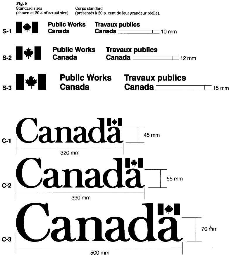
Standard sizes
Three character sizes have been selected to meet common requirements for signatures. The standard sizes (measured by their x-height) are designated as follows:
- S-1 (10 mm)
- S-2 (12 mm)
- S-3 (15 mm)
Three sizes of the wordmark are used to meet common requirements. The standard sizes are designated as follows (the dimensions refer to the x-height and the corresponding length):
- C-1 (45 mm/320 mm)
- C-2 (55 mm/390 mm)
- C-3 (70 mm/500 mm)
Size and fit
When the markings are to appear on the front doors the following factors will determine the selection of sizes:
- door configuration and length of the signature, i.e. any restrictions that may limit the choice of sizes;
- function and operational requirements; and
- relationship between signature and wordmark, i.e. the visual balance.
As the first step, the approximate length of the signature should be determined with the aid of Table 1. This will ensure that the character size is suitable and that the signature will fit.
As the next step, the sizes of the signature and wordmark should be selected with the aid of Table 2. It shows various options of combining sizes.
Once the appropriate combination has been established, the codes (e.g. S-1/C-1) become key information when procuring and installing markings.
The effect of typical size combinations is shown in Figure 9. The examples indicate how the selection of sizes (Table 2) influences the appearance of markings.

Table 1
Determining the length of a signature
To determine the approximate length of the signature and select a character size:
- Verify the space available on the vehicle (most vehicle doors allow approximately 600 mm).
- Review the three columns below to find your organization’s signature or one that is similar in length.
- Select a character size that ensures a good fit and meets operational requirements for visibility.
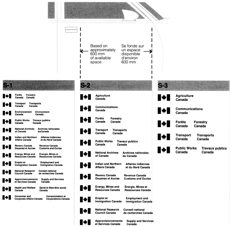
Table 2
Combining the signature and wordmark
To choose an appropriate combination:
- Refer to the column for the signature size selected in Table 1 (e.g. S-1, S-2, S-3).
- Find your organization’s signature or one that is similar in length, and select a size combination that appears to provide a good visual relationship between the wordmark and the length of the signature. (See also Figure 9.)
- Refer to the codes (e.g. S-1/C-1) when ordering markings.
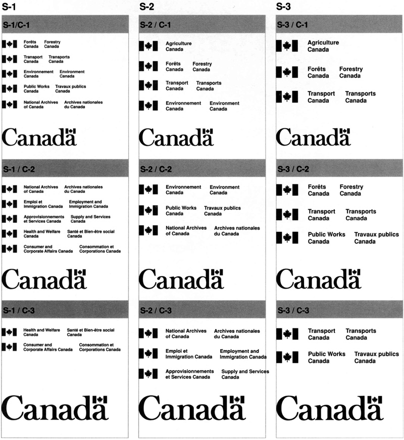
Size of service titles
Normally, service titles should appear in a character size that is larger than the size used for the institution’s signature (Fig. 10). To create emphasis, the following size relationships between signature and service title may be used: 10 mm and 12 mm; 10 mm and 15 mm; or 12 mm and 15 mm. It is recognized that the relative length of the signature or the service title, as well as any space restrictions may limit the choice of sizes referred to above.
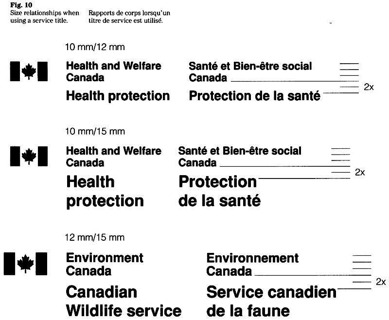
Placement of markings
Markings for each vehicle should be provided in a set, consisting of two decals each of the signature and of the ‘Canada” wordmark in the appropriate colour and sizes established for the type of vehicle. Described here is the positioning of markings on doors, the common method of identifying a vehicle.
Placement on doors
The decals bearing the signature and the wordmark should be positioned on both front doors as shown (Fig. 11). Exact left-to-right and top-to-bottom placement on a door may vary due to variations of shape, contour, attachments or other obstacles.
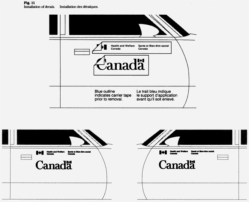
Space between signature and wordmark
The space between the base line of the signature and the top of the “Canada” wordmark should measure approximately 80 mm (the minimum space is 60 mm). See Figure 12.
Vertical alignment
Generally, the “Canada” wordmark is vertically aligned with the flag symbol of the signature (Fig. 13). In some cases, it may be more effective to centre the wordmark below the signature instead of aligning it on the left (Fig. 14). In view of the many differences with respect to markings and vehicle doors, some judgement will be needed to choose the alignment that appears to be most effective.
In cases where the signature incorporates additional words such as a service title, the wordmark may be vertically aligned with the left column of the text above (Fig. 15).
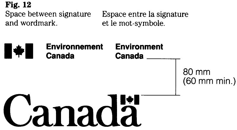
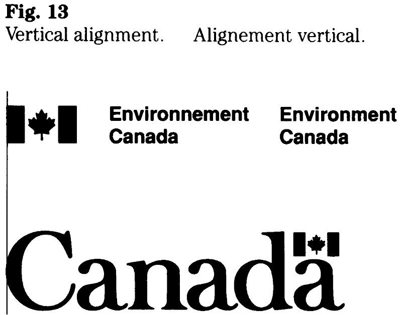
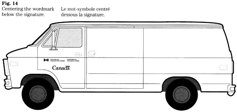
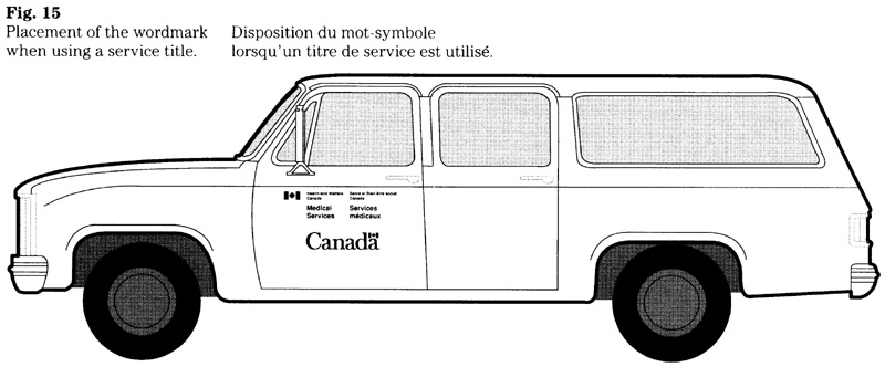
Installation and maintenance
Accurate installation of the markings is essential if the intent of FIP guidelines is to be met. Basic instructions for installing decals are provided with each set. The institution that operates the vehicle should normally issue additional instructions that are specific to the vehicle to be marked.
Ensuring that the appearance of markings will be maintained is part of general vehicle maintenance. Markings that are damaged or deteriorated should be replaced as soon as possible.
Special requirements
Set out here are factors that apply when special requirements have to be met. The selection of markings and sizes will normally require design advice (see “Enquiries”). In view of the variances with respect to size, type and function of a vehicle, special requirements are treated here by means of suggested practices.
Vehicles bearing a stripe
When designing markings in conjunction with a horizontal stripe, the width of the stripe should be proportional to the size of the vehicle. For example, for purposes of illustrating the vehicle shown in Figure 16, a stripe of 180 mm was used.
Markings that are applied on a horizontal stripe should have certain proportions in relation to the width of the stripe. The suggested ratio between the width of the stripe, the x-height of the wordmark, and the x-height of the signature is 100:39:11 (Fig. 16). For example, a stripe measuring 180 mm in width would require a wordmark having an x height of 70 mm and a signature of 20 mm.
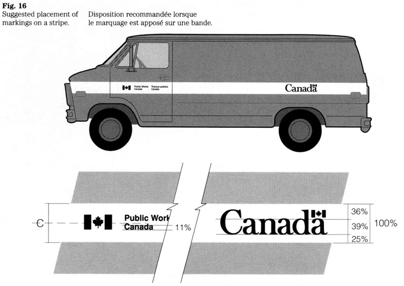
Trucks, trailers and special purpose vehicles
To determine the size and placement of markings, an assessment of the vehicle is required. This should include the operational requirements and the surfaces suitable for the markings. The assessment, as well as a photograph, should be provided when seeking design advice.
The designs shown in Figure 17 indicate several approaches but evidently do not explore all options. It is recommended that markings should be tailored to the particular vehicle.
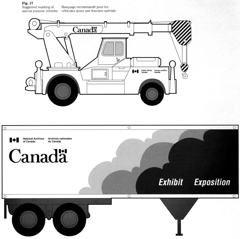
Substrates for markings
To ensure good adhesion and to avoid distortions, markings should be applied to smooth surfaces. Vehicle bodies consisting of irregular surfaces (e.g. ribbed metal) will require the installation of a suitable substrate (plate) to bear the markings (Fig. 18).
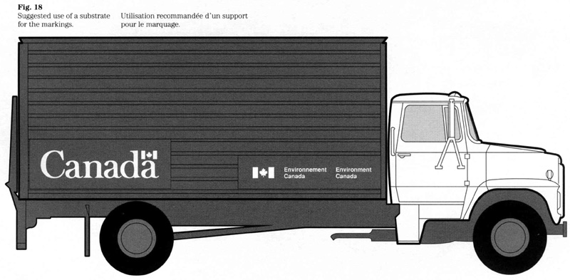
“Canada” wordmark
In addition to displaying the wordmark together with the signature on the front door, the wordmark may also be presented on its own on the sides, rear and front of certain vehicles. Examples are trailers that provide large surface areas allowing an effective display of the wordmark. Generally, the size of the wordmark should be in proportion to the overall surface area (Fig. 19).
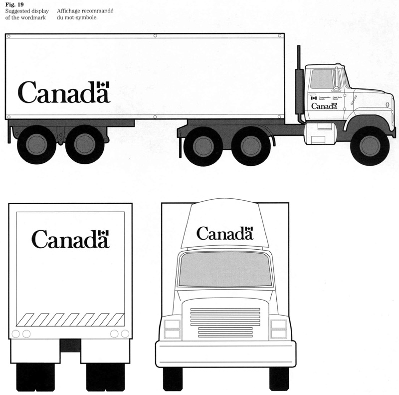
Source of supply
A central source of supply, intended to ensure consistency in the application of design and material standards for all vehicle markings, has been established within Supply and Services Canada (SSC). Use of this source for the supply of markings is mandatory for all departments and departmental corporations named in Schedules I and II to the Financial Administration Act, and for all branches designated as departments for purposes of the Act. Parent corporations named in Schedule III, Part 1 (and subject to FIP policy) are encouraged to use the services and expertise of this source as well.
Standards of service
The following schedule is based on the date that the client provides Supply and Services Canada (i.e. Canadian Government Expositions and Audio-Visual Centre) with a completed order form or a funded requisition (as applicable):
- layout and cost quotation – three weeks;
- production and delivery of the markings – four weeks.
These time frames represent normal delivery schedules. Should a significant delay occur, or is expected to occur, SSC will at once notify the client in writing and provide an explanation for the delay.
Quality control
Both workmanship and materials are the responsibility of SSC. All materials used must be in strict accordance with CGSB standards and FIP design standards. Should defects in workmanship or materials occur, SSC is responsible for rectifying the problem as soon as possible. Warranties on materials are limited to those given to SSC by suppliers and contractors.
Material specifications
All markings are fabricated as pressure-sensitive decals. The following standards and specifications of the Canadian General Standards Board (CGSB) pertain to the materials for markings:
- 62.3-M Prefabricated Markings, Exterior, for Aircraft
- 62.8-M Prefabricated Opaque Markings, General Purpose, for Use on Exterior and Interior Surfaces
- 62.9-M Prefabricated Markings, Positionable, Exterior, for Aircraft, Ground Equipment and Facilities
- 109.2-M Letters and Symbols, Die-cut Film, FIP
- 1-GP-12 Standard Paint Colors
- 1-GP-191M Fast Drying, Automotive Refinishing, Enamel, Gloss
Note: These publications may be obtained from the Canadian Government Publishing Centre, Supply and Services Canada.
Enquiries
Each institution is responsible for implementing these standards and guidelines and has named an official (referred to as FIP Coordinator) to manage its corporate identity. Enquiries regarding the guidelines should be routed through the FIP Coordinator of the institution concerned.
Enquiries on all aspects of design, colour, and the use of the FIP signage typeface should be directed to the Administrative Policy Branch of Treasury Board Secretariat.
Enquiries with respect to the procurement of markings should be directed to the Canadian Government Expositions and Audio-Visual Centre, Supply and Services Canada.
Signage
4.1 Signage: System overview and implementation
FIP Manual,
Introduction
The signs that identify federal real property provide assistance to users of the facilities. They also represent an important aspect of the government’s visual identity. These signs communicate essential information about the facility, and about the government and its operations.
These guidelines provide an overview of the government’s sign system and describe how signage should be planned and managed. These instructions are prepared for the use of planners and managers of facilities. All others who are involved in formulating messages or who are responsible for the design, procurement or placement of signs will find it helpful to consult these guidelines as well. (See the centre fold for a visual presentation of the sign system.)
This edition of “Signage” supersedes the version. This edition clarifies responsibilities for implementation, reflects Public Service reform and establishes links with Treasury Board policies on real property management.
Background
A review of government signs in the early seventies revealed major shortcomings with respect to quality, design and overall effectiveness. Moreover, it was found that many federal facilities lacked clear identification. To rectify this situation and to improve communications, the Treasury Board Secretariat was charged with developing a comprehensive sign system as part of the Federal Identity Program. The principal goals were: to improve the presentation of the official languages; to achieve uniformity consistent with the corporate identity; and to effect standardization. In developing the designs, emphasis was placed on functional demands, user needs, specific government wide requirements, and standardization, both to achieve cost savings and to conform to national and international standards.
Objectives and scope
Signage represents a significant aspect of the federal identity and is linked to the following policy objectives:
- to enable the public to clearly recognize federal activities by means of consistent identification;
- to improve service to the public by facilitating access to programs and services;
- to project the equality of status of the two official languages;
- to ensure effective management of the federal identity, consistent with government wide priorities; and
- to promote good management practices in the fields of corporate identity and information design.
The following goals pertain to the sign system. The system is intended to:
- improve communications through consistent appearance and clear, readily understood messages;
- achieve visual consistency throughout the government and compatibility with national and international standards; and
- effect cost savings through standardization of the system’s components.
In summary, the system is intended to meet the operational requirements of departments, to help implement government policy and, most importantly, to assist the user public.
Scope and application
The system applies to a broad range of sign messages that identify, direct, regulate, warn or inform. The different types of signs are referred to as primary identification signs, common use signs, operational signs, and project signs. This system is to be used by all federal institutions that are subject to FIP policy.
Signs that are prescribed by a regulatory authority are not covered by these guidelines. Examples are traffic signs, which are subject to the Manual of Uniform Traffic Control Devices for Canada, and emergency exit signs, which are prescribed by the National Building Code.
Related policies
The guidelines on signage are related to Treasury Board policies on communications and real property management, as well as to the policy of the Federal Identity Program. (See “Applicable policies and guidelines” in this section.)
Enquiries
Treasury Board policy requires that each institution that is subject to FIP name an official to manage its corporate identity. All enquiries should be routed through the designated official, who is usually referred to as the FIP Coordinator.
Enquiries about the guidelines and design standards should be directed to:
- Federal Identity Program
- Administrative Policy Branch
- Treasury Board Secretariat
Roles and responsibilities
Because of the diversity of federal institutions, there is no one way to organize functional responsibilities for signage. Government departments and agencies are diverse in terms of their size, mandate, services, modes of service delivery and, of course, needs concerning signage. Moreover, the function of real property management is organized with varying degrees of centralization or decentralization at the headquarters, regional, and district levels. Despite these variances, there should be a common understanding of roles and responsibilities concerning signage.
Custodian department and occupant organization
Signage is a shared responsibility that involves both the custodian department and the organization that occupies federal real property. Table 1 indicates the activities and roles concerning the different types of signs and the areas of shared responsibility. This overview is intended to help assign functional responsibilities within an organization. The letter codes used in the table are defined below:
C – Custodian department, the organization that administers and manages federal real property;
O – Occupant, the federal organization that occupies the real property.
Note: To indicate that the organization has a secondary role, the code is shown in parenthesis.
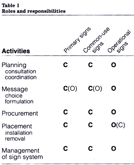
Table 1: Roles and responsibilities - Text version
| Activities | Primary Signs | Common-Use Signs | Operational Signs |
|---|---|---|---|
| Planning – Consultation Coordination | C | C | O |
| Message – Choice Formulation | C(O) | C(O) | O |
| Procurement | C | C | O |
| Placement – Installation Removal | C | C | O(C) |
| Management of Sign System | C | C | O |
Lease agreements
The custodian department is responsible for specifying and negotiating signage requirements for real property that is leased from the private sector. The lease or occupancy agreement should include a clause that permits the installation of appropriate identification and directional signs.
Project signs
The federal organization that manages a project is responsible for the sign that identifies it.
Treasury Board Secretariat
As stated in the policy, the Treasury Board Secretariat (TBS) provides functional leadership for the government’s corporate identity. It is also responsible for coordinating implementation. With respect to signage, TBS:
- develops or revises design standards and guidelines in consultation with the FIP Standing Committee on Sign Development (see below);
- ensures compatibility with national and international standards (e.g. graphic symbols) through liaison with the appropriate standards organizations; and
- monitors implementation of the sign system by assessing compliance with the policy and conformance with standards.
FIP Standing Committee
The FIP Standing Committee on Sign Development advises the Treasury Board Secretariat on all matters concerning government signage. The Committee develops and maintains design standards and addresses new government wide requirements. Enquiries concerning the Committee should be directed to the Administrative Policy Branch, Treasury Board Secretariat.
Planning and managing
Signage has a direct influence on the operation and appearance of government facilities and, therefore, should be planned. Ideally, signs should be seen as part of an environmental information system that helps users to understand their environment and guides them to their destination. Planning signage means interpreting the needs of users and defining operational requirements.
Creating a “readable” environment
Signs should provide clear, unambiguous answers to three questions: where am I and where am I going; how will I get there; how will I know when I have arrived. Good signage helps to explain the facility and, in a sense, answers questions before they are asked. A well-planned system enables people to find their destination readily and quickly, reducing the need to search or to ask questions.
All signs within a facility tend to interact, and the effectiveness of a system depends on all its components being consistent.
Planning the sign system for a facility
The following should be considered when planning a sign system:
- physical characteristics of the building or site;
- direction and type of traffic flow;
- means of access;
- needs of the user public;
- wayfinding;
- messages related to common services, health, safety and security;
- sequence, priority and grouping of sign messages;
- placement and installation of signs; and
- illumination of signs.
Consultation and coordination
The planning and management of signage involves functional areas that include:
- property management;
- facilities planning;
- health and safety; and
- security.
Standardization of operational signs
A department with a significant investment in signage may consider standardizing its operational signs. Standardization could improve communications, simplify procurement and reduce costs. Several departments (e.g. Public Works Canada; Transport Canada; and Revenue Canada, Customs and Excise) have taken steps to rationalize their signage requirements. These initiatives vary according to needs and may include the development of standard terminologies or messages, common sign formats and sizes, catalogues of sign products, or complete sign systems.
Maintaining a system
The dynamics of organizations will invariably affect their signage. Changes caused by reorganizations, relocations or new operations will call for additional messages, modifications or the removal of signs. Managing a system includes keeping information current and removing signs with messages that are obsolete or redundant.
The effectiveness of a system also depends on the physical appearance of signs. Periodic inspection and maintenance is needed to keep sign faces clean, and to repair or replace signs that are deteriorated or defaced.
Assessing a facility and its user public
Nature of the facility
The type of occupancy and the status of ownership of a facility normally influence decisions concerning signage. For example, several federal institutions may share a facility or it may be occupied by a mix of public and private sector organizations. Furthermore, the nature of the building or site may dictate decisions concerning the size and placement of signs.
Single or multi occupancy facility
The type of occupancy determines the signature that is used on the primary sign or directory board. The signature of the occupant organization identifies a facility that is occupied by a single organization. Those facilities shared by two or more federal organizations (multi occupancy facilities) are identified by the “Government of Canada” signature.
Crown owned or leased facility
The ownership of real property can affect decisions concerning the placement and installation of signs. This applies particularly to signs required for accommodation that is leased. (See “Roles and responsibilities” in this section). The installation of an exterior sign may be subject to restrictions (e.g. a municipal sign By law).
Signs provided by the lessor
There are cases where a lessor provides directional signs as a tenant service. Such signs would not be subject to government policy and design standards although they could, of course, refer to a federal institution.
Heritage buildings
Signs intended for a heritage building require special considerations. The dimensions of signs, their placement and the method of installation are critical factors in maintaining the visual integrity of such buildings. (See section 4.2, “Primary identification signs”, for more details on this topic.)
User public
A general knowledge of the user public is needed in order to determine sign requirements. While some signs will be required for operational reasons, others will help to direct or inform people who are unfamiliar with a site.
Facilities to which the general public has access include: federal buildings, regional and district offices, employment and immigration centres, passport offices, customs and taxation offices, land border facilities, health services facilities, schools, museums, passenger terminals, parks and waterways.
Facilities intended primarily for employees include: offices, workshops, laboratories, research stations, telecommunications facilities, construction sites, wharves and warehouses.
Service to the public
Government policy states that “Institutions must clearly identify real property occupied by organizational units that provide services directly to the public, and ensure that the signs make it easier to find these services.”
It follows that, to meet this objective, careful planning of signage for such a facility is required. The concept of “clear” identification pertains to the size and location of a sign (visibility), the relationship of the sign to the observer (legibility), and the wording of the message (clarity).
Real property accessibility
The Treasury Board policy entitled “Real property accessibility” sets out specific requirements with respect to signs. Appendix D of the policy defines the scope.
The national standard of Canada, CAN/CSA B651 M90, Barrier Free Design, includes design requirements and provides general guidance on the use of tactile characters or symbols. The Government of Canada adopted the CSA standard to help make its buildings and other facilities accessible and safely usable by persons with physical or sensory disabilities.
Graphic requirements
A comparison of the graphic requirements prescribed by the CSA standard and those of the Federal Identity Program indicates that the character proportions and the degree of colour contrast prescribed by the two standards are fully compatible.
Differences exist, however, with respect to ratios between character size and viewing distance. This means that the character size and, consequently, the size of the sign must be increased to ensure a proper degree of legibility for persons who are visually impaired. The placement of such signs is also critical and institutions should consult the CSA standard and relevant guidelines when making decisions on sign installations.
Graphic symbols
To ensure compatibility, the graphic symbols referred to by CSA have been included in the set of symbols of the Federal Identity Program. Exceptions are signs and symbols that identify parking spaces, since their design is subject to the Manual of Uniform Traffic Control Devices for Canada.
Tactile signs
Design standards for tactile messages are currently being developed to meet the requirements of the Treasury Board policy and the CSA standard. The aim is to integrate tactile messages into the sign system and to establish a uniform, coherent approach to both visual and tactile messages.
The government’s sign system
This section sets out an overview of the system, which includes primary identification, common use, operational and project signs. For a visual presentation of the system refer to the centrefold.
Design standards
The system is based on design standards that evolved from a review of national and international standards and an assessment of the needs and practices of the government (see also “Background” in this guide). The research included existing systems of architectural signage that were designed for venues such as transportation terminals, office complexes and international events. In defining the design standards, an effort was made to achieve an optimum balance between flexibility to respond to a variety of needs, and standardization to ensure cost effectiveness and uniformity.
Where applicable, the system is compatible with the national standard of Canada, CAN/CSA Z321, Signs and Symbols for the Occupational Environment, and international standard ISO 7001, Public Information Symbols.
Design standards prescribe the use of the system’s components and deal with the following aspects:
- corporate symbols;
- signage typeface;
- set of graphic symbols;
- directional arrow;
- sign layout; and
- use of colour.
The application of these standards results in a “visual language” unique to the sign system. (See the centrefold for an overview of the graphic components.)
Types of signs
Each type of sign has a specific function, as described below.
Primary identification sign
This is the first sign that identifies a federal facility and bears the signature and the wordmark. Depending on the type and location of the facility, the sign may be an exterior or an interior sign.
The advance sign is a sub type of the primary identification sign. It may be required to indicate distance or direction to a facility that is located off the main thoroughfare or farther along the road.
Common-use sign
A common use sign bears a message related to the facility itself; this sign would be required regardless of who occupies the premises. This type of sign includes area identification signs, directory boards, and signs related to health, safety, emergencies, and common services.
Operational sign
Based on the operational needs of the occupant organization, this type of sign includes directional and location signs, name plates, regulatory signs, and informational signs related to a service, facility, procedure or condition.
Project sign
A project sign provides on site information on government programs or projects, such as employment or public works. It is intended for short term use and has a life span of up to two years.
Standard signs
To meet government wide requirements, many commonly used signs have been standardized with respect to their message, design, size and materials. This standardization has brought about cost savings and has simplified procurement. At present, there are about 150 items included in section 4.3A, “Standard signs”. For information on ordering these signs, consult the Catalogue of signs of the Canada Communication Group.
Colour of signs
The system uses a set of standard colours that distinguish the different types of signs and their messages.
These colours form an integral part of the design standards and should be applied consistently. An overview is provided below; for details, see the pertinent sections of this manual.
The system’s basic colours are FIP dark grey and FIP light grey, the colours used for all primary identification signs. Directional and location signs, and directory boards, as well as informational signs, use FIP dark grey.
Signs that convey regulatory, warning, or emergency messages use colours that conform to national standards. As appropriate, the background colours are white plus red, black, yellow, red, or green. Signs conveying general information use blue or FIP dark grey, as appropriate.
Project signs feature colour bands that may be in FIP red, blue, green, or orange.
Standard colours
A reference system is used for the purpose of identification and colour matching. Previously, colours were identified in CGSB (Canadian General Standards Board) standard 1 GP 12, Standard Paint Colours. Due to the withdrawal of Parts I and II of that standard in 1991, the following reference system now applies.
Listed below are the colours used for the sign system. The numbers refer to colours included in a U.S. government publication entitled Federal Standard No. 595B, Colors used in government procurement.
- Red: 11120
- Orange: 12300
- Yellow: 13591
- Green: 14120
- Blue: 15092
- Dark grey: 26008
- Light grey: 26440
For information on the availability of swatches for purposes of colour matching, contact the Federal Identity Program (see “Enquiries”).
Weather-resistant product
A special weather-resistant product has been approved for exterior primary identification signs where it is used for the red flag in the wordmark. This 3M product is referred to as cast-in “tomato” red vinyl No.-180-13.
Using colour to assist wayfinding
As described above, the sign system employs colour to distinguish different types of messages. However, there may be cases where colour coding is used to identify specific areas and to assist wayfinding. When used for such purposes, it is recommended that no more than six colours be employed and that colour codes be applied in conjunction with other means, e.g. by reinforcing information through alpha or numeric codes. Because certain people will have difficulty in distinguishing colours, a total reliance on colour coding is considered impractical. When adopting colour codes, care should be taken to avoid possible conflict with the meaning established by the standard sign colours (e.g. a red sign normally indicates a message related to danger).
Perception of signs
The perception of a sign is governed by factors such as the viewing distance and angle, clarity of the message, reading time and speed of movement. All of these aspects influence an observer’s ability to perceive a specific sign, to read its message and to act upon it. This means that decisions about message length, and sign size and placement are interrelated.
Sign message
Much of the effectiveness of a sign depends on the formulation of the message. This calls for a good understanding of sign communications and for emphasis on the use of plain language. Section 1.2, entitled “Message”, describes the functional identification of government services under the heading “Sign communications”.
Most signs interact with others since few signs are seen in isolation. This raises the question of the relative importance of one message as opposed to another, or which sign should have priority. For example, signs related to health, safety or security should normally appear in prominence. Ideally, an environmental information system should indicate a structure or hierarchy that distinguishes important information from other messages. In other words, the content of the sign message may be the overriding factor when determining viewing distance and character size.
Viewing conditions
Important decisions such as the size of a sign and its location are influenced by the viewing conditions at the site, namely:
- the angle from which a sign would normally be viewed;
- the quality and intensity of the light available;
- possible obstructions of the sight lines between viewer and sign; and
- the visual environment behind or around the sign (e.g. other, competing signs or similar distractions).
Some of these factors may be beyond the direct control of the person planning the size and location of the sign, but two questions need to be answered:
- will the sign be conspicuous enough; and
- will the sign message be legible.
Viewing angle
Ideally, a sign should be placed at a right angle to the observer’s central line of vision; that is, the viewing angle should be nearly 90 degrees. The legibility of a sign message deteriorates when the viewing angle is less than 45 degrees.
Viewing distance and displacement
The placement of a sign should be determined in relation to the observer’s normal line of vision. Displacement is the distance between the centre of a sign and an observer’s central line of vision (measured at a right angle to the central line of vision). Ideally, the angle of displacement should be between 5 and 15 degrees (e.g., 0.25 m of displacement per 1.00 m of viewing distance provides an angle of approximately 15 degrees at the eye of an observer).
Viewing distance and character size
The decision concerning viewing distance and character size is important because it affects the sign’s legibility and ultimate size. Although the distance character size ratio is the major factor when determining character size, there are other factors that may call for a character size that is either smaller or larger. (See “Siting of signs”.)
The viewing distances referred to here are pedestrian related, which means that they are based on an observer who is standing or walking towards a sign. When determining the character size for a sign intended for vehicular traffic, the normal speed of traffic passing the sign becomes an additional factor.
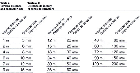
Table 2: Viewing distance and character size - Text version
| Viewing Distance | Character Size |
|---|---|
| 1 m | 5 mm |
| 2 m | 6 mm |
| 4 m | 8 mm |
| 6 m | 10 mm |
| 7 m | 12 mm |
| 9 m | 15 mm |
| 12 m | 20 mm |
| 15 m | 25 mm |
| 18 m | 30 mm |
| 24 m | 40 mm |
| 30 m | 50 mm |
| 36 m | 60 mm |
| 48 m | 80 mm |
| 60 m | 100 mm |
| 72 m | 120 mm |
| 90 m | 150 mm |
| 120 m | 200 mm |
Distance character size ratio
Table 2 shows the viewing distance and corresponding character size, which is intended for general guidance. It represents values applicable to normal viewing conditions and reading distances. The values are based on the signage typeface (see section 4.5).
When more than one character size is used on a sign, the viewing distance character size data should be applied to the main message, the largest size.
Traffic speed
When designing a sign intended for vehicular traffic, the 50 or 60 mm size should be considered for traffic speeds of up to 30 km/h; the 80 or 100 mm size for speeds of up to 50 km/h; and the 120, 150 or 200 mm size for speeds of up to 100km/h.
Illumination
Ease of perception of a sign depends to a large degree on the quality, intensity and colour of ambient light that falls on it. Generally, available ambient light should suffice, but operational or site conditions may call for special measures to be taken to ensure there are acceptable levels of illumination. The following aspects should be evaluated when determining siting and illumination.
Exterior signs
Nighttime visibility of a sign may be needed to facilitate access to services provided directly to the public (especially those located in northern regions). This may also apply in cases where a sign must be legible outside a facility’s regular hours of operation. A decision on the most appropriate lighting or illumination method (front illuminated, trans illuminated or use of retro reflective sign materials) should take into account both energy and cost efficiency.
Interior signs
Available ambient light is normally sufficient to illuminate interior signs. To minimize costs and to avoid additional lighting requirements, the placement of illumination should be coordinated with the siting of signs.
Special (battery operated) lighting may be needed for signs that must be visible during emergency conditions (such as a power failure). It is also important to provide proper illumination for signs bearing regulatory, warning or emergency messages, and to ensure effective recognition of safety colours. Certain illuminants, such as low and high-pressure sodium lamps and clear mercury vapour lamps, may distort colours under some circumstances. To avoid misinterpretation, supplementary illumination (e.g. by incandescent lamps) may have to be provided.
Siting of signs
Choosing a proper site is key to a sign’s effectiveness; the following points should be observed when determining the size and placement of a sign.
Sign dimensions
The ultimate size of a sign can be a critical factor and should be assessed during the planning process. This applies to exterior signs in particular, where environmental or aesthetic concerns should be part of the criteria that are considered in determining the size and location of a sign.
Both the character size and the length of the message determine the overall size of a sign. It follows that the size of a sign can be reduced by rephrasing the message or by selecting a different character size. There is a growing concern that oversized signs cause visual clutter.
Primary identification signs
The size of a primary identification sign should be based on two principles: the need to identify and the need to integrate. This means that a sign should communicate clearly but should also be of a size appropriate to the architecture or site that it is to identify. This is particularly important when a sign for a heritage building is being planned; the ultimate size and location of the sign should not lead to visual detraction.
The kind of facility to be identified will also influence decisions on the size of a primary identification sign. Clearly, the degree of prominence desired will vary from one kind of facility to another. For example, the sign for an office that provides services directly to the public should be made more prominent than one that identifies a facility that is not permanently staffed. A small sign (commonly referred to as a plaque) may be sufficient in the latter case.
Placement and installation
The placement of signs within a building or on a site involves these considerations: where signs should be located; how they should be installed; and, in the case of directional signs, how many should be provided.
Installation of signs: where and how?
Signs can be installed by various means. The methods of installation include the following: mounted on exterior or interior surfaces; erected on posts to be freestanding; suspended from ceilings or screens; mounted on wall brackets; or designed to be movable, such as a desk or counter sign. The nature of the facility or site, the message and type of sign, and the needs of the user public will suggest the most appropriate method of installation.
All signs should be displayed in a manner that is consistent throughout a facility. For example, directional signs should appear at the same height and, thus, become reference points that are readily noticeable. Uniformity of sign placement should be part of the planning process.
The need to convey several messages in a particular location may call for grouping the messages. This should be part of the planning process; it means combining these messages into one display or incorporating them into one sign layout. The objective is to avoid confusing clusters of different signs, all in one location.
Signs tend to modify their surroundings; their placement should be planned to integrate them into their environment. As applicable, factors such as landscape (terrain, vegetation) or architecture (surface, texture, colour, modules) should be fully considered when determining the installation of a sign.
Directional signs: how many?
Several factors influence decisions on how many signs will be needed to provide direction on a particular route. These include the nature of the environment (complexity), the distance between the starting point and the destination, and the number of decision points (intersections) on a route. Research has shown that signs should be located just before each decision point. When there are long distances between decision points, a message may need to be repeated, confirming the direction towards the destination.
The need to help the user public by providing information and direction should not be interpreted as a call for many signs. One problem of providing too many signs is that it creates too many reference points and, thus, diminishes essential information. Generally, the number of signs included in a well thought out sign plan will be fewer than in a plan that has not been carefully prepared.
Procuring services or sign products
Signage was previously a mandatory common service, provided by Supply and Services Canada. In , it became an optional common service. Federal institutions should ensure conformance with all applicable FIP design standards and specifications when they procure services or sign products either from a government service organization or directly from the private sector.
Procurement process
Except for those stock items available through catalogue orders, signs have to be designed and fabricated to meet specific requirements. This means that all information about the message, site and viewing conditions should be available before a sign layout and specifications can be prepared. The tasks of defining requirements and obtaining approvals should normally be supported by internal procedures and guidelines that complement the technical information provided in the FIP Manual.
When procuring sign products directly from the private sector, federal institutions are responsible for providing the sign manufacturers or consultants with the corporate symbols, standard typeface, graphic symbols, and all applicable guidelines, standards and specifications of the Federal Identity Program.
The Canada Communication Group (CCG), a special operating agency within Supply and Services Canada, provides services and sign products through standing offers with the private sector. Such services include the design, fabrication and installation of signs, as well as the planning of sign systems. The agency’s Catalogue of signs lists the products available and describes the components of the government’s sign system. Requests for a copy of the Catalogue and enquiries concerning the ordering of signs may be directed to the Signage Section of the Canada Communication Group.
Applicable policies and guidelines
This guide should be used with the following policies or guidelines:
Communications volume, Treasury Board Manual
- Communications policy (Chapter 1)
- Federal Identity Program policy (Chapter 2)
Real property management volume Treasury Board Manual
- Assignment of administration (Chapter 2)
- Real property accessibility (Chapter 6)
- Heritage buildings (Chapter 9)
Federal Identity Program Manual
- 1.0, Management guide to corporate identity
- 1.1, Design
- 1.2, Message
- 4.2, Primary identification signs
- 4.3, Common use and operational signs
- 4.4, Project signs
- 4.5, Signage typeface
Standards and references
Standards and specifications
A number of standards and specifications pertaining to signs, symbols and materials are referred to in the FIP Manual. They are brought together here to assist the reader.
Canadian General Standards Board (CGSB):
- 109.1M, Signage System, Extruded Aluminum, FIP
- 109.2M, Letters and Symbols, Die cut Film, FIP
- 109 GP 5MP, Signage Materials, Interior and Exterior.
Canadian Standards Association (CSA):
- CAN/CSA Z321, Signs and Symbols for the Occupational Environment
- CAN/CSA B651 M90, Barrier Free Design
- CAN/CSA Z234.4 89, All numeric Dates and Times.
U.S. Government Standard:
- Federal Standard No. 595B, Colors used in government procurement.
ISO (International Organization for Standardization):
- ISO 7001, Public Information Symbols.
Suggested reading
Arthur, Paul and Passini, Romedi, Wayfinding: People, Signs, and Architecture,McGraw Hill, Inc., New York, 1992.
Canada Communication Group, Catalogue of signs,Ottawa, 1992.
Cherry, Colin, On Human Communication, The MIT Press, Cambridge, Massachusetts, 1978.
Easterby, R.S. and Zwag, H.J.G., editors, Information Design, John Wiley and Son Ltd., Toronto, 1984.
Follis, J., and Hammer, D., Architectural Signing and Graphics,Whitney Library of Design, New York, 1979.
Frascara, Jorge, et al, “Environmental Information Systems”,Icographic, Vol. II, No. 1, Mobilia Press Aps, Denmark, 1982.
McLendon, Charles B. and Blackistone, M., Signage: Graphic Communications in the Built World, McGraw Hill, Inc., New York, 1982.
Passini, Romedi, Wayfinding in Architecture,Van Nostrand Reinhold Company Inc., New York, 1984.
Definitions
- Common-use sign (panneau d’usage courant)
- any sign with a message related to the facility itself. This type of sign remains valid regardless of changes in the facility’s occupants, e.g. a directory board, a sign relating to fire safety, and signs identifying rooms. (See also “operational sign”.)
- Design standard (norme graphique)
- the approved rules on the use of design elements outlined in the FIP policy. They prescribe elements such as shape, size, layout, colour, typography, and use of symbols.
- FIP signage (signalisation du PCIM)
- primary identification signs; common use signs; operational signs; and project signs. (Excluded are signs that are subject to a regulation that specifies their design.)
- Operational sign (panneau fonctionnel)
- any sign with a message related solely to the operational needs, and hence the responsibility, of the occupant institution. (See also “common use sign”.)
- Primary identification sign (panneau d’identification principal)
- the first sign that identifies a federal facility and bears the signature and the wordmark.
- Project sign (panneau de projet)
- a sign that provides information about federal programs or projects, e.g. public works or employment.
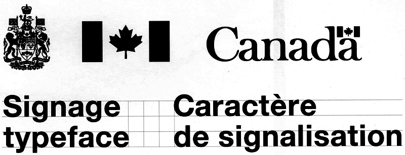
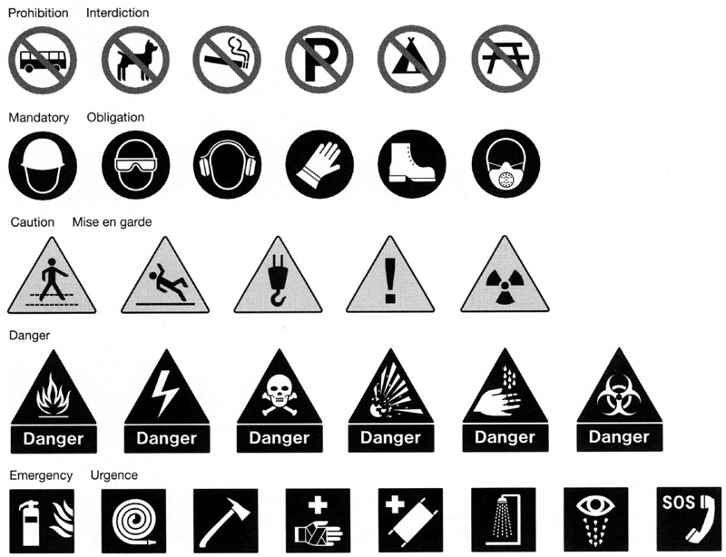
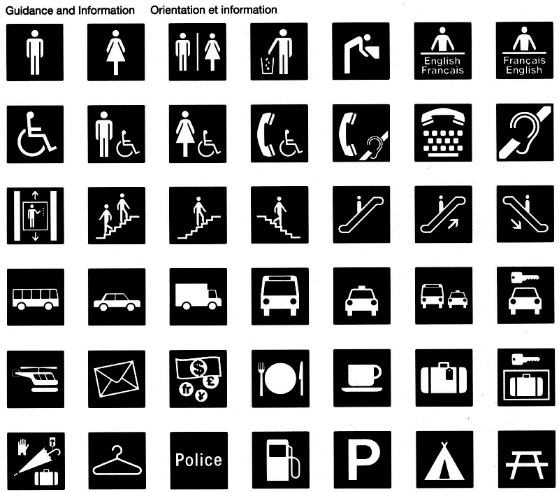
Primary identification signs
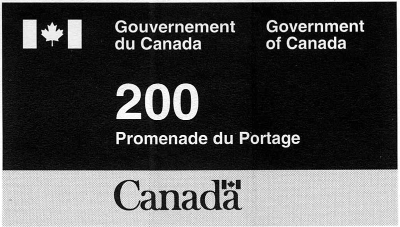

Common-use signs
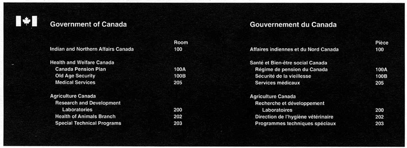
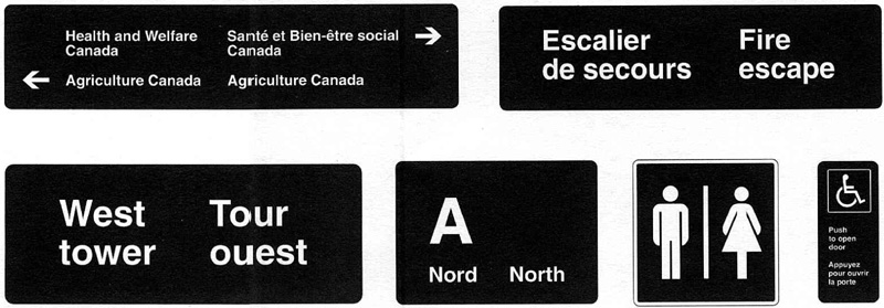
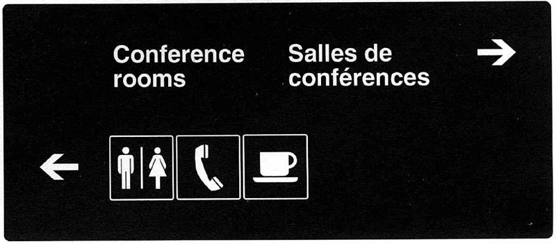
Operational signs


Project sign

Advance sign
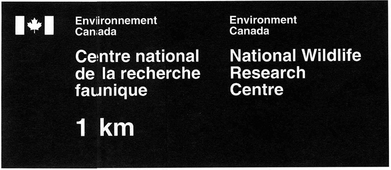
4.2 Primary identification signs
FIP Manual,
Introduction
The signs that identify the estimated 18,000 facilities of the government of Canada form an important aspect of the federal identity. This section clarifies FIP policy on the identification of federal facilities, sets out the design standards and provides guidance on how particular requirements may be met. It is intended for designers, facility planners, property managers and administrators.
This section should be used with Chapter 470, “Federal Identity Program” of the Administrative Policy Manual, and the key sections of the FIP Manual, 1.1, “Design” and 1.2, “Message”. The reading of section 4.1, “Signage”, is essential to the proper understanding of the subject.
Scope
Guidelines and standards set out the requirements for the design and production of primary identification signs. The purpose of such signs is to identify federal facilities and sites. Depending on the type of facility and its location it may be an exterior or an interior sign.
Determining the requirements
The requirements for a primary identification sign must be defined. Generally, each sign installation is unique, and should be planned by assessing the user requirements, the type of facility, the sign’s message, placement and method of installation. In certain locations, an advance sign that precedes the primary sign may be needed (Fig. 3).
Use of a primary sign
This is the first sign used to identify a federal facility and therefore appears near the entrance to a building, site or office (Fig. 1). Depending on the nature of the site, more than one primary sign may be needed to identify the principal points of access. Where the installation of an exterior sign is not feasible (e.g. leased accommodation) an interior primary sign is used instead.
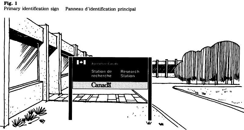
Use of an advance sign
A sub-type of the primary sign, the advance sign indicates the distance or direction to a facility that is located off the main thoroughfare or farther along the road (Fig. 2). Thus, an advance sign may convey either a change of direction, confirm the direction of travel or, where required, indicate a distance. It may be an exterior or interior sign and it is always located in advance of the primary sign.
In addition to the federal signature, the message may include a service title, the name of a facility, a directional arrow, or a distance. The message should be as concise as possible, emphasizing the direction or distance.
When indicating a direction on an advance sign, the standard arrow should be used. Rules on the application of the arrow are set out in section 4.3.
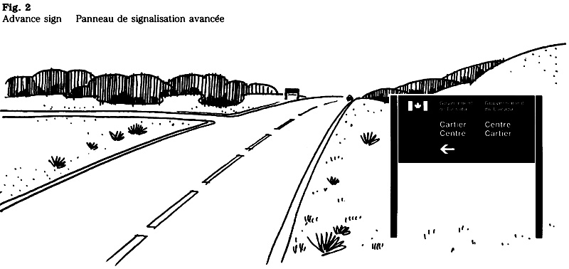
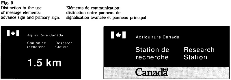
Method of installation
The building or site to be identified should be evaluated to determine the most effective method of sign installation. Possible restrictions on the sign’s dimensions or its placement become part of the design criteria and should be known before the layout stage. Generally, free-standing signs are preferred because they provide the most effective means of identifying a building. Where site conditions do not permit a free standing sign, a surface-mounted sign is used instead.
Free-standing sign
Generally, this method of installation is recommended for all exterior applications (Fig. 4). Where feasible, a sign should be installed perpendicular to the flow of traffic and therefore be double-faced. Where site conditions require the sign to be installed parallel to the roadway or building, a single-faced sign is used.
Surface-mounted sign
The majority of interior signs are surface-mounted. This method applies also to exterior signs that are designed to fit specific architectural details (e.g. fascia, transom) and to signs or plaques that are mounted on the surface of a structure (Fig. 5).
Although signs may be mounted on the glass of doors or partitions, no letters or symbols may be applied directly to transparent surfaces. The lack of an opaque background greatly reduces legibility.
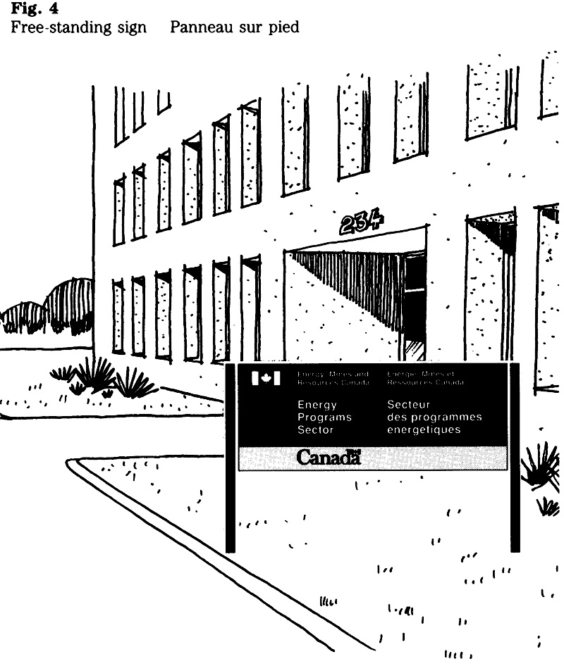
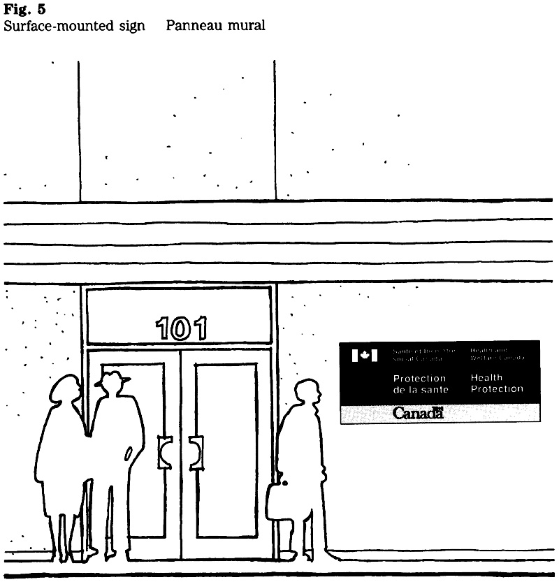
Signature, wordmark and titles
The key message elements on primary signs are the federal signature, the “Canada” wordmark and the titles of organizations and their services.
Federal signature
One of three layouts can be used for primary signs (Fig. 6). In most cases, a one- or two line signature is used. A three-line signature may be used for signs where horizontal space is limited, or where the length of the title requires it.
Flag symbol
For the reasons stated in section 1.1, the modified version of the flag symbol is used for all primary identification signs.
“Canada” wordmark
The medium-weight of the “Canada” wordmark is used for all primary signs (Fig. 7). Design standards prescribe the relative size and position of the wordmark within a sign layout.
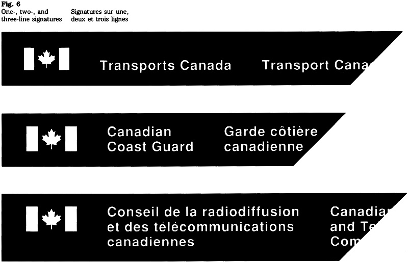

Titles of organizations
On all signs, organizations are identified by their applied title rather than by their legal title. Appendix A of Chapter 470 lists the applied titles that have been approved.
Use of service titles
The creation and use of service titles is described in section 1.2. Generally, a service title appears in conjunction with the name of the parent organization. In certain cases, however, it may also be used with the “Government of Canada” signature. Examples are signs for multi-occupancy buildings where the identification of a particular service or program would be more meaningful to the public than the name of the department; such as the service title “Passport Office” rather than “External Affairs Canada” (Fig. 8).
“Government of Canada” signature
This signature (Fig. 9) is used to identify facilities or sites shared by two or more federal organizations. If necessary, the occupant organizations may be identified below the “Government of Canada” signature.
Generally, a sign for a multi-occupancy facility identifies only those organizations that are subject to FIP. In cases where a building is shared with a federal organization exempt from FIP, that organization would normally use a separate sign.
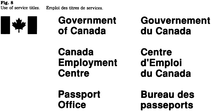

Message
Guidelines on the creation of messages for primary signs are set out in section 1.2, “Message”. Details on the message content of exterior and interior signs are provided below.
Exterior signs
Brevity of the message is particularly critical on signs that identify multi-occupancy buildings. Rather than identifying the different federal organizations, it is generally preferable to use the street address on the primary sign. In cases where the occupant organizations need to be identified, no more than three titles may appear on the exterior sign. When limiting the number to three, preference should be given to the titles of organizations that provide services directly to the public.
Where a multi-occupancy facility has a separate entrance serving one organization only, that entrance should have a primary sign identifying the federal organization concerned.
Interior signs
When required, an interior primary identification sign may include additional information such as a service title, floor or room number, and hours of operation (Fig. 10).
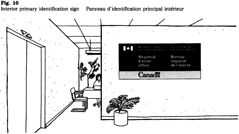
Design standards
To achieve consistency in the visual appearance of all primary signs, design standards have been established. These standards, which cover the layout, signage typeface, character sizes and colours, are set out below. For details on the use of the signage typeface consult section 4.5.
All measurements pertaining to the layout are based on the “x”, the unit of measurement used in signage. The character sizes are expressed in millimetres.
Signature layout
To attain visual balance between the symbol and the accompanying title, two size relationships have been established. Based on the number of lines used for the signature, these relationships are described below.
One-line signature
The ratio between the character size and the height of the flag symbol is 1:3 (Fig. 11). For example, when using the 50 mm character size, the height of the flag symbol must be 150 mm, or 3x.
Two-line and three-line signatures
The ratio between the character size and the height of the flag symbol is 1:3.4 (Fig. 12). For example, when using the 50 mm character size, the height of the flag symbol must be 170 mm, or 3.4x.
Size relationships
Table 1 shows the character size with the corresponding height of the symbol using the two ratios referred to above.
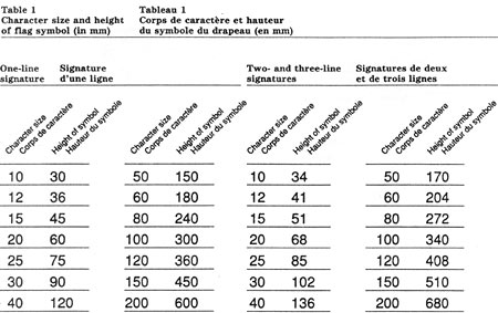
Table 1: Character size and height of flag symbol (in mm) - Text version
One Line Signatures
| Character size | Height of Symbol |
|---|---|
| 10 | 30 |
| 12 | 36 |
| 15 | 45 |
| 20 | 60 |
| 25 | 75 |
| 30 | 90 |
| 40 | 120 |
| 50 | 150 |
| 60 | 180 |
| 80 | 240 |
| 100 | 300 |
| 120 | 360 |
| 150 | 450 |
| 200 | 600 |
Two and Three-Line Signatures
| Character size | Height of Symbol |
|---|---|
| 10 | 34 |
| 12 | 41 |
| 15 | 51 |
| 20 | 68 |
| 25 | 85 |
| 30 | 102 |
| 40 | 136 |
| 50 | 170 |
| 60 | 204 |
| 80 | 272 |
| 100 | 340 |
| 120 | 408 |
| 150 | 510 |
| 200 | 680 |

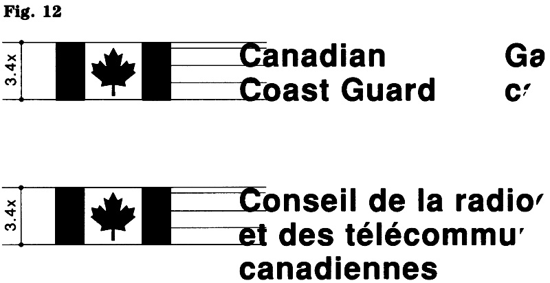
Character size ratios
Although a sign can be designed using only one character size, more than one size is generally needed to make the sign effective. By varying the size, emphasis is placed on the main message while secondary information is de-emphasized. Normally, two character sizes are used on a primary sign. If required, three different sizes can be used.
The most commonly used character size relationship is that of 1.5:1. It provides an effective layout with good legibility. Depending on message length and layout requirements, other ratios such as 1:1, 2:1, 3:1, etc. can be used (Fig. 13). The standard character sizes that can be combined on a sign when using a 1.5:1, 2:1 or 3:1 ratio are presented in Table 2.
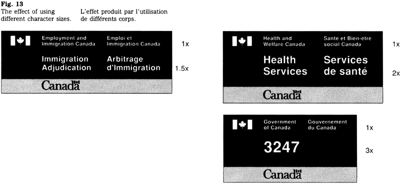
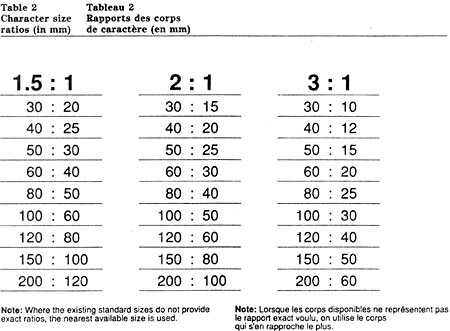
Table 2: Character size ratios (in mm) - Text version
| 1.5 : 1 | 2 : 1 | 3 : 1 |
|---|---|---|
| 30 : 20 | 30 : 15 | 30 : 10 |
| 40 : 25 | 40 : 20 | 40 : 12 |
| 50 : 30 | 50 : 25 | 50 : 15 |
| 60 : 40 | 60 : 30 | 60 : 20 |
| 80 : 50 | 80 : 40 | 80 : 25 |
| 100 : 60 | 100 : 50 | 100 : 30 |
| 120 : 80 | 120 : 60 | 120 : 40 |
| 150 : 100 | 150 : 80 | 150 : 50 |
| 200 : 120 | 200 : 100 | 200 : 60 |
Note: Where the existing standard sizes do not provide exact rations, the nearest available size is used.
For guidance on the selection of the appropriate character size, see “Viewing distance and character size” in section 4.1. For the convenience of the reader, the basic data have been included in this section as well (see Table 3).
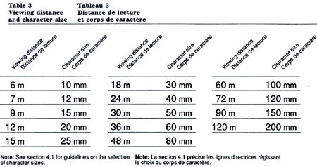
Table 3: Viewing distance and character size - Text version
| Viewing Distance | Character Size |
|---|---|
| 6 m | 10 mm |
| 7 m | 12 mm |
| 9 m | 15 mm |
| 12 m | 20 mm |
| 15 m | 25 mm |
| 18 m | 30 mm |
| 24 m | 40 mm |
| 30 m | 50 mm |
| 36 m | 60 mm |
| 48 m | 80 mm |
| 60 m | 100 mm |
| 72 m | 120 mm |
| 90 m | 150 mm |
| 120 m | 200 mm |
Note: See section 4.1 for guidance on the selection of character sizes.
Use of standard spaces
To achieve consistency among sign layouts and to assist with their preparation, standard spaces for the position of the graphic elements have been established. These spaces, expressed in number of “x”, are shown in Table 4. The term “message unit” refers to the signature or a paragraph. The application of standard spaces is indicated in Figure 14.
The minimum space referred to in Table 4 may be used to resolve minor problems related to the layout.
The application of the “Canada” wordmark is described elsewhere in this section (see figure 17).
Layout methods
A primary sign is laid out using one of two methods (see “Manual layout” and “Computer-aided layout”).
Regardless of the method used, the layout is based on the principle that the dimensions of a sign are determined by the length of the message and the character size used. Although this principle applies to the majority of sign layouts, there are cases that require a sign to fit a specific dimension. For guidance on preparing a layout for such signs see “Design variations”.
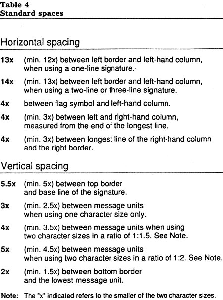
Table 4: Standard Spaces - Text version
Horizontal Spacing
| 13x | (min. 12x) between left border and left-hand column when using a one-line signature. |
|---|---|
| 14x | (min. 13x) between left border and left-hand column, when using a two or three-line signature. |
| 4x | between flag symbol and left-hand column. |
| 4x | (min. 3x) between left and right-hand column, measured from the end of the longest line. |
| 4x | (min. 3x) between longest line of the right-hand column and the right border. |
Vertical Spacing
| 5.5x | (min. 5x) between top border and base line of the signature. |
|---|---|
| 3x | (min 2.5x) between message units when using one character size only |
| 4x | (min. 3.5x) between message units when using two character sizes in a ratio of 1:1.5 (see note). |
| 5x | (min. 4.5x) between message units when using two character sizes in a ratio of 1:2 (see note). |
| 2x | (min. 1.5x) between bottom border and the lowest message unit. |
Note: the “X” indicated refers to the smaller of the two character sizes.
Manual layout
When preparing the layout, the use of grid paper is recommended (Fig. 14). The steps are:
- determine the most effective character size ratio between message units, Table 2;
- determine the character size required, Table 3;
- lay out the message elements by applying the number of “x” required, Table 4;
- determine the approximate sign dimensions by multiplying the number of “x” by the x-height of the character size used.
Computer-aided layout
The majority of sign layouts are prepared with the computer-aided layout system developed by Supply and Services Canada. The system permits the designer to explore various layout options, e.g. character size ratios and line breaks.
A layout is prepared by selecting the appropriate design program and entering the message. The preliminary layout is then modified to meet special requirements (e.g. limitations with respect to dimensions, relationship of layout to the standard blade sizes, and the availability of pre-spaced legends). The printout (Fig. 15) represents a simulated layout and, although it is not true in its proportions, indicates precise dimensions for fabrication and installation.
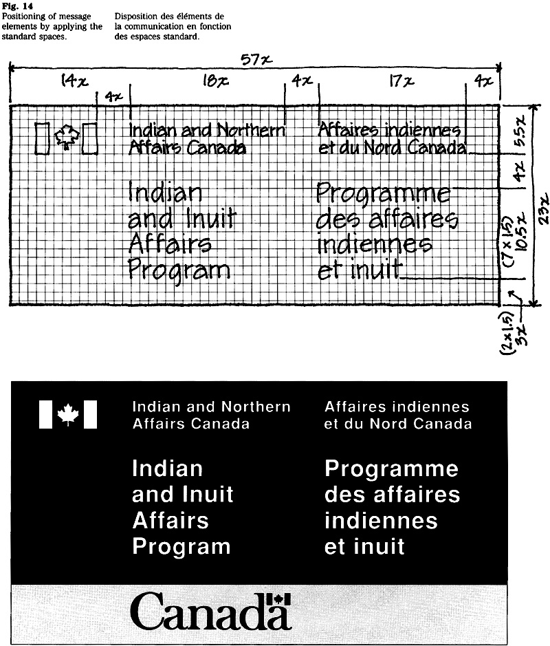
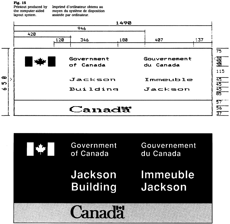
Relationship between dark grey and light grey areas
To achieve consistency in the appearance of all primary signs, the relationship between the dark grey and the light grey areas has been established (Fig. 16), The following procedure is used to determine the height of the light grey band bearing the “Canada” wordmark:
- prepare the layout for the federal signature and the sign’s message, including all margins;
- measure the height of this layout (i.e. the area that will appear in dark grey);
- calculate 30 per cent of that height;
- compare the result with the standard heights of the band shown in Table 5 and select the height that is closest to it; and
- select the corresponding x-height of the “Canada” wordmark shown in Table 5.
Example: A layout with a height of 1,025 mm would require a light grey band of 308 mm; i.e. 1,025 x 30 + 100 = 308. As shown in Table 5, the closest standard height for the band is 300 mm; the corresponding x-height of the wordmark is 113 mm.
Standard heights of the band
The standard blades of extruded aluminum for the FIP signage system (100 mm, 150 mm and 200 mm) form the basis for the standard heights of the light grey band. The heights shown in Table 5 apply to all signs, regardless of the material used for the substrate.
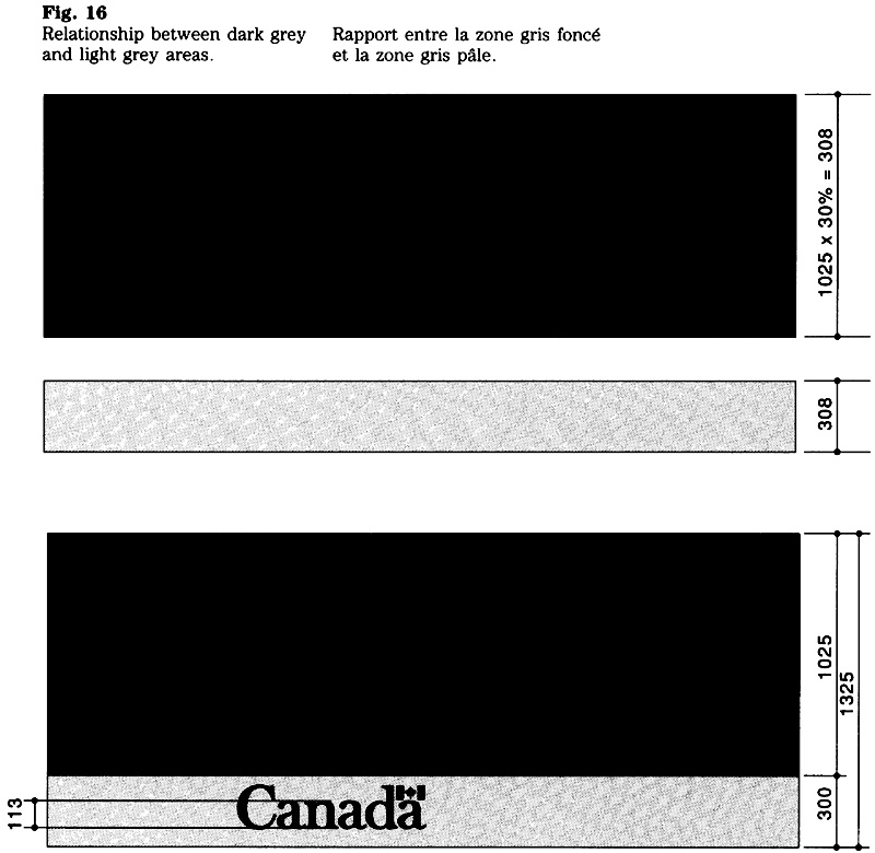
Relationship between height of band and word-mark
The x-height of the “Canada” wordmark has a precise relationship with the height of the light grey band. The corresponding sizes are shown in Table 5. If required, the x-height of the wordmark can be calculated by referring to Figure 17.
Position of wordmark
The position of the wordmark within the band is indicated in Figure 17.
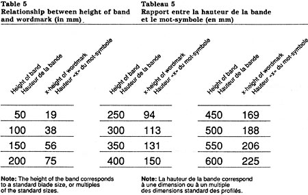
Table 5: Relationship between height of band and wordmark in mm - Text version
| Height of band | x-height of wordmark |
|---|---|
| 50 | 19 |
| 100 | 38 |
| 150 | 56 |
| 200 | 75 |
| 250 | 94 |
| 300 | 113 |
| 350 | 131 |
| 400 | 150 |
| 450 | 169 |
| 500 | 188 |
| 550 | 206 |
| 600 | 225 |
Note: The height of the band corresponds to a standard blade size, or multiples of the standard sizes.
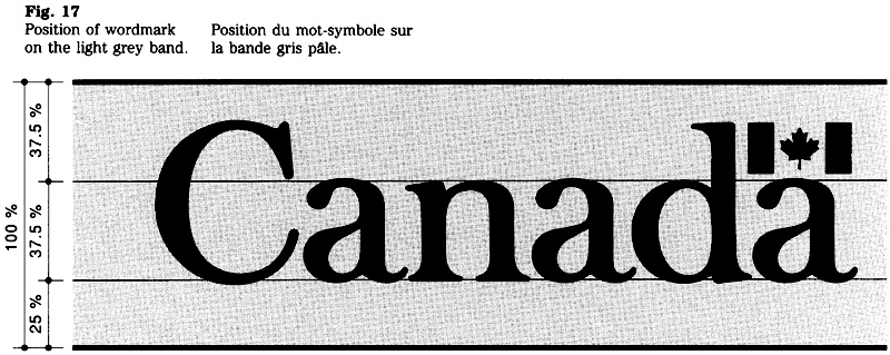
Standard colours
The numbers below refer to colours shown in CGSB 1-GP-12, Standard Paint Colours. The following standard colours are used for primary identification signs and shall be applied as indicated:
- FIP dark grey (No. 501-201) for the part of the sign bearing the signature and message;
- FIP light grey (No. 501-224) for the band bearing the “Canada” wordmark (this designation supersedes No. 401-303);
- white (No. 513-201) for the signature and message;
- black (No. 512-201) for the letters in the “Canada” wordmark;
- red for the flag in the wordmark (see below).
On all exterior primary signs, a special, weather-resistant product shall be used. it is specified as: 3M cast-in “tomato” red vinyl No. 180-13. For interior primary signs, the red is specified as: FIP red, No. 509-211.
Design variations
Certain variations from the design standards may be required when a primary, sign is to be installed in a special location such as a shopping centre. Variations in the use of colour or typeface are not permitted without prior consultation with the Administrative Policy Branch of Treasury Board Secretariat.
Layout modifications
There are instances where a sign must be designed to fit specific architectural details. Typical examples are fascias, transoms or other modular spaces at the side of or above entrances. To integrate a sign into such spaces may require modifications to the layout. In some cases it may simply mean an increase in the margin surrounding the layout to fit the sign to the architectural detail (Fig. 18). In other instances it may require a departure from the standard layout (Fig. 19). Design advice is available from the Administrative Policy Branch of Treasury Board Secretariat.
Note:
Certain signs for leased accommodation may be owned by the lessor and therefore be subject to the building owner’s signage standards. It follows that such signs cannot conform to FIP design standards.
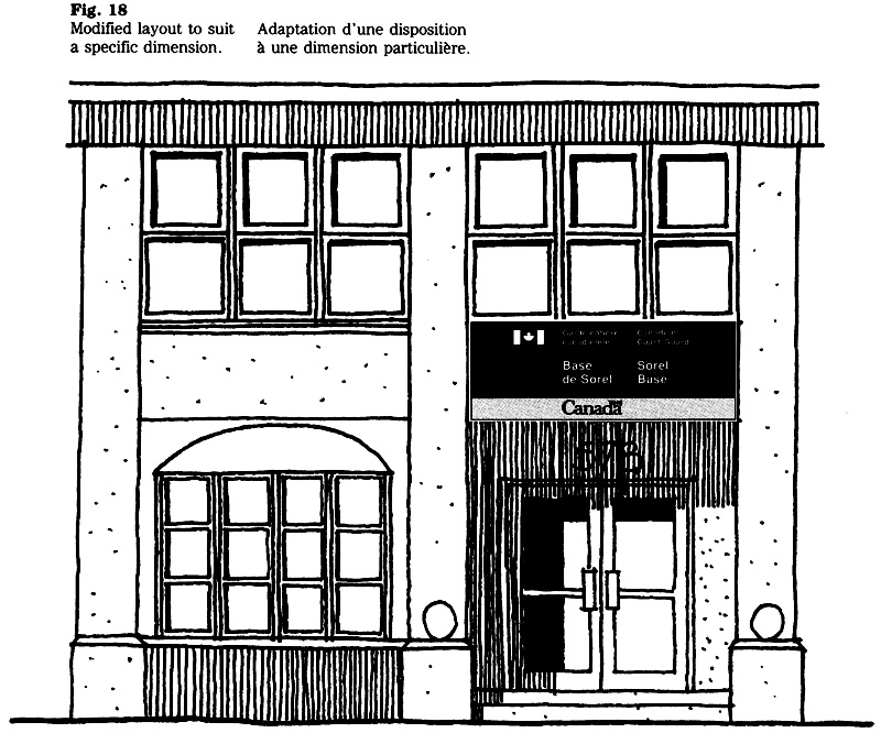
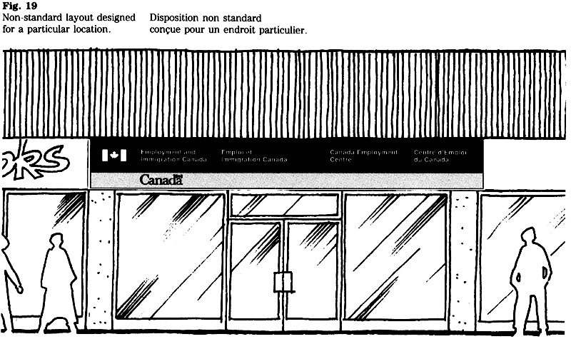
Special considerations
Heritage buildings
The planning of a primary sign for a heritage building requires special consideration. The size of the sign, its placement and the method of installation are critical factors in maintaining the visual integrity of such buildings.
Depending on site conditions, either a small freestanding sign or a surface-mounted sign (commonly referred to as a plaque) is recommended. Details of the proposed sign installation should be referred to the Federal Heritage Buildings Review Office of Environment Canada for approval.
Existing signs or inscriptions
There may be instances where the installation of a primary sign raises questions on the status of an existing sign, one that originated before the FIP became mandatory such as a metal plaque, building inscription or a Coat of Arms. Many of these signs were designed as an integral part of the architecture or as an ornament and should not be removed or obliterated when the primary sign is installed. Exceptions are cases where the wording on the existing sign would contradict the message of the new primary sign. Where a unilingual building name appears on the face of a building, it would not need to be altered, because the bilingual version of the name can be placed on the primary sign.
Material requirements
The following CGSB specifications apply to the production of all exterior primary identification signs and are mandatory:
- 109. 1M, Signage System, Extruded Aluminum, FIP
- 109.2M, Letters and symbols, Die-cut Film, FIP.
Although these specifications were developed for exterior signs, they may also be used for interior primary identification signs. In cases where a material other than the extruded aluminum blade system is required, it shall conform to CGSB 109-GP-5MP, Signage Materials, Interior and Exterior.
Reproduction of symbols
When preparing dies, films or other items needed for reproduction, the original artwork of the flag symbol and the “Canada” wordmark should be used. The Administrative Policy Branch of the Treasury Board Secretariat keeps the original artwork and will provide it upon request.
4.3 Common-use and Operational Signs
FIP Manual,
Introduction
Every government facility requires a variety of common-use and operational signs, such as directory boards, direction signs, name plates, and regulatory, warning, and informational signs. These signs form part of the FIP signage system and are subject to design standards which pertain to the layout, typeface, graphic symbols and colours.
This guide sets out the design of the different signs and provides guidelines on their application. It is intended for designers, facility planners, property managers and administrators. The installation of regulatory, warning and emergency related signs will require consultation with security and safety officers.
This edition of section 4.3 supersedes the version. It includes a new design standard for mandatory signs which was recommended by the Office of the Fire Commissioner of Canada (see p. 10).
Applicable publications
This section should be used with the following policies, guidelines or specifications:
Communications volume, Treasury Board Manual
- Chapter 1, Government Communications Policy
- Chapter 2, Federal Identity Program
Federal Identity Program Manual
- Section 1.0, Management guide to corporate identity
- Section 1.1. Design
- Section 1 .2, Message
- Section 4.1, Signage: system overview
- Section 4.5, Signage typeface
Canadian General Standards Board (CGSB)
- 1-GP-12, Standard Paint Colours
- 109-GP- SM, Signage Materials, Interior and Exterior
- 109-1M, Signage System. Extruded Aluminum, FIP
- 109 2M, Letters and Symbols. Die-cut Film, FIP
National and international standards for signs and symbols
Where applicable, the signs and symbols described in this guide conform to the following standards: National Standard of Canada CANCSA-Z32 1, Signs and Symbols for the Occupational Environment and ISO (International Organization for Standardization) Standard 7001, Public Information Symbols.
Use of corporate signatures
Corporate signatures are used on directory boards and, as required, on operational signs, regulatory signs and parking control signs.
Scope
Guidelines and standards set out the requirements for the design and production of common-use and operational signs. The purpose of such signs is to convey messages that inform, direct, instruct, regulate or warn users of a federal facility. Depending on the requirements, these can be exterior or interior signs.
Description of directory boards
The federal institutions, organizational units, programs and services located within a facility are usually indicated on a directory board. A standard directory board system has been adopted for government-wide use (Fig. 1).
The need to provide one or more directories depends on the nature of the building, the number of occupants and the type of services they provide. The use of a directional sign instead of a directory board may be more appropriate for a small facility with few occupants.
Generally, several directory boards are needed for a multi-storey building. A main directory board, containing general information, is placed in the building’s entrance lobby, and secondary directories are located at internal traffic junctions.
Corporate signature
The signature appears on all main and secondary directory boards (see note). If only one federal organization occupies a facility, that organization’s signature appears on the directory board. In the case of a multi-occupancy facility (one that is shared by two or more federal institutions), the “Government of Canada’’ signature is used.
Flag symbol
For the reasons stated in section 1.1, the modified version of the flag symbol is used for all directory boards (see Figure 2).
Note: The signature may be omitted on a secondary board, if the organization’s signature appears on the main directory board. The decision not to use the signature is at the discretion of the federal organization concerned.
Text
Guidance on the wording and organization of texts for directories is provided in section 1.2. When planning the message for a directory board, the following points should be considered:
- What information is essential to help visitors?
- What sequence is most appropriate for listing the occupants?
- Does the text relate to preceding or subsequent sign messages?
- Are terms and titles used consistently?
- How are the locations being identified (by floor number, room number, area designation, or directional arrow)?
Layout and design
The signature and text are presented in both official languages in a side by side layout. The column indicating the location appears to the right of each language (see Figure 1)
Presentation of the signature
A one-line signature is best suited for the layout of directory boards and should he used where feasible. A two-line signature is used for lengthy titles (Fig. 2).
See Table 6 for the relationship between the character size and the height of the flag symbol.
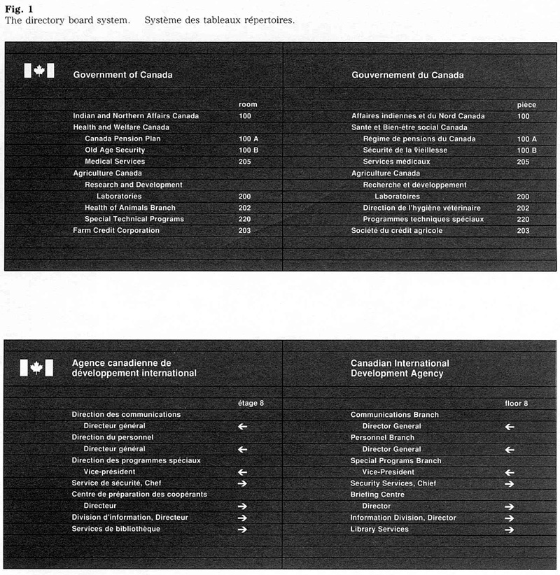
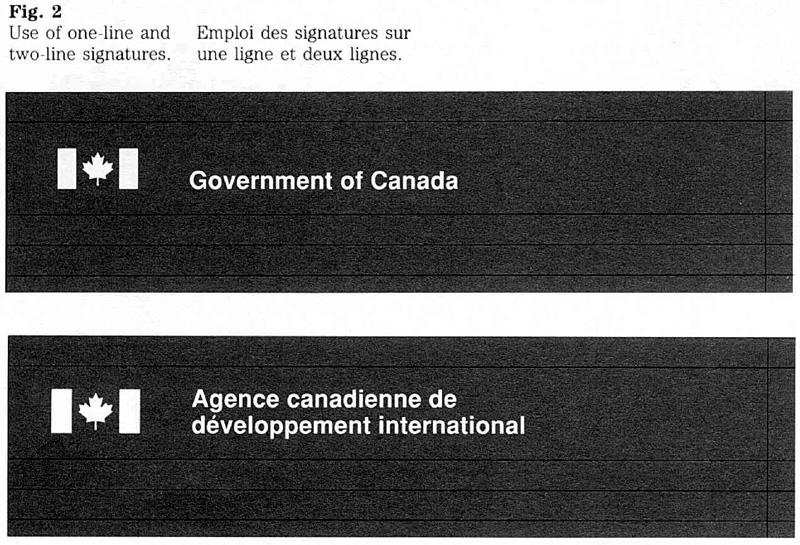
Layout of the text
The text for a directory board must be organized and structured to help users. The structure is indicated by means of blank lines, indentations, dots and line breaks (Fig. 3). The use of these methods is described below. All layout details should be shown on the directory board order form.
A blank line is used to separate different blocks of information.
An indentation is used for the second and subsequent lines of an item, or to indicate items that are secondary to a main title.
A dot can be used to emphasize an item. Placed at the start of a line, dots are useful when the text includes several levels that need to be distinguished.
Line breaks should be selected and indicated on the order form. Hyphenation should be avoided.
Character sizes
The directory board system has been designed to accommodate standard character sizes (Fig. 4). The character size for the signature is 10 mm, the size for all text is 8 mm. The standard size of the directional arrow is 16 mm. When a directory board is to be revised the use of the standard sizes is important.
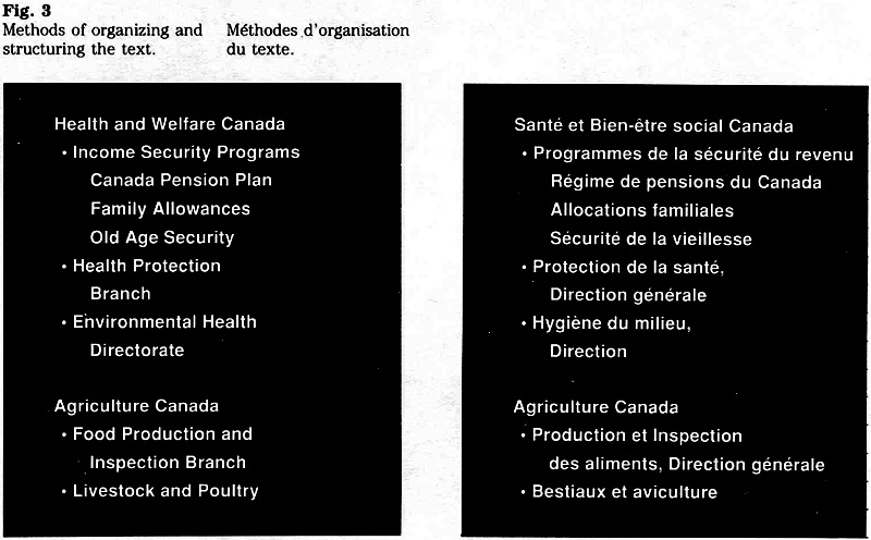

Directory board incorporating the wordmark
Normally, a directory board is preceded by the facility’s primary identification sign. However, in cases where the installation of a primary sign (exterior or interior) is not feasible, the directory board may serve as a primary identification sign and a directory. In such cases the “Canada” wordmark appears at the bottom of the board on a light grey blade (Fig. 5).
Directory board components
The directory board system uses modular blades. This accommodates texts that vary in length and facilitates updating. The directory boards are manufactured from aluminum extrusions, and consist of a “signature blade” and the narrower “text blades” (Fig. 6). The frames that support the blades are cut to the height required for a particular board normally, a directory board should consist of at least five ‘‘text blades’’ plus the ‘‘signature blade’’. A number of blank blades are usually provided at the bottom of each board to accommodate possible additions at a later date.
The aluminum extrusions are finished in FIP dark grey, the signature and text appear in white.
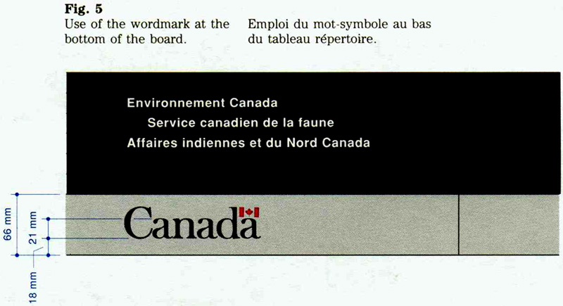
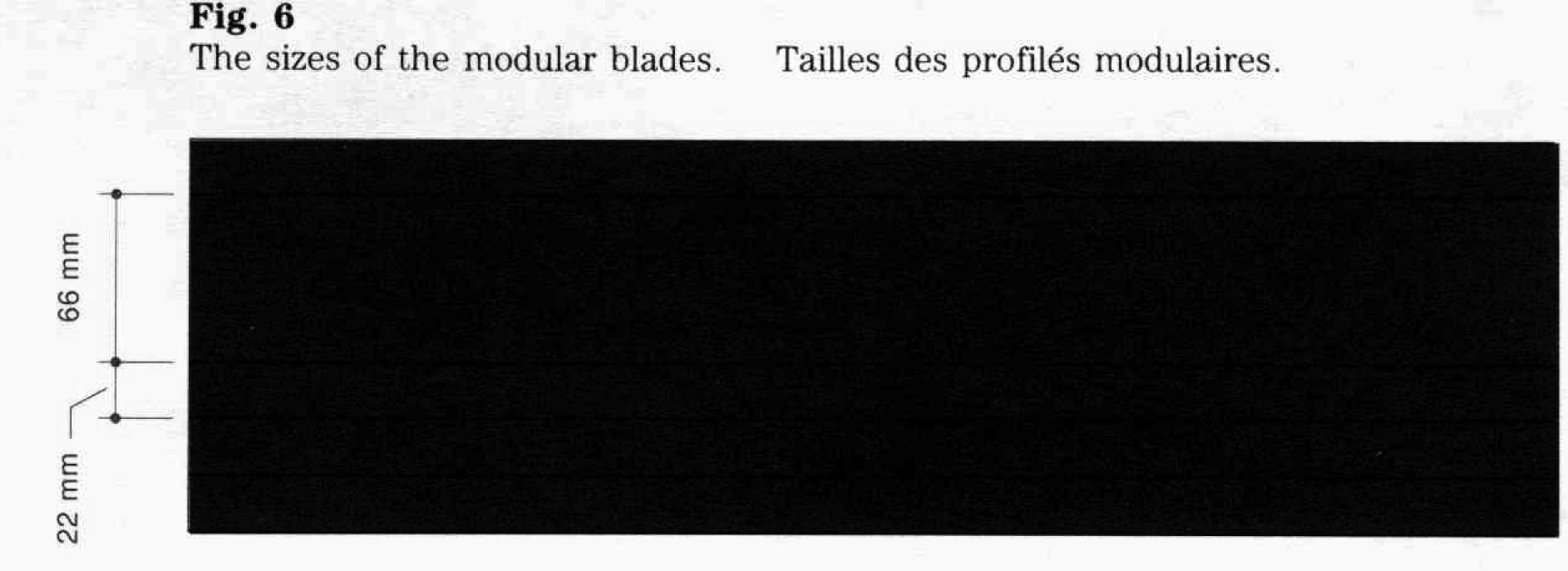
Description of signs
A great variety of common-use and operational signs is used in government facilities. Described below are direction and location signs, area identification signs, name plates, and signs that convey a regulatory, warning, or informational message.
Direction and location signs
These signs indicate the ‘‘direction to’’ or the ‘‘location of’’ a facility, service, organizational unit, etc. Direction signs are placed near decision points or along routes to a particular location. Location signs identify the destination.
A direction sign normally includes one or more arrows. As required, the message may refer to a particular area or a distance (Fig. 7).
A location sign bears a message that confirms the destination (Fig. 8).
The background colour of direction and location signs is FIP dark grey, the lettering is white.
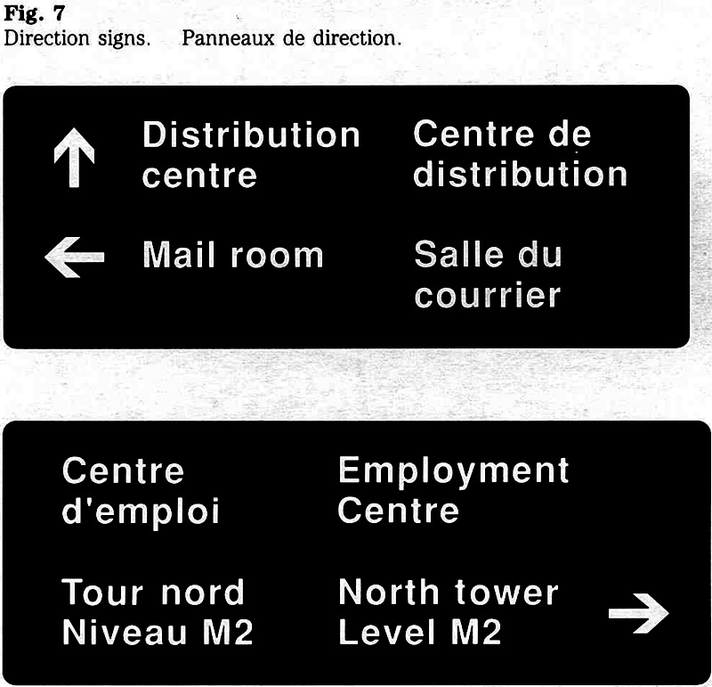

Area identification signs
These signs identify a specific section, zone, floor or room. Area identification signs form part of a system that helps users of a facility to orient themselves.
The sign’s message consists usually of a numeric or alphanumeric designation (Fig. 9).
The background colour of area identification signs is FIP dark grey, the lettering is white.
Name plates
A name plate identifies the occupant of a work station or room. A standard design has been adopted for government-wide use.
The name plate assembly consists of the backing piece and two blades: one to identify the location, and the other to bear the occupant’s name. Where a name must be accompanied by the occupant’s title, two plates are combined, as illustrated (Fig. 10).
The standard name plate accommodates up to 18 characters. The occupant has the choice of whether to use initials or to spell out the first name, but should bear in mind that a smaller character size must be used for names exceeding 18 characters.
The background colour of name plates is FIP dark grey, the lettering is white.
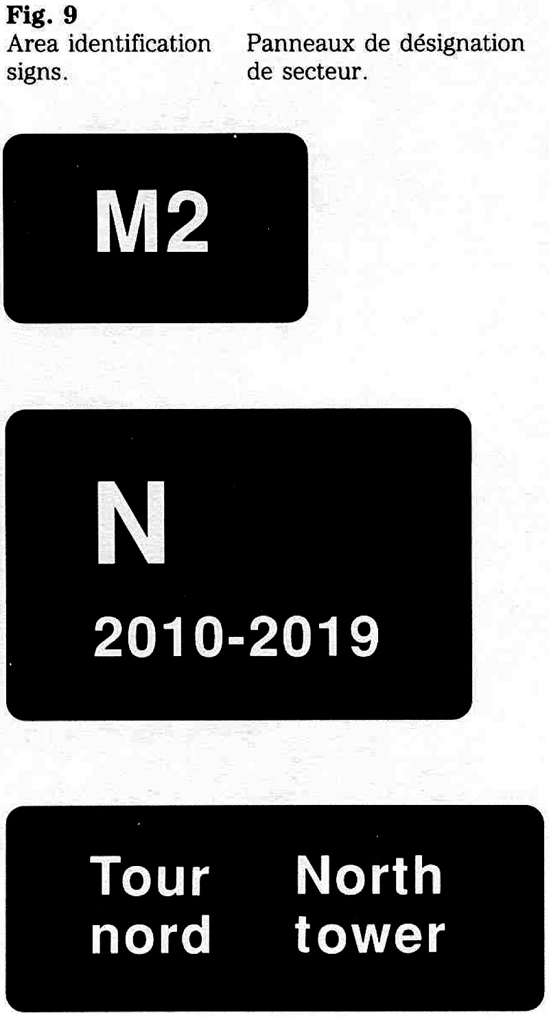
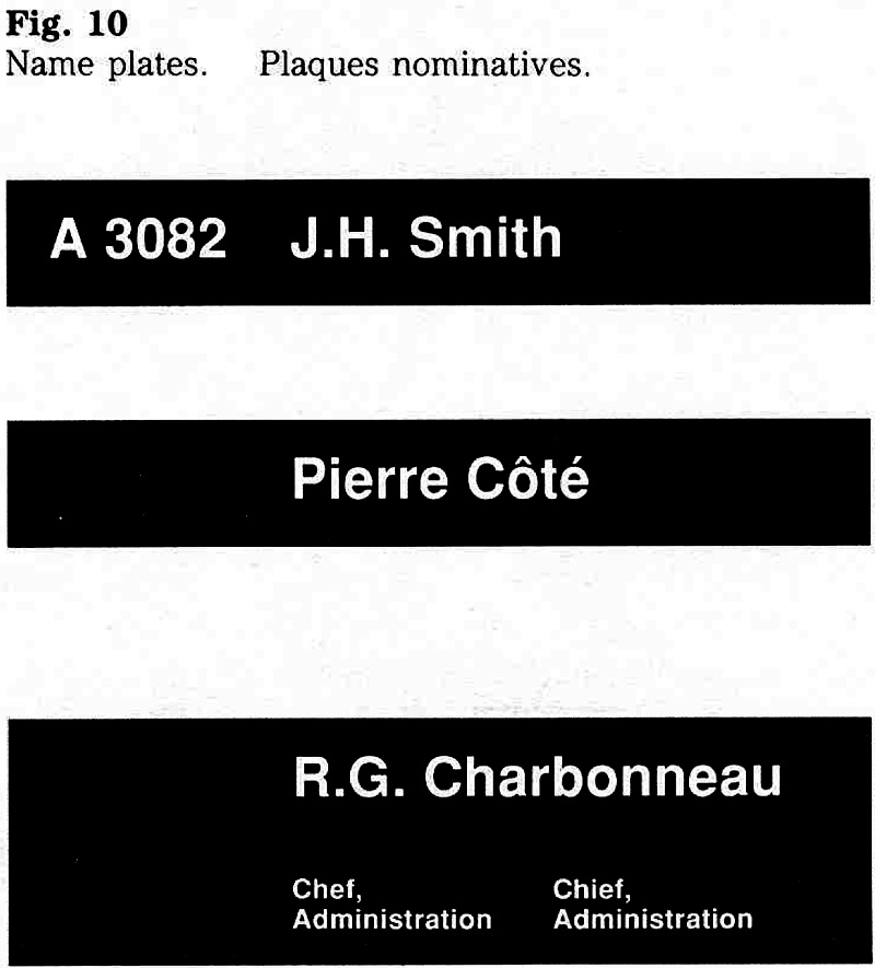
Regulatory, warning and informational signs
These signs are classified into six types according to function. Distinct colours help users to distinguish between the different types of signs (Fig. 11). The government’s system is based on the national standard, CAN/CSA-Z321, Signs and Symbols for the Occupational Environment
The classification, function and colours of the six sign types are set out in Table 1, specific features or design elements are described below.
Regulatory class
Regulatory signs convey an order (prohibition or mandatory) and are distinguished by a red border. Based on a sign height of 100 units, the specification for the border is as follows (see Fig. 11):
- 8 unit wide border - 1:12.5;
- 3 unit wide surround (space between the edge and the border) 1.33.3.
For example, a sign measuring 120 mm in height requires a 10 mm wide red border and a 4 mm wide surround. The measurements are rounded to the nearest millimetre.
Warning class
These signs include the word indicating the nature of time hazard (Fig. 11). The requirements are:
- messages indicating a potential hazard (type :3) begin with the word “Caution!”;
- messages indicating a definite hazard (type 4) begin with the word ‘‘Danger!’’.
Information class
This class includes the emergency sign (type 5) and the guidance and informal sign (type 6).
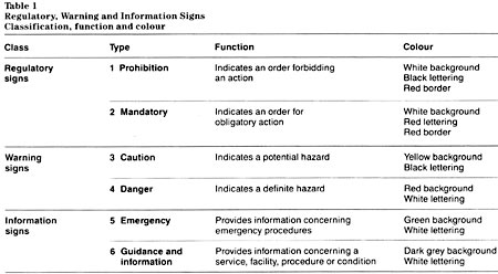
Table 1: Regulatory, Warning and Information Signs – Classification, function and colour - Text version
| Class | Type | Function | Colour |
|---|---|---|---|
| Regulatory Signs | 1 Prohibition | Indicates an order forbidding an action | White background, black lettering, red border |
| 2 Mandatory | Indicates an order for obligatory action | White background, red lettering, red border | |
| Warning Signs | 3 Caution | Indicates a potential hazard | Yellow background, black lettering |
| 4 Danger | Indicates a definite hazard | Red background, white lettering | |
| Information Signs | 5 Emergency | Provides information concerning emergency procedures. | Green background, white lettering |
| 6 Guides and information | Provides information concerning a service, procedure or condition | Dark grey background, white lettering |
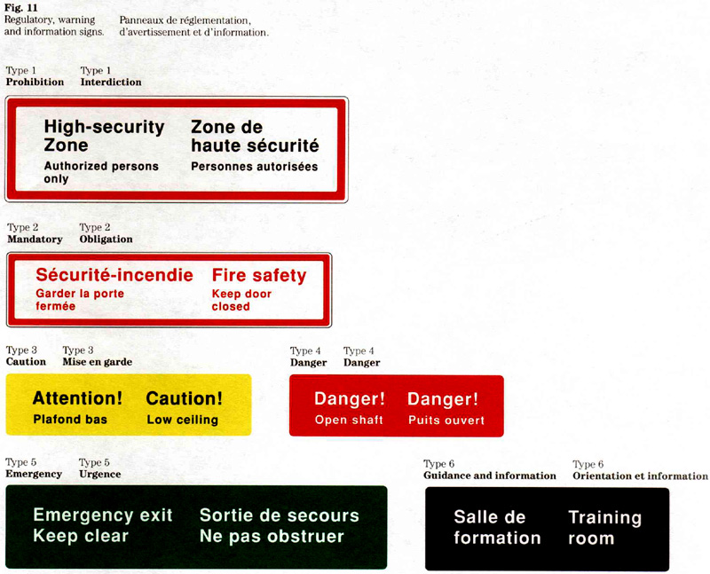
Parking control signs
To meet Public Works Canada’s signage requirements in parking facilities, a standard format has been developed. Each of these signs bears the “Government of Canada” signature to indicate the signing authority. Parking control signs use graphic symbols, text, or a combination of both (Fig. 12). The examples shown here indicate how the standard sign format can be used for messages related to parking (see note).
Design standards
The design standards for parking control signs cover the layout, signage typeface, graphic symbols and colours. The general message is contained in the main area of the sign. Specific information, such as directional arrows and permit numbers, is displayed in the lower, white area.
Colour is used as follows:
- the background of the main area is black, the lettering is white;
- the background of the lower area is white, the lettering is black;
- the “Parking” and “Access” symbols appear in white on a blue background;
- the ‘‘No parking” symbol appears in red and black on a white background.
Note: The standard format described here does not apply to regulatory signs such as ‘‘Stop’’, ‘‘One way” - or ‘‘Do not enter’’. These signs should conform to the Manual of Uniform Traffic Control Devices for Canada.

Layout of signs
Set out here are guidelines for preparing sign layouts. These guidelines cover the use of different character sizes, and the positioning of words, lines and columns of text. In view of the many factors affecting the design, judgement is required when applying these rules to a particular sign.
Layout and sign dimensions
Most layouts are designed on the basis of two factors, the length of the text and the size of the characters. This means that sign dimensions vary in accordance with these factors.
When a layout has to fit specific dimensions, the character size and the arrangement of the text become the variables. Examples of such layout requirements are the use of standard modular sign sizes for the production of a series of signs, or the need to design a sign to fit a specific architectural detail.
Use of character sizes
Although a brief message can be expressed using only one character size, more than one size if often needed to make a sign effective. By varying the size, the main message can be emphasized (Fig. 13). Normally, two character sizes are used on a sign.
For guidance on choosing the appropriate character size, see “Viewing distance and character size” in section 4.1. For the convenience of the reader, the basic data have been included in Table 2 below.
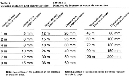
Table 2: Viewing Distance and Character Size - Text version
| Viewing Distance | Character Size |
|---|---|
| 1 m | 5 mm |
| 2 m | 6 mm |
| 4 m | 8 mm |
| 6 m | 10 mm |
| 7 m | 12 mm |
| 9 m | 15 mm |
| 12 m | 20 mm |
| 15 m | 25 mm |
| 18 m | 30 mm |
| 24 m | 40 mm |
| 30 m | 50 mm |
| 36 m | 60 mm |
| 48 m | 80 mm |
| 60 m | 100 mm |
| 72 m | 120 mm |
| 90 m | 150 mm |
| 120 m | 200 mm |
Note: See Section 1 .4 for guidelines on the selection of character sizes.

Character size ratios
The ratio of 1.5:1 is most common. To meet special layout on message requirements, other ratios such as 2:1 or 3:1 can be used. Figure 14 shows the effect of different ratios.
The standard character sizes that can be combined on a sign when using ratios of 1.5:1, 2:1 or 3:1, are indicated in Table 3.
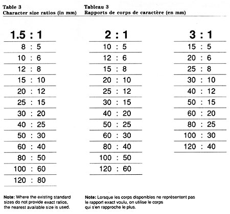
Table 3: Character size ratios (in mm) - Text version
| 1.5 : 1 | 2 : 1 | 3 : 1 |
|---|---|---|
| 8 : 5 | 10 : 5 | 15 : 5 |
| 10 : 6 | 12 : 6 | 20 : 6 |
| 12 : 8 | 15 : 8 | 25 : 8 |
| 15 : 10 | 20 : 10 | 30 : 10 |
| 20 : 12 | 25 : 12 | 40 : 12 |
| 25 : 15 | 30 : 15 | 50 : 15 |
| 30 : 20 | 40 : 20 | 60 : 20 |
| 40 : 25 | 50 : 25 | 80 : 25 |
| 50 : 30 | 60 : 30 | 100 : 30 |
| 60 : 40 | 80 : 40 | 120 : 40 |
| 80 : 50 | 100 : 50 | |
| 100 : 60 | 120 : 60 | |
| 120 : 80 |
Note: Where the existing standard sizes do not provide exact ratios, the nearest available size is used.
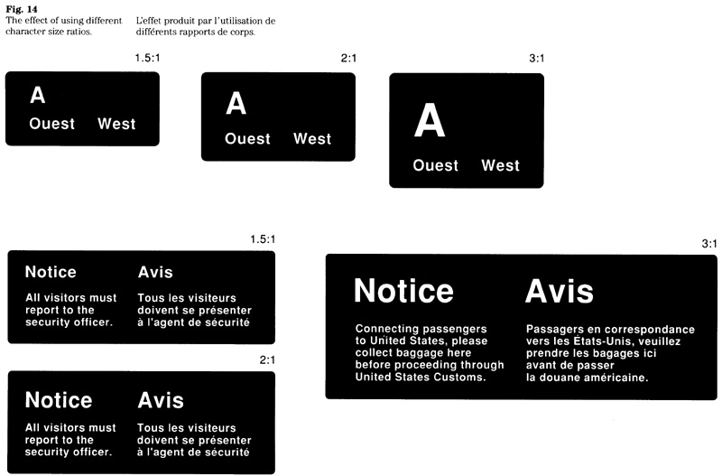
Text layout
All measurements pertaining to the layout are based on the “x”, the unit of measurement used in signage. The character sizes are given in millimetres.
A sign’s message units (words, lines and columns of text) are positioned according to standard spaces. To accommodate different viewing conditions, two sets of standard spaces apply. For signs using small character sizes (5 mm to 40 mm), the measures in Table 4 apply. For signs using large sizes (50 mm to 200 mm), refer to Table 5.
The minimum spaces referred to in Tables 4 and 5 may be required to achieve a balanced layout, to express spatial relationships, or to resolve layout problems.
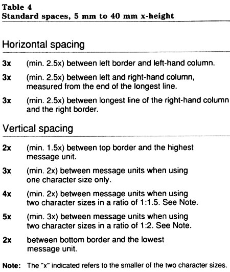
Table 4: Standard spaces, 5mm to 40 mm x-height - Text version
| 3x | (min. 2.5x) between left border and left-hand column. |
|---|---|
| 3x | (min. 2.5x) between left and right-hand column, measured from the end of the longest line. |
| 3x | (min 2.5x) between longest line of the right-hand column and the right border. |
| 2x | (min 1.5x) between top border and the highest message unit |
|---|---|
| 3x | (min 2x) between message units when using one character size only. |
| 4x | (min. 2x) between message units when using two character sizes in a ratio of 1:1.5. (see note). |
| 5x | (min. 3x) between message units when using two character sizes in a ratio of 1:2. See note. |
| 2x | between bottom border and the lowest message unit. |
Note: the “X” indicated refers to the smaller of the two character sizes.
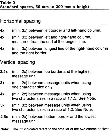
Table 5: Standard spaces 50 mm to 200 mm x-height - Text version
| 4x | (min. 3x) between left border and left-hand column. |
|---|---|
| 4x | (min. 3x) between left and right-hand column measured from the end of the longest line. |
| 4x | (min. 3x) between longest line of the right-hand column and the right border. |
| 2.5x | (min. 2x) between top border and the highest message unit. |
|---|---|
| 3x | (min. 2x) between message units when using one character size only. |
| 4x | (min. 2x) between message units when using two character sizes in a ratio of 1:1.5. (see note). |
| 5x | (min. 3x) between message units when using two character sizes in a ratio of 1:2. See note. |
| 2.5x | (min. 2x) between bottom border and the lowest message unit. |
Note: the “X” indicated refers to the smaller of the two character sizes.
Layout methods
Sign layouts can be prepared manually or with the aid of a computer. The two methods are described below.
Manual layout
The use of grid paper is recommended (Fig. 15). The steps are:
- establish the character size on the basis of the sign’s viewing distance, Table 2;
- determine the most effective character size ratio if more than one size is used. Table 3;
- lay out the message elements by referring to the standard spaces; use Table 4 or 5, as appropriate.
The approximate dimensions of the sign are determined by multiplying the number of “x” by the character size used. (Consult section 4.5 for details on calculating sign dimensions.)
Computer-aided layout
The majority of sign layouts are being prepared with the computer-aided layout system developed by Supply and Services Canada. The system permits the designer to explore various layout options, such as character size ratios and line breaks.
A layout is prepared by selecting the appropriate design program and entering the message. The printout (Fig. 16) represents a simulated layout and, although it is not true in its proportions, indicates precise dimension for the purpose of fabrication.
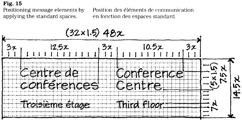
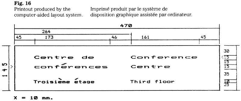
Layout modifications
There are cases where a sign must be designed to fit specific architectural details. Typical examples are modular spaces at the side of or above entrances. In some cases, a layout can be modified by simply increasing the margins surrounding the message (Fig. 17). In other instances, a restructuring of the text, or the use of different character sizes may be necessary to achieve a sign that fits.
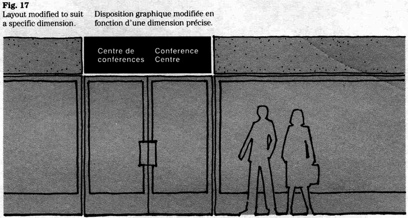
Signature layout
One of three layouts can be used for the signature in most cases, a one or a two-line signature is used. A three-line signature may be required on a sign where horizontal space is limited, or where the length of the title requires it (Fig. 18).
For the reasons stated in section 1.1, the modified version of the flag symbol is used whenever a signature appears in white on a dark background.
One-line signature
The relationship between the character size and the height of the flag symbol is 1:3. For example, when using the 10 mm character size, the height of the flag symbol must be 30 mm, or 3x.
Two-line and three-line signatures
The relationship between the character size and the height of the flag symbol is 1:3.4. For example when using the 10 mm character size, the height of the flag symbol must be 34 mm or 3.4x.
Size relationships
Table 6 shows the character size with the corresponding size of the flag symbol using the ratios referred to above.
Spacing
The space between the flag symbol and the left hand column, and between the language columns, is based on the character size of the particular signature. Subject to specific layout requirements, the following spaces apply:
- 3x for small sizes (5 to 40 mm);
- 4x for large sizes (50 to 200 mm).
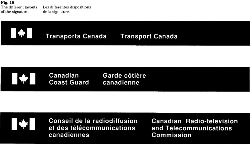
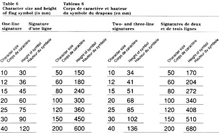
Table 6: Character size and height of flag symbol (im mm) - Text version
| Character Size | Height of Symbol |
|---|---|
| 10 | 30 |
| 12 | 36 |
| 15 | 45 |
| 20 | 60 |
| 25 | 75 |
| 30 | 90 |
| 40 | 120 |
| 50 | 150 |
| 60 | 180 |
| 80 | 240 |
| 100 | 300 |
| 120 | 360 |
| 150 | 450 |
| 200 | 600 |
| Character Size | Height of Symbol |
|---|---|
| 10 | 34 |
| 12 | 41 |
| 15 | 51 |
| 20 | 68 |
| 25 | 85 |
| 30 | 102 |
| 40 | 136 |
| 50 | 170 |
| 60 | 204 |
| 80 | 272 |
| 100 | 340 |
| 120 | 408 |
| 150 | 510 |
| 200 | 680 |
The directional arrow
The arrow is one of the most commonly used symbols in the signage system. To ensure that it is applied effectively, the following rules have been developed.
Standard arrow design
A design that conforms with ISO Standard 7001 has been adopted for the FIP signage system. The arrow can be used to indicate eight different orientations (Fig. 19).
Size of the arrow
As required, the size of the arrow can be 2x, 3x, 4x or 5x of the x-height used for the sign message (Fig. 20).
Applying the arrow
The directional arrow always functions in conjunction with a message and therefore must be integrated into the layout. This means that the appropriate size and position of the arrow needs to be determined.
To help position it in a layout, the arrow is used within a square module as illustrated (Fig. 21).
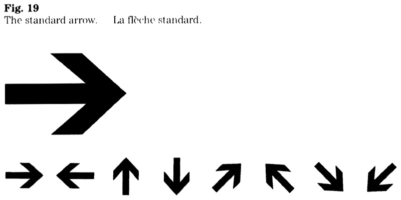
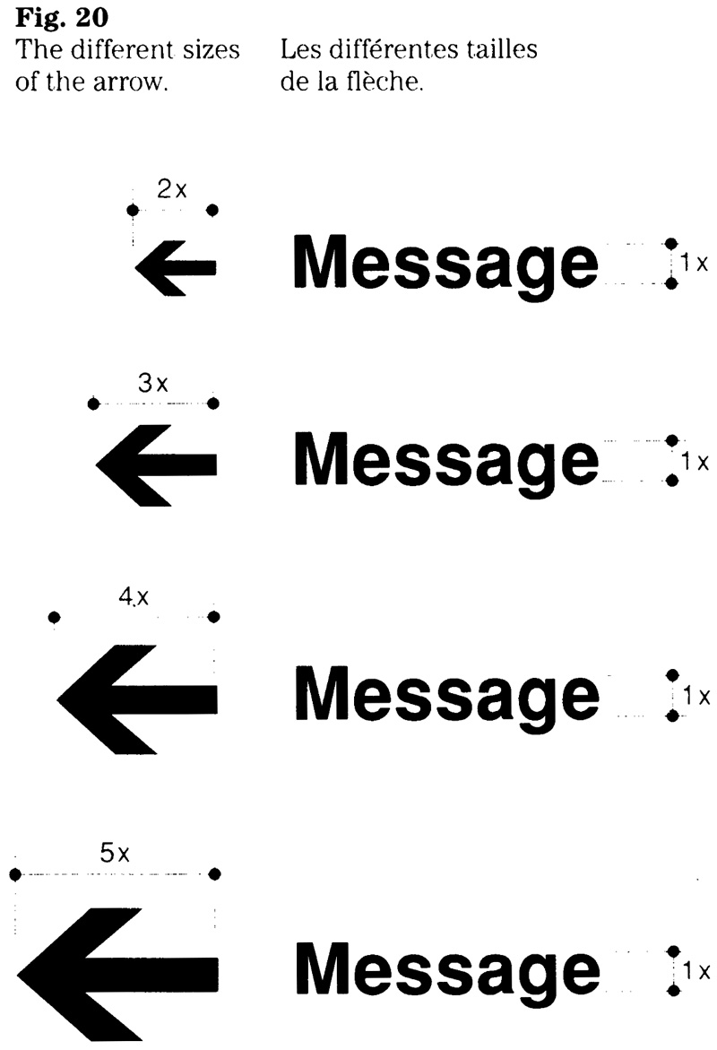
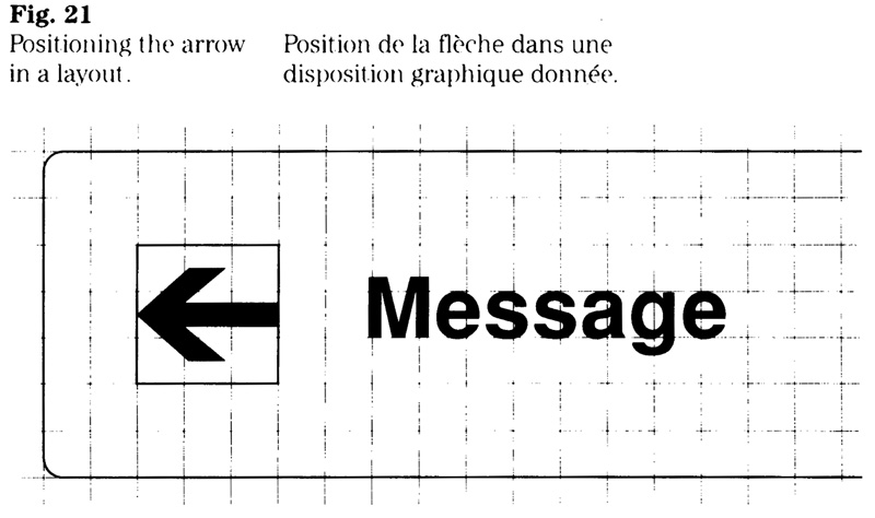
Selecting the size of the arrow
The selection of an appropriate arrow size in relation to the character size depends on how the arrow is used. When the arrow appears with each of the two language columns, a 2x or 3x arrow should be used. In cases where one arrow must serve both language columns, a 3x, 4x or 5x arrow should be applied. The effect of the different sizes is shown in Figure 22.
When only one arrow is used, its size should be 3x for an interior sign and 4x or 5x for an exterior sign. Furthermore. the large arrow sizes should be used for signs related to vehicular traffic.

Position of the arrow
The arrow’s position within a layout generally depends on the number of different directions to be indicated, and whether arrows are used with each language column or whether one arrow is used to serve both language columns.
When preparing a layout, careful consideration should be given to the size of the arrow and its position in relation to the message. The object is that the reader of either of the two official languages should be readily aware of the direction. Subject to specific requirements, one or more of the following options will apply (Fig. 23):
- using only one arrow in a size appropriate for the layout;
- using an arrow with each language column;
- placing the arrow on either the left side, the right side, or below the message; or
- arranging a series of arrows in a column at the right (or left) of each language column.
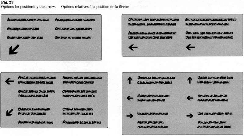
Orientation and position
The interaction between the message, the arrow and its orientation should be considered in each case. Generally, the perception of a message can be improved by placing the arrow in relation to where it is pointing. This is based on the principle that an arrow should appear to “pull” (not “push”) the message (Fig. 24). This rule applies particularly to signs where quick comprehension of the change in direction is essential.
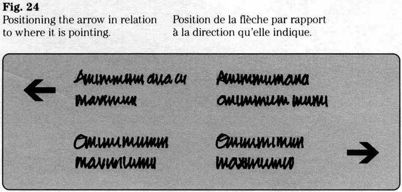
How to indicate straight ahead
Because no special symbol exists to convey “straight ahead”, either the “up” or the “down” arrow is used. This can, however, cause confusion in the mind of viewers who may interpret the direction as “up” or ‘”down” instead of “straight ahead”. The following rules are intended to avoid this kind of misinterpretation.
The choice between the “up” and “down” arrow should be based on the sign’s placement and the method of installation (Fig. 25). For signs that are installed at or below eye level, the “up” arrow should be used. For signs that are installed above eye level, the “down” arrow is recommended. Examples of the latter kind are interior, ceiling-suspended, and exterior, overhead signs.
Before deciding whether to use an “up” or a “down” arrow, the proposed location should be evaluated.
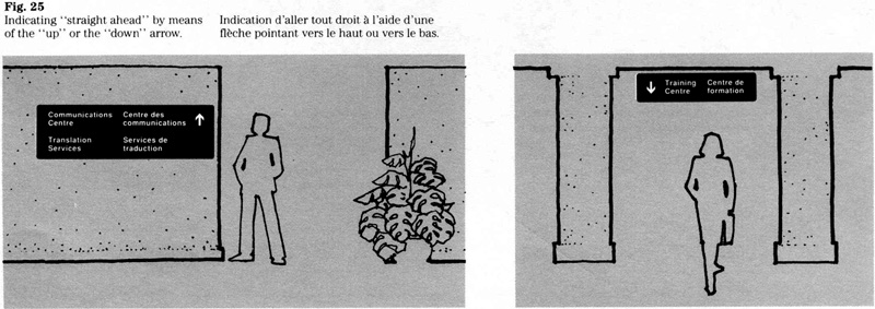
The arrow as a separate sign
A separate, self-contained “arrow sign” has been developed for use with the standard signs included in section 4.3A. By means of a modular, square substrate, these “arrow signs” allow message and direction, to be displayed in a variety of ways. Figure 26 indicates how the “arrow sign” should be installed.
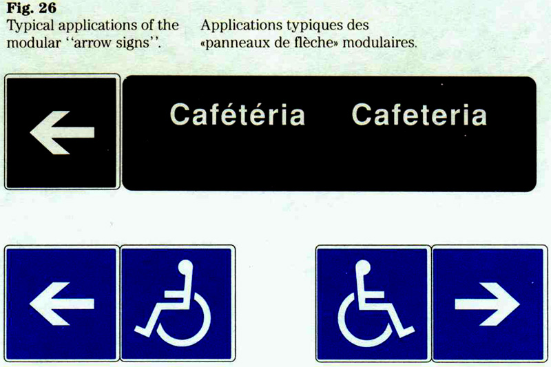
Graphic symbols
The government’s set of symbols
Described here is the set of graphic symbols adopted by the Government of Canada. It was first published in 1980 under the title “Graphic symbols for public areas and occupational environments”.
Developed for government-wide use in the FIP signage system, the symbols are intended to meet the general requirements of federal institutions. The set includes regulatory warning and information symbols.
During initial development, the existing standards and practices in Canada and other countries were reviewed. The principles established by Committee Z32l of CSA (Canadian Standards Association) and Committee TC145 of ISO (International Organization for Standardization) were adopted, and the following national amid international standards have been applied:
- CAN/CSA-Z321, Signs and Symbols for the Occupational Environment;
- ISO 7001, Public Information Symbols.
Details on each symbol are set out in section 4.3A. A general description of the set of symbols is provided below.
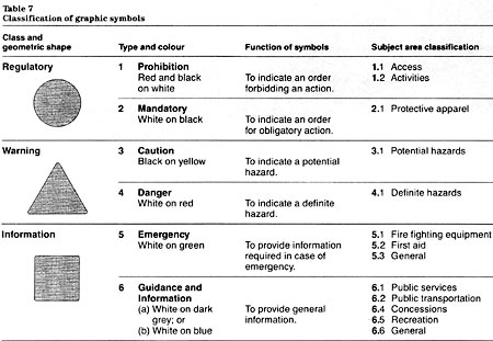
Table 7: Classification of graphic symbols - Text version
| Class and Geometric Shape | Type and Colour | Function of Symbols | Subject area classification |
|---|---|---|---|
| Regulatory – Circle | 1. Prohibition – red and black on white | To indicate an order forbidding an action. |
|
| 2. Mandatory – white on black | To indicate an order for obligatory action. | 2.1 Protective apparel | |
| Warning – Triangle | 3. Caution – black on yellow | To indicate a potential hazard. | 3.1 Potential hazards |
| 4. Danger – white on red | To indicate a definite hazard. | 4.1 Definite hazards. | |
| Information – Square | 5. Emergency – white on green | To provide information required in case of emergency. |
|
6. Guidance and Information
|
To provide general information. |
|
Objectives
The government’s set of symbols is based on the following objectives:
- to provide users of government facilities with uniform, easily learned and understood graphic symbols;
- to harmonize the symbols with those developed by national and international standards organizations;
- to achieve as much visual coherence as possible within the FIP signage system; and
- to effect cost savings through standardization.
The FIP Standing Committee on Sign Development maintains and develops the design standards in accordance with the above objectives. Enquiries should be directed to that committee, c/o Administrative Policy Branch, Treasury Board Secretariat.
Shape, colour and classification
The system of symbols is based on the consistent use of geometric shapes and specific colours. These shape and colour codes permit users to distinguish between the six types of symbols. The shape, colour, function and subject area of each type are indicated in Table 7.
Design standards
Design standards prescribe the shape, colour and image content of symbols. Other aspects, such as the size relationship of shapes, the proportion of the bonder, and the production sizes, have also been standardized.
Size relationship of shapes
A specific size relationship between the three shapes has been established (Fig. 27). It is based on the need to compensate for differences in the surface area and apparent size of the three shapes. The relationship is as follows:
- diameter of the circle, 80 units;
- base of the equilateral triangle, 100 units;
- height of the square, 75 units.
To establish a simple range of sizes for the symbols, all sizes have been based on the height of the square. Thus, the standard sizes are actual for any square symbol, but nominal for symbols using a circular or triangular shape.
Proportion of the border to the shape
To delineate the shape. all symbols are surrounded by a border 2 units wide. The relative proportion of the border to the shapes is as follows:
- 1:40 for the circle of 80 units measured on the diameter;
- 1:50 for the triangle of 100 units measured on the base:
- 1:38 for the square of 75 units measured on the height.
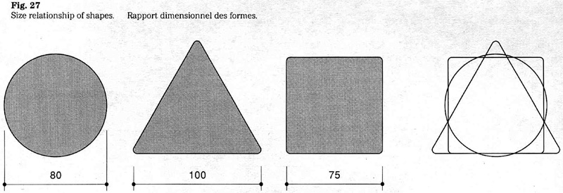
Standard sizes
A range of sizes has been established. Table 8 indicates the viewing distance for each symbol size. It should be noted that the values are intended for general guidance only and do not represent a definitive distance/size relationship.
Legibility at a given viewing distance varies owing to differences in the colour, shape and image detail of the different types of symbols. The values shown in ‘Table 8 are based on normal viewing conditions, which means adequate lighting and viewing angles that do not exceed 10 degrees.
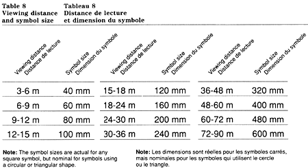
Table 8: Viewing Distance and symbol size - Text version
| Viewing Distance | Symbol Size |
|---|---|
| 3-6 m | 40 mm |
| 6-9 m | 60 mm |
| 9-12 m | 80 mm |
| 12-15 m | 100 mm |
| 15-18 m | 120 mm |
| 18-24 m | 160 mm |
| 24-30 m | 200 mm |
| 30-36 m | 240 mm |
| 36-48 m | 320 mm |
| 48-60 m | 400 mm |
| 60-72 m | 480 mm |
| 72-90 m | 600 mm |
Note : The symbol sizes are actual for any square symbol, but nominal for symboles using a circular or triangular shape.
Regulatory symbols
The circle is used to convey regulatory messages; symbol types 1 and 2. See Figure 28.
Type 1, Prohibition
The prohibition symbol consists of a black image located on a white field, circumscribed by a red ring, and diagonally bisected at 45 degrees by a red slash. The red ring is surrounded by a white bonder.
The red slash is printed over the black image, and is oriented from top left to bottom right.
The ring and slash of the prohibition symbol have the following proportion to the outer diameter of 80 units:
- 7.5 unit wide ring, 1:10.7;
- 7 unit wide slash, 1:11.4.
Type 2, Mandatory
The mandatory symbol consists of a white image on a black disc, surrounded by a white border.
Warning symbols
The triangle is used to convey warnings; symbol types 3 and 4. See Figure 29.
Type 3, Caution
The caution symbol consists of a black image on a yellow equilateral triangle, surrounded by a black border.
Note: CSA standard Z69-1960 prescribes the colour of the image indicating ionizing radiation (symbol 3.1.5) as purple instead of black.
Type 4, Danger
The danger symbol consists of an equilateral triangle surmounting a rectangle of equal width. The triangle contains the image and the rectangle the word “Danger”. The background colour is red. The image, the lettering, and the border surrounding the triangle and rectangle are white.
Information symbols
The square is used for emergency information, and for general guidance and information: symbol types 5 and 6. See Figure 30.
Type 5, Emergency
The emergency symbol consists of a white image on a green square, surrounded by a white border.
Type 6, Guidance and information
Depending on requirements either a dark grey or a blue symbol is used (Fig. 31). In general, the colours are applied as follows:
- The dark grey symbol is used for administrative areas where a neutral colour is appropriate. The specifications are: white image on a dark grey square, surrounded by a white bonder.
- The blue symbol is used for areas requiring a more conspicuous sign colour (public areas, industrial sites or facilities, parking areas). The specifications are: white image on a blue square, surrounded by a white border.
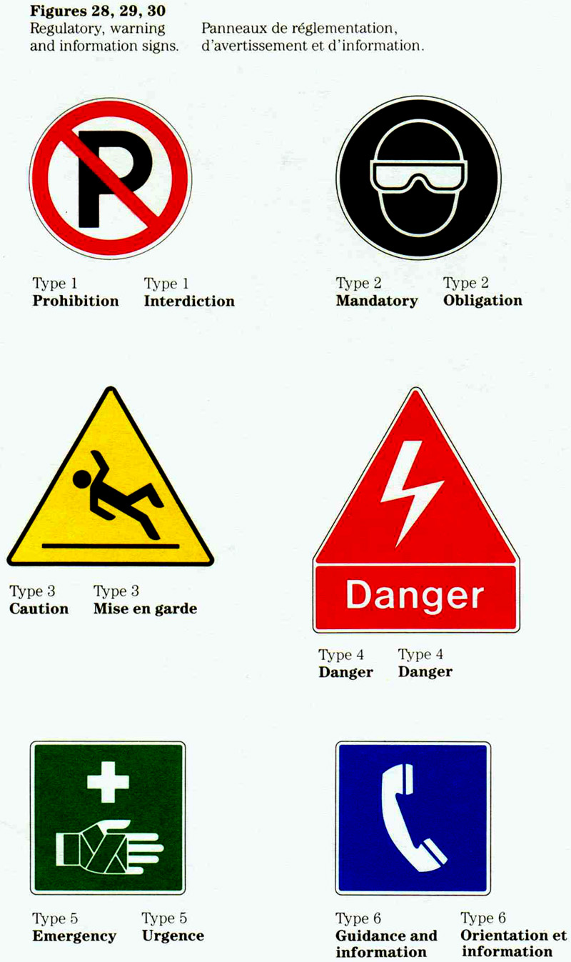
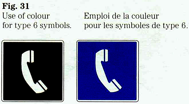
Implementation of a sign system
The implementation of a sign system requires careful planning and coordination. General guidelines on the development and placement of signs are set out below.
Planning a system
When planning a sign system, the following questions should he asked (see also “Sign communications” in section 1.2):
- What are the user requirements (access, traffic patterns, principal destinations, safety and security)?
- What messages are needed to inform, to orient, to identify, to warn, or to regulate?
- Which signs are available as standard items? Consult section 4.3A.
- Is the wording of the sign messages clean and concise? Rephrasing can often lead to a more effective sign.
- What is the hierarchy or relative importance of the different messages?
- Is this hierarchy being conveyed to users? Important messages should stand out.
- Have the design criteria such as viewing distance, character size, sign dimensions and installation method been determined?
Siting of signs
The siting of a sign is as important as its design. A sign functions in the context of its surroundings and is perceived as being part of it. An incorrectly placed sign can make its message ambiguous, contradictory on incomprehensible.
The signing of a facility requires a siting plan, sign schedule and installation instructions. The siting of regulatory, warning or emergency signs should be done in consultation with the facility’s safety or security officer.
The following points should be considered when selecting the most effective position for a sign (see also “Human factors” and “Environmental factors” in section 4. 1):
- Signs should be placed in a uniform and consistent manner, giving users reference points at appropriate locations on decision points.
- Signs should be placed so that users have enough time to take appropriate action.
- In general, signs are more effective when displayed alone. When signs are grouped together, they should be placed in an appropriate order.
- When signs with distinct messages are grouped together, the use of adequate space between signs is important to avoid confusion.
- When signs with complementary messages are grouped together, they should be installed in a compact display. The inter-relationship of such messages is conveyed by placing signs adjacent to each other.
- Oversigning tends to reduce the effectiveness of important messages. The number of signs used in any one location should be kept to a minimum.
Compound sign messages
The term compound message refers to a sign consisting of different design elements: words, graphic symbols, and directional arrows. A sign layout incorporating such elements requires that a designer determines their sequence, relative position, and size relationship.
Generally, the different elements of a compound message should be incorporated into one sign layout. Figure 32 shows a possible design solution and may serve as a basis for the layout of similar signs.
Use of modular signs
A compound message may also be conveyed by combining separate signs. The system of standard signs has been designed to permit the installation of individual signs (e.g. verbal message, graphic symbol, directional arrow) in a compact display. The examples indicate how the modular signs can be combined (Fig. 33).
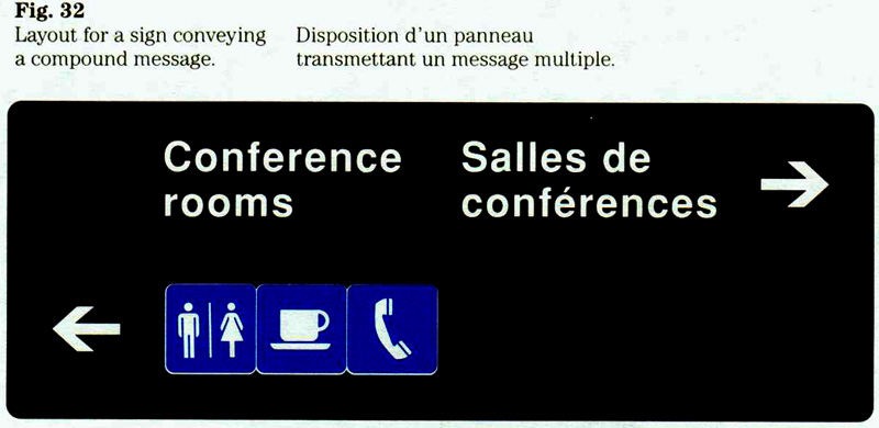
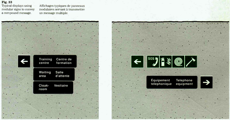
Special requirements
Certain variations from the design standards and guidelines may be necessary when signs are intended for special environments such as a commercial zone in an office building. The Administrative Policy Branch of the Treasury Board Secretariat provides design advice and should be consulted when special needs must be assessed. The intent of the FIP signage system can often be met despite certain variations.
Leased facilities
Signs situated in a leased facility and owned by the lessor may refer to the federal institution that is a tenant. Not being government-owned, it follows that such signs would not be subject to FIP design standards.
Messages normally expressed by a graphic symbol
It is recognized that a verbal message rather than the graphic symbol can be more appropriate in certain cases. The decision on whether to use words or the graphic symbol should be based on the context in which a particular sign is to be applied. For example, either one of the signs shown in Figure 34 could be appropriate in a given situation. Normally, such a choice applies only to type 6 symbols.
Sign colours
The FIP signage system is based on the consistent use of specific colours. Where special requirements call for non-standard colours, the Administrative Policy Branch of the Treasury Board Secretariat should be consulted.
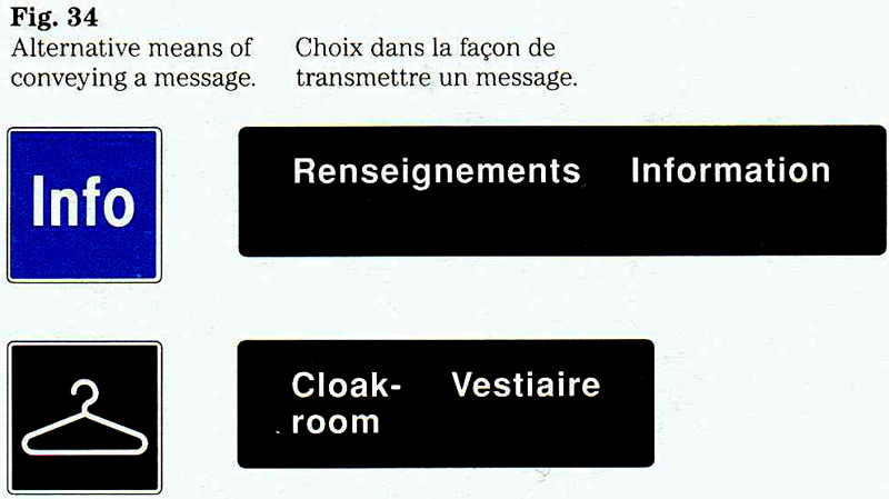
Material requirements
Signage materials
A variety of materials is used for common-use and operational signs. Advice on the use of these materials is available from the Canadian Government Expositions and Audio-Visual Centre, Supply and Services Canada.
All common use and operational signs must conform to CGSB 109-GP-5M, Signage materials, Interior and Exterior. Exterior signs fabricated from extruded aluminum blades must conform to CGSB 109.1M.
The directory board system described in this section has been adopted for government-wide use. Consisting of aluminum extrusions, the system is designed to be functional and flexible to meet the needs of users.
Standard colours
Shown below, are the standard colours referred to in this section. Their numbers refer to colours included in CGSB 1-GP-12, Standard Paint Colour. Where available, numbers for both semi-gloss and flat colours are given (e.g. 501-201 stands for FIP dark grey in semi-gloss, while 501-301 refers to the flat colour).
| FIP dark grey: |
501-201, .501-301 |
|---|---|
| FIP light grey: |
501-224 |
| Red: |
509-202. 509-302 |
| Yellow: |
505-210, 505-310 |
| Green: |
503-207 |
| Blue: |
502204. 502-304 |
| Black: |
512 201, 512-301 |
| White: |
51:3-201, 513-301 |
Reproduction
When preparing films or other items needed for reproduction, the original artwork should be used. This applies to the flag symbol, the “Canada” wordmark, the signage typeface, the standard arrow, and the graphic symbols. The Administrative Policy Branch of the Treasury Board Secretariat keeps the original artwork and will provide it to federal institutions upon request.
Enquiries
Each institution is responsible for implementing these standards and guidelines and has named an official (referred to as FIP Coordinator) to manage its corporate identity. Enquiries regarding the guidelines should be routed through the FIP Coordinator of the institution concerned.
Enquiries on all aspects of design, colour, and the use of the FIP signage typeface should be directed to the Administrative Policy Branch of Treasury Board Secretariat.
Enquiries with respect to the procurement of signs should be directed to the Canadian Government Expositions and Audio-Visual Centre, Supply and Services Canada.
4.3A Common use and operational signs
FIP Manual,
Note: Set out here are common use and operational signs that have been standardized for government wide use. This edition supersedes the version. For information on the use of these signs within the signage system, consult section 4.3 of the Federal Identity Program Manual. For information on procurement, consult the Catalogue of Signs, Federal Identity Program, issued by Supply and Services Canada.
Verbal messages
Numbering system
A numbering system is used to distinguish the different types of signs. For example, a number beginning with a 3 stands for a caution sign.
To indicate the order of the official languages on a number given sign, the code letters E and F are used; numbers containing an E refer to English/French signs, and an F refers to French/English signs.
Index
1 Prohibition
- 1E.1.1 Do not enter
- 1E.1.2 No trespassing
- 1E.1.3 Authorized persons only
- 1E.1.4 Restricted Area
- 1E.1.5 Operations Zone, ...
- 1E.1.6 Security Zone, ...
- 1E.1.7 High security Zone, ...
2 Mandatory
- 1E.2.1 Food and beverages not permitted
- 1E.2.2 No smoking in elevators
- 1E.2.3 No smoking, except in ...
- 2E.1.1 Fire safety, keep door closed
- 2E.1.2 In case of fire, do not use elevators
- 2E.1.3 Do not open this door except in an emergency
- 2E.1.4 In case of fire, smoke, gas – Sound fire alarm ...
- 2E.1.5 In case of fire, smoke, gas – Alert the occupants ...
- 2E.1.6 Emergency exit – Press on bar for 3 seconds ...
- 2E.1.7 Emergency exit – Press on bar ...
3 Caution
- 3E.1.1 Caution! Open slowly
- 3E.1.2 Caution! Use handrail
- 3E.1.3 Watch your step
- 3E.1.4 Caution! Battery room
- 3E.1.5 Caution! Microwaves
4 Danger
- 4E.1.1 Danger! Keep clear
- 4E.1.2 Danger! Keep hands off
5 Emergency
- 5E.1.5 Emergency use only
- 5E.1.7 Emergency exit only
6 Guidance and Information
- 6E1.1 Information
- 6E1.2 Reception
- 6E1.3 Electrical room
- 6E1.4 Waiting room
- 6E1.5 Conference room
- 6E1.6 Cloakroom
- 6E1.7 Lockers
- 6E1.8 Photocopier
- 6E1.9 Library
- 6E1.10 Records office
- 6E1.11 Mail room
- 6E1.12 Cafeteria
- 6E1.13 Mechanical room
- 6E1.14 Telephone equipment
- 6E1.15 Shipping
- 6E1.16 Receiving
- 6E1.17 Shipping and receiving
- 6E1.18 Deliveries at rear
- 6E1.19 Storage
- 6E1.20 Janitor
- 6E1.21 Hours of operation, 08:00-16:00
- 6E1.22 Hours of operation, 08:00-12:00, 13:00-16:00
- 6E.2.1 Entrance
- 6E.2.2 Exit
- 6E.2.3 Use other door
- 6E.2.4 Use revolving door
- 6E.2.5 Ring bell
- 6E.2.6 Closed
- 6E.2.7 Keep door closed
- 6E.2.8 Do not disturb
- 6E.2.9 Meeting in progress
- 6E.2.10 Out of order
- 6E.2.11 Not in use
- 6E.2.12 Opening this door will cause an alarm to sound
- 6E.2.13 Standpipe hose rack – Operating instructions ...
- 6E.2.14 Please discard sanitary napkins ...
- 6E.2.15 Fire alarm
- 6E.2.16 Fire door
- 6E.2.17 Fire escape
- 6E.2.18 Evacuation point for disabled persons
Type 1 Prohibition

| 1E.1.1 | Do not enter |
Entrée interdite |
|---|---|---|
| 1E.1.2 | No trespassing |
Passage interdit |
| 1E.1.3 | Authorized persons only |
Personnes autorisés |
| 1E.1.4 | Restricted Area Authorized persons only |
Zone à accès limité Personnes autorisées |
| 1E.1.5 | Operations Zone Authorized persons only |
Zone de travail Personnes autorisées |
| 1E.1.6 | Security Zone Authorized persons only |
Zone de sécurité Personnes autorisées |
| 1E.1.7 | High security Zone Authorized persons only |
Zone de haute sécurité Personnes autorisées |
| 1E.2.1 | Food and beverages not permitted |
Nourriture et boissons interdites |
| 1E.2.2 | No smoking in elevators | Défense de fumer dans les ascenseurs |
| 1E.2.3 | No smoking except in designated areas |
Défense de fumer sauf dans les endroits désignés à cette fin |
Type 2 Mandatory

| 2E.1.1 | Fire safety Keep door closed |
Sécurité-incendie Garder la porte fermée |
|---|---|---|
| 2E.1.2 | In case of fire Do not use elevators |
En cas d’incendie Ne pas utiliser les ascenseurs |
| 2E.1.3 | Do not open this door except in an emergency |
N’ouvrir cette porte qu’en cas d’urgence |
| 2E.1.4 | In case of fire, smoke, gas
|
En cas de feu, fumée, gaz
|
| 2E.1.5 | In case of
|
En cas de feu, fumée, gaz
|
| 2E.1.6 | Emergency exit Press on bar for 3 seconds Door lock will release in 15 seconds |
Sortie de secours Appuyer sur la barre pendant 3 secondes Le dispositif de verrouillage se déclenchera dans 15 secondes |
| 2E.1.7 | Emergency exit Press on bar Door lock will release in 15 seconds |
Sortie de secours Appuyer sur la barre Le dispositif de verrouillage se déclenchera dans 15 secondes |
Type 3 Caution

| 3E.1.1 | Caution! Open slowly |
Attention! Ouvrir avec soin |
|---|---|---|
| 3E.1.2 | Caution! Use handrail |
Attention! Tenir la rampe |
| 3E.1.3 | Watch your step | Attention à la marche |
| 3E.1.4 | Caution! Battery room |
Attention! Salle d'accumulateurs |
| 3E.1.5 | Caution! Microwaves (Note 1) |
Attention! Micro-ondes |
Type 4 Danger

| 4E.1.1 | Danger! Keep clear |
Danger! Ne pas s’approcher |
|---|---|---|
| 4E.1.2 | Danger! Keep hands off |
Danger! Attention à vos mains |
Type 5 Emergency

| 5E.1.5 | Emergency use only |
Utiliser en cas d’urgence seulement |
|---|---|---|
| 5E.1.7 | Emergency exit only |
Sortie de secours seulement |
Type 6 Guidance and information

| 6E.1.1 | Information | Renseignements |
|---|---|---|
| 6E.1.2 | Reception | Réception |
| 6E.1.3 | Electrical room |
Local électrique |
| 6E.1.4 | Waiting areas |
Salle d’attente |
| 6E.1.5 | Conference room |
Salle de conférences |
| 6E.1.6 | Cloakroom | Vestiaire |
| 6E.1.7 | Lockers | Cases |
| 6E.1.8 | Photocopier | Photocopieur |
| 6E.1.9 | Library | Bibliothèque |
| 6E.1.10 | Records office |
Bureau des dossiers |
| 6E.1.11 | Mail room | Salle du courrier |
| 6E.1.12 | Cafeteria | Cafétéria |
| 6E.1.13 | Mechanical room |
Local technique |
| 6E.1.14 | Telephone equipment |
Équipement téléphonique |
| 6E.1.15 | Shipping | Expédition |
| 6E.1.16 | Receiving | Réception |
| 6E.1.17 | Shipping and receiving |
Expédition et réception |
| 6E.1.18 | Deliveries at rear | Livraison à l’arrière |
| 6E.1.19 | Storage | Entreposage |
| 6E.1.20 | Janitor | Concierge |
| 6E.1.21 | Hours of operation |
Heures d’affaires |
| 08:00-16:00 | ||
| 6E.1.22 | Hours of operation |
Heures d’affaires |
| 08:00-12:00 13:00-16:30 |
||
| 6E.2.1 | Entrance | Entrée |
| 6E.2.2 | Exit | Sortie |
| 6E.2.3 | Use other door (Note 2) |
Utiliser l’autre porte |
| 6E.2.4 | Use revolving door |
Utiliser la porte tournante |
| 6E.2.5 | Ring bell | Sonner |
| 6E.2.6 | Closed | Fermé |
| 6E.2.7 | Keep door closed |
Garder la porte fermée |
| 6E.2.8 | Do not disturb (Note 3) |
Ne pas déranger |
| 6E.2.9 | Meeting in progress (Note 3) |
Réunion en cours |
| 6E.2.10 | Out of order (Note 3) |
Défectueux |
| 6E.2.11 | Not in use (Note 3) |
Hors d’usage |
| 6E.2.12 | Opening this door will cause an alarm to sound |
L’ouverture de cette porte déclenchera une alarme |
| 6E.2.13 | Standpipe hose rack Operating instructions ... |
Support de tuyau à colonne montante Mode d'emploi ... |
| 6E.2.14 | Please discard sanitary napkins and tampons in container provided for this purpose and not in toilet bowl |
Veuillez jeter les |
| 6E.2.15 | Fire alarm | Avertisseur d’incendie |
| 6E.2.16 | Fire door | Porte coupe-feu |
| 6E.2.17 | Fire escape | Escalier de secours |
| 6E.2.18 | Evacuation point for disabled persons |
Point d’évacuation des personnes handicapées |
- Note 1 - This message is intended for persons using heart pacemakers.
- Note 2 - This message should be used in conjunction with a directional arrow.
- Note 3 - This Message is intended for temporary use only.
Graphic symbols
Set out here are the symbols adopted to date. Each symbol is identified by its number and the referent, i.e. what the symbol stands for; also described is the function of the symbol.
Numbering system
A numbering system is used to distinguish the different types of symbols. The first digit stands for the type of symbol, the second refers to the sub group, and the last digit identifies a particular symbol.
"a" and "b" versions of certain symbols
A number followed by the letters "a, b" indicates the existence of two versions. The "a" version of the symbol faces right and the "b" version is reversed, facing left.
The two versions are provided to avoid conflict of directionality when the symbol is used in conjunction with an arrow. The direction inherent in the image of the symbol must be the same as that of the arrow.
Only the "a" versions are shown in this appendix.
1 Prohibition
Access
- 1.1.1 Buses prohibited
- 1.1.2 Dogs prohibited
Activities
- 1.2.1 Smoking prohibited
- 1.2.2 Parking prohibited
- 1.2.3 Camping prohibited
- 1.2.4 Picnics prohibited
2 Mandatory
Protective apparel
- 2.1.1 Head protection must be worn
- 2.1.2 Eye protection must be worn
- 2.1.3 Hearing protection must be worn
- 2.1.4 Hand protection must be worn
- 2.1.5 Foot protection must be worn
- 2.1.6 Breathing protection must be worn
3 Caution
Potential hazards
- 3.1.1 Caution, safety lane
- 3.1.2 Caution, slippery floor
- 3.1.3 Caution, overhead crane
- 3.1.4 Caution! be alert
- 3.1.5 Caution, presence of ionizing radiation
4 Danger
Definite hazards
- 4.1.1 Danger, flammable
- 4.1.2 Danger, electrical hazard
- 4.1.3 Danger, poison
- 4.1.4 Danger, explosion hazard
- 4.1.5 Danger, chemical burn
- 4.1.6 Danger, presence of etiologic agents
5 Emergency
Fire fighting equipment
- 5.1.1 Fire extinguisher
- 5.1.2 Fire hose
- 5.1.3 Fire axe
First aid
- 5.2.1a,b First Aid
- 5.2.2 Stretcher
- 5.2.3 Emergency shower
- 5.2.4 Emergency eyewash
General
- Emergency telephone
6 Guidance and information
Publics services
- 6.1.1 Toilet for men
- 6.1.2 Toilet for women
- 6.1.3 Toilet for men and women
- 6.1.4a,b Access for the physically handicapped
- 6.1.6 Police
- 6.1.7a,b Bus
- 6.1.8a,b Car
- 6.1.9 Telephone
- 6.1.10 Parking
- 6.1.11 Elevator for people
- 6.1.12 Elevator for freight
- 6.1.13a,b Stairs, up
- 6.1.14a,b Stairs, down
- 6.1.15 Stairs
- 6.1.16 Escalator
- 6.1.17a,b Escalator, up
- 6.1.18a,b Escalator, down
- 6.1.19 Postal facilities
- 6.1.20 Currency exchange
- 6.1.21 Cloakroom
- 6.1.22 Waste disposal
- 6.1.23 Shower
- 6.1.24 Baggage, general
- 6.1.25 Baggage locker
- 6.1.26 Baggage cart
- 6.1.27a,b Truck
- 6.1.28 Access for the hearing impaired
- 6.1.29 Drinking fountain
- 6.1.30 Information
- 6.1.31 Services in both official languages, English/Français
- 6.1.32 Services in both official languages, Français/English
Public transportation
- 6.2.1 Bus transportation
- 6.2.2 Taxi transportation
- 6.2.3 Bus and taxi transportation
- 6.2.4 Air transportation
- 6.2.5a,b Helicopter transportation
Concessions
- 6.4.1 Coffee shop
- 6.4.2 Restaurant
- 6.4.3 Car rental
- 6.4.3 Gasoline station
Recreation
- 6.5.1 Camping area
- 6.5.2 Picnic area
General
- 6.6.3 Smoking permitted
Type 1 Prohibition
1.1.1 - Buses prohibited
To indicate an area where buses are prohibited.

1.1.2 - Dogs prohibited
To indicate an area where dogs are prohibited.

1.2.1 - Smoking prohibited
To indicate an area where smoking is prohibited.

1.2.2 - Parking prohibited
To indicate an area where parking is prohibited.

1.2.3 - Camping prohibited
To indicate an area where camping is prohibited.

1.2.4 - Picnics prohibited
To indicate an area where picnics are prohibited.

Type 2 Mandatory
2.1.1 - Head protection must be worn
To indicate an area where the wearing of head protection is mandatory.

2.1.2 - Eye protection must be worn
To indicate an area where the wearing of eye protection is mandatory.

2.1.3 - Hearing protection must be worn
To indicate an area where the wearing of hearing protection is mandatory.

2.1.4 - Hand protection must be worn
To indicate an area where the wearing of hand protection is mandatory.

2.1.5 - Foot protection must be worn
To indicate an area where the wearing of foot protection is mandatory.

2.1.6 - Breathing protection must be worn
To indicate an area where the wearing of breathing protection is mandatory.

Type 3 Caution
3.1.1 - Caution, safety lane
To indicate the location of a safety lane.

3.1.2 - Caution, slippery floor
To indicate the presence of slippery floor conditions. (Note 1)

3.1.3 - Caution, overhead crane
To indicate the presence of an overhead crane.

3.1.4 - Caution, be alert!
To indicate the presence of a potential hazard due to a temporary condition. (Note 2)

3.1.5 - Caution, presence of ionizing radiation
To indicate the actual or potential presence of ionizing radiation and to identify objects, devices, materials, or combinations of materials which emit ionizing radiation. (Note 3)

Type 4 Danger
4.1.1 - Danger, flammable
To indicate the presence of a flammable substance.

4.1.2 - Danger, electrical hazard
To indicate the presence of electric current which may be a definite hazard.
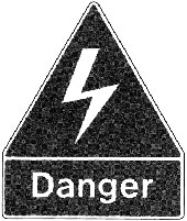
4.1.3 - Danger, poison
To indicate the presence of a poisonous substance.

4.1.4 - Danger, explosion hazard
To indicate the presence of an explosive substance.

4.1.5 - Danger, chemical burn
To indicate the presence of a highly corrosive chemical.

4.1.6 - Danger, presence of etiologic agents
To indicate the presence of such micro-organisms as viruses, bacteria, fungi and molds; commonly referred to as etiologic agents. (Note 4)

Type 5 Emergency
5.1.1 - Fire extinguisher
To indicate the location of a fire extinguisher.

5.1.2 - Fire hose
To indicate the location of a fire hose.

5.1.3 - Fire axe
To indicate the location of a fire axe.

5.2.1 a,b - First aid
To indicate the location of a facility providing first aid, e.g. a first aid kit or a first aid station.

5.2.2 - Stretcher
To indicate the loaction of a stretcher.

5.2.3 - Emergency shower
To indicate the location of an emergency shower.

5.2.4 - Emergency eyewash
To indicate the location of an emergency eyewash facility.

5.3.1 - Emergency telephone
To indicate the location of an emergency telephone.

Type 6 Guidance and Information
6.1.1 - Toilet for men
To indicate a toilet facility which is intended for men only.

6.1.2 - Toilet for women
To indicate a toilet facility which is intended for women only.

6.1.3 - Toilet for men and women
To indicate a toilet facility which is intended for men and women. This symbol may also serve as an advance sign to indicate the location of separate facilities.

6.1.4 a,b - Access for the physically handicapped
To indicate a facility accessible to, usable by, or intended for persons whose mobility is restricted by a physical handicap.

6.1.6 - Police
To indicate the location of a police force or security staff.

6.1.7 a,b - Bus
To indicate a facility specifically designed or intended for buses.

6.1.8 a,b - Car
To indicate a facility specifically designed or intended for cars.

6.1.9 - Telephone
To indicate the location of a public telephone.

6.1.10 - Parking
To indicate an area where vehicles may be parked.
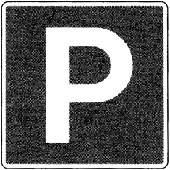
6.1.11 - Elevator for people
To indicate the location of an elevator for people.
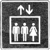
6.1.12 - Elevator for freight
To indicate the location of an elevator for freight.

6.1.13 a,b - Stairs, up
To indicate the location of stairs which lead to an upper level.
6.1.14 a,b - Stairs, down
To indicate the location of stairs which lead to a lower level.
6.1.15 - Stairs
To indicate the location of stairs.
6.1.16 - Escalator
To indicate the location of escalators which provide transportation to an upper or lower level. (Note 5)

6.1.17 a,b - Escalator, up
To indicate the location of an escalator which provides transportation to an upper level.
6.1.18 a,b - Escalator, down
To indicate the location of an escalator which provides transportation to a lower level.
6.1.19 - Postal facilities
To indicate the location of a facility which provides postal service, i.e. any type of facility from a post office to a mail box.

6.1.20 - Currency exchange
To indicate the location of a facility where currency may be exchanged.

6.1.21 - Clockroom
To indicate the location where clothing may be kept.

6.1.22 - Waste disposal
To indicate the location of a receptacle for the disposal of waste.

6.1.23 - Shower
To indicate the location of a shower.

6.1.24 - Baggage, general
To indicate the location of baffage-related functions.

6.1.25 - Baggage locker
To indicate the location where lockable space for baggage is for rent.

6.1.26 - Baggage cart
To indicate the location where baggage carts are available.

6.1.27 a,b - Truck
To indicate a facility specifically designed or intended for trucks.

6.1.28 - Access for the hearing impaired
To indicate a facility or service that is equipped to serve persons with a hearing impairment.

6.1.29 - Drinking fountain
To indicate the location of a drinking fountain.

6.1.30 - Information
To indicate the location of a facility or service that provides information.

6.1.31 - Services in both official languages
To indicate the availability of government services in both official languages.

6.1.32 - Services in both official languages
To indicate the availability of government services in both official languages.

6.2.1 - Bus transportation
To indicate the location where transportation by bus is available, i.e. a bus terminal or a bus stop.

6.2.2 - Taxi transportation
To indicate the location where transportation by taxi is available, e.g. a taxi stand.

6.2.3 - Bus and taxi transportation
To indicate the location where transportation by bus and taxi is available.

6.2.4 - Air transportation
To indicate the location of air transportation. (Note 6)

6.2.5 a,b - Helicopter transportation
To indicate the location where transportation by helicopter is available.
6.4.1 - Coffee Shop
To indicate the location of a coffee shop.

6.4.2 - Restaurant
To indicate the location of a restaurant which provides full service.

6.4.3 - Car rental
To indicate the location of car rental facilities.

6.4.4 - Gasoline station
To indicate the location where motor vehicles may be refueled.

6.5.1 - Camping area
To indicate an area where camping is permitted.

6.5.2 Picnic area
To indicate an area where picnic tables are available.
6.6.3 - Smoking permitted
To indicate an area where smoking is permitted.

Note 1 - This sign is intended for temporary used and shall only be displayed while the slippery conditions exist.
Note 2 - This sign shall only be used temporarily while the hazardous condition exists.
Note 3 - For further details refer to CSA Standard Z69-1960, Specification for a radiation symbol.
Note 4 - This symbol is used to identify laboratories and storage areas where etiologic agents are kept. Users of this symbol are cautioned that it is not generally understood by the public. In situations where the symbol is used in public space, additional hazard information must be provided to ensure public safety. In lieu of the term "etiologic agent", the message may refer to "infectious substance" which is considered to be more easily understood.
Note 5 - This symbol serves as an advance sign where indication of direction (up or down) is not required, or to indicate the location of an escalator whose direction is altered depending on peak demand of traffic flow.
Note 6 - The inherent directionality of this image must be considered when the symbol is used in conjunction with a directional arrow. The symbol should be rotated as required to provide consistency in the directionality of the elements.
Directional arrows
An "arrow sign" is used to convey direction in conjunction with a sign bearing text or a graphic symbol. Two signs, D1 for cardinal points and D2 for collateral points, have been developed for this purpose. The arrow is centered on a square, modular sign, permitting a variety of ways in which message and direction can be displayed.
"Arrow signs" are available in the standard green, dark grey and blue colours used for "emergency" and "guidance and information" signs. When displayed together, the colours of the "arrow sign" must be the same as the sign bearing the message.
D1 - Indication of direction, cardinal points



D2 - Indication of direction, collateral points



4.3B Tactile Signage
FIP Manual (Interim Guide),
Preface
Universal Design principles have been applied to develop a Government of Canada tactile signage system that is to be implemented in federal facilities as a requirement of the Treasury Board Manual, Chapter 1-6, Accessibility Policy originally issued in 1991.
Based on the principles of CAN/CSA B-651 95 Barrier-Free Design, the tactile signage system incorporates raised pictograms, lettering and dome braille. Information is in a bilingual format and is in a black and white colour combination.
The signage was developed by a Working Group on Tactile Signage chaired by Public Works and Government Services Canada (PWGSC). The Working Group has partnering representatives from the Treasury Board Secretariat’s Federal Identity Program (TBS FIP), the Canadian National Institute for the Blind, the Canadian Council of the Blind, the Status of Disabled Persons Secretariat, the National Capital Commission and the Fire Prevention Branch of Human Resources Development Canada. 3M Canada Incorporated assisted in the development of prototypes for the signage system. Results from the detailed evaluations of the prototypes guided the TBS FIP design advisor in final design refinements.
Although originally developed for installation in federal buildings, given the uniqueness and proven excellence of the signage as well as the current consumer and market demand, the TBS Federal Identity Program will be approaching the Canadian Standards Association and other levels of government to have the signage adopted as a national standard.
Introduction
Purpose of the Tactile Signage Installation Guide
This Installation Guide has been prepared to assist the Facility Managers of Government of Canada-occupied facilities in the acquisition and installation of tactile signage and to do so in an efficient and affordable manner. Tactile signage is required to bring federal facilities into compliance with Treasury Board requirements for accessibility (see 1.2).
This Installation Guide assists Facility Managers in undertaking the following tasks:
- Determining where and how many tactile signs are required
- Determining when tactile signs are not required
- Ordering and installing the tactile signs
- Resolving unique installation conditions
For ease of use, the Installation Guide has attempted to address the questions that may arise, and provided answers by means of illustrated scenarios.
Treasury Board Requirements for Tactile Signage
The implementation requirements for tactile signage in federal work areas of Crown owned, lease-purchase and leased federal facilities is identified in Treasury Board Manual, Chapter 1-6, Accessibility, Appendix B, Barrier-free Design: Implementation Requirements which states: Tactile signage must be used for washrooms, emergency egress, elevators, stairwells and doors off main corridors.
The Treasury Board Secretariat’s Federal Identity Program (TBS FIP) has approved the design and fabrication standards for the washroom, stairwell and emergency egress signs included in this guide. The scope of this document has been limited to tactile signage for washrooms, stairwells and emergency egress since tactile signage standards for ‘doors off main corridors’ are to be developed by the TBS FIP Working Group on Tactile Signage at a later date. The tactile identification of controls and floor designation signage in elevators is already identified in Appendix C: Elevator Requirements of CAN/CSA B651-95 Barrier-Free Design(an extract from the CSA Standard CAN/CSA B44 M94 elevator code).
Federal Facilities Requiring Tactile Signage
As indicated in 1.2, Treasury Board Manual, Chapter 1-6, Accessibility, Appendix B: Barrier-free Design: Implementation Requirements requires tactile signage in federal real property of Crown-owned, lease purchase or leased facilities to identify washrooms, emergency egress, stairwells.
Each custodian department under section 2 of the Financial Administration Act (FAA) is responsible for determining in which facilities or portions of facilities the Implementation Requirements are applicable. In this regard, the Barrier-free Design: Implementation Requirements state:
2.2 Various new buildings or structures, due to their specialized design function or requirements, may be candidates for a reduced level of accessibility or can be completely exempted from barrier-free design requirements. Such facilities include, but are not limited to: naturally inaccessible facilities in remote locations, unattended monitoring stations, facilities which are designed and constructed to accommodate able-bodied personnel (i.e. where being able-bodied is part of the job requirement); and facilities where operational requirements preclude reasonable access by persons with disabilities. If the specialized design or operational requirement that justified the exemption from the policy changes, then the department must reassess the facility against the policy to ensure that the exemption is still justified.
2.3 In some cases, access need not be provided to certain parts of the facility such as boiler rooms, roofs, elevator pits, elevator penthouses, mechanical rooms, electrical vaults, piping or equipment catwalks, or areas of hazardous occupancy (as defined by the National Building Code or National Fire Code), unless the intended use requires public access or the job requirements are such that a person with a disability could meet these requirements.
Tactile Signage in Leased Facilities
Where the tactile signage is to be installed in buildings only partially occupied by federal tenants, the tactile signs are installed for those washrooms, exits and stairwells on those floors, or portions of floors, occupied by the federal tenant only. For example, if there are six stairwells serving a floor which a federal tenant only partially occupies, only those stairwells providing emergency exiting requirements for the federal tenant would be identified by a tactile ‘Stairs’ sign.
As indicated in 3.2 to 3.4, tactile stairwell or exit signs are also not installed for egress stairs or exits in, or from, parking garages, unless they are intended to meet the needs of specific user(s).
For leased facilities, there may also already be provision in the lease agreement to supply and install tactile signs and this should be verified. Unless the leased facility has been previously exempted or is eligible for exemption, tactile signs will be required and may be the responsibility of the owner of the leased facility.
Tactile Signage in Heritage Facilities
The Heritage Facilities section of Appendix B, Barrier-Free Design: Implementation Requirements of Treasury Board Manual, Chapter 1-6, Accessibility, states:
5.1 The requirements for heritage facilities are the same as those for other Crown owned facilities except where these requirements will significantly reduce the heritage quality of the facility.
Consequently, the installation of tactile signage in facilities designated by the Federal Heritage Buildings Review Office (FHBRO) should be coordinated with the appropriate FHBRO representative.
The Tactile Signs and their applications
The tactile signs illustrated below incorporate raised pictograms, lettering and dome braille. Information is in a bilingual, format with white lettering on a black background. All signs are available in English-French and French-English formats. Text information is repeated in black dome braille near the base of the black field.
The signs are finished in a plastic material complying with CGSB-109-GP-5MP and suitable for interior and exterior applications. The signs are provided with an adhesive backing tape for application to painted drywall, metal, concrete or wood, vinyl wall covering, etc. See 4.4 for installation on other surfaces.
Tactile signs have been developed as a Government of Canada standard and have been evaluated and approved by the Treasury Board Secretariat’s Federal Identity Program, Public Works and Government Services Canada, Canadian National Institute for the Blind (CNIB) and other agencies. Therefore, duplication, fabrication and/or delivery through sources other than those noted in section 7.0 is discouraged.
Washroom Signs
These signs shall identify the entrances for various configurations of men’s or women’ washrooms which may or may not contain toilet facilities accessible to persons with disabilities.
Although the washrooms may include inner vestibule or privacy doors, the tactile signs are required for the exterior entrance doors only unless secondary doors (e.g. to janitors closets, utility rooms, etc.) are also located inside the vestibules.
The signs are not generally installed for private or ensuite washrooms (e,g. in the offices of senior management) unless they are intended to meet the needs of specific user(s). The sign is also not installed for washrooms in areas already exempted from accessibility requirements (See 2.0 of this document).
The finished signs are 150 mm wide by 230 mm high, with the exception of the two signs required for accessible individual washrooms which, when combined, are a total of 300 mm wide by 150 mm high.
3.1.1 Toilet for Men
This sign is to identify the entrance for men’s washrooms which do not contain facilities for persons with disabilities.
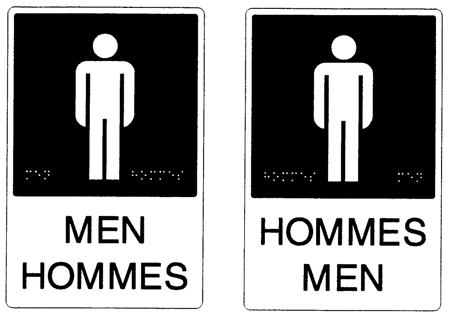
3.1.2 Accessible Toilet for Men
This sign is to identify the entrance for men’s washrooms designed to accommodate persons with disabilities.
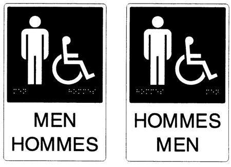
3.1.3 Toilet for Women
This sign is to identify the entrance for women’s washrooms which do not contain facilities for persons with disabilities.
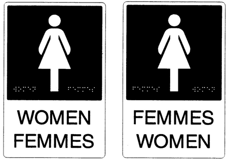
3.1.4 Accessible Toilet for Women
This sign is to identify the entrance for women’s washrooms designed to accommodate persons with disabilities.
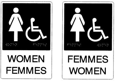
3.1.5 Toilet for Men and Women
This sign is to identify the entrance for a washroom that can be used by either men or women, but does not contain facilities for persons with disabilities.
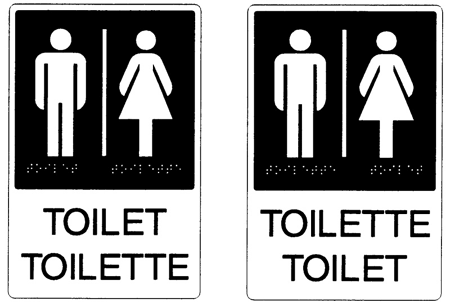
3.1.6 Accessible Toilet for Men and Women
This combination of two signs is to identify the entrance for a washroom that can be used by either men or women with disabilities.

Stairs Sign
This sign is to identify entrances to non fire-rated communications stairs only. It is NOT to be used for fire-rated egress stairs or open stairs along interior or exterior circulation routes (concourse stairs, etc.). The tactile identification of open stairs is addressed in the Treasury Board Manual, Chapter 1-6, Accessibility, Appendix B: Barrier-free Design: Implementation Requirements which states... detectable warnings must be provided for all stairs except exit stairs in a separate stairwell.
Prior to installation of the ‘Stairs’ sign, it is recommended that the actual life safety classification of the stairways being identified be verified with the appropriate life safety personnel.
This sign is not to be installed for entrances to/from stairs in parking garages, unless it is intended to meet the needs of specific user(s). The signs are also not installed for stairwell entrances located in areas already exempted from accessibility requirements (See 2.0 of this document).
The finished sign is 150 mm wide by 230 mm high.
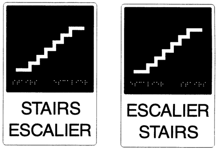
Exit Stair Sign
This sign is to identify entrances to fire-rated egress stairs only. It is NOT to be used for communication stairs or open stairs along interior or exterior circulation routes (concourse stairs, etc.). The tactile identification of open stairs is addressed in the Treasury Board Manual, Chapter 1-6, Accessibility, Appendix B: Barrier-free Design: Implementation Requirements which states... detectable warnings must be provided for all stairs except exit stairs in a separate stairwell.
Prior to installation of the ‘Exit Stair’ signs, it is recommended that the actual life safety classification of the stairways being identified be verified with the appropriate life safety personnel.
This sign shall not be installed for entrances to/from stairs in parking garages, unless it is intended to meet the needs of specific user(s). The signs are also not installed for stairwell entrances located in areas already exempted from accessibility requirements (See 2.0 of this document).
The finished sign is 150 mm high by 450 mm wide.
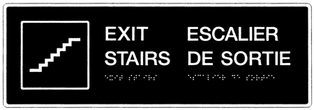
Exit Sign

This sign is to identify:
- exits directly to exterior safe areas (e.g. entrance vestibules exiting to the exterior),
- exits directly to fire-rated exit corridors which lead directly to exterior safe areas (e.g. exits which open into a concourse or lobby need not be identified with a tactile ‘Exit’ sign if no other doors are located within the exit), and
- exits to a separate building (e.g. adjacent buildings connected by a concourse or walkway).
Since the ‘Exit’ sign is not directional, the sign is not intended to identify interior doorways or open corridors leading to an exit doorway (even though they may be identified by overhead ‘Exit’ signs) or crossover floors.
Prior to installation of the ‘Exit’ signs, it is recommended that the actual life safety classification of the doorways being identified be verified with the appropriate life safety personnel.
The sign is not installed for exits leading from, parking garages, unless it is intended to meet the needs of specific user(s). The signs are also not installed for exit doorways from areas already exempted from accessibility requirements (See 2.0 of this document).
The finished sign is 260 mm wide by 75 mm high.
Installation of Tactile Signage
CAN/CSA-B651-95 Barrier-Free Design Standard Installation Requirements for Tactile Signage
The installation of tactile signage proposed in this Installation Guide is based on the requirements of CAN/CSA-B651-95 Barrier-FreeDesign, Section 6.4, Signage unless site conditions require alternate locations. The following extracts from Section 6.4, Signage pertain to the installation of tactile signage:
6.4.3 Illumination: The minimum illumination on signs shall be 200 lx.
6.4.4 Tactile Characters or Symbols: Characters, symbols or pictograms on tactile signs shall if wall mounted, have the centreline at a height of 1500 ± 25mm.
Commentary: Raised characters or symbols of identification greatly assist persons with visual impairments... Such identification should be located beside doors and openings to rooms within a building, and placed at a uniform height and distance from the door... Consistent location, such as at the door handle side, also makes identification easier.
Who does the Installation?
Generally, building maintenance staff with painting, drywall and/or carpentry skills should be able to follow the appropriate parts of this Installation Guide and install tactile signs at the locations prescribed by the Facility Manager. If these skills are not available in-house, the Facility Manager may wish to contract installation of the signage to a local signage company. In this case, the contractor should be directed to adhere to the procedures described in this Installation Guide.
Standard Installation Procedures
Typical installation requires that tactile signs be located at a height of 1500 mm (±25 mm) on the wall adjacent to latch side of the doorway – not on the hinged side of the doorway. Refer to 5.0, Non-Typical Signage Installations if the wall space on the latch side of the door is inadequate or obstructed.
To install the tactile sign on smooth surfaces simply,
- Using a pencil (or other erasable marking instrument), lightly mark the wall on which the sign is to be installed with a horizontal line at a distance of 1500 mm (±25 mm) above the finished floor (using a level if necessary) on the latch side of the door. This is the height which CAN/CSA-B651-95 Barrier-Free Design specifies for all tactile signs.
- Mark in pencil the location for the top of the sign by calculating the distance from the centre of the sign to the top of the sign (you may also refer to the height of the sign being installed in Section 3.0), and gently scribe this distance above the line you have drawn in Step (a).
- Strike a vertical guideline 50 mm to 75 mm in from the edge of the door or door frame to locate the edge of the sign. Consistent spacing between the door and sign will assist persons with visual impairments in locating the signs as well as provide a more professional installation.
- Lightly trace guidelines for the remaining edges of the sign.
- For improved adhesion, clean inside the area to be covered by the sign, using sandpaper where necessary.
- Peel off the backing for the adhesive tape at the back of the sign.
- Lightly align the top and side of the sign with the guidelines. When properly aligned, apply pressure to the top of the sign. After the top edge has adhered, brush the sign from top to bottom, pushing lightly with your hand. Now push hard at the centre, working out towards the left and right.
- Using a light meter, verify that the level of illumination of the sign is a minimum of 200 lx. If the existing level of lighting is inadequate, relamp the fixtures.

Do not alter the legibility of the tactile information on the sign by drilling the sign for mounting screws, etc. See 4.4, Installation of tactile signage on rough/uneven surfaces for alternative mounting techniques.
To avoid irreversible damage to the finishes of heritage facilities designated by the Federal Heritage Buildings Review Office (FHBRO), do not install tactile signage in these buildings without consulting the appropriate FHBRO representative. See also 2.2, Tactile signage in heritage facilities.
Installation on Rough/Uneven Surfaces
In this method, a separate support panel (the same size as the tactile sign) is fastened to the wall by tap screws and spacers, with the screws set flush with the surface of the support panel. While these support panels can be ordered through the National Master Standing Offer described in section 7.0, purchase the proper type and size of screws and spacers at your local hardware dealer. The tactile sign is then applied to the support panel via the adhesive backing supplied with the sign. So as not to alter the legibility of the tactile information, never alter the finished face of the sign with any fastening devices such as screws, nails, etc.
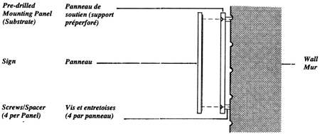
Installation on Glass Surfaces
Where building conditions require the application of the tactile sign to transparent or semi-transparent glass surfaces (e.g. an ‘Exit’ sign to identify doorways in a vestibule), backing panels the same size of the tactile signs identified in section 3.0 are also available through the National Master Standing Offer described in section 7.0.
The backing panels are intended for mounting to the glass surface behind the sign to hide the tape thereby providing a cleaner installation.
Exterior Applications
Although the Treasury Board Manual, Chapter 1-6, Accessibility, Appendix B, Barrier Free Design: Implementation Requirements does not specify outdoor uses for the signs, some custodian departments may utilize the signs to identify such facilities as outdoor public washrooms. In these cases, the signs should be located as specified in Sections 4.0 or 5.0 of this document.
Although the signs have been fabricated to resist outdoor applications, more durable exterior-grade adhesives may be required in place of the adhesive tape supplied on the signs. See also 4.4, Installation on rough/uneven surfaces.
Removal of Existing Signage
This Installation Guide does not deal with the removal of existing signage that may be made redundant by the installation of tactile signs or minor repairs that may be required by such removal.
A strategy to address those issues will have to be developed in consultation with the Facility Manager and/or building owner.
Non-Typical Signage Installations
This section is intended to address unique conditions or situations where existing site conditions restrict locating the tactile signs on the hatch side of doors and/or at the 1500 mm ±25 mm height (centre of sign) as required in CAN/CSA-B651-95 Barrier Free Design. These include double doors, multiple sets of exit doors, inadequate mounting space or obstructions on the latch side of doors, etc.
Single Doors Across Corridors
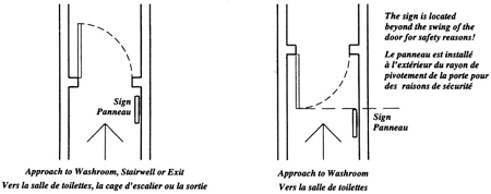
Double Doors Across Corridor
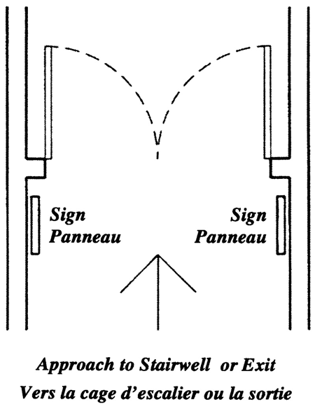
Doors in Close Proximity
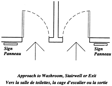
Multiple Sets of Exit or Stairwell Doors
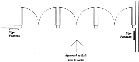
Recessed Doors

Protruding Doors
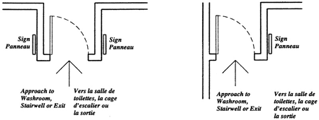
Utility Doors InsideWashroom
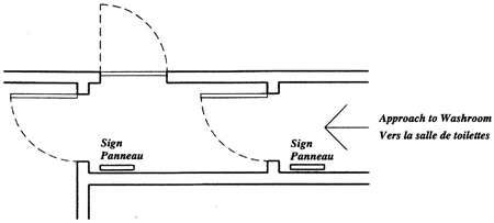
Installation Summary
The key points to remember in installation of the signs are:
- Install the signs beside the doorway to be identified. Never install the signs DIRECTLY on doors.
- Install the signs so the centre of the sign is at a height of 1500 mm and the edge of the sign is 50-75 mm away from the edge of the door or door frame.
- Always locate the sign on the wall beside the hatch side of the door if possible. Refer to section 5.0 if the wall space beside the door is limited.
- Do not alter the legibility of the tactile information on the sign by drilling the sign for mounting screws, etc. See 4.4, Installation of tactile signage on rough/uneven surfaces for alternative mounting techniques.
- Prior to installation of ‘Exit’ or either of the ‘Stairwell’ signs, it is recommended that the actual life safety classification of the stairways and/or doorways being identified be verified with the appropriate life safety personnel.
- Prior to installing the signs in heritage buildings, coordinate the location and installation of the signs with the appropriate representative of the Federal Heritage Buildings Review Office.
We trust that this guide will assist in the successful installation of the Federal Identity Program tactile signage. However, should you require assistance in determining your signage requirements, you may wish to contact the PWGSC Architectural and Engineering Services Accessibility Coordinator in your region.
How to Order Tactile Signage
A multi-year National Master Standing Offer (NMSO) agreement for the supply of the TBS Federal Identity Program tactile signs illustrated in section 3.0 of the FIP Tactile Signage Installation Guide has been awarded to:
Eye Catch Signs
2482 Maynard Street
Halifax, Nova Scotia
Canada B3K 3V4
Telephone: (902) 423-3309 x 244
Facsimile: (902) 423-6144
Internet Address: sales@eyecatchsigns.com
The NMSO, which went into effect , is effective for one year with an option to renew for two additional one year terms.
When ordering the tactile signs, please specify:
-
NMSO number EJ116-6-0001/001/CM
-
the reference code for the signs required (located below the sign illustrations in section 3.0)
-
the quantities of signs required (i.e. ATM-El, TAH-F1, etc).
-
any support panels required for installation of signs on rough surfaces (refer to section 4.4).
-
any backing panels required to install the signs on glass (refer to section 4.5).
-
If you require further assistance in placing an order for
-
the tactile signage, you may also contact:
Signage Coordinators
Buildings Directorate
Architectural and Engineering Services
Real Property Services
Public Works and Government Services Canada
Telephone: (819) 775-4501 or 775-4502
Facsimile: (819) 775-4081
Bibliography
CAN/CSA-B651-95 Barrier-Free Design: Public Safety A National Standard of Canada, Canadian Standards Association, .
CAN/CSA-Z321-96 Signs and Symbols for the Workplace,Canadian Standards Association, 1996.
Federal Identity Program Manual, Treasury Board of Canada Secretariat, 1992.
Treasury Board Manual, Chapter 1-6, Accessibility, .
4.4 Project Signs
FIP Manual,
Introduction
Signs that provide on-site information about government programs or projects form an important aspect of the federal identity. This section sets out the design standards that were developed to achieve a uniform appearance of federal project signs. It is intended for designers, communication advisors and administrators.
This section should be used with Chapter 470, “Federal Identity Program” of the Administrative Policy Manual, and the key sections of the FIP Manual, 1.1, “Design” and 1.2, “Message”. A familiarity with section 4.1, “Signage”, is essential to the proper understanding of the subject.
Scope
Guidelines and standards set out the requirements for the design and production of project signs. The purpose of these signs is to provide on-site information about federal programs or projects, such as employment or public works. Project signs are intended for temporary use, generally for a period of up to two years and, depending on the project, may be for exterior or interior use.
These guidelines do not apply to signs that identify programs undertaken jointly with another level of government (see the section entitled “Identification of shared-cost programs”).
Determining the requirements
The federal organization that is sponsoring the program or project is responsible for determining the requirement for a sign. A decision to use a sign, as opposed to other media, is generally based on the organization’s communication policy, cost efficiency, the feasibility of installing a sign, and the duration of the project.
Signature and wordmark
The federal signature and the “Canada” wordmark are the key elements on project signs. They appear in a prescribed position on the top and bottom bands respectively.
Federal signature
As required, a one or two-line signature is used on project signs (Fig. 1). Design standards prescribe the size and position of the signature within a sign layout.
Flag symbol
For the reasons stated in section 1.1, the modified version of the flag symbol is used for all project signs.
“Canada” wordmark
The medium-weight of the “Canada” wordmark is used for all project signs (Fig. 2). Design standards prescribe the relative size and position of the wordmark within a sign layout.
“Government of Canada” signature
This signature (Fig. 3) is used to identify programs or projects that involve two or more federal organizations. If required, the participating departments may be referred to in the sign’s message.


Message
The sign’s message should consist of a clear and concise statement informing the public about the nature of the program or project. Texts must be brief; the main message should not exceed five words per language.
A federal sign that informs the public about a construction project should not include information about a contractor or consultant. Normally, such information appears on a separate sign.
For more comprehensive guidelines on the creation and presentation of texts see section-1.2, “Message”.
Examples of sign messages
The following examples indicate how different kinds of information may be presented and how the text is structured (Fig. 4).
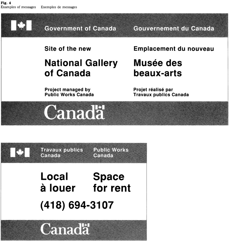
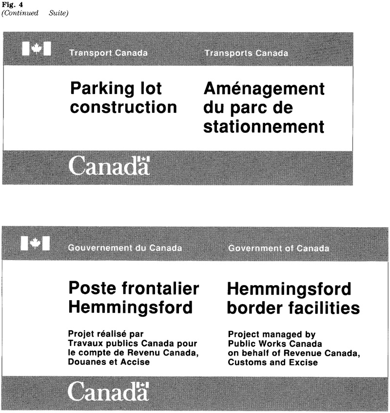
Design standards
To achieve uniformity, a basic design consisting of coloured bands at the top and bottom of the sign has been adopted. The requirements with respect to the layout, signage typeface, character sizes and colours, are set out below. For details on the signage typeface consult section 4.5.
Relationship between bands and central area
To achieve a uniform appearance, a certain relationship between the height of the band and the central area has been adopted. The height of each band should represent between 15 and 25 per cent of the total height of the sign. On a given sign, both bands should be the same height (Fig. 5).
Sign proportions
In general, signs should be designed in a rectangular, horizontal format to accommodate the side by side presentation of the two official languages. Just as the relationship between the bands and the central area is governed by limits, there is also a range governing the proportion of height to length. The preferred proportion is 1:2, the minimum being 1:1.5 and the maximum 1:2.5 (Fig. 6).
Designing a sign to meet these proportions is generally achieved by an appropriate choice of character size ratios and line breaks.
Sign dimensions
The size of project signs varies greatly and depends on factors such as message length, viewing distance, site requirements and standard sheet sizes. The viewing distance, which determines the character size required, is an important factor. It ensures the effectiveness of the sign when installed. Furthermore, for reasons of economy, the dimensions should relate to the standard sheet sizes of the material to be used; e.g. plywood, vinyl, card or paper.
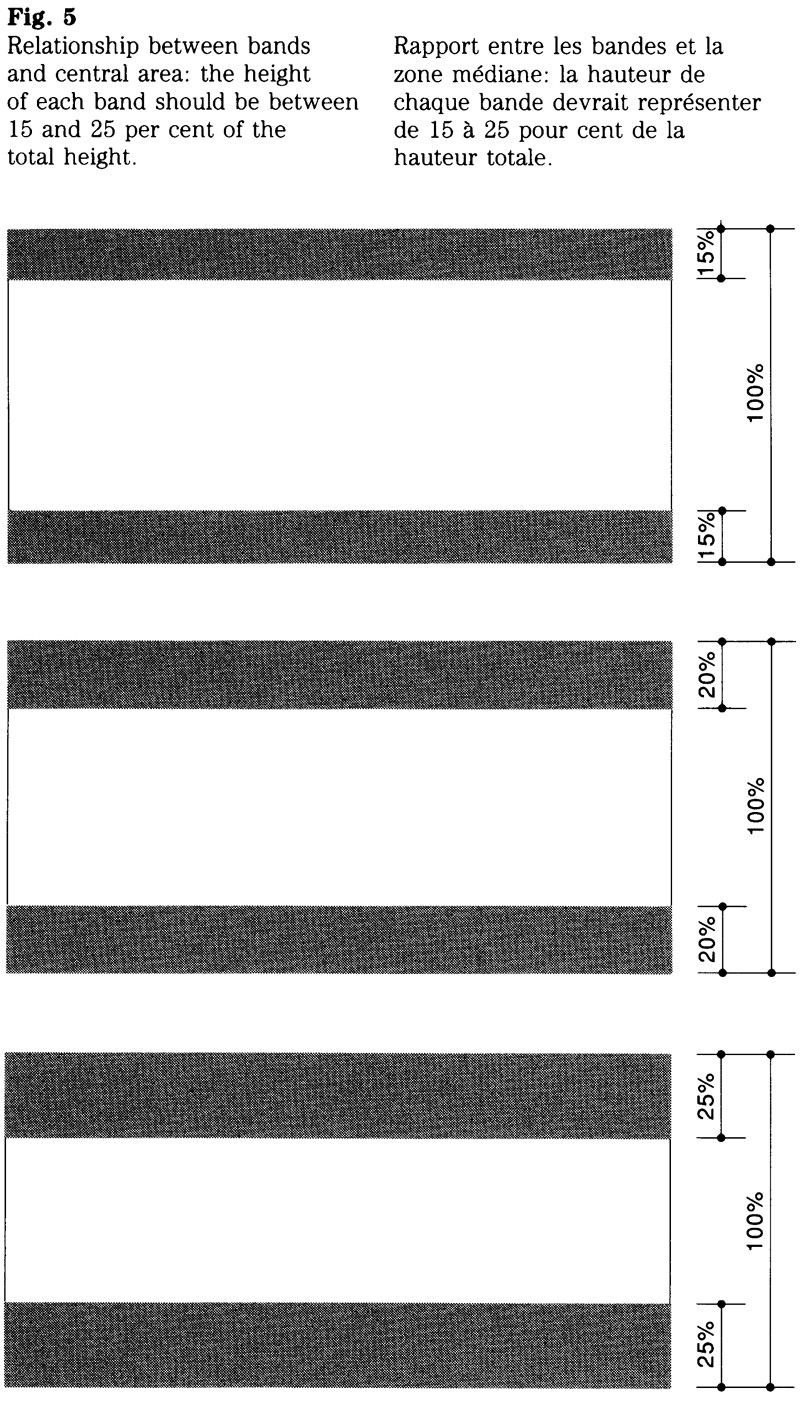

Character size ratios
Generally, signs are designed by selecting two character sizes. By varying the size, emphasis is placed on the main message while secondary information is de-emphasized.
The most commonly used character size ratio is that of 1.5:1, where the larger size is used for the main message and the smaller size for the signature and any secondary information. Depending on message length and layout requirements, other ratios such as 1:1, 2:1 or 3:1 can be used. The standard character sizes that can be combined on a sign are presented in Table 1.
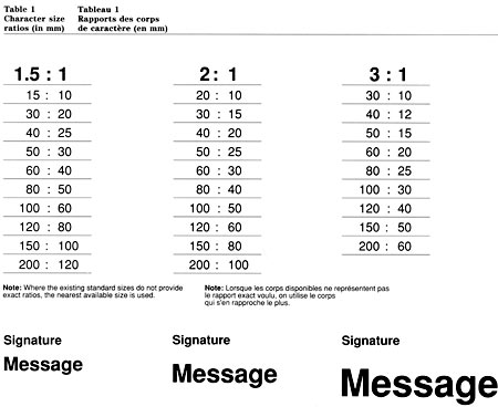
Table 1: Character size ratios (in mm) - Text version
| 1.5 : 1 | 2 : 1 | 3 : 1 |
|---|---|---|
| 15:10 | 20:10 | 30:10 |
| 30:20 | 30:15 | 40:12 |
| 40:25 | 40:20 | 50:15 |
| 50:30 | 50:25 | 60:20 |
| 60:40 | 60:30 | 80:25 |
| 80:50 | 80:40 | 100:30 |
| 100:60 | 100:50 | 120:40 |
| 120:80 | 120:60 | 150:50 |
| 150:100 | 150:80 | 200:60 |
| 200:120 | 200:100 |
Note: Where the existing standard sizes do not provide exact rations, the nearest available size is used.
Viewing distance and character size
For guidance on the selection of the appropriate character size, see “Viewing distance and character size” in section 4.1. For the convenience of the reader, the basic data have been included in Table 2 of this section.
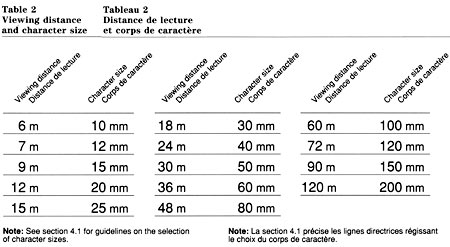
Table 2: Viewing Distance and Character Size - Text version
| Viewing Distance | Character Size |
|---|---|
| 6 m | 10 mm |
| 7 m | 12 mm |
| 9 m | 15 mm |
| 12 m | 20 mm |
| 15 m | 25 mm |
| 18 m | 30 mm |
| 24 m | 40 mm |
| 30 m | 50 mm |
| 36 m | 60 mm |
| 48 m | 80 mm |
| 60 m | 100 mm |
| 72 m | 120 mm |
| 90 m | 150 mm |
| 120 m | 200 mm |
Note: See section 4.1 for guidance on the selection of character sizes.
Size of the “Canada” wordmark
The standard size relationship between the federal signature and the wordmark is 1:2.5. See Table 3 for the corresponding sizes.
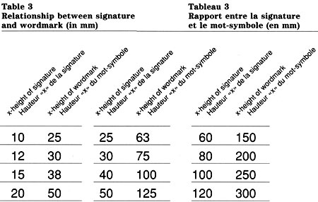
Table 3: Relationship between signature and wordmark (in mm) - Text version
| x-height of signature | x-height of wordmark |
|---|---|
| 10 | 25 |
| 12 | 30 |
| 15 | 38 |
| 20 | 50 |
| 25 | 63 |
| 30 | 75 |
| 40 | 100 |
| 50 | 125 |
| 60 | 150 |
| 80 | 200 |
| 100 | 250 |
| 120 | 300 |
Use of standard spaces
The layout of signs is based on the “x”, the unit of measurement used in signage. Each message element is positioned according to standard spaces. See Table 4 and Figure 7.
Certain variations from the standard spaces may be required when a layout must fit a standard sheet size. For example, a layout can be modified by using additional space for the sign’s margins. Any additional space should be distributed evenly to maintain a balanced layout. Conversely, where a preliminary layout slightly exceeds the dimensions prescribed for the sign, the minimum space referred to in Table 4 can be used. Any reduction from the standard spaces should be distributed evenly in the layout.
The use of minimum spaces should be avoided on exterior signs intended for long viewing distances.
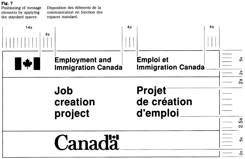
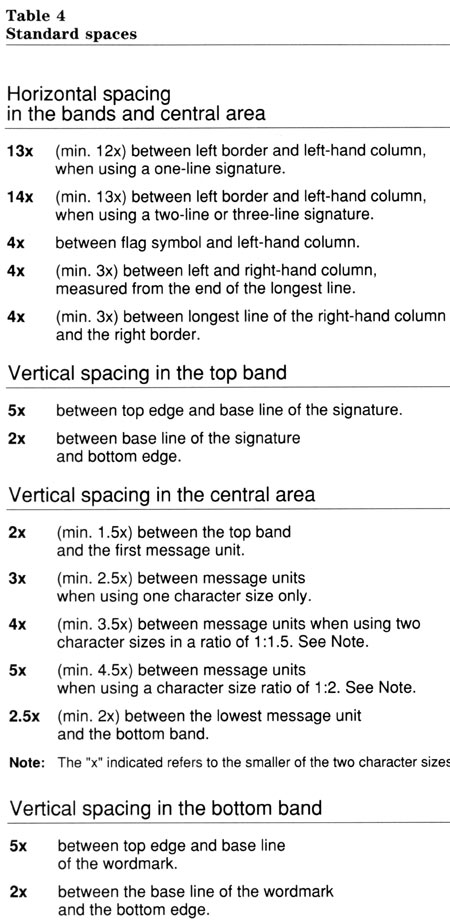
Table 4: Standard Spaces - Text version
| 13x | (min. 12x) between left border and left-hand column when using a one-line signature |
|---|---|
| 14x | (min. 13x) between left border and left-hand column, when using a two or three-line signature. |
| 4x | between flag symbol and left-hand column. |
| 4x | (min. 3x) between left and right-hand column, measured from the end of the longest line. |
| 4x | (min. 3x) between longest line of the right-hand column and the right border. |
| 5x | between top edge and base line of the signature. |
|---|---|
| 2x | between base line of the signature and bottom edge. |
| 2x | (min. 1.5x) between the top band and the first message unit |
|---|---|
| 3x | (min 2.5x) between message units when using one character size only |
| 4x | (min. 3.5x) between message units when using two character sizes in a ratio of 1:1.5 (see note). |
| 5x | (min. 4.5x) between message units when using two character sizes in a ratio of 1:2 (see note). |
| 2.5x | (min. 2x) between the lowest message unit and the bottom band. |
Note: the "X" indicated refers to the smaller of the two character sizes.
| 5x | between top edge and baseline of the wordmark. |
|---|---|
| 2x | between the base line of the wordmark and the bottom edge. |
Signature layout
To achieve visual balance between the symbol and the accompanying title, two size relationships have been established. Based on the number of lines used for the signature, these relationships are described below.
One-line signature
The ratio between the character size and the height of the flag symbol is 1:3 (Fig. 8). For example, when using the 50 mm character size, the height of the flag symbol must be 150-mm, or 3x.
Two-line signature
The ratio between the character size and the height of the flag symbol is 1:3.4 (Fig. 9). For example, when using the 50-mm character size, the height of the flag symbol must be 170-mm, or 3.4x.
Size relationships
Table 5 shows the character size with the corresponding height of the flag symbol using the two ratios referred to above.
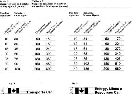
Table 5: Character size and height of flag symbol (in mm) - Text version
| Character size | Height of Symbol |
|---|---|
| 10 | 30 |
| 12 | 36 |
| 15 | 45 |
| 20 | 60 |
| 25 | 75 |
| 30 | 90 |
| 40 | 120 |
| 50 | 150 |
| 60 | 180 |
| 80 | 240 |
| 100 | 300 |
| 120 | 360 |
| 150 | 450 |
| 200 | 600 |
| Character size | Height of Symbol |
|---|---|
| 10 | 34 |
| 12 | 41 |
| 15 | 51 |
| 20 | 68 |
| 25 | 85 |
| 30 | 102 |
| 40 | 136 |
| 50 | 170 |
| 60 | 204 |
| 80 | 272 |
| 100 | 340 |
| 120 | 408 |
| 150 | 510 |
| 200 | 680 |
Basic layout
There are two factors that affect the layout of a sign:
- the need to select a character size appropriate for the sign’s viewing distance; and
- the need to assess the economical use of sheet material for the sign’s substrate (standard sheet sizes of plywood, card or paper).
An evaluation of both factors at the layout stage should ensure that the sign’s message will be legible for the viewer, and that the sign can be produced economically.
Layout methods
A sign layout can be prepared with the aid of a computer or be drawn manually. Regardless of the method used, the basic steps are the same.
Manual layout
A manually prepared layout (Fig. 10) should follow the steps set out below:
- establish an appropriate character size ratio between the main message, the signature, and any secondary information, Table 1;
- lay out the message in the central area of the sign by referring to the standard spaces shown in Table 4;
- lay out the signature in the top band, Table 4;
- lay out the “Canada” wordmark in the bottom band, Tables 3 and 4;
- assess whether the sign layout meets the general design criteria set out under “Relationship between bands and central area” and “Sign proportions”;
- modify the layout, if required;
- select the appropriate character size for the main message, Table 2;
- determine the approximate sign dimensions by calculating the height and length of the sign on the basis of the number of “x” shown in the layout;
- make any adjustments necessary to fit the layout to a standard sheet size (e.g. spacing, line breaks, or character sizes).
Computer-aided layout
A sign layout is prepared by selecting the appropriate design program and entering the message. As required, the preliminary layout is modified to meet general design criteria, such as the relationship between bands and central area, sign proportions and standard sheet sizes.
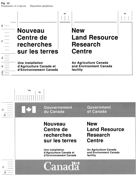
Design variations
A variation from the standard may be needed when a project sign must meet special requirements. For example, it may be desirable to use an illustration depicting the building project, or a graphic device that reinforces the message (Fig. 11). Such requirements can normally be met without deviating from the basic intent of the design standards. However, variations in the use of colour or typeface are not permitted without prior consultation with the Administrative Policy Branch of Treasury Board Secretariat.
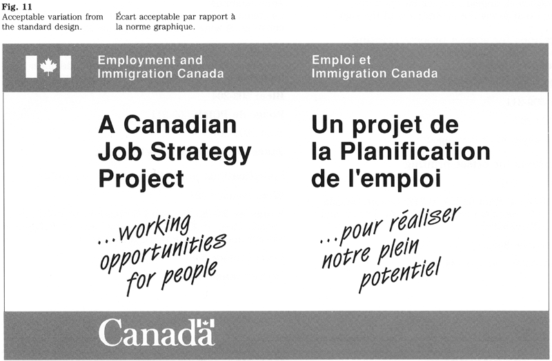
Standard colours
A range of standard colours has been adopted for project signs and shall be used as indicated below.
Top and bottom bands
The federal organization that sponsors the program or project can choose one of these four colours: blue, FIP red, green or yellow-orange. Generally, an organization would adopt the same colour for all of its project signs.
The contrasting colour used for the signature and wordmark is white.
Central area
The message shall appear in black on the white background that forms the central area of the sign.
Specifications for screen process printing
The numbers refer to colours shown in CGSB-1-GP-12, Standard Paint Colours.
Blue: 502-204
FIP red: 509-211
Green: 503-207
Yellow-orange: to be developed
Specifications for offset printing
Blue: Pantone 301
FIP red: General Printing Ink, 0-712; Inmont Canada Ltd., 4T51577; Monarch Inks, 62539/0; or Sinclair and Valentine, RL163929/0
Green: Pantone 348
Yellow-orange: Pantone 144
Material requirements
Project signs are produced from a variety of materials. Advice on their use is available from the Canadian Government Expositions Centre of Supply and Services Canada.
General criteria for materials are set out in CGSB-109-GP-5M, Signage Materials, Interior and Exterior. Where applicable, project signs shall conform to this standard.
Reproduction of symbols
When preparing films or other items needed for reproduction, the original artwork of the flag symbol and the “Canada” wordmark should be used. The Administrative Policy Branch of the Treasury Board Secretariat keeps the original artwork and will provide it upon request.
4.5 Signage Typeface
FIP Manual,
Introduction
This section sets out the design of the signage typeface and describes the spacing system to be used. The typeface was adopted to provide a graphic standard for the government’s signage system and to achieve consistency in the production of signs. Chapter 470, “Federal Identity Program” of the Administrative Policy Manual, outlines the application of these design standards.
Computer-aided design
The unit system of the signage typeface makes it highly suitable for computer-aided design applications. Programs can be designed that make the assembly of characters or the production of sign layouts much more efficient than manual methods.
Use of pre-spaced legends
When multiples of a particular signature or message are required, using pre-spaced legends is generally more economical than having to assemble each individual signature or message. The term “pre-spaced legend” refers to a product that consists of die-cut characters positioned on a carrier sheet, ready to be applied to a substrate.
Visual criteria
The character spacing system was developed to achieve optimum legibility of messages under normal viewing conditions. This means those conditions generally found in and around government facilities.
The system was designed for sign messages that are viewed under available ambient light, and is therefore not intended for signs that are internally illuminated or fabricated of retro-reflective materials. Because the irradiation associated with such signs reduces legibility, the space between characters should be increased proportionally to compensate for this optical effect. Depending on the degree of irradiation, the space may need to be 50 to 80 per cent greater than the data on character spacing shown in this section.
Design of the typeface
The FIP signage typeface is based on Helvetica medium. Variances in stroke width and design detail make other versions of Helvetica medium visually incompatible when combined with the FIP signage typeface. In view of the need for consistency when revising or updating messages, the FIP signage typeface should be used for the production of all signs.
Scope
Guidelines and specifications set out the requirements on the use of the FIP signage typeface, which is specified for all signs and for the markings of vehicles, aircraft and watercraft.
Enquiries
Advice regarding the use of the FIP signage typeface and its spacing system is available from the Administrative Policy Branch of the Treasury Board Secretariat. This office also keeps the original artwork of the typeface.
The typeface
The typeface includes all characters commonly used in sign messages; the letters, numerals, symbols and punctuation marks are shown in Appendix A.
When preparing dies, film strips, or other items needed for reproduction, the original artwork of the typeface should be used (see “Enquiries”).
Symbols of the FIP
Generally, the signage typeface is used with the corporate symbols of the FIP. The use of these symbols is described in Section 1.1, “Design” and their application is set out in 4.2, 4.3 or 4.4.
Directional arrow
For the design of the standard directional arrow and the guidelines on its use refer to Section 4.3, “Common-use and operational signs.”
The system of measurement
The unit is the basic measure of the typeface. It is an arbitrary measurement based on the division of the x-height into 50 equal portions. The unit serves to measure the width of individual characters, and the space between adjoining characters and words. The actual measure varies according to the character size in use (Fig. 1).
Character size
The character size is based on the x-height and is measured in millimetres. The standard character sizes with their corresponding unit widths are indicated in Table 1.
See Section 4.1 for guidelines on the selection of character size based on the viewing distance. For the convenience of the reader, the basic data on viewing distance have been included here as well (see Table 2).
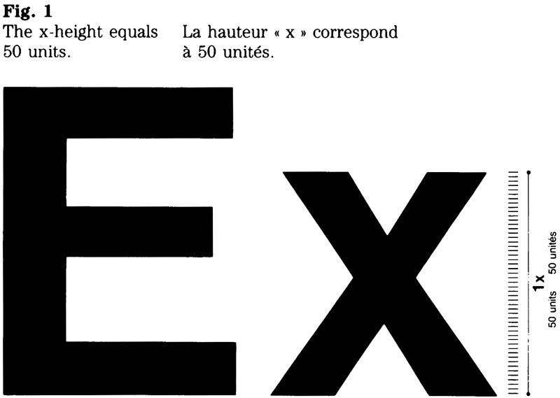
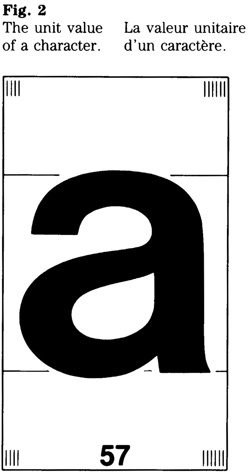
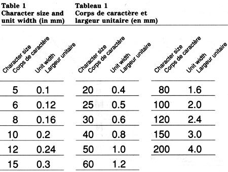
Table 1: Character size and unit width (in mm) - Text version
| Character Size | Unit Width |
|---|---|
| 5 | 0.1 |
| 6 | 0.12 |
| 8 | 0.16 |
| 10 | 0.2 |
| 12 | 0.24 |
| 15 | 0.3 |
| 20 | 0.4 |
| 25 | 0.5 |
| 30 | 0.6 |
| 40 | 0.8 |
| 50 | 1.0 |
| 60 | 1.2 |
| 80 | 1.6 |
| 100 | 2.0 |
| 120 | 2.0 |
| 150 | 3.0 |
| 200 | 4.0 |
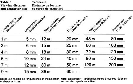
Table 2: Viewing distance and character size - Text version
| Viewing Distance | Character Size |
|---|---|
| 1 m | 5 mm |
| 2 m | 6 mm |
| 4 m | 8 mm |
| 6 m | 10 mm |
| 15 m | 25 mm |
| 18 m | 30 mm |
| 24 m | 40 mm |
| 30 m | 50 mm |
| 36 m | 60 mm |
| 48 m | 80 mm |
| 60 m | 100 mm |
| 72 m | 120 mm |
| 90 m | 150 mm |
| 120 m | 200 mm |
The character spacing system
This system controls the space between characters and is based on the unit value, a number which represents the width of a specific character including a space on either side (Fig. 2). As mentioned above, the actual measure of the unit value varies according to the character size in use.
The data that indicate how the unit value for each character is constructed is presented in Table 3. The application of the character spacing system and the methods that can be used are described below.
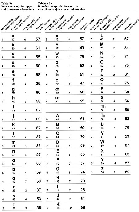
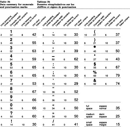
Assembly of characters
Several methods are used to assemble characters. All derive from the spacing system but each is suited to different conditions. Factors such as character size, type of equipment and method of reproduction determine the choice of one of the following methods for producing sign messages.
Spacing characters manually
This basic method involves the use of Table 4, which indicates the inter-character space in number of units. This space is measured and each character is positioned accordingly. In view of the relatively small spaces that may have to be measured, this method is practical only with the larger character sizes (e.g. 50 mm and up).
Normally, the characters are positioned with the aid of grid paper which indicates the space between lines.
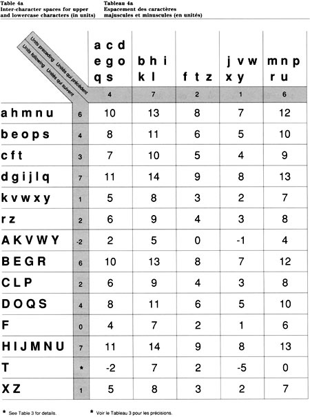
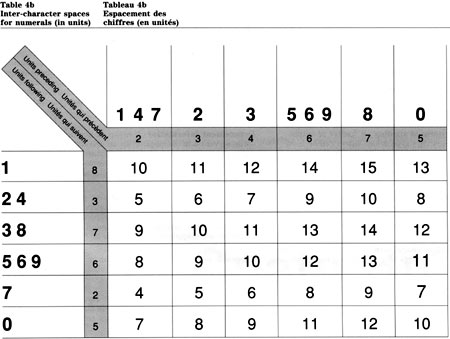
How to use Table 4
The inter-character space shown in Table 4 represents the total of the “units following” one character and the “units preceding” the next character. The inter-character space is expressed in number of units. To convert units into millimetres, refer to Table 1 to find the width of one unit in any given character size.
To find the space between characters, locate the first character in the left-hand column and the one that follows in the row above. The intersecting field shows the number of units required. For example, an uppercase “G” followed by a lowercase “o” will require a space of 10 units in between. See Fig. 3.
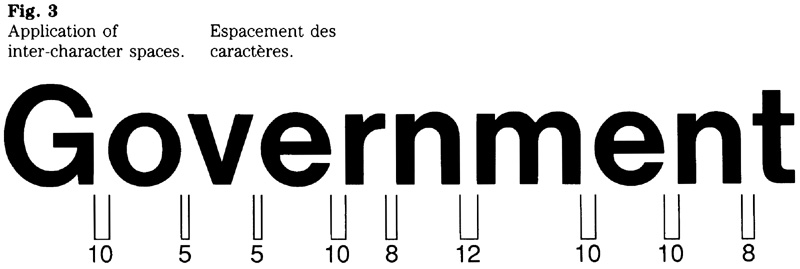
Spacing characters visually
Although the inter-character spaces should be measured with a ruler, a person can acquire the skill to space characters visually and achieve satisfactory results. This applies to the smaller character sizes in particular (e.g. up to 50 mm). To verify that inter-character spacing is accurate and consistent enough, appropriate checks should be made. This may be done by measuring the length of a line of text that has been spaced visually and comparing it with the results of calculations using the unit values of the particular characters in that line.
Computer-generated spacing
A variety of output devices that either set type or cut letters can be used to generate characters and the space in between. Organizations planning to use such an output device should assess whether it can be adapted to accommodate the FIP signage typeface.
In order to use the FIP typeface with a particular output device, each character must be fitted into the unit system of the equipment concerned. See “Enquiries” for the availability of the original artwork.
Tiles to assemble characters
The term “tile” refers to a product that consists of a die-cut character positioned on backing paper that is trimmed to include the prescribed space on either side of the character. When assembling characters, the individual tiles are simply butted to form words (Fig. 4). The result is an accurately spaced message.

Space between words, lines, columns
The following rules apply in general, regardless of the method of character assembly used.
Space between words, punctuation marks and special characters
One of three measures (Fig. 5) is used to control the space between words, punctuation marks and special characters. These measures are:
- 35 units for a full space;
- 25 units for a medium space;
- 15 units for a small space.
When inserting these spaces, principles of good typographic practice should be followed. The conventions of the two official languages need to be observed.
The examples show the different spaces in a particular context (Fig. 6).

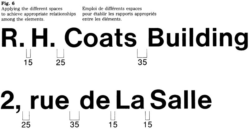
Spacing of lines
The spacing of lines is measured from baseline to baseline. It equals 2x (Fig. 7).
Space between columns
The space between the left and right-hand columns is measured in number of “x”. For guidance on the standard spaces used in sign layouts refer to the manual sections dealing with specific types of signs.
Vertical alignment of lines
The vertical alignment of different lines of text must make allowances for the particular shape of the first character of each line. Any characters that have straight vertical strokes (e.g. B, D, E, b, k, 1, m, etc.) align perfectly, of course, but characters with a rounded or angular shape must be aligned optically, otherwise the characters do not appear to line up.
Optical alignment
Optical alignment is normally achieved by manually adjusting the position of the first character, if required. Any character with a rounded or angular shape should extend slightly beyond the start line (Fig. 8).
Adjusting the unit values
Optical alignment may also be achieved by using an output device, and programming it to subtract a certain number of units from the unit value of the first character in a line.
For example, the unit value of the letter “E” is constructed of 7+52+6 units. Therefore the 7 units at the left of the character need to be subtracted. In the case of a “C”, which has a unit value of 4+64+2, the adjustment consists of subtracting the 4 units to the left of the character and an additional 2 units to account for the portion of the “C” that must extend beyond the start line. This results in an adjusted unit value of 62+2. The number of units to be subtracted is summarized below.
To achieve optical alignment of the first character of a line, the character’s unit value should be adjusted as follows:
- subtract 3 units from j v w x y z J T Z
- subtract 4 units from f t A V W X V
- subtract 6 units from a c d e g m n o p q r s u C G O Q S
- subtract 7 units from b h i k l B D E F H I K L M N P R U
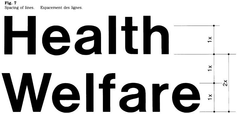
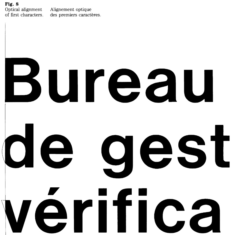
Using the system
In addition to providing a standard for inter-character spacing, the system of measurement is also useful for calculating sign dimensions. Whether the sign layout and character assembly is a manual or computer-aided process, the unit system can be used for calculating the length of a line, the space occupied by a message, and the total dimensions of a sign.
Calculating line length and sign dimensions
To pre-determine the length of a line of text, the unit values of the individual characters, including any word spaces, must be added together. (See Table 3.) By dividing the total of the unit values by 50, the number of “x” occupied by that line of text can be determined. To convert the number of ‘‘x” into millimetres, the character size being used is multiplied by the number of ‘‘x”.
Calculating the dimensions of the sign shown in figure 9
Refer to Section 4.2 for details on layout and standard spaces. Two character sizes were chosen for this particular sign: 20 mm for the federal signature and 30 mm for the message ‘‘Canadian Wildlife Service”. The calculations are as follows:
Sign length
- Establish the longest line in each column (i.e. “Canadian” and “de la faune”). By referring to Table 3, add the unit value of each character in the word ‘‘Canadian” as follows: C(70 - 4 = 66), a(57), n(57), a(57), d(60), i(27), a(57), n(57 - 6 = 51); the total is 432 units. To convert the units into number of “x”, divide by 50: 432 ÷ 50 = 8.6x. To convert the number of ‘‘x” into millimetres, multiply by 30 mm, the character size used for the word “Canadian”: 8.6 x 30 = 258 mm.
Similarly, calculate the length of ‘‘de la faune”, which comes to a total of 318 mm.
Add the subtotals: 258 + 318 = 576 mm - According to the tables in Section 4.2, 14x are required for the left margin. Multiply that number by the character size used for ‘‘Environment Canada” (20 mm): 14 x 20 = 280 mm
4x are required between the two columns. Multiply that number by the character size used for ‘‘Canadian” (30 mm): 4 x 30 = 120 mm
4x are required for the right margin. Multiply that number by the character size used for ‘‘de la faune” (30 mm): 4 x 30 = 120 mm
Add the subtotals: 280 + 120 + 120 = 520 mm - Determine the sign length by adding a and b: 576 + 520 = 1096 mm
Sign height
- According to the tables in Section 4.2, 5.5x are required between the sign’s top edge and the baseline of the signature, and between the baseline of the signature and the baseline of “Canadian”. Add these spaces: 5.5 + 5.5 = 11x, and multiply the total by the character size used for the signature (20 mm): 11 x 20 = 220 mm
- 4x are required between the baseline of “Canadian” and the baseline of “Service”, and 2x are required between the baseline of “Service” and the sign’s bottom edge. Add these spaces: 4 + 2 = 6x, and multiply the total by the character size used for the sign’s message (30 mm): 6 x 30 180 mm
- Add the results of d and e to determine the height of the sign: 220 + 180 = 400 mm
Note: for purposes of these calculations, the sign area required for the Canada’ wordmark has been omitted. For details on the height of that band, see Section 4.2.
Sign dimensions
Based on the 20 mm and 30 mm character sizes used in the example, the sign in figure 9 would measure 400 mm x 1096 mm.
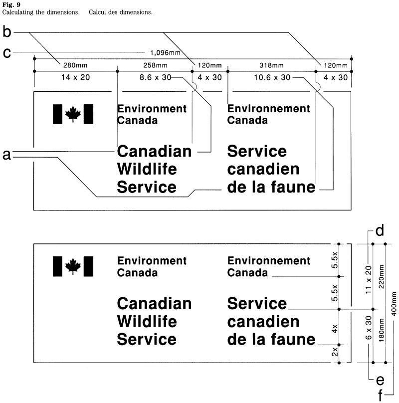
Assessing alternative character sizes
Once the dimensions of a sign are known in number of “x” (Fig. 10), the effect of a smaller or larger character size on the sign’s dimension can easily be calculated.
For instance, instead of combining 20 mm and 30 mm as in the example above, the dimensions of the sign in Fig. 9 may be calculated by combining 15 mm and 25 mm, or 25 mm and 40 mm. The calculations are shown in Table 5.
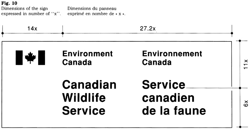
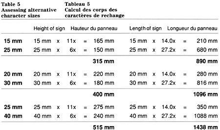
Commonly used character sizes
When assessing character sizes see Table 2 for the data on standard sizes, and Fig. 11 for an illustration of the sizes commonly used.
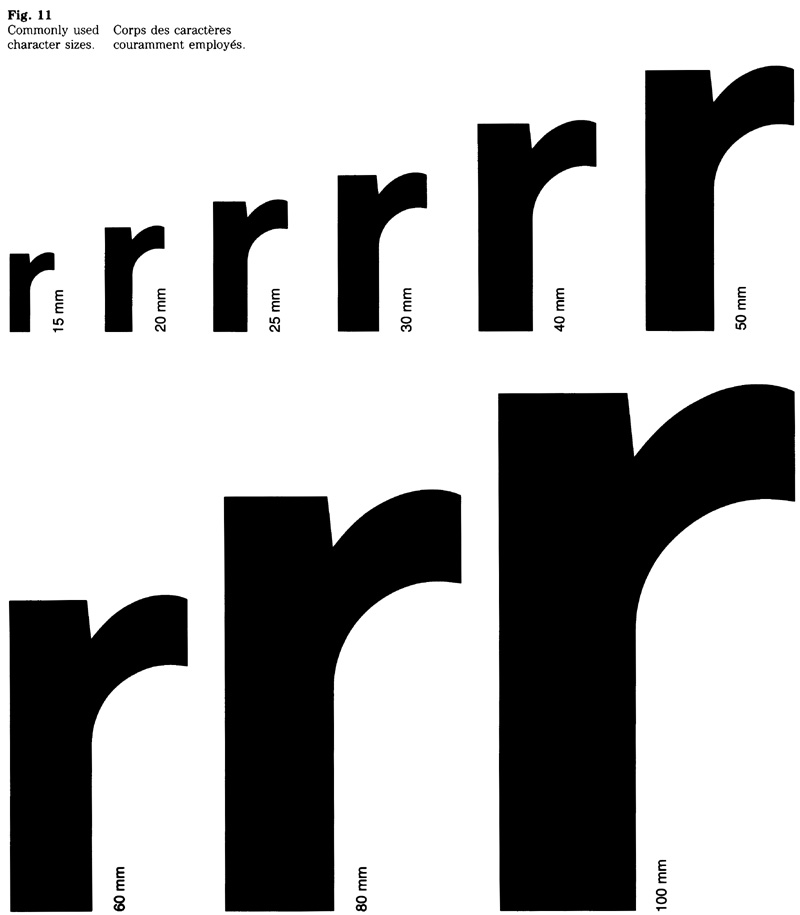
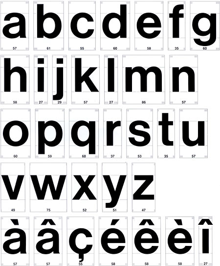
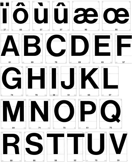
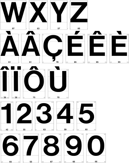
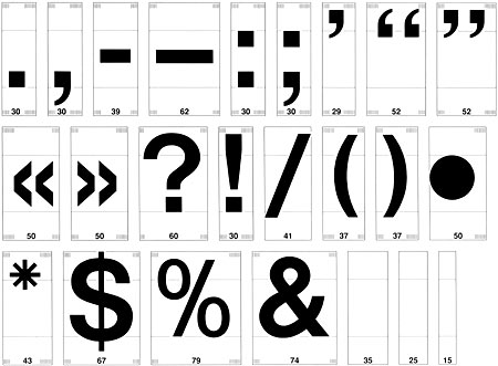
Use of UPPERCASE and numerals for codes and abbreviations
The inter-character spaces that govern the assembly of UPPERCASE characters differ from those used for assembling a combination of upper and lower case characters.
The data that indicate how the unit value for each character is constructed are presented in Table Bl. The use of the spacing system for UPPERCASE characters is described below.
Note that the use of UPPERCASE characters applies solely to abbreviations, codes, and the like.
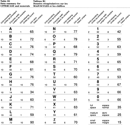
How to use Table B2
Characters are assembled with the aid of Table B2 which shows the inter-character space required. This space is expressed in number of units, and represents the total of the “units following” one character and the “units preceding” the next character.
To find the space between characters, locate the first character in the left-hand column and the one that follows in the row above. The intersecting field shows the number of units required. For example, a “G” followed by “R” will require a space of 16 units in between. If a character size of 25 mm were to be used, 16 units represent 8 mm (16 x 0.5 mm).
Using the inter-character spaces prescribed will normally result in a relatively even spacing of all characters in a particular abbreviation or code. Nevertheless, adjustments may be needed for certain awkward character combinations (e.g. LY, WJ). To achieve consistent spacing, such adjustments should be done visually by comparing the space between all characters of the particular abbreviation or code.
For guidance on the methods of assembling characters, see “Assembly of characters” (p. 7). The details on the spacing of punctuation marks are provided in Table 3b (p. 7); the inter-character spaces for numerals are shown in Table 4b (p. 9).
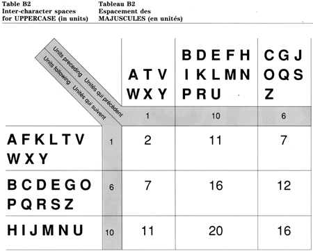
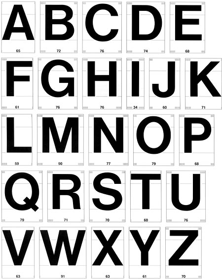
Marketing
5.1 Advertising Archived
This section has been archived on the Web
Information identified as archived is provided for reference, research or recordkeeping purposes. The text that is struck out below has been replaced. Information is now available in the Ads section of the Design Standard for the Federal Identity Program.
FIP Manual,
Introduction
Advertising signatures should be presented in a consistent manner, clearly conveying federal sponsorship of the message. Set out here are guidelines on how government policy on the use of the federal signature and the “Canada” wordmark should be applied in advertising. These guidelines are intended to promote clear and consistent identification of the sponsor, while allowing flexibility on how signatures are being applied. The guidelines were developed to assist all those involved in the planning and preparation of government-sponsored advertising.
This section should be used with Chapter 470, “Federal Identity Program”, and Chapter 480, ‘Government Communications Policy” of the Administrative Policy Manual. Official languages requirements with respect to advertising are set out in Chapter 470.
Section 1. 1, “Design”, of the FIP Manual contains comprehensive guidelines on the use of symbols and signatures, as well as information on the availability of proofs for reproduction.
Guideline examples
These guidelines include typical examples to show how the signature and wordmark should be applied in federal advertising. Most of the examples stem from actual advertisements; some of them were modified to reflect the guidelines.
Scope
Guidelines set out the use of corporate signatures in government-sponsored advertising within Canada. They apply to print advertising, outdoor and transit advertising, television and radio advertising, as well as to paid announcements.
Advertising signatures
Described below are design criteria that apply to advertising signatures in print advertising, outdoor and transit advertising, and in paid announcements. These criteria pertain to the layout, the relative size and position of the signature and wordmark, as well as the use of colour.
Federal signature
Three aspects determine the design of a signature: layout, type size and typeface. This involves choosing the appropriate layout (e.g. one-, two- or three-line signature), the type size, and the suitable typeface (i.e. Helvetica light, regular or medium). Described below is the effect of these variables on the design of a signature.
Layout
The signature layout should be chosen on the basis of the signature’s length (i.e. number of words) and the space allocated for it in the advertisement. Basically, it is a question of whether a signature should be displayed horizontally, or in a more compact, vertical layout (Fig. 1).
Where horizontal space is limited, the choice of layout is directly related to the signature’s type size. To fit a particular width and to permit the use of a large enough type size, certain signatures may need to be displayed in three or possibly four lines (Fig. 2).

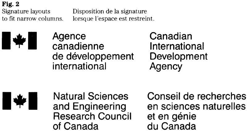
Type size
The type size of the signature should relate to the overall layout and typography of an advertisement. In each case, judgement will be needed to select a suitable type size for the signature, and to allocate sufficient space surrounding it. For printed applications, the type size should not be less than 8 point (Fig. 3).
Typeface
One of three typefaces (Helvetica light, regular or medium) may be used for signatures. The choice should be based on the advertisement’s overall design, the particular media, and whether the signature is reproduced in positive or negative form. In general, Helvetica regular and medium can be reproduced effectively in either positive or negative form. Helvetica light may be used when the signature appears in positive form. See Fig. 4.
When a signature is accompanied by additional information such as a service title, different sizes or weights of type may be used to make the important parts stand out or to de-emphasize others (Fig. 5). Further details on such typographic variations are contained in section 1. 1.
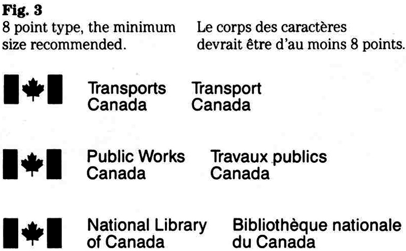
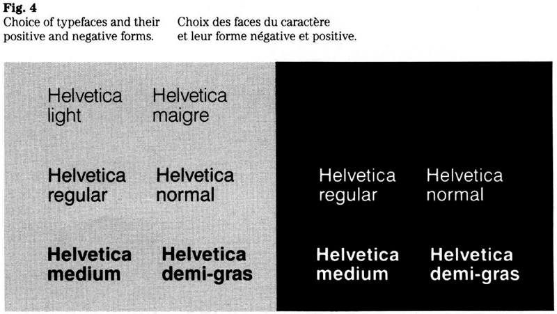
“Government of Canada” signature
This signature should be used to identify advertisements pertaining to government-wide initiatives or to identify messages sponsored by two or more departments.
Reproduction proofs of this signature are available from the Administrative Policy Branch of the Treasury Board Secretariat, which maintains a supply of proofs in a range of weights and point sizes (Fig. 6).
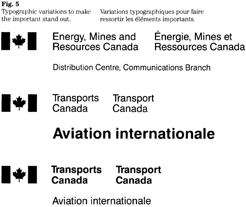
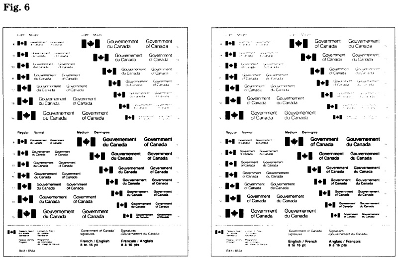
Coat of Arms signature
This signature is used by institutions that use the Coat of Arms for identification.
Two layouts have been adopted for the Coat of Arms signature: one symmetrical and the other asymmetrical. The choice of layout is at the discretion of the institution concerned, but should be compatible with the overall design of the particular advertisement.
Technical details on the layouts for the Coat of Arms signature are contained in section 1.1.
“Canada” wordmark
Two weights of the wordmark are in use (Fig. 7). The regular-weight version of the wordmark is used for most media. Because of viewing conditions, the medium weight wordmark is recommended for outdoor advertising. Details regarding these weights and the standard sizes are contained in section 1.1.
Defined in the FIP policy as the dominant graphic symbol of the program, the “Canada” wordmark must be used in a prominent position, generally as the final element of an advertisement.
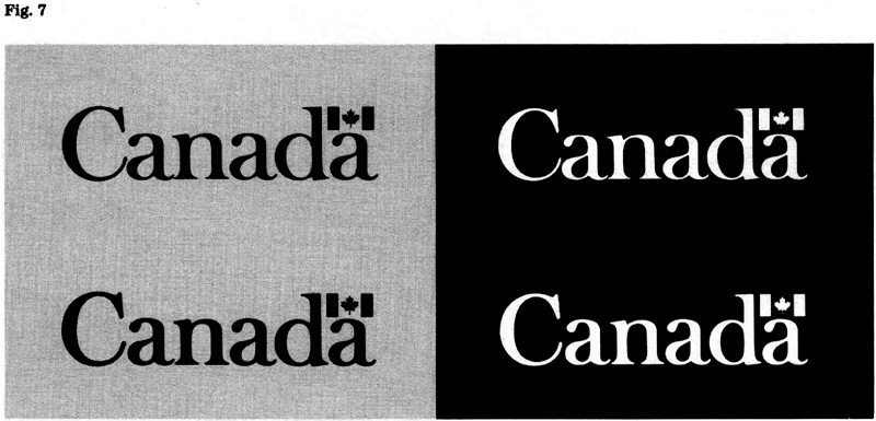
Applying the signature and wordmark
Care should be taken to achieve an appropriate relationship between signature and wordmark. This involves selecting the relative size, placement and colours for these elements.
Typical size relationships between signature and wordmark are shown below. It is recognized that various factors (e.g. layout, length of the signature, nature of the message, media used) will influence decisions when selecting sizes (Fig. 8).
Another factor in achieving an appropriate relationship between the elements is the use of colour. A common method is to employ positive and negative forms for the signature and wordmark (Fig. 9). When a colour (other than black or white) is used, it should generally be employed to emphasize the wordmark.
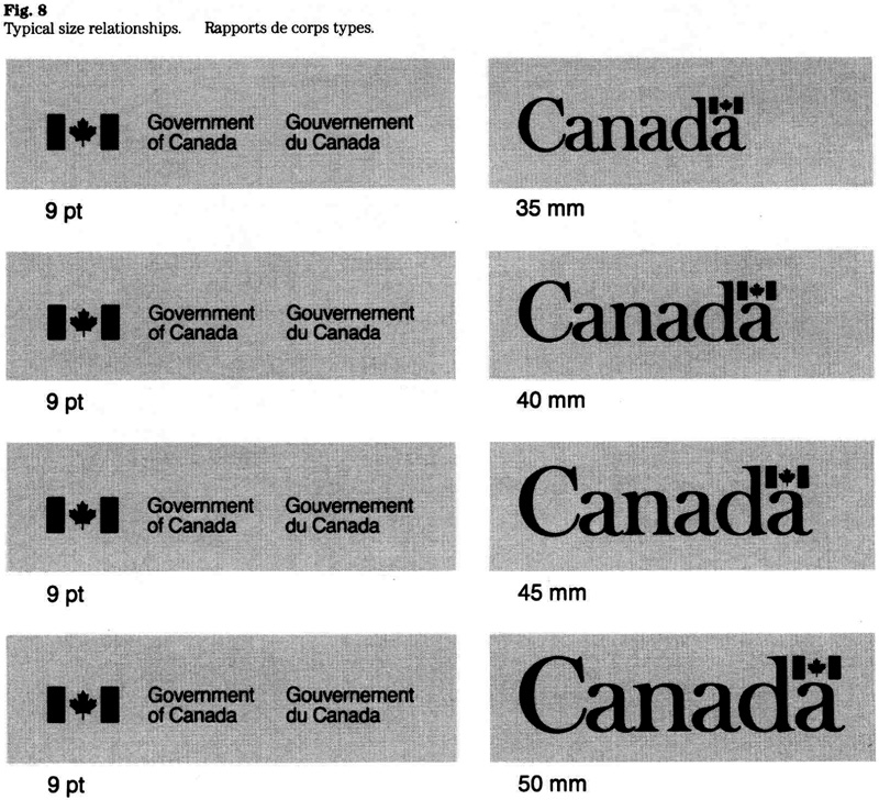
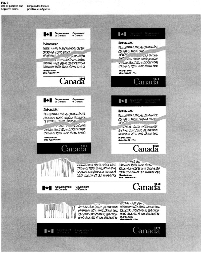
Colour and contrast
To ensure clear recognition and to maintain the integrity of the government’s corporate identity, basic rules with respect to colour and contrast apply. (See “Television advertising” with respect to rules on colour for that medium.)
When displaying the federal signature, both the flag and the type should be in the same colour. The options are:
- black (or dark-coloured) signature on a white (or light-coloured) background; or
- white (or light-coloured) signature on a black (or dark-coloured) background.
When displaying the “Canada” wordmark, both the type and the flag may be in the same colour; or the flag in the wordmark may be rendered in red with the type appearing in black or white, as appropriate. The options are:
- black (or dark-coloured) wordmark on a white (or light-coloured) background;
- white (or light-coloured) wordmark on a black (or dark-coloured) background;
- type in black and flag in FIP red on a white (or light.-coloured) background; or
- type in whit-e and flag in FIP red on a black (or dark-coloured) background.
Note: When red is used for the flag in the ‘Canada” wordmark, the field behind the red maple leaf and between the red bars may be rendered in white or in the colour of the overall background. (In no instance may the red bars be connected by horizontal lines.)
Visual criteria
To ensure the integrity and recognition value of both signature and wordmark the following criteria should be observed when designing an advertisement (Fig. 10):
- the signature and wordmark must be displayed in generous open space, free from close association with interfering or distracting elements;
- although the wordmark must be displayed in association with an appropriate signature, the two elements should appear well separated from each other;
- the wordmark shall never be used in a headline, phrase or sentence.
The use of generous open space surrounding the signature and wordmark is particularly important when a slogan, special symbol (see note) or other graphic device must be displayed nearby. This means selecting an appropriate size and spatial relationship for the various elements and integrating them into the design.
Note: The policy on the use of special symbols is set out in Chapter 470. When the use of a special symbol has been authorized in accordance with that policy, it may be applied in advertising.
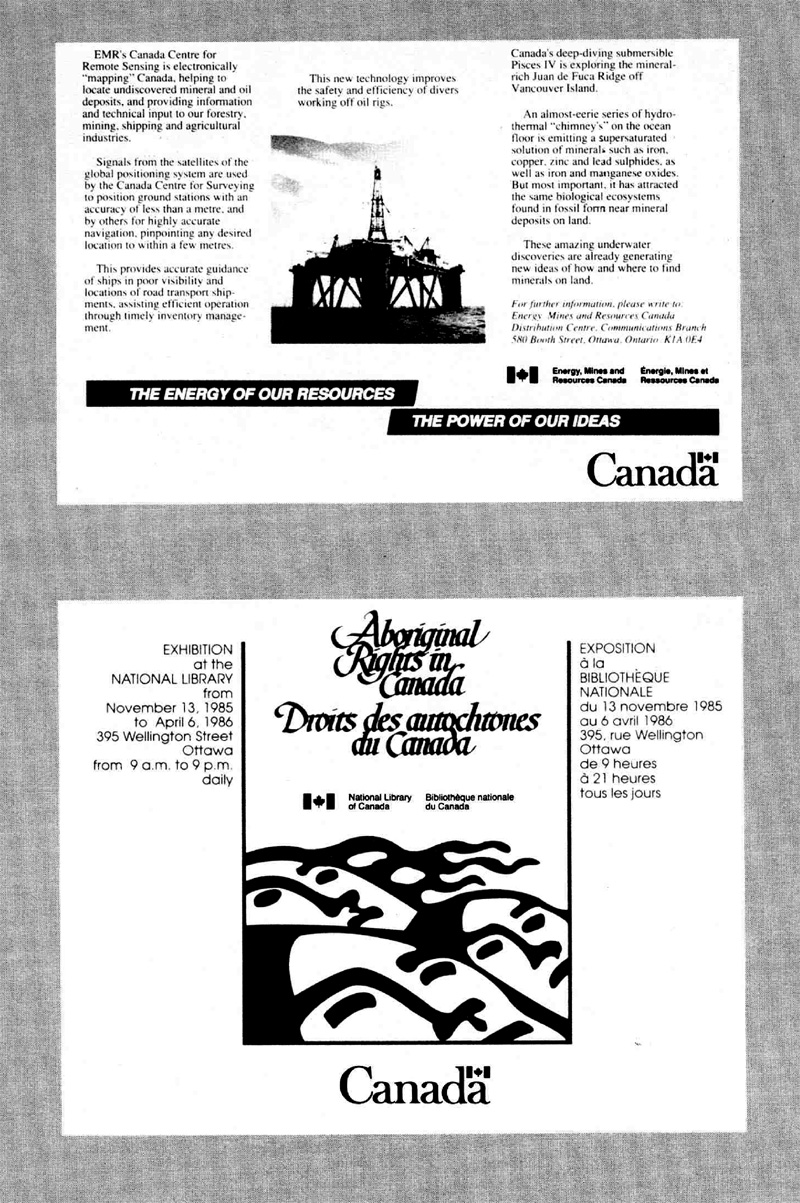
Print advertising
The signature and wordmark should be integrated into the advertisement’s design as follows.
The federal signature should appear below the last paragraph of the body copy or in the advertisement’s lower left corner. The choice of layout, typeface and type size of the signature should complement the advertisement’s design.
The “Canada” wordmark should be the dominant identifier in relation to the federal signature. Wherever feasible, the wordmark should appear in the lower right corner of time advertisement.
Examples on how advertising signatures may be applied are presented below (Fig. 11).
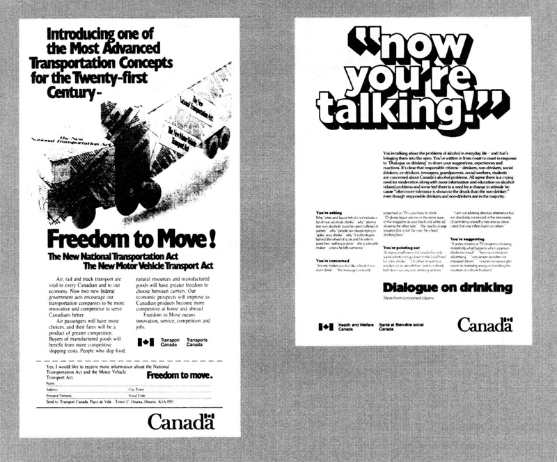
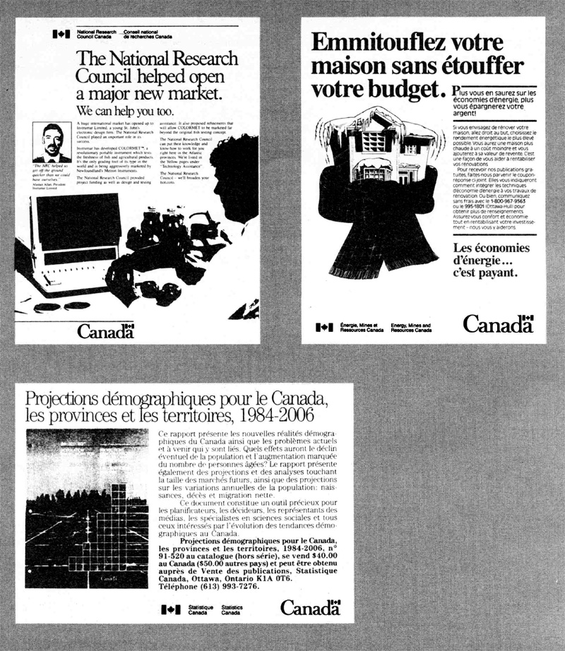
Paid announcements
Paid announcements are public notices regarding tenders, sales, public hearings, offers of employment, business hours, addresses and the like. The signature and wordmark should be integrated into the design of an announcement as follows.
The federal signature should normally appear at the top of the announcement. The choice of layout, typeface and type size for the signature should complement the typography of the notice.
The “Canada” wordmark should be placed at the bottom of the announcement and appear as the dominant identifier in relation to the federal signature.
Examples on how advertising signatures may be applied in paid announcements are shown below (Fig. 12).
Other considerations
Because of horizontal space restraint of the standard newspaper column, certain signatures may need to be laid out in three or possibly four lines to permit the use of an adequate type size (minimum size is 8 point).
Where an institution inserts several notices in the same edition of a newspaper, lineage costs can be reduced and the effectiveness of advertising improved by incorporating these notices in one layout under a single signature.
Developing graphic standards
Federal institutions that are using paid announcements on a regular basis are encouraged to develop (if they have not already done so) graphic standards that prescribe the layout and typography as well as the position of the signature and wordmark. The application of such standard formats allows an institution to project a consistent look and to achieve greater efficiency when preparing and placing paid announcements.
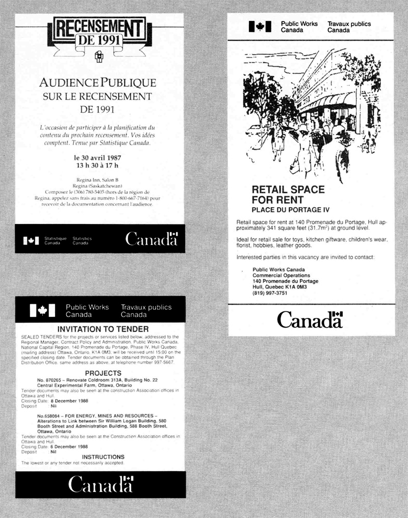

Outdoor and transit advertising
The signature and wordmark should be integrated into the design of the advertisement as follows.
The federal signature should normally appear in the lower left corner of the advertisement, The choice of layout, typeface and type size of the signature should complement the advertisement’s design.
The “Canada” wordmark should appear in the lower right corner of the advertisement and be the dominant identifier in relation to the federal signature.
Examples on how signatures may be applied in outdoor and transit advertisements are shown below (Fig. 13).

Television advertising
The "Canada" wordmark is used as the dominant identifier and shall appear as the last image of the commercial. The sponsoring institution must be identified in conjunction with the display of the wordmark. The methods are:
-
During the display of the wordmark, announcement by voice-over of the sponsoring institution’s applied title or the “Government of Canada” title; the announcement is in the language of the station.
-
Where use of method a is not appropriate, the federal signature must be presented visually. This may be done immediately prior to or on the same image with, the “Canada” wordmark. The signature of the sponsoring institution or the “Government of Canada” signature is used, as appropriate. The “Canada” wordmark should appear in prominence in relation to the visual display of a signature.
Examples on how the signature and wordmark may be used are shown in Fig. 14.
Colour and contrast
To ensure clear recognition and to maintain the integrity of the government’s corporate identity, basic rules with respect to colour and contrast apply.
When displaying the “Canada” wordmark, both the type and the flag may be in the same colour; or the flag in the wordmark may be rendered in red with the type appearing in white or black, as appropriate. The options are:
- white wordmark on a dark-coloured background;
- black wordmark on a light-coloured background;
- white type arid red flag, or black type and red flag, on a contrasting background (this use of colour is generally not recommended when the wordmark is superimposed on a photographic background, is displayed in a relatively small size, or shown during a very brief time interval.)
When displaying the federal signature, both the flag and the type should he in the same colour; i.e. white signature on a dark-coloured background, or black signature on a light-coloured background.
Other considerations
When applying the wordmark, the following aspects should be considered.
Superimposition
When superimposing the wordmark on a photograph, the area behind the wordmark should provide adequate and continuous contrast.
Rendering of the flag
When red is used for the flag in the “Canada’’ wordmark, the field behind the red maple leaf and between the red bars may be rendered in white or in the colour of the overall background. (In no instance may the red bars be connected by horizontal lines.)
Animation
Techniques of animation may be employed when presenting the “Canada” wordmark, but the wordmark should appear in its actual form in the final image of the commercial.
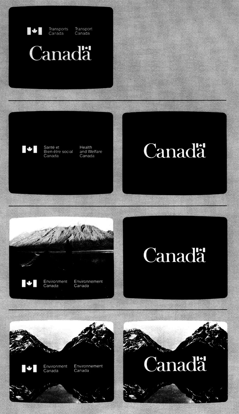
Radio advertising
The sponsor of a radio commercial is identified by announcing, within an appropriate phrase, the applied title of the federal institution concerned or the words “Government of Canada”. This announcement is made at the end of the message in the language of the station.
Enquiries
Each institution is responsible for implementing these guidelines and has named an official (referred to as FIP Coordinator) to manage its corporate identity. All enquiries regarding the guidelines should be routed through the FIP Coordinator of the institution concerned.
5.2 Published Material Archived
This section has been archived on the Web
Information identified as archived is provided for reference, research or recordkeeping purposes. The text that is struck out below has been replaced. Information is now available in the How to apply the official symbols to products section of the Design Standard for the Federal Identity Program.
FIP Manual,
Introduction
Information material published by federal institutions should be clearly and consistently identified. These guidelines explain how government policy on the use of corporate signatures and the “Canada” wordmark should be implemented. They are intended to promote clear and consistent identification of published material while allowing flexibility in applying the federal identity. The guidelines are meant to assist all those involved in managing, planning or designing information products.
Applicable publications
This guide should be used with the following policies or guidelines:
Communications Volume, Treasury Board Manual
- Government Communications Policy, including Publishing Guidelines
- Federal Identity Program Policy, including Appendix A, Official languages
Federal Identity Program Manual
- 1.0 Management guide to corporate identity
- 1.1 Design
Scope
These guidelines describe the use of signatures and the “Canada” wordmark when identifying published material, which comprises both printed and electronic products and includes these fields of application:
- books, booklets, periodicals, monographs, brochures, leaflets, newsletters, bulletins, maps;
- posters, display cards, public notices;
- packaging or labels that identify disks, cassettes, audio tapes or microforms;
- information kits, loose-leaf binders or similar holders of printed material;
- electronic products requiring on-screen identification;
- alternate media designed for communications with disabled persons.
Definitions
For easy reference, certain terms established for Federal Identity Program (FIP) purposes are included here.
- “Canada” wordmark:
-
the global identifier of the government; it consists of the word “Canada” with the Canadian flag over the final “a”.
- Signature:
- the combination of a symbol and a title. (Also referred to as the corporate signature.)
Basic considerations
Planning
An institution’s corporate identity should be presented as an integral part of a publication. This means looking at corporate identity in terms of communications objectives, program delivery and service to the public. In practical terms the following points should be considered:
- Which signature is appropriate (e.g. regular signature or variant)?
- Should a visual relationship exist between content and corporate identity?
- How should the corporate identity be presented (e.g. level of prominence, visibility)?
- What functional requirements should be met to assist users to gain access to or retrieve the publication?
- By considering each of these points, corporate identity becomes part of the planning process. The key is to apply it in a purposeful manner.
Using a global approach
It is often more effective to look at corporate identity requirements globally rather than dealing with each product. This means that an institution rationalizes the design of its publications in conjunction with corporate identity requirements, and develops graphic standards to establish a corporate “look”. This practice is outlined in the “Management guide to corporate identity” and suggested for institutions with major publishing programs.
Context
When planning a publication it may help to analyze visual context when presenting the identifying elements together with the title.
For example, the context in which the title will appear should be considered when determining the wording. Concepts conveyed by the corporate signature and “Canada” wordmark (e.g. Canadian, Canada, government, federal or national) may not need to be included in the publication’s title. Titles should be sufficiently descriptive to assist users but be as brief as possible.
Numerous options exist when developing a design integrating title or message, corporate identity, and all other graphic elements. To determine which presentation is most appropriate, certain questions can help in the critical assessment of a design proposal. It may seem simplistic to look at publication design in such terms, but the sole purpose of this is to develop and strengthen visual context and meaning. Typical questions are:
- Why is this significant?
- What does this mean?
- Would this help users?
- What if this appeared here?
- What if this were omitted?
Other identifiers
The Publishing Guidelines referred to in the Introduction set out the requirements for a catalogue number, ISBN (International Standard Book Number), ISSN (International Standard Serial Number), and CIP (Cataloguing in Publication) data. These identifiers should be displayed in a consistent manner to assist users.
Note: Catalogue numbers, ISBNs and CIP data are available from the Canadian Government Publishing Centre; ISSNs are provided by the National Library of Canada.
Use of signatures
The signature normally used by the publishing institution is applicable in most cases but other options may be considered. For example, a variant of the signature can be created when a particular program or service needs to be identified. The development and use of signature variants is described in section 1.1, “Design”.
“Government of Canada” signature
Information products on government-wide initiatives or programs sponsored by more than one department should normally be identified by the “Government of Canada” signature. As needed, the titles of the federal institutions involved may be referred to elsewhere, e.g. in an introductory text or on the title page.
Design considerations
Designers have various options when applying the corporate identity and the technical advice given here is not intended to limit the creative process. The following subjects are fully described and illustrated in section 1.1, “Design”.
Signatures
The layout, typeface and type size of a signature are variable. This means that a signature may consist of a layout having one, two or three lines and may use Helvetica light, regular or medium in an appropriate size.
Typeface
One of three typefaces (Helvetica light, regular or medium) may be used for signatures. The choice is at the discretion of the designer.
Type size
The type size of the signature should be appropriate in relation to the overall presentation. This means selecting a type size that is compatible with the other graphic elements and allocating adequate space for the signature within the layout.
Type size or weight variations
When a signature includes additional words such as a service title, different sizes or weights of type may be used to make the important information stand out.
Coat of Arms signature
Institutions that use the Coat of Arms for identification may choose one of two signature layouts: symmetrical or asymmetrical.
Presentation
Designers have certain flexibility when displaying the signature and wordmark. The principle is to meet corporate and communications objectives when making design decisions.
The “Canada” wordmark has been defined as the dominant symbol of the federal identity. This aspect should be reflected when presenting the wordmark on a product.
General rules on using the signature and wordmark are provided in “Visual criteria”, section 1.1. These include the principle that they should appear separated from each other when displayed on the same surface. The signature and wordmark should be seen as two distinct elements and their visual relationship is dependent on factors such as relative position, size, and the use of colour including positive or negative forms.
On multi-page products, the signature and word-mark may be presented on the same page or on different pages, and they may be displayed on the front cover, the title page, an inside page, or the spine (if applicable).
Other symbols
Although restricted by FIP policy, there are cases where symbols other than the government’s corporate symbols may appear on published material. For example, the President of the Treasury Board may approve, for government-wide use, a symbol that promotes a major program or event sponsored or supported by the Government of Canada.
When displaying such a symbol, it should appear well separated from the signature and wordmark. To avoid visual conflict between symbols, it is important to select an appropriate size and spatial relationship.
Colour and contrast
To enhance recognition and to maintain the integrity of the government’s corporate identity, basic rules with respect to colour and contrast apply.
Signature
Normally the same colour should be used when reproducing both the flag and the type. The use of colour and contrast is as follows:
- black (or dark coloured) signature on a white (or light coloured) background; or
- white (or light coloured) signature on a black (or dark coloured) background.
Note: In cases where FIP red is being used for reproduction, the flag may be rendered in red while the type appears in black or white, as appropriate.
“Canada” wordmark
The wordmark may be reproduced with both the type and the flag appearing in the same colour, or, if FIP red is being used, the flag may be rendered in red. The options are:
- black (or dark coloured) wordmark on a white (or light coloured) background;
- white (or light coloured) wordmark on a black (or dark coloured) background;
- where FIP red is being used for reproduction, the flag may be rendered in red while the type appears in black or white, as appropriate.
Co-published products
Products published by a private publisher in cooperation with federal institutions are not subject to FIP policy and therefore do not bear the government’s corporate identity.
Basic requirements for indicating the government’s involvement in a product are set out in the terms and conditions of the contract for co-published products. These call for a statement normally shown on (or the reverse of) the title page; here is an example:
Published by NC Press Limited in cooperation with Agriculture Canada and the Canadian Government Publishing Centre, Supply and Services Canada.
Enquiries
Each institution has named an official (referred to as FIP Coordinator) to manage its corporate identity. All enquiries about these guidelines should be routed through the FIP Coordinator of the institution.
Enquiries by organizational headquarters should be directed to the Administrative Policy Branch of Treasury Board Secretariat.
5.4 Shared-cost Programs
FIP Manual,
Introduction
Government policy requires that federal participation in shared-cost programs be identified when informing the public about such programs.
The principle of federal identity is set out in the Federal Identity Program (FIP) policy which states: “federal participation in shared cost programs should be clearly identified to enable the public to recognize the role of the sponsors”. In applying this principle to a particular shared-cost program, the policy refers to the responsibility government in publicity associated with that program.
The need for guidelines became evident following a review of publicity for shared-cost programs. Most of the examples indicated a lack of consistency and clarity in identifying the federal government. Further to the principles set out in the policy, these guidelines are intended to serve the following objectives:
- improve the methods of presenting the corporate identifiers of the sponsors of a shared-cost program;
- assist in developing clear and effective visual communications that inform the public about the nature of the program and identify its sponsors in a consistent manner,
These guidelines should be used with Chapter 470, ‘‘Federal Identity Program”, and Chapter 480, “Government Communications Policy”, of the Administrative Policy Manual. The policy on the use of the official languages in the identification of shared-cost programs is set out in Chapter 470.
Section 1.1, “Design”, of the FIP Manual contains comprehensive guidelines on the government’s symbols, signatures, standard typefaces and the use of colour.
Overview
It is obvious that symbols are intrinsically distinctive. A great variety of symbols such as logotypes, emblems, wordmarks, signatures and coats of arms are used to identify governments, institutions and companies (Fig. 1).
The meaning of symbols is established according to the context in which they are seen. Normally, a symbol is applied individually, not in context with other symbols. When symbols are presented together, their significance changes and meanings may be affected. Certain principles should be observed when designing information material that includes the corporate identifiers of different sponsors. The guidelines were developed to assist administrators, communications advisors and designers responsible for the planning of publicity.
Scope
Guidelines set out the requirements when identifying the Government of Canada as a sponsor of a shared-cost program. These guidelines apply to a broad range of material including publications, forms, news releases, advertisements, audio-visuals, exhibits and signs.
It is recognized that joint identification may also be required for purposes other than shared-cost programs. The principles set out in these guidelines would apply there as well.
Contract terms
Chapter 470 includes this directive: “...a federal organization entering into a contract or agreement with another level of government or a private institution shall include therein provisions that set out the terms for joint identification of the sponsors”. Generally, such terms would be developed in the context of the communications plan for a shared-cost program. The terms should refer to the method of identification, the order of precedence, the use of the two official languages, and the use of colour.
Government cheques
The Receiver General cheque is a payment instrument approved by the Treasury Board pursuant to section 28(1) of the Financial Administration Act. The inclusion of the corporate identity of another sponsor on the cheque would represent a new instrument requiring Treasury Board approval. Federal institutions should consult the Accounting, Banking and Compensation Directorate, Supply and Services Canada, regarding operational considerations when including other corporate identifiers on Receiver General cheques.
Definitions
For purposes of these guidelines the following definitions apply:
- corporate identifier
-
refers to a graphic device intended to identify an institution; for example. signatures, logotypes, wordmarks, emblems.
- identification
-
refers to applying the corporate identifiers of the sponsors when informing the public about a shared cost program.
- shared-cost program
-
includes any activity, project or facility (within Canada) that is funded jointly by a federal organization with another level of government or with a private institution.
- signature
- The combination of a symbol and a title.
Identification of sponsors
The identification of sponsors should be based on two principles, equivalence and brevity. This means:
- presenting the sponsors as equal partners in a joint enterprise; and
- identifying the sponsors in a concise and clear manner to ensure optimum recognition.
Means of federal identification
Normally, the corporate identity of the Government of Canada is expressed by an appropriate signature (incorporating the flag or the Coat of Arms) and the “Canada” wordmark. However, this requirement does not apply to shared-cost programs. As applicable, one of the following means should be used to identify federal sponsorship:
Coat of Arms: Generally, the Coat of Arms is used to identify ministers and certain quasi-judicial institutions. (See Chapter 470 for details on the use of the Coat of Arms with respect to FIP policy.) Other usages are described under “Use of armorial bearings and flags” in this section.
Federal signature: As required, it may consist of the signature of the institution concerned, or the “Government of Canada” signature.
“Canada” wordmark: The wordmark may serve as the identifier, provided that an appropriate reference to the Government of Canada (or one of its institutions) is made in the text or in an acknowledgement.
Credit line: Should the use of any of the above identifiers be inappropriate or not feasible, federal participation may be indicated by a credit line. This applies particularly in cases where many sponsors are involved.
Choosing the method
When determining which method should be used for a particular application, the following factors should be considered:
- the nature of the program and the communication objectives;
- whether there is a need to identify the departments or agencies as opposed to the governments concerned (e.g. “Environment Canada” and “Saskatchewan Environment” instead of “Government of Canada” and Government of Saskatchewan”);
- the medium to be used (e.g. a sign, an advertisement);
- the feasibility of displaying corporate identifiers when space is limited (e.g. when there is a choice between signature and wordmark, the latter would be more compact and easier to apply).
In conjunction with any one of these methods, it may be helpful to use a statement amplifying the roles of the sponsors. Here is an example.
This project is jointly funded by Energy, Mines and Resources Canada and the Ontario Ministry of Energy under the 1986 Agreement to promote energy conservation projects and the development of alternative energy technologies.
Language requirements for titles
When another government or a private institution is being identified in an announcement pertaining to a shared-cost program, its title (or signature) may be in English or French, or both, as required by the sponsor concerned.
The titles of federal institutions must appear in both official languages in a side by side format in all signatures.
Design criteria
These criteria are general and are based on common practices in the field of corporate identity. The requirements of different participants may vary. Therefore, good coordination is needed when designing a joint announcement bearing the identity of the sponsors.
Because corporate identifiers vary greatly in style and appearance, it is generally difficult to display them in close association. The following criteria should be observed when applying a signature, wordmark or other device:
- display in generous open space, free from close association with any interfering or distracting elements;
- respect visual equivalence, i.e. try to achieve visual balance between corporate identifiers on the basis of size, density, weight and colour;
- respect the graphic standards of the organization concerned, i.e. use the proper corporate symbol and typeface.
When preparing a layout, careful consideration should be given to the use of colour. Notwithstanding that colour is an important element of corporate identity and many institutions have adopted a specific colour for that purpose. the use of corporate colours may not always be appropriate in the context of joint identification. Communications will generally be more effective if colour is used in a uniform or neutral manner (the FIP provides a range of colour options which are detailed in Section 1.1 of the FIP Manual).
Order of precedence
When two or more sponsors have to be identified, it follows that the true order of precedence needs to be resolved. Agreement on which identifier should appear left (or above) and which identifier right (or below) should be sought when developing the communications plan for a shared cost program. For example, the agreement may establish the order in accordance with the share of the financial contribution or the lead role of the participant who administers the program. Order of precedence may also be based on “seniority” of the different levels of government, i.e. federal, provincial, territorial, municipal.
Either a side-by-side or an over-and-under format may be used. The choice of format depends on the media used, as well as factors such as number of sponsors, layout of the message, and whether the presentation is unilingual or bilingual.
Examples of identification
Presented below are examples involving the use of signatures, wordmarks or credit lines. Most of the examples stem from actual applications. Some of them were modified to reflect the criteria set out in these guidelines.
Application of signatures
This is the method most commonly used when identifying the sponsors. The examples indicate how signatures may be presented (Fig. 2).
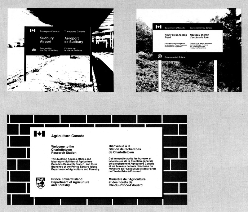
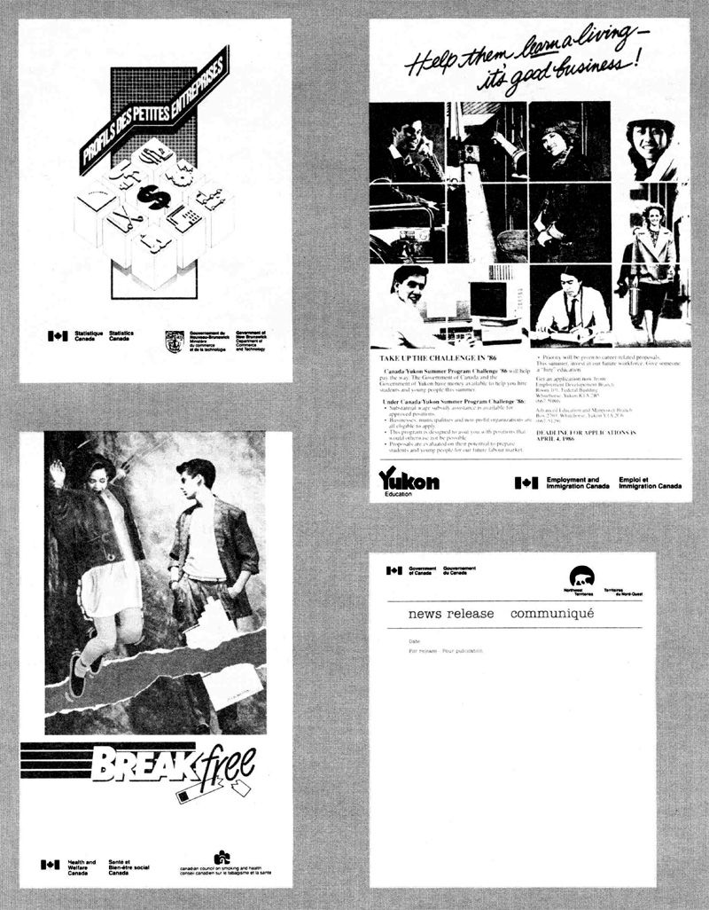
Application of wordmarks
This method applies when the sponsors have agreed to use their respective wordmark. The examples indicate how this may be done (Fig. 3).

Use of credit lines
Generally, a credit line consists of a lead-in sentence followed by the titles of the sponsors. The titles should he presented in a uniform manner, using the same typeface, type size and colour. The examples indicate how credit lines may be set up (Fig. 4).

Armorial bearings and flags
Symbols such as coats of arms, shields and flags are often used to portray joint activities of governments. The use of these symbols is subject to rules of protocol and their field of application is more or less distinct from the corporate identity of a government institution.
Where applicable, coats of arms, shields or flags may be used in lieu of the corporate identifiers that are normally employed. This applies particularly when provincial and territorial governments need to be identified in conjunction with the federal government. For example, a layout incorporating the federal Coat of Arms and the shields of the provinces and territories is well suited to portray the relationship of the governments (Fig. 5). A similar effect. may be achieved by using the different flags (Fig. 6).
For further information on the flags, coats of arms and floral emblems used by provincial and territorial governments, readers should refer to the Canadian Symbols prepared by the Department of the Secretary of State of Canada. The publication is available from the Canadian Government Publishing Centre, Supply and Services Canada.
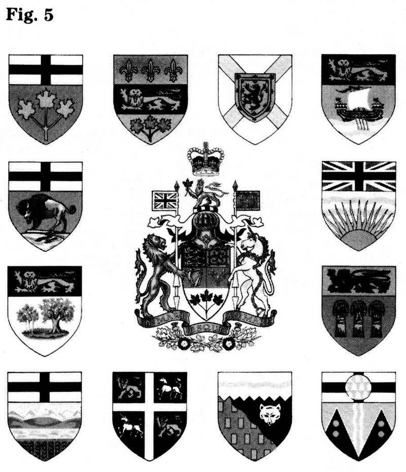
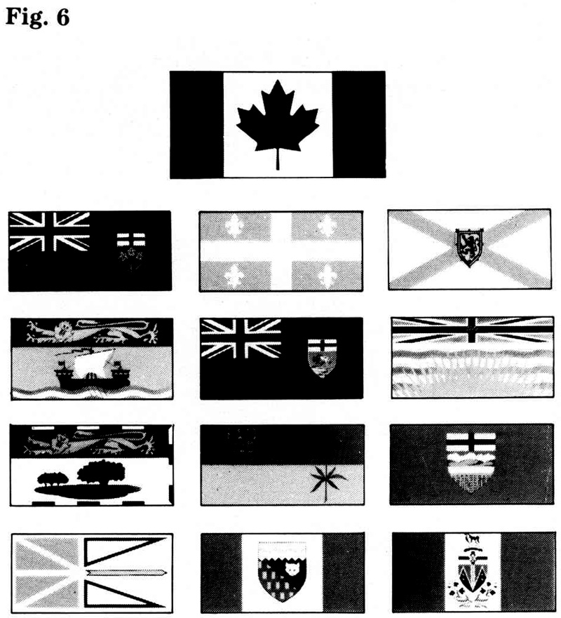
Enquiries
Enquiries regarding the corporate identity of a sponsor should be directed to the office responsible for identity of the institution concerned. In the case of the federal government, this responsibility rests with the FIP Coordinator appointed by each institution,
A list of provincial and territorial managers of corporate identity is being maintained by the Administrative Policy Branch of the Treasury Board Secretariat. The Branch may be contacted for information.
Because the requirements for corporate identity may be subject to change, it is suggested to enquire about current requirements.
Reproduction proofs
Details on the availability of reproduction proofs of the federal signature and “Canada” wordmark are provided in section 1.1 of the FIP Manual. Requests for proofs of signatures or logos of other sponsors should be addressed to the corporate identity manager of the institution concerned.
Page details
- Date modified: