
Canada 150 logo info
The Canada 150 logo
The Canada 150 logo is composed of a series of diamonds, or “celebratory gems”, arranged in the shape of the iconic maple leaf. The four diamonds at the base represent the four original provinces that formed Confederation in 1867: Ontario, Quebec, New Brunswick and Nova Scotia. Additional diamonds extend out from the base to create nine more points, in total representing the 13 provinces and territories.
The Canada 150 logo is an evocative symbol and will become an enduring reminder of one of Canada’s proudest moments. The maple leaf motif is recognized at home and abroad as distinctively Canadian, and it fosters feelings of pride, unity and celebration.
Canadian students were invited to create the official logo for the 150th anniversary of Confederation through a national design contest. The winning design was Ariana Cuvin’s and was chosen from a field of over 300 eligible entries.
Canada 150 typeface
A single, unified typeface has been created that supports Canada’s two official languages, as well as its Indigenous languages.
The typeface, Canada 150, was created by Canadian typeface designer Raymond Larabie, who offered his creation to the Government of Canada for the 150th anniversary of Confederation. The typeface includes all Latin characters and accents, common Cyrillic characters, and syllabic and diacritical elements contained in Canada’s Indigenous languages.
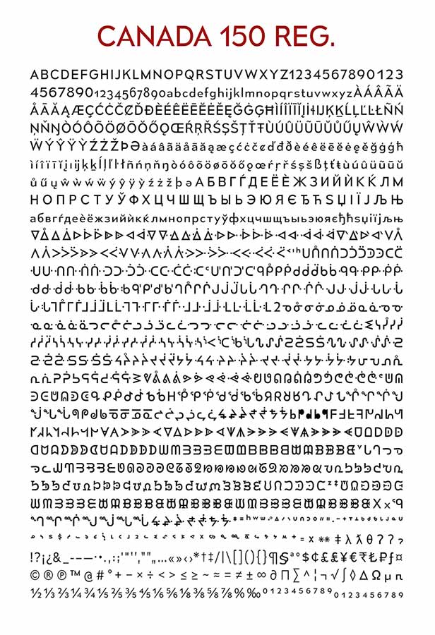
Note: To see the full image of the typeface, click on the image above.