
Interpretation Guide – Health Economics
March 2024
On this page
- Preamble
- Opportunity cost
- Economic evaluation
- Cost-utility analysis
- Quality-adjusted life year (QALY)
- Cost-effectiveness plane
- Cost-effectiveness thresholds
- Sequential analysis
- Cost-effectiveness frontier
- Further readings
- Abbreviations
- References
- Version history
- Acknowledgements
Preamble
The National Advisory Committee on Immunization (NACI) Interpretation Guide – Health Economics is a document that outlines how to interpret common concepts related to cost-utility analysis (CUA). The audiences of this Interpretation Guide are NACI and federal, provincial and territorial immunization program planners and decision-makers.
Opportunity cost
In the context of a fixed budget in the health system, opportunity cost is the benefits foregone as a consequence of adopting a new intervention and displacing an existing one.
Economic evaluation
Health economic analyses evaluate the inputs (called costs) required to create and sustain health programs, and the outcomes (health) of these programs. Outcomes can be valued in a few different ways. Depending on which outcomes are used, the economic evaluation is classified differently:
- Cost-utility analysis (CUA): Health outcomes are valued in quality-adjusted life years (QALYs) or another generic measure of health-related utility
- Cost-effectiveness analysis (CEA): Health outcomes are measured in natural units (e.g., cases averted)
- Cost-benefit analysis (CBA): Health outcomes are valued in monetary units.
CUA is the form of economic evaluation recommended by NACI as the reference case ("standard"), as outlined in the NACI Guidelines for the Economic Evaluation of Vaccination Programs in Canada.Footnote 1 CUA uses a generic outcome measure (QALYs) allowing decision-makers to make comparisons across different conditions and interventions.
Cost-utility analysis
- Assesses cost-effectiveness (or value for money)
- Does not assess budget constraints. An intervention may be assessed to be cost-effective but not adopted because it is too expensive.
- Generates a summary measure called an incremental cost-effectiveness ratio (ICER), sometimes called an incremental cost-utility ratio (ICUR) (Figure 1)
- The ICER provides an estimate of the additional (incremental) cost for one additional unit of health outcome
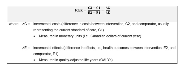
Text description
This figure consists of a box divided in two compartments horizontally. The top compartment is light grey in colour and contains an equation which reads, "ICER equals cost two minus cost one, all divided by effect two minus effect one. Therefore, ICER equals delta cost divided by delta effect". The bottom compartment is white and contains definitions of delta cost and delta effect. The explanations of these terms read as follows: "Where delta cost is the incremental costs (difference in costs between intervention, C2, and comparator, usually representing the current standard of care, C1) measured in monetary units (i.e., Canadian dollars of current year)." and "Where delta effect is the incremental effects (difference in effects, i.e., health outcomes between intervention, E2, and comparator, E1) measured in quality-adjusted life years (QALYs)."
Quality-adjusted life year (QALY)
- QALY is a function of health-related quality of life (HRQoL) and quantity of life
- HRQoL is measured in health utilities, which:
- Represent the strength of individuals' preferences for different health states
- Are anchored at 0 and 1, representing HRQoL equivalent to being dead and equivalent to having perfect health, respectively
- See example in Figure 2, where both individuals A and B live an equivalent of one year in "perfect health" (i.e., 1 QALY)
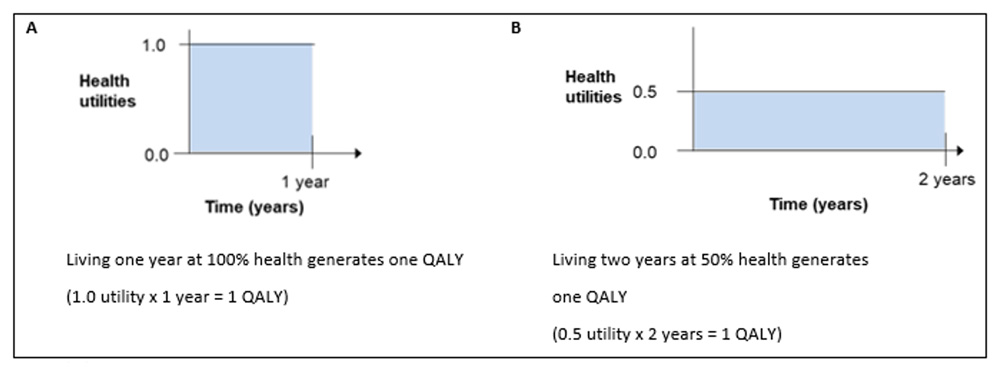
Text description
Graphical representation of quality-adjusted life years (QALYs) for two individuals. Figure is divided vertically in two, with the left side labelled "A" and the right side labelled "B". Both A and B each contain a bar graph with time measured in years on the x-axis and health utilities on the y-axis. In scenario A, time spans from 0 to 1 years and health utilities span from 0.0 to 1.0, and the resulting square on the graph is filled in with light blue. There is a description under the graph which states that living one year at 100% health generates one QALY. This can be obtained mathematically by multiplying 1.0 utilities by 1 year. In scenario B, time spans from 0 to 2 years and health utilities span from 0.0 to 0.5, and the resulting rectangle on the graph is filled in with light blue. There is a description under the graph which states that living two years at 50% health also generates one QALY, obtained mathematically by multiplying 0.5 utilities by 2 years.
Cost-effectiveness plane
- The ICER formula can be represented graphically in a cost-effectiveness plane (Figure 3):
- y-axis (vertical axis) = incremental costs (in dollars)
- x-axis (horizontal axis) = incremental effects (often in QALYs)
- Points on plane = interventions (A, B, C, D) or comparator (O), which is often the standard of care; the coordinates of the interventions (A, B, C, D) show the incremental costs and incremental effects compared to (O)
- Slopes connecting interventions (A, B, C, D) to comparator (O) = ICERs comparing intervention (A to D) and comparator (O) (see Figure 4 for interpretations of ICERs falling in each quadrant)
- Quadrants of plane can be labelled as I to IV, or by the directions of a compass.
- Note that the terms "cost-saving" and "dominant" are often incorrectly used interchangeably. Cost-saving refers to an intervention costing less than the comparator (hence, refers to quadrants III and IV collectively); whereas dominant refers to an intervention being less costly and more effective (hence, refers to quadrant IV exclusively).
- Quadrants III and I can both be used to calculate ICERs: cost (saved) per QALY (lost) in Quadrant III, and cost (expended) per QALY (gained) in Quadrant I (see section on "Cost-effectiveness thresholds"). While these ICERs should theoretically be treated similarly, the context of diminishing health to save money is quite different from the context of spending money to add health. This relates to opportunity costs, as the money saved would be used to invest in other interventions to, in theory, improve health. Similarly, the money spent would displace other interventions, but would, in theory, improve efficiency and resource allocation assuming the correct decision was made to adopt the intervention (see section on "Opportunity Costs").
Text description
The cost-effectiveness plane, consisting of four quadrants, with difference in effects on the x-axis and difference in costs on the y-axis. The top right quadrant (i.e., above the x-axis and to the right of the y-axis) is labelled quadrant I and represents scenarios in which new interventions are both more costly and more effective than the standard of care. The top left quadrant (i.e., above the x-axis and to the left of the y-axis) is labelled quadrant II and represents scenarios in which new interventions are more costly but less effective than the standard of care. The bottom left quadrant (i.e., below the x-axis and to the left of the y-axis) is labelled quadrant III and represents scenarios in which new interventions are less costly and less effective than the standard of care. Finally, the bottom right quadrant (i.e., below the x-axis and to the right of the y-axis) represents scenarios in which new interventions are less costly and more effective than the standard of care. For interventions that fall within quadrants I or III, the choice whether to accept or reject a new intervention is based on value judgements by decision-makers. Interventions that fall within quadrant II are considered dominated and should be rejected by decision-makers. Interventions that fall within quadrant IV are considered dominant and should be favoured by decision-makers. There are four interventions plotted on the plane. Intervention A is in quadrant I, extending midway through the x-axis but sits low on the y-axis. Intervention B is in quadrant I, and does not extend as far as Intervention A across the x-axis but reaches much higher on the y-axis. Note that Intervention A costs a little more than the comparator, but is substantially more effective. Intervention B costs substantially more than the comparator, but is only a little more effective. Thus, Intervention A has a lower ICER than that of B. Lower ICERs in this quadrant represent greater cost-effectiveness (or greater value for money). In other words, it costs less to purchase an additional unit of benefit. Intervention C is the mirror image of Intervention A in quadrant III. Intervention D is the mirror image of Intervention B in quadrant III. Note that Intervention C costs a little less than the comparator, but is substantially less effective. Intervention D costs substantially less than the comparator, but is only a little less effective. Thus, Intervention D has a higher ICER than that of C. Higher ICERs in this quadrant represent greater cost-effectiveness (or greater value for money). This is the opposite of quadrant I (northeast) interpretations. Finally, next to the top right corner of the cost-effectiveness plane there is a small compass, showing the cardinal directions of north, east, south, and west, that can be used to describe the quadrants themselves (for example, quadrant I can also be referred to as the northeast quadrant), as well as the relative positions of different interventions within the plane.
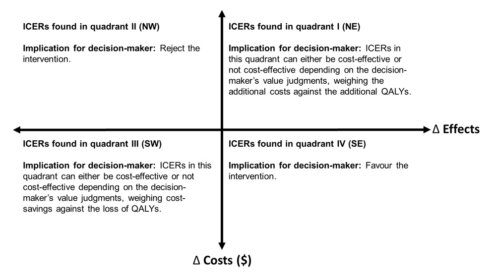
Text description
The same cost-effectiveness plane as in Figure 3, consisting of four quadrants, with difference in effects on the x-axis and difference in costs on the y-axis. Each quadrant contains an explanation of how ICERs in that quadrant should be interpreted, and what the implications for decision-makers are. The description for ICERs found in the first, or northeast, quadrant (i.e., top right quadrant) reads as follows: “The implication for decision-makers is that ICERs in this quadrant can be either cost-effective or not cost-effective depending on the decision-maker's value judgements, weighing the additional costs against the additional QALYs.” The intervention is more costly and more effective than the comparator. The description for ICERs found in the second, or northwest, quadrant (i.e., top left quadrant) reads as follows: “The implication for decision-makers is that they ought to reject the intervention.” The intervention is more costly and less effective than comparator (i.e., intervention is dominated by the comparator). Note that ICERs in this quadrant are negative. The description for ICERs found in the third, or southwest, quadrant (i.e., bottom left quadrant) reads as follows: “The implication for decision-makers is that ICERs in this quadrant can be either cost-effective or not cost-effective depending on the decision-maker's value judgements, weighing the cost-savings against the loss of QALYs.” The intervention is less costly and less effective than the comparator. Lastly, the description for ICERs found in the fourth, or southeast, quadrant (i.e., bottom right quadrant) reads as follows: “The implication for decision-makers is that they ought to favour the intervention.” The intervention is less costly and more effective than the comparator (i.e., intervention is dominant over comparator). Note that ICERs in this quadrant are negative.
Cost-effectiveness thresholds
- Some international decision-makers use cost-effectiveness thresholds to support their value judgments of ICERs falling in quadrants I (NE) and III (SW) – that is, decision-makers compare if the ICERs are above or below a threshold (interpretations are opposite for quadrants I and III as noted in Figure 3).
- Canada and many other National Immunization Technical Advisory Groups (NITAGs) do not use explicit thresholds
- In Canada, decisions to adopt or reject an intervention is not based on cost-effectiveness alone. NACI's decision framework accounts for efficacy, effectiveness, burden of disease, equity, ethics and other key public health decision criteria.
- Figure 5 is a graphical representation of a cost-effectiveness threshold on a cost-effectiveness plane
- If decision-makers adopt interventions that are not cost-effective relative to the threshold, more cost-effective expenditures will be displaced
- There are theoretical challenges of determining a threshold when using a societal perspective in an economic evaluation (which is one of the two perspectives that NACI recommends, the other being the publicly funded health system perspective)
- The opportunity cost for the societal perspective is not known and there are no estimates in the literature
- It is not appropriate to compare ICERs generated from a societal perspective to commonly used thresholds from a healthcare payer perspective.
- There are theoretical challenges of adopting or rejecting interventions with ICERs that fall in quadrant III (SW)
- Challenges include ethical considerations of accepting less effective interventions to save money, as well as inefficiency in resource allocation
- Decision-makers may consider a steeper cost-effectiveness threshold in Quadrant III (SW) to account for people valuing health loss greater than the equivalent health gain.
The solid line represents a cost-effectiveness threshold that does not change in Quadrant III (SW). The dotted line represents a cost-effectiveness threshold that becomes steeper in Quadrant III (SW). The steeper threshold accounts for people valuing health loss greater than the equivalent health gain. Given the explicit cost-effectiveness threshold depicted, decision-makers should adopt interventions A and D, and reject interventions B and C.
Text description
The same cost-effectiveness plane as in figures 3 and 4. There is a solid black line running from the bottom left corner of the bottom left quadrant to the top right corner of the top right quadrant, splitting the plane in half along a diagonal. This black line is labelled as the cost-effectiveness threshold, and there are labels indicating that any ICERs above the threshold should be rejected, while any below should be favoured. There is also a dotted line in the bottom left quadrant that runs from the origin to the bottom middle of the quadrant, forming a triangle that sits below the cost-effectiveness threshold. This dotted line represents a cost-effectiveness threshold that accounts for people valuing health loss greater than the equivalent health gain. This figure also contains text to the right of the cost-effectiveness plane, describing different cost-effectiveness thresholds either specific to vaccines or not specific to vaccines. The following are thresholds not specific to vaccines: WHO – 1 to 3 times GDP per capita; UK NICE – £20,000 to £30,000 per QALY; Canada CADTH – none; common in the literature: $50,000 or $100,000 per QALY. The following are thresholds specific to vaccines: US ACIP – none; Germany STIKO – none; Canada NACI – none; and UK JCVI – £20,000 per QALY.
For the UK NICE threshold empirical evidence suggests threshold should be lower (best estimate: £12,936 per QALY).Footnote 6 For the UK JCVI threshold, the Consultation on the Cost-Effectiveness Methodology for Vaccination Programmes and Procurement Report recommended a lower threshold (£15,000),Footnote 7 which the UK government rejected.Footnote 8
Sequential analysis
- When comparing three or more interventions, a sequential analysis is recommended
- Compares an intervention with the next most costly intervention in sequence
- Recall: ICERs compare two interventions (see Figure 1 formula)
- Figure 6 describes the steps to calculate sequential ICERs
- Tables 1 – 3 show the steps to calculate sequential ICERs with an example (adapted from CADTH 2017 Table 3)Footnote 9
Figure 6: Steps to a sequential analysis when comparing three or more interventions
- Step 1: Order interventions (3 or more) from least costly to most costly in table
- Step 2: Calculate delta cost and delta effect, comparing to intervention listed directly above
- Step 3: Remove any intervention that is more costly and less effective (i.e., dominated) than one directly above
- Step 4: Calculate ratios, delta cost divided by delta effect, after the dominated interventions have been removed
- Step 5: Remove any intervention whose sequential ICER is greater than the sequential ICER of the subsequent pair (i.e., intervention subjected to extended dominance, meaning the intervention will never be the optimal strategy regardless of the cost-effectiveness threshold)
- Step 6: Recalculate ratios, delta cost divided by delta effect, after interventions subjected dominance have been removed to finalize sequential ICERs
Implication for decision-makers: The most cost-effective strategy is the intervention with the highest ICER that lies below the threshold, which is a different interpretation compared to quadrants I and III in the cost-effectiveness plane
| Costs | QALYs | ∆Costs | ∆QALYs | Sequential ICER | Comment | |
|---|---|---|---|---|---|---|
| Vaccine A | $3,000 | 4.00 | n/a | n/a | n/a | n/a |
| Vaccine B | $4,500 | 4.10 | $1,500 | 0.10 | 15,000 | n/a |
| Vaccine C | $5,000 | 5.00 | $500 | 0.90 | 556 | n/a |
| Vaccine D | $7,900 | 4.30 | $2,900 | -0.70 | -4,143 | Remove Vaccine D from analysis because it is more costly and less effective than C (i.e., D is dominated by C) |
| Vaccine E | $8,000 | 6.00 | $100 | 1.70 | 59 | n/a |
| Vaccine F | $12,000 | 6.05 | $4,000 | 0.05 | 80,000 | n/a |
| Vaccine G | $50,000 | 6.01 | $38,000 | -0.04 | -950,000 | Remove Vaccine G from analysis because it is more costly and less effective than F (i.e., G is dominated by F) |
| Costs | QALYs | ∆Costs | ∆QALYs | Sequential ICER | Comment | |
|---|---|---|---|---|---|---|
| Vaccine A | $3,000 | 4.00 | n/a | n/a | n/a | n/a |
| Vaccine B | $4,500 | 4.10 | $1,500 | 0.10 | 15,000 | Remove Vaccine B from analysis because its sequential ICER is greater than that of the next row (i.e., Vaccine B is subjected to extended dominanceFootnote * through interventions A and C) |
| Vaccine C | $5,000 | 5.00 | $500 | 0.90 | 556 | n/a |
| Vaccine E | $8,000 | 6.00 | $3,000 | 1.00 | 3,000 | n/a |
| Vaccine F | $12,000 | 6.05 | $4,000 | 0.05 | 80,000 | n/a |
Footnotes
|
||||||
| Costs | QALYs | ∆Costs | ∆QALYs | Sequential ICER | Comment | |
|---|---|---|---|---|---|---|
| Vaccine A | $3,000 | 4.00 | n/a | n/a | n/a | Implication: If the decision-maker uses an explicit cost-effectiveness threshold of $50,000 per QALY, then the most cost-effective intervention is E. If the threshold is $100,000 per QALY, then the most cost-effective intervention is F. |
| Vaccine C | $5,000 | 5.00 | $2,000 | 1.00 | 2,000 | |
| Vaccine E | $8,000 | 6.00 | $3,000 | 1.00 | 3,000 | |
| Vaccine F | $12,000 | 6.05 | $4,000 | 0.05 | 80,000 |
Cost-effectiveness frontier
- A sequential analysis comparing three or more interventions can be graphically represented by a cost-effectiveness frontier (Figure 7)
- y-axis (vertical axis) = mean costs
- x-axis (horizontal axis) = mean effects
- Note that the axes are mean effects and costs, not incremental effects and costs like in the cost-effectiveness plane in Figure 3
- Point = intervention
- Frontier = line linking the interventions that are not dominated
- Interpretation:
- Any interventions above and to the left of the frontier are more costly and less effective than existing interventions (i.e., Vaccines D and G in Figure 7)
- Any interventions below and to the right of the frontier are less costly and more effective than existing intervention; hence, the new intervention would redefine the frontier
- Implication for decision-maker: Interventions above and to the left of the frontier can be rejected; interventions located on the frontier can be considered efficient, existing interventions; interventions below and to the right of the frontier can be favoured (and should subsequently redefine the frontier with its inclusion).
Text description
A graph with QALYs on the x-axis and cost on the y-axis. The x-axis begins at 4 and increases in increments of 0.5 until 6. The y-axis begins at $0 and increases in increments of $10,000 until $50,000. The vaccines from Tables 1-3 are plotted on the graph, with vaccines A, C, E, and F being represented with green diamonds connected by a solid line; vaccines D and G being represented with solid blue circles; and vaccine B being represented with a solid orange circle. There is a legend to the right of the plot indicating that the solid line connecting vaccines A, C, E, and F is referred to as the cost-effectiveness frontier; interventions represented with solid blue circles (D and G) were rejected due to dominance; and interventions represented with solid orange circles (B) were rejected due to extended dominance.
Further readings
- Drummond MF, Sculpher MJ, Claxton K, Stoddart GL, Torrance GW. (2015). Methods for the Economic Evaluation of Health Care Programmes. (4th ed.) Oxford University Press.
- Government of Canada. (2023). National Advisory Committee on Immunization (NACI): Guidelines for the economic evaluation of vaccination programs in Canada. (1st ed.)
- Cape, JD, Beca, JM, Hoch, JS. Introduction to Cost-Effectiveness Analysis for Clinicians. Health Policy and Economics. 2013; 90(3):103–105.
- Neumann PJ, Cohen JT. QALYs in 2018—Advantages and Concerns. JAMA. 2018; 319(24):2473–2474. doi:10.1001/jama.2018.6072.
- Postma MJ, de Vries R, Welte R, Edmunds WJ. Health economic methodology illustrated with recent work on Chlamydia screening: the concept of extended dominance. Sex Transm Infect. 2008; 84(2):152-4. doi: 10.1136/sti.2007.028043.
Abbreviations
- ACIP
- Advisory Committee on Immunization Practices
- CADTH
- Canadian Agency for Drugs and Technologies in Health
- CUA
- Cost-utility analysis
- CBA
- Cost-benefit analysis
- CEA
- Cost-effectiveness analysis
- CUA
- Cost-utility analysis
- HRQoL
- Health-related quality of life
- ICER
- Incremental cost-effectiveness ratio
- JCVI
- Joint Committee on Vaccination and Immunisation
- NACI
- National Advisory Committee on Immunization
- NICE
- National Institute for Health and Clinical Excellence
- NITAG
- National Immunization Technical Advisory Group
- QALY
- Quality-adjusted life year
- STIKO
- Standing Committee on Vaccination
- WHO
- World Health Organization
References
- Footnote 1
-
Government of Canada. National Advisory Committee on Immunization (NACI): Guidelines for the economic evaluation of vaccination programs in Canada 2023
- Footnote 2
-
Leidner A, Meltzer M, Messonnier M, et al. Guidance for health economics studies presented to the Advisory Committee on Immunization Practices (ACIP), 2019 update: Centers for Disease Control and Prevention, 2019.
- Footnote 3
-
STIKO. Modelling methods for predicting epidemiological and health economic effects of vaccinations - guidance for analyses to be presented to the German Standing Committee on Vaccination (STIKO). Berlin, 2016.
- Footnote 4
-
Joint Committee on Vaccination and Immunisation. Code of practice June 2013, 2013.
- Footnote 5
-
Claxton K, Martin S, Soares M, et al. Methods for the estimation of the National Institute for Health and Care Excellence cost-effectiveness threshold. Health Technol Assess 2015;19(14):1-503, v-vi. doi: 10.3310/hta19140
- Footnote 6
-
Immunisation and High Consequence Infectious Diseases Team, Global and Public Health Group. Consultation on the cost-effectiveness methodology for vaccination programmes and procurement (CEMIPP) report: Department of Health and Social Care, 2018.
- Footnote 7
-
Department of Health and Social Care. Cost-effectiveness methodology for immunisation programmes and procurements (CEMIPP): the government's decision and summary of consultation responses. In: Care DoHaS, ed., 2019.
- Footnote 8
-
Klok RM, Postma MJ. Four quadrants of the cost-effectiveness plane: some considerations on the south-west quadrant. Expert Rev Pharmacoecon Outcomes Res 2004;4(6):599-601. doi: 10.1586/14737167.4.6.599
- Footnote 9
-
CADTH. Guidelines for the economic evaluation of health technologies: Canada. 4th ed. ed. Ottawa, 2017.
Version history
| Version | Date | Changes made |
|---|---|---|
| V1.0 | March 2024 | First edition |
Acknowledgements
This interpretation guide was prepared by: MW Yeung, A Tuite, R Ximenes, A Cernat, MC Tunis, and B Sander.
This interpretation guide was reviewed by: G Gebretekle, R N Miranda, A Sinilaite, O Baclic, E Tice, C Jensen, A Stevens, J Zafack, E Abrams, W Siu, S Pierre, in addition to the NACI Economics Task Group.
NACI gratefully acknowledges the contributions of: C Tremblay, J Daniel, C Mauviel, in addition to the Influenza Working Group (Members: J Papenburg (Chair), P De Wals, D Fell, I Gemmill, R Harrison, J Langley, A McGeer and D Moore; Liaison representatives: L Grohskopf (Centers for Disease Control and Prevention); Ex-officio representatives: C Bancej (Centre for Immunization and Respiratory Infectious Diseases, PHAC), J Reiter (First Nations and Inuit Health Branch, Indigenous Services Canada), and M Russell (Biologics and Genetic Therapies Directorate, Health Canada).
NACI members: S Deeks (Chair), R Harrison (Vice-Chair), V Dubey, M Andrew, J Bettinger, N Brousseau, H Decaluwe, P De Wals, E Dubé, K Hildebrand, K Klein, J Papenburg, A Pham-Huy, B Sander, S Smith, and S Wilson.
Liaison representatives: L Bill / M Nowgesic (Canadian Indigenous Nurses Association), LM Bucci (Canadian Public Health Association), E Castillo (Society of Obstetricians and Gynaecologists of Canada), A Cohn (Centers for Disease Control and Prevention, United States), L Dupuis (Canadian Nurses Association), D Fell (Canadian Association for Immunization Research and Evaluation), S Funnell (Indigenous Physicians Association of Canada), J Hu (College of Family Physicians of Canada), M Lavoie (Council of Chief Medical Officers of Health), D Moore (Canadian Paediatric Society), M Naus (Canadian Immunization Committee), and A Ung (Canadian Pharmacists Association).
Ex-officio representatives: V Beswick-Escanlar (National Defence and the Canadian Armed Forces), E Henry (Centre for Immunization and Respiratory Infectious Diseases (CIRID), PHAC), M Lacroix (Public Health Ethics Consultative Group, PHAC), C Lourenco (Biologic and Radiopharmaceutical Drugs Directorate, Health Canada), D MacDonald (COVID-19 Epidemiology and Surveillance, PHAC), S Ogunnaike-Cooke (CIRID, PHAC), K Robinson (Marketed Health Products Directorate, HC), G Poliquin (National Microbiology Laboratory, PHAC), and T Wong (First Nations and Inuit Health Branch, Indigenous Services Canada).
NACI Economics Task Group
Members: BH Sander (Chair), E Rafferty, D Fisman, B Tsoi, P De Wals, J Langley, M Naus, and K Klein.
PHAC participants: MW Yeung, A Tuite, and MC Tunis.