
Front-of-Package Nutrition Labelling: September 18, 2017 Stakeholder Engagement Meeting

Download the entire report
(PDF format, 2.07 MB, 27 pages)
Organization: Health Canada
Type: Report
Date published: 2017-11-02
Table of Contents
- Executive Summary
- Introduction
- Health Canada Introductory Presentations
- Panel Discussions: Food Industry Perspectives on FOP Labelling
- Panel Discussion: Research Expert Perspectives on FOP Labelling
- Key Messages
- Discussion on Proposed FOP Symbols
- Closing Remarks
- Questions from Online Participants and Answers
Please note: This report is intended to summarize the spirit of the proceedings and discussion that took place at the Front-of-Package Nutrition Labelling Stakeholder Engagement Meeting, held in Ottawa on September 18, 2017. Participants may submit clarifications by contacting us at: healthyeating-sainealimentation@hc-sc.gc.ca. These comments will be posted on Health Canada's Openness and Transparency website.
Executive Summary
The incidence of chronic disease in Canada is a major health concern that not only has an impact on mortality and morbidity, but also has a large bearing on the economy in terms of direct health care costs and indirect costs, such as those related to loss of productivity.
In October 2016, the former Minister of Health released the Healthy Eating Strategy as part of the Government's vision of a healthy Canada. A part of the Strategy is a commitment by Health Canada to engage the public and stakeholders to get input on a number of interlocking initiatives to improve the food environment. One of these initiatives includes a front-of-package (FOP) labelling approach aimed at helping Canadians make healthier and more informed food choices, particularly on sugars, sodium and saturated fat.
On September 18, 2017, Health Canada brought together industry and health stakeholders, as well as academic and international experts to share and review evidence and to explore options for FOP symbols for further consultation. Health Canada representatives opened the meeting by indicating that diet-related chronic diseases are a major health problem, specifically diets high in sugars, sodium, and saturated fat. Canadians face a number of healthy eating challenges, which are being addressed by the Healthy Eating Strategy. Part of the Strategy is improving the information on food labels and FOP labelling. Health Canada has proposed FOP 'high in' nutrition symbols that would help consumers identify foods high in sugars, sodium, and saturated fat, and that could drive reformulation of some of these products, so they contain lower levels of these nutrients. Health Canada consulted on proposed symbols for a 'high in' FOP labelling approach through a pre-regulatory online consultation conducted in the fall of 2016.
The Retail Council of Canada (RCC), the Food & Consumer Products of Canada (FCPC) and the Canadian Beverage Association (CBA) each presented proposed FOP symbols that were considered at the meeting. In addition, Abacus Data presented the results of an online survey, co-funded by FCPC and CBA. There were a number of key messages from the industry presentations, including:
- A need for coordinated implementation of all the labelling changes.
- Consumers should be provided with more information, rather than just a warning label.
- A need for education to accompany any FOP system.
- Unintended consequences, such as identifying nutrient dense foods as bad, should be avoided.
Academic experts from the Universities of Alberta, Toronto, and Waterloo, as well as an international expert from the Pan American Health Organization, presented research data on FOP labelling and the experiences in other countries. There were several conclusions from these presentations:
- There should be a mandatory FOP and not one that simply directs the consumer to the Nutrition Facts table (NFt).
- The symbol should be meaningful, intuitive and allow quick decision making.
- If colour is included, it should only be one colour (red).
A discussion on the strengths and weaknesses of each symbol proposed by industry, Health Canada and Dietitians of Canada was held. No firm decisions were reached on which ones should be dropped or changed. It was decided that similar ones should be combined and that some positive aspects might be adopted in re-designed symbols that would be subjected to further consultations.
The Minister of Health provided closing remarks. The key message was that discussion is very important and that stakeholders are essential partners in improving the health of Canadians and implementing the initiatives outlined in the Healthy Eating Strategy.
Introduction
Background and Context
Chronic non-communicable diseases, such as type 2 diabetes, cardiovascular disease, and cancer, are a major health concern in Canada. The incidence of Type 2 diabetes continues to increase and cardiovascular disease is one of the leading causes of death in Canada. With high rates of obesity and hypertension, as well as an aging Canadian population, the impact of chronic diseases is likely to continue to increase unless action is taken to reduce modifiable risk factors.
One of the major modifiable risk factors for obesity, type 2 diabetes, cardiovascular disease, and cancer is diet. Poor diet is a primary risk factor for chronic disease and places a high economic burden on the health care system. Costs related to unhealthy diets and other risk factors for chronic disease are estimated to be $26.7 billion annually.
Diets high in sugars, sodium, and saturated fat are strongly linked to obesity and chronic disease risk. Taking action to reduce the intakes of these nutrients in the diets of Canadians can help to reduce the incidence of obesity and chronic diseases, along with the associated economic burden.
In October, 2016, the former Minister of Health released a Healthy Eating Strategy, as part of the Government's vision of a healthy Canada, in response to several food and nutrition commitments outlined in the 2015 Mandate Letter from the Prime Minister of Canada. The Strategy ties Health Canada's ongoing nutrition efforts with new, complementary initiatives to make it easier for Canadians to choose healthier food options. The Strategy states that Canadians 'need to have the right tools to access, understand and use nutrition information to make healthier choices'. For this reason, Health Canada proposed a front-of-package (FOP) labelling approach aimed at helping Canadians make healthier and more informed food choices, particularly with respect to sugars, sodium and saturated fat.
In November of 2016, Health Canada conducted a public consultation on FOP nutrition labelling to solicit input from all interested Canadians, including: consumers; industry members and associated organizations; health professionals and associated organizations; all levels of government; academic and research experts; and non-government organizations. Over 1500 responses were received from interested stakeholders. In December 2016, Health Canada commissioned public opinion research on the symbols proposed for FOP nutrition labelling, the results of which are available on the Library and Archives Canada website. In early 2017, a cost benefit study was undertaken to quantify the proposed benefits and costs of making amendments to the Food and Drug Regulations to, among other things, require a FOP nutrition symbol on foods that contain high levels of sugars, sodium, or saturated fat. In May 2017, Agriculture and Agri-Food Canada hosted a Food Processing Industry Roundtable meeting, where Roundtable members requested that Health Canada convene a stakeholder meeting to share and review evidence and explore options for FOP symbols for further consultation. In response to this request, Health Canada hosted the meeting on September 18, 2017. In the spirit of openness and transparency, the meeting was streamed live and made accessible to other interested parties who could not be physically present.
Purpose of the Report
This report summarizes the proceedings and outcomes of the FOP Nutrition Labelling Stakeholder Engagement Meeting, held in Ottawa on September 18, 2017. The meeting presentations can be ordered from the Health Canada Openness and Transparency website. Some of the views expressed are those of the participants and do not necessarily reflect those of Health Canada or the Government of Canada.
Meeting Objectives
The objectives of the meeting were to bring together a balanced mix of industry stakeholders, scientific experts and health sector representatives to share and review evidence, and to explore additional options for the design of an FOP nutrition symbol for Canada. Stakeholders were invited to submit symbol options that they wished to be included in the discussion. In order for the symbol options to achieve the public health objectives, minimize costs to industry, and align with Health Canada's health protection legislative authority, it was asked that the symbols meet the following three evidence-based criteria:
- Follow the 'high-in' approach;
- Focus on the three nutrients of public health concern (sugars, sodium and saturated fat); and
- Be black and white.
All symbols contributed by participants were included in the discussion on September 18th, 2017, despite not all meeting the above-listed criteria.
Symposium Participants
| Participant | Organization |
|---|---|
| Jim Goetz ׀ President | Canadian Beverage Association |
| Anthony van Heyningen ׀ Senior Director, Research and Policy | Canadian Beverage Association |
| Isabelle Neiderer ׀ Director Nutrition | Dairy Farmers of Canada |
| Jackie Crichton ׀ Chair, Dairy Regulatory/Technical Committee and Director of Regulatory Affairs Canadian Meat Council | Dairy Processors Association of Canada/Canadian Meat Council |
| Michi Furuya Chang ׀ Vice President Scientific Affairs & Nutrition | Food & Consumer Products of Canada |
| Carla Ventin ׀ Vice President of Federal Government Affairs | Food & Consumer Products of Canada |
| Chris Kyte ׀ President | Food Processors of Canada |
| Alain Brandon ׀ Senior Director, Corporate Social Responsibility and Government Relations | Loblaw Companies Limited |
| Alison Baxter ׀ Director, Health and Wellness and Industry Relations | Retail Council of Canada |
| David Wilkes ׀ Senior Vice President, Government Relations and Grocery Division | Retail Council of Canada |
| Bruce Anderson, Abacus Data | Invited by Food & Consumer Products of Canada and Canadian Beverage Association |
| Lewis Retik, Gowlings WLG |
| Participant | Organization |
|---|---|
| Kelly Masotti ׀ Director, Public Issues | Canadian Cancer Society |
| Jill Skinner ׀ Associate Director, Policy Develoment and Strategic Direction | Canadian Medical Association |
| Ian Culbert ׀ Executive Director | Canadian Public Health Association |
| Anne-Marie Morel ׀ Public Policies Advisor | Coalition québécoise sur la problématique du poids |
| Dr. Seema Nagpal ׀ Epidemiologist and Senior Leader, Government Relations and Public Policy | Diabetes Canada |
| Pat Vanderkooy ׀ Manager, Public Affairs | Dietitians of Canada |
| Manuel Arango ׀ Director, Health Policy | Heart and Stroke Foundation of Canada |
| Participant | Organization |
|---|---|
| Dr. Fabio Gomes | Pan American Health Organization |
| Dr. Kim Raine | University of Alberta |
| Dr. Mary L'Abbé | University of Toronto |
| Dr. David Hammond | University of Waterloo |
| Participant | Organization |
|---|---|
| Christine Donoghue ׀ Associate Deputy Minister | Health Canada |
| Pierre Sabourin ׀ Assistant Deputy Minister | Health Products and Food Branch, Health Canada |
| Kendal Weber ׀ Acting Associate Assistant Deputy Minister | Health Products and Food Branch, Health Canada |
| Karen Mclntyre ׀ Director General | Food Directorate, Health Products and Food Branch Health Canada |
Over 1800 stakeholders registered in Health Canada's Stakeholder Registry were invited to participate in the meeting via live web streaming; there were over 300 registered connections. Viewers could see presentations and hear discussions; a number of them also contributed questions to the discussions. Representatives of other government departments and agencies (Global Affairs Canada, Justice Canada, Agriculture and Agri-Food Canada, Canadian Food Inspection Agency, and the Public Health Agency of Canada) were invited as observers.
Health Canada Introductory Presentations
Christine Donoghue and Karen McIntyre of Health Canada opened the meeting with introductory remarks to frame the agenda for the day and provide background related to the Healthy Eating Strategy.
- Chronic diseases such as diabetes, heart disease, stroke, cancer and obesity are leading causes of mortality and disability in Canada. Diets high in sugars, sodium, and saturated fat are strongly linked to these conditions.
- Canadians face a number of healthy eating challenges, including the widespread availability of inexpensive foods and beverages high in sugars, sodium, and saturated fat; powerful marketing; difficulties understanding and using nutritional information; and challenges accessing nutritious foods.
- Canada ranks among the worst among Organization for Economic Co-operation and Development countries in terms of obesity.
- The Healthy Eating Strategy, which is a priority for Minister Petitpas Taylor, presents solutions to help alleviate obesity and diet-related chronic diseases.
- The Strategy includes:
- better nutrition guidance through a modernized Canada's Food Guide,
- improved food labels and FOP labelling to help Canadians make informed food choices,
- improved food quality (less sodium, no industrially produced trans fat),
- protected vulnerable populations, by restricting marketing of unhealthy foods and beverages to children, and
- better food access through an improved Nutrition North Canada program.
- Product specific information can help Canadians make informed food choices.
- Voluntary nutrient content and health claims only highlight positive attributes of foods. The Nutrition Facts table is on the side or back and can be difficult to understand and interpret, particularly by those with limited time, motivation, or health literacy.
- The criteria that were selected, i.e., 'High in' and the three nutrients of public health concern, were identified based on a review of the evidence to help consumers make quick and easy decisions about foods they purchase and decrease diet-related disease risk factors.
- The symbol would help consumers quickly and easily identify foods high in sugars, sodium, and saturated fat and would encourage reformulation of products where possible to lower levels of these nutrients of public health concern.
- The criterion for black and white was selected based on feedback from industry obtained during the cost benefit exercise. In order to minimize the cost burden on small and medium sized enterprises, black and white was chosen instead of colour for the FOP nutrition symbol.
- The strengths and weaknesses of different 'High in' symbol options were considered through a pre-regulatory online consultation (> 1500 comments were received), focus group testing, scientific evidence, and a cost benefit analysis with industry.
Panel Discussions: Food Industry Perspectives on FOP Labelling
An overview of the presentations from the three food industry associations specific to their design proposals is provided below, as well as some survey results commissioned by FCPC and the CBA.
Retail Council of Canada (RCC)
- RCC expressed concerns about the thresholds and the three-nutrient focus. However, they want to be part of the solution and provided some suggested approaches that still met Health Canada's criteria.
- RCC expressed concern that the current HC proposals are similar to a chemical warning and that foods with different levels of nutrients above the threshold will not be differentiated.
- RCC's proposed 'Check the NFt' symbols (Figure 1) would meet the Health Canada specified criteria. These symbols have vertical or horizontal variations which allow for design flexibility and refer consumers to the Nutrition Facts table for more information.
- RCC added that using the symbol with an enhanced Nutrition Facts table, in which high levels of sugars, sodium, and saturated fat are highlighted, would make it easier to see the key nutrients over the threshold.
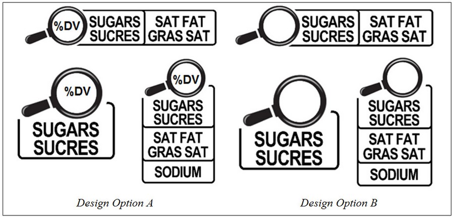
Figure 1 text description
This figure contains of two sets of front-of-package symbol designs with magnifying glasses, proposed by RCC.
On the left are three examples for the first set labelled 'Design Option A'. The first example contains a black and white magnifying glass icon with the text '% DV' in black font inside the lens. Extending to the right of the magnifying glass are two rounded rectangles side by side. The rectangles are white with a black outline. The first rectangle contains the word 'SUGARS' on top of the word 'SUCRES' in bold capital black font. The second rectangle contains the words 'SAT FAT' on top of the words 'GRAS SAT' in bold capital black font.
The second example contains a magnifying glass icon with the text '% DV' inside the lens. Extending below it is a rounded rectangle containing the word 'SUGARS' on top of the word 'SUCRES' in bold capital black font. The rectangle is white with a black outline.
The third example contains a magnifying glass icon with the text '% DV' inside the lens. Extending below it is three vertically stacked rounded rectangles. The rectangles are white with a black outline. The top rectangle contains the word 'SUGARS' on top of the word 'SUCRES' in bold capital black font. The middle rectangle contains the words 'SAT FAT' on top of the words 'GRAS SAT' in bold capital black font. The bottom rectangle contains the word 'SODIUM' in bold capital black font.
On the right are three examples of the second set labelled 'Design Option B'. These examples are similar to the examples in Design Option A, but do not contain the text '%DV' in the magnifying glass lens.
The first example contains a black and white magnifying glass icon. Extending to the right of the magnifying glass are two rounded rectangles side by side. The rectangles are white with a black outline. The first rectangle contains the word 'SUGARS' on top of the word 'SUCRES' in bold capital black font. The second rectangle contains the words 'SAT FAT' on top of the words 'GRAS SAT' in bold capital black font.
The second example contains a magnifying glass icon. Extending below it is a rounded rectangle containing the word 'SUGARS' on top of the word 'SUCRES' in bold capital black font. The rectangle is white with a black outline.
The third example contains a magnifying glass icon. Extending below it is three vertically stacked rounded rectangles. The rectangles are white with a black outline. The top rectangle contains the word 'SUGARS' on top of the word 'SUCRES' in bold capital black font. The middle rectangle contains the words 'SAT FAT' on top of the words 'GRAS SAT' in bold capital black font. The bottom rectangle contains the word 'SODIUM' in bold capital black font.
Food & Consumer Products of Canada (FCPC)
- FCPC expressed concerns with Health Canada's process to develop a FOP nutrition labelling system and feels that the Healthy Eating Strategy initiatives unfairly target the food processing industry.
- FCPC expressed concern that Health Canada's proposed symbol appears not to have been modified in light of feedback that was provided by stakeholders in response to the November 2016 consultation. In response to that consultation, FCPC had proposed that Health Canada adopt 'Facts Up Front' (Figure 2), an industry-led FOP approach that has been adopted by a number of multinational companies operating in the United States and Canada.
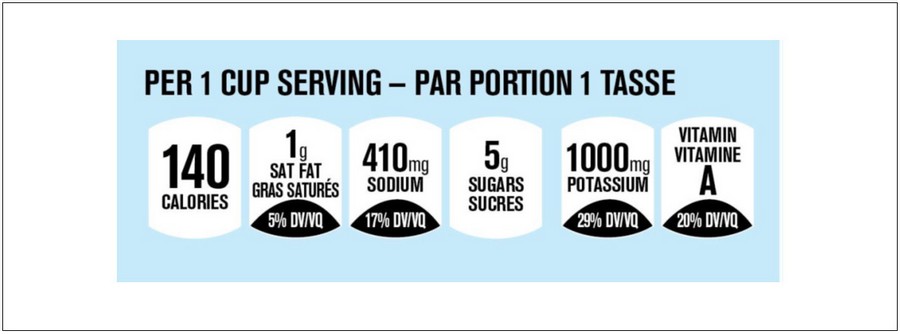
Figure 2 text description
This figure contains the Facts Up Front symbol proposed by FCPC. The symbol shows a light blue rectangle. Within the rectangle, the words 'PER 1 CUP SERVING - PAR PORTION 1 TASSE' in bold capital black font appear along the top.
Below the text are six thumbnail shapes in white side by side. The first thumbnail contains the text '140' in bold black font on top of the word 'CALORIES' in bold capital black font.
The second thumbnail contains the text '1g' in black font on top and just below it are the words 'SAT FAT' on top of the words 'GRAS SATURÉS' in bold capital black font. At the bottom is a horizontal black pointed oval shape with the text '5% DV/VQ' in bold capital white font.
The third thumbnail contains the text '410mg' in black font on top of the word 'SODIUM' in bold capital black font. At the bottom is a horizontal black pointed oval shape with the text '17% DV/VQ' in bold capital white font.
The fourth thumbnail contains the text '5g' in black font on top. Below it is word 'SUGARS' on top of the word 'SUCRES' in bold capital black font.
The fifth thumbnail contains the text '1000mg' in black font on top of the word 'POTASSIUM' in bold capital black font. At the bottom is a horizontal black pointed oval shape with the text '29% DV/VQ' in bold capital white font.
The last thumbnail contains the word 'VITAMIN' on top of the word 'VITAMINE' in bold capital black font. Below this is the letter 'A' in large bold capital black font. At the bottom is a horizontal black pointed oval shape with the text '20% DV/VQ' in bold capital white font.
- FCPC asserted that this system is: fact and science-based; non-discriminatory; supported by consumer research; compatible with the Canadian regulatory framework; widely applicable to packaged food and beverages; supported by a broad array of stakeholders; and accompanied by a robust public education campaign.
- FCPC proposed further modification of this system with only nutrients of concern and interpretive elements including options for colours and words (Figure 3). FCPC noted that colour should not be excluded as it is in place in many systems globally and that the FOP footprint should be consistent across packages.
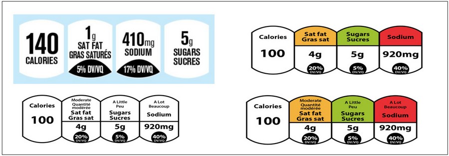
Figure 3 text description
This figure contains four front-of-package symbol designs proposed by FCPC.
The first symbol, in the top left, is the Facts Up Front symbol. The symbol shows a light blue rectangle. Within the rectangle are four thumbnail shapes in white side by side. The first thumbnail contains the text '140' in bold black font on top of the word 'CALORIES' in bold capital black font. The second thumbnail contains the text '1g' in black font on top and just below it are the words 'SAT FAT' on top of the words 'GRAS SATURÉS' in bold capital black font. At the bottom is a horizontal black pointed oval shape with the text '5% DV/VQ' in bold capital white font. The third thumbnail contains the text '410mg' in black font on top of the word 'SODIUM' in bold capital black font. At the bottom is a horizontal black pointed oval shape with the text '17% DV/VQ' in bold capital white font. The fourth thumbnail contains the text '5g' in black font on top. Below it is word 'SUGARS' on top of the word 'SUCRES' in bold capital black font.
The second symbol, in the top right, is a traffic light Facts Up Front symbol. It contains four thumbnail shapes with black outlines side by side. The first thumbnail contains the text 'Calories' in bold mixed-case black font on top of the number '100' in bold black font. The second, third and fourth thumbnails are divided in the middle by a horizontal black line. The top of the second thumbnail is orange with the words 'Sat fat' on top of the words 'Gras sat' in bold mixed case black font. The bottom of the second thumbnail is white with the text '4g' in bold black font. Below it is a black circle with the text '20%' on top of the text 'DV/VQ' in capital white font. The top of the third thumbnail is green with the word 'Sugars' on top of the word 'Sucres' in bold mixed case black font. The bottom of the third thumbnail is white with the text '5g' in bold black font. Below it is a black circle with the text '5%' on top of the text 'DV/VQ' in capital white font. The top of the last thumbnail is red with the word 'Sodium' in bold mixed case black font. The bottom of this thumbnail is white with the text '920mg' in bold black font. Below it is a black circle with the text '40%' on top of the text 'DV/VQ' in capital white font.
The third symbol, in the bottom left, is a modified Facts Up Front symbol in black and white. It contains four white thumbnail shapes with black outlines side by side. The first thumbnail contains the text 'Calories' in bold mixed-case black font on top of the number '100' in bold black font. The second, third and fourth thumbnails are divided in the middle by a horizontal black line. The top half of the second thumbnail contains the word 'Moderate' on top of the words 'Quantité modérée' in mixed case black font. Just below is the words 'Sat fat' on top of the words 'Gras sat' in bold mixed case black font. The bottom of the second thumbnail contains the text '4g' in bold black font. Below it is a black circle with the text '20%' on top of the text 'DV/VQ' in capital white font. The top half of the third thumbnail contains the words 'A Little' on top of the word 'Peu' in mixed case black font. Just below is the word 'Sugars' on top of the word 'Sucres' in bold mixed case black font. The bottom of the third thumbnail contains the text '5g' in bold black font. Below it is a black circle with the text '5%' on top of the text 'DV/VQ' in capital white font. The top half of the fourth thumbnail contains the words 'A Lot' on top of the word 'Beaucoup' in mixed-case black font. Just below is the word 'Sodium' in bold mixed case black font. The bottom of this thumbnail contains the text '920mg' in bold black font. Below it is a black circle with the text '40%' on top of the text 'DV/VQ' in capital white font.
The fourth symbol, in the bottom right, is a modified traffic light Facts Up Front symbol. It contains four thumbnail shapes with black outlines side by side. The first thumbnail is white and contains the text 'Calories' in bold mixed-case black font on top of the number '100' in bold black font. The second, third and fourth thumbnails are divided in the middle by a horizontal black line. The top half of the second thumbnail is orange and contains the word 'Moderate' on top of the words 'Quantité modérée' in mixed case black font. Just below is the words 'Sat fat' on top of the words 'Gras sat' in bold mixed case black font. The bottom of the second thumbnail is white and contains the text '4g' in bold black font. Below it is a black circle with the text '20%' on top of the text 'DV/VQ' in capital white font. The top half of the third thumbnail is green and contains the words 'A Little' on top of the word 'Peu' in mixed case black font. Just below is the word 'Sugars' on top of the word 'Sucres' in bold mixed case black font. The bottom of the third thumbnail is white and contains the text '5g' in bold black font. Below it is a black circle with the text '5%' on top of the text 'DV/VQ' in capital white font. The top half of the fourth thumbnail is red contains the words 'A Lot' on top of the word 'Beaucoup' in mixed-case black font. Just below is the word 'Sodium' in bold mixed case black font. The bottom of this thumbnail is white and contains the text '920mg' in bold black font. Below it is a black circle with the text '40%' on top of the text 'DV/VQ' in capital white font.
Canadian Beverage Association (CBA)
- CBA outlined principles that they believed should underpin any FOP system, including: science-based; compatible with the regulatory framework; applied uniformly; consistent visually; and informative to consumers.
- CBA indicated that fact-based FOP labelling has already been implemented, or proposed, in many countries on a voluntary basis. Fact-based FOP labelling is mandatory in Mexico and Thailand - only Chile has a mandatory interpretive system.
- CBA felt that the symbols proposed in the 2016 consultation paper are similar to poisonous, corrosive, and explosive hazard symbols.
- CBA believes that Canada should align itself with major trading partners, taking into account that guiding principles for Codex FOP labelling will be developed shortly.
- Because CBA feels that it is critical to understand the views and understandings of Canadians for a variety of labelling options, FCPC and CBA co-funded a consumer survey on preferences for 3 FOP systems, conducted by Abacus Data.
Abacus Data
- Abacus Data presented the results of the Canadian Attitudes on Food and Beverage Initiatives, which was an online survey of 1500 people, aged 18 and over, drawn from a Research Now panel and statistically weighted to match the Canadian population.
- The results indicate that Canadians:
- Feel they have a healthy diet and are well-served by the market.
- Don't necessarily think they will change their choices, knowing that there are healthier options available.
- Are split on whether or not the Government is doing enough to promote healthy eating.
- Are able to get the nutritional information that they need, and that they are aware enough of what is healthy and what is not. In the case of sugars, sodium, and saturated fat, over 60% felt that the information that is currently available on food labels is clear enough.
- More than 59% preferred the colour-coded 'Facts up Front' model compared to the Health Canada's 'High in' symbol (Figure 5) and the non-colour coded 'Facts Up Front'. This was consistent over gender, age, income level, and political preference.
- Respondents in both Split A and B thought that the colour coded Facts Up Front symbol was clearest about the health aspect of the product and that it tells them what they want to know and is most likely to affect their choices.
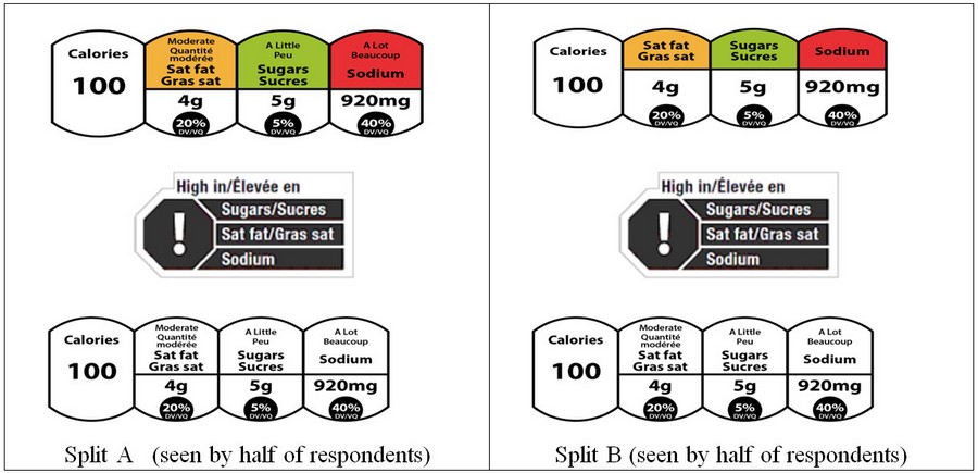
Figure 4 text description
This figure contains front-of-package symbol designs tested in the Abacus survey.
The set of three symbols on the left are labelled 'Split A (seen by half of respondents)'. The first symbol in this set is the modified traffic light Facts Up Front symbol. This symbol contains four thumbnail shapes with black outlines side by side. The first thumbnail is white and contains the text 'Calories' in bold mixed-case black font on top of the number '100' in bold black font. The second, third and fourth thumbnails are divided in the middle by a horizontal black line. The top half of the second thumbnail is orange and contains the word 'Moderate' on top of the words 'Quantité modérée' in mixed case black font. Just below is the words 'Sat fat' on top of the words 'Gras sat' in bold mixed case black font. The bottom of the second thumbnail is white and contains the text '4g' in bold black font. Below it is a black circle with the text '20%' on top of the text 'DV/VQ' in capital white font. The top half of the third thumbnail is green and contains the words 'A Little' on top of the word 'Peu' in mixed case black font. Just below is the word 'Sugars' on top of the word 'Sucres' in bold mixed case black font. The bottom of the third thumbnail is white and contains the text '5g' in bold black font. Below it is a black circle with the text '5%' on top of the text 'DV/VQ' in capital white font. The top half of the fourth thumbnail is red contains the words 'A Lot' on top of the word 'Beaucoup' in mixed-case black font. Just below is the word 'Sodium' in bold mixed case black font. The bottom of this thumbnail is white and contains the text '920mg' in bold black font. Below it is a black circle with the text '40%' on top of the text 'DV/VQ' in capital white font.
The second symbol in this set contains a black octagon with a large white exclamation mark in the middle. Three black bars extend out from the right side of the octagon. The top black bar contains the words 'Sugars/Sucres' in white font, the middle black bar contains the words 'Sat fat/Gras sat' in white font, and the bottom black bar contains the word 'Sodium' in white font. The words 'High in/Élevée en' in black font sit above the octagon and bars. The octagon, bars, and the words together are outlined by a thin grey line.
The third symbol in this set is the modified Facts Up Front symbol in black and white. It contains four white thumbnail shapes with black outlines side by side. The first thumbnail contains the text 'Calories' in bold mixed-case black font on top of the number '100' in bold black font. The second, third and fourth thumbnails are divided in the middle by a horizontal black line. The top half of the second thumbnail contains the word 'Moderate' on top of the words 'Quantité modérée' in mixed case black font. Just below is the words 'Sat fat' on top of the words 'Gras sat' in bold mixed case black font. The bottom of the second thumbnail contains the text '4g' in bold black font. Below it is a black circle with the text '20%' on top of the text 'DV/VQ' in capital white font. The top half of the third thumbnail contains the words 'A Little' on top of the word 'Peu' in mixed case black font. Just below is the word 'Sugars' on top of the word 'Sucres' in bold mixed case black font. The bottom of the third thumbnail contains the text '5g' in bold black font. Below it is a black circle with the text '5%' on top of the text 'DV/VQ' in capital white font. The top half of the fourth thumbnail contains the words 'A Lot' on top of the word 'Beaucoup' in mixed-case black font. Just below is the word 'Sodium' in bold mixed case black font. The bottom of this thumbnail contains the text '920mg' in bold black font. Below it is a black circle with the text '40%' on top of the text 'DV/VQ' in capital white font.
The set of three symbols on the right are labelled 'Split B (seen by half of respondents)'. The first symbol in this set is traffic light Facts Up Front symbol. It contains four thumbnail shapes with black outlines side by side. The first thumbnail contains the text 'Calories' in bold mixed-case black font on top of the number '100' in bold black font. The second, third and fourth thumbnails are divided in the middle by a horizontal black line. The top of the second thumbnail is orange with the words 'Sat fat' on top of the words 'Gras sat' in bold mixed case black font. The bottom of the second thumbnail is white with the text '4g' in bold black font. Below it is a black circle with the text '20%' on top of the text 'DV/VQ' in capital white font. The top of the third thumbnail is green with the word 'Sugars' on top of the word 'Sucres' in bold mixed case black font. The bottom of the third thumbnail is white with the text '5g' in bold black font. Below it is a black circle with the text '5%' on top of the text 'DV/VQ' in capital white font. The top of the last thumbnail is red with the word 'sodium' in bold mixed case black font. The bottom of this thumbnail is white with the text '920mg' in bold black font. Below it is a black circle with the text '40%' on top of the text 'DV/VQ' in capital white font.
The second and third symbols in this set are identical to the second and third symbol in the set on the left of this figure, as previously described.
The second symbol in this set contains a black octagon with a large white exclamation mark in the middle. Three black bars extend out from the right side of the octagon. The top black bar contains the words 'Sugars/Sucres' in white font, the middle black bar contains the words 'Sat fat/Gras sat' in white font, and the bottom black bar contains the word 'Sodium' in white font. The words 'High in/Élevée en' in black font sit above the octagon and bars. The octagon, bars, and the words together are outlined by a thin grey line.
The third symbol in this set is the modified Facts Up Front symbol in black and white. It contains four white thumbnail shapes with black outlines side by side. The first thumbnail contains the text 'Calories' in bold mixed-case black font on top of the number '100' in bold black font. The second, third and fourth thumbnails are divided in the middle by a horizontal black line. The top half of the second thumbnail contains the word 'Moderate' on top of the words 'Quantité modérée' in mixed case black font. Just below is the words 'Sat fat' on top of the words 'Gras sat' in bold mixed case black font. The bottom of the second thumbnail contains the text '4g' in bold black font. Below it is a black circle with the text '20%' on top of the text 'DV/VQ' in capital white font. The top half of the third thumbnail contains the words 'A Little' on top of the word 'Peu' in mixed case black font. Just below is the word 'Sugars' on top of the word 'Sucres' in bold mixed case black font. The bottom of the third thumbnail contains the text '5g' in bold black font. Below it is a black circle with the text '5%' on top of the text 'DV/VQ' in capital white font. The top half of the fourth thumbnail contains the words 'A Lot' on top of the word 'Beaucoup' in mixed-case black font. Just below is the word 'Sodium' in bold mixed case black font. The bottom of this thumbnail contains the text '920mg' in bold black font. Below it is a black circle with the text '40%' on top of the text 'DV/VQ' in capital white font.
Table Discussion Regarding Information Presented by Panellists
Key points relevant to the presentations included:
- Industry associations were divided on the use of colour in a FOP symbol. Some expressed concerns about the use of colour because it increases package design and printing costs. FCPC responded that these costs are not the only consideration. Manufacturers would rather spend more to colour-code information in Facts Up Front than display a black and white or one-colour interpretive system like those proposed by Health Canada or RCC.
- Industry felt strongly that there needs to be a clear link with the information in the NFt and that this should remain the principle source of balanced information for consumers to make informed choices. There was concern that HC's proposal could divert attention from the NFt by providing too much of a shortcut to making purchase decisions. A counterpoint was made that nutrient content and health claims also divert attention from the NFt, particularly when consumers are making choices very quickly while shopping.
- Clarification is needed on the methodology used by Abacus Data for their survey. There are important limitations inherent to public opinion research. There was discussion on studies which look at what people prefer or say they understand versus testing to see if they understand a concept or how they actually use the concept. No functional tasks were asked of participants in the Abacus Data survey. The Abacus study did not test consumer understanding of a mix of colours in a symbol.
- If a colour-coded scheme such as the one proposed by FCPC (Figure 3- modified 'Facts Up Front') was to be put into place, a graded set of thresholds would be required that would also align with nutrient content claims. Health Canada was asked to consider extending the timelines for the regulatory project in order to do further focus group testing with RCC's proposal (Figure 1- FOP 'Check the NFt' symbol options).
- There was general agreement around the table that accompanying education campaigns will be crucial no matter which system is chosen.
Panel Discussion: Research Expert Perspectives on FOP Labelling
Dr. Kim Raine, University of Alberta
Front-of-Package Labelling as a Policy Tool for Chronic Disease Prevention: Essential Elements
- There is a public health crisis with diet outranking tobacco as the number one risk factor for developing disease.
- Two thirds of the Canadian population is overweight or obese.
- A comprehensive approach is needed to prevent diet-related chronic disease, including communication of consistent reliable nutrition information.
- Nutrition labelling is a key policy tool for providing consumers with information to help them reduce their consumption of less healthy nutrients.
- The NFt is difficult to interpret and needs strong literacy and numeracy skills, and it does not convey the impact of nutrients on disease risk.
- More than 158 FOP labelling systems have been documented in Canada. These are applied inconsistently and to foods with dubious nutritional quality.
- Based on 13 reviews that dealt with FOP labelling, FOP labelling is a suitable policy option for helping consumers make healthier food choices. It is more effective that side/back labelling and consumers are more likely to identify healthier foods with it.
- The consensus recommendation is for a single, standardized FOP labelling system, which prevents competition from competing messages. It should be implemented as part of a standardized, coordinated, multi-pronged approach.
- Specific recommendations are that the FOP label should be standardized, simple, interpretive, ordinal, visually prominent, consistently located, and supported by ongoing, regularly updated promotion.
Dr. Mary L'Abbé, University of Toronto
Evidence Regarding Consumer Behaviour Towards Front-of-Pack Labelling
- FOP labelling has a strong foundation; it is supported by a number of authoritative scientific bodies.
- Foods with 'positive' FOP symbols are perceived to be better. About half of all foods sold in Canada have FOP messages, mainly in the form of nutrient content claims.
- A labelling system that provides information on nutrients of public health concerns is needed, in addition to those that show positive nutrients.
- Increased cognitive skills are required to interpret the information as the label becomes more complex.
- The information should be interpretive. Symbols that show guideline daily amounts (non-interpretive) (for example, the 'Facts Up Front' labels shown in Figures 2 and 3) are out-performed by more interpretive ones. For traffic light labelling (semi-interpretive), it has been shown that foods that have a red are avoided and that two greens out-performs a red. With star rating systems (semi-interpretive) there is confusion about the meaning of no stars (is it good or bad). Warning labels (most interpretive) allow consumers to make faster decisions.
- Interpretive labelling, such as that used in Chile, is better understood by consumers, encourages reformulation, and has a public health benefit.
Dr. David Hammond, University of Waterloo
Front-of-Package Labelling - Evidence & Effective Principles
- Consumers rely on the NFt, but do not really understand the information. Only 24% correctly identified the calorie amount. Canadians that need the information the most cannot understand it. The proposed changes to the NFt will not address this issue.
- Current FOP systems emphasize positive information, resulting in some poor nutritional quality foods having positive labels.
- Effective labels must be salient and visible, and the content must be understandable.
- The label should be on the top of the front of the package, have a border and contrasting colour, feature a symbol and make use of colour to enhance the message.
- The label should be simple, so that no nutritional knowledge is required, and it should be interpretive, with information provided as guidance, rather than specific facts. The 'Facts Up Front' label (Figures 2 and 3) is neither simple nor interpretive, while the magnifying glass (Figure 1) just points back to the NFt, which is troublesome to understand. One third to one half of consumers do not understand health star ratings. The traffic light symbol is interpretive, but could provide misleading information if there are two greens and one red.
- The 'high in' symbol, used in Chile, is the simplest and most interpretive. It is the most effective for avoiding unhealthy foods and rated highest amongst consumers when asked what additional information they would like to see on food products (79% would support a government policy that would require a symbol for 'high in sugar' on the front of package labels).
Dr. Fabio Gomes, Pan American Health Organization
Front-of-Package Labelling - evidence, policy and action
- As a result of different package and portion sizes, it is difficult to make comparisons between similar products, as well as between products in different categories, when using numerical nutrition information.
- While shopping, consumers do not use extended cognitive effort in selecting a product, thus the major goal is to make a satisfactory choice with not thinking about it too much.
- A decision on a food purchase is made in 4 to 8 seconds. Persuasive elements on the label include characters from children's stories, images and references to fresh fruit and vegetables, and nutrient content and health benefit claims.
- With traffic light symbols, green and yellow increase the appeal for these products.
- It is quicker to identify foods high in sodium with a warning label, compared to the traffic light and Guideline Daily Amounts labels that are complex, requiring education and time.
- Black and white labels are most effective as they provide the greatest contrast for the human eye.
- In Chile, warning symbols, plus the elimination of licensed characters from food labels, became mandatory in 2016. Also products labelled 'high in' are banned from schools and have advertising restrictions.
- Surveys have shown that 91.6% of consumers are influenced by the warning symbols and as a result, 18% of products have already been reformulated to avoid the symbols.
Table Discussion Regarding Information Presented by Panellists
Key points relevant to the presentations included:
- Although the interpretive FOP symbols are simple, they provide enough information for the consumer to make the decision to eat less of this food.
- Consumers want information to make an easier choice. For those that want more detailed information, the NFt is still on the package.
- Research shows that these systems change consumer behaviour. There likely will not be a risk of desensitization to the symbols. Consumers will likely come to rely on these more often.
- A number of participants expressed concern that warning symbols do not discriminate between nutrient-dense foods and others. There could be unintended consequences, such as children under 2 years old being fed low fat milk.
- It was noted that it could be a challenge to compare foods within a category if all, or none, have FOP symbols. In some products there are already 5 to 10-fold differences in the nutrient levels.
Key Messages
Industry
- There needs to be a coordinated implementation of all labelling changes.
- Some supported a link to the NFt in the FOP symbol.
- Some prefer more nuanced information in the symbol, such as the % DV.
- There are concerns related to the criteria. More information needs to be provided and unintended consequences should be avoided.
- There were mixed views on the use of colour in the symbol. Some stakeholders supported the use of multiple colours (green, amber, red) while others preferred black and white.
- People should be able to have a treat without facing a warning label.
- There was agreement that education is a key component of nutrition labelling.
Scientific Experts
- Specific recommendations are that the FOP label should be standardized, simple, interpretive, visually prominent, consistently located, and supported by ongoing, regularly updated promotion.
- There should be a mandatory FOP system.
- The FOP system should not simply direct to the NFt.
- The symbol should be meaningful, interpretive and allow quick decision making. Facts Up Front is not interpretive.
- If colour is included, it needs to be only one colour.
Discussion on Proposed FOP Symbols
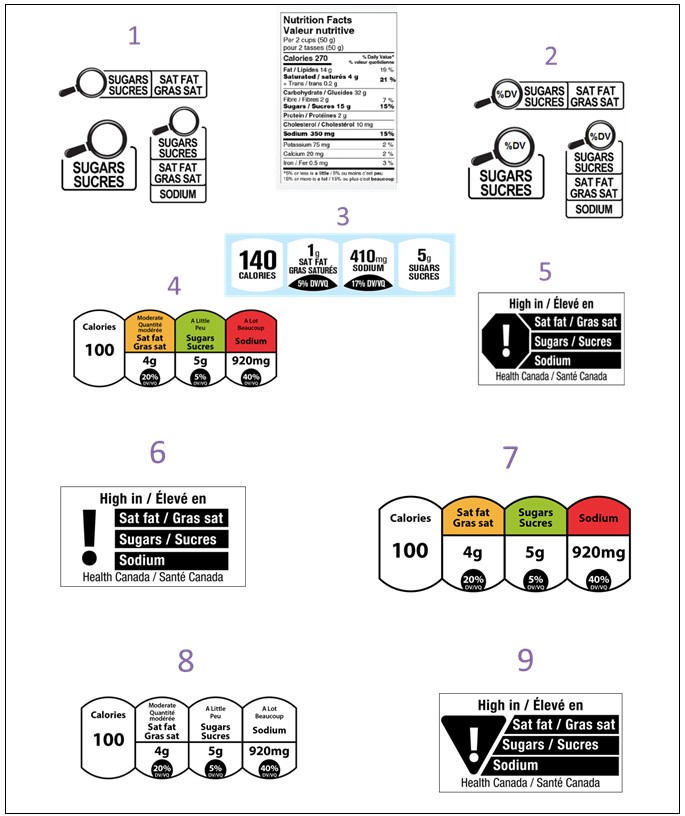
Figure 5 text description
This figure contains nine front-of-package symbol designs, labelled 1 through 9.
Symbol 1 contains a set of three examples of a front-of-package symbol design with magnifying glasses. The first example contains a black and white magnifying glass icon with the text '% DV' in black font inside the lens. Extending to the right of the magnifying glass are two rounded rectangles side by side. The rectangles are white with a black outline. The first rectangle contains the word 'SUGARS' on top of the word 'SUCRES' in bold capital black font. The second rectangle contains the words 'SAT FAT' on top of the words 'GRAS SAT' in bold capital black font. The second example contains a magnifying glass icon with the text '% DV' inside the lens. Extending below it is a rounded rectangle containing the word 'SUGARS' on top of the word 'SUCRES' in bold capital black font. The rectangle is white with a black outline. The third example contains a magnifying glass icon with the text '% DV' inside the lens. Extending below it is three vertically stacked rounded rectangles. The rectangles are white with a black outline. The top rectangle contains the word 'SUGARS' on top of the word 'SUCRES' in bold capital black font. The middle rectangle contains the words 'SAT FAT' on top of the words 'GRAS SAT' in bold capital black font. The bottom rectangle contains the word 'SODIUM' in bold capital black font.
Symbol 2 contains a set of three examples of another front-of-package symbol design with magnifying glasses. These examples are similar to the examples shown in Symbol 1, but do not contain the text '%DV' in the magnifying glass lens. The first example contains a black and white magnifying glass icon. Extending to the right of the magnifying glass are two rounded rectangles side by side. The rectangles are white with a black outline. The first rectangle contains the word 'SUGARS' on top of the word 'SUCRES' in bold capital black font. The second rectangle contains the words 'SAT FAT' on top of the words 'GRAS SAT' in bold capital black font. The second example contains a magnifying glass icon. Extending below it is a rounded rectangle containing the word 'SUGARS' on top of the word 'SUCRES' in bold capital black font. The rectangle is white with a black outline. The third example contains a magnifying glass icon. Extending below it is three vertically stacked rounded rectangles. The rectangles are white with a black outline. The top rectangle contains the word 'SUGARS' on top of the word 'SUCRES' in bold capital black font. The middle rectangle contains the words 'SAT FAT' on top of the words 'GRAS SAT' in bold capital black font. The bottom rectangle contains the word 'SODIUM' in bold capital black font.
Between symbols 1 and 2 is a modified Nutrition Facts table, with the saturated fat, sodium and sugars information bolded. All text is in mixed-case black font. Left justified at the top of the table is the heading Nutrition Facts and stacked below it is the heading Valeur nutritive. Both are in bold. The next line is Per 2 cups open parenthesis 50 g close parenthesis. The next line is pour 2 tasses open parenthesis 50 g close parenthesis. There is a thin rule below pour 2 tasses open parenthesis 50 g close parenthesis that spans the width of the table. The next line is Calories in bold followed by the number 270, also in bold. Right justified on the same line is the subheading percent symbol Daily Value in bold. Stacked under this is percent symbol valeur quotidienne also in bold. Both Percent Daily Value and percent valeur quotidienne are followed by an asterisk that refers to a footnote at the bottom of the Nutrition Facts table. There is a thick rule under the Calories information that ends after the number 270. It does not span the width of the table. Left justified on the next line is Fat, forward slash, Lipides, in bold, followed by 14 g. Right justified on the same line is the number 19 followed by a percent symbol. Indented on the next line is Saturated, forward slash, saturés followed by 4 g, in bold. Indented on the next line is a plus symbol followed by Trans, forward slash, trans followed by 0.2 g. Right justified and vertically centered against the saturated and trans fat information on the left is the number 21 followed by a percent symbol, in bold. There is a thin rule below the trans fat information that spans the width of the table. The next line is Carbohydrate, forward slash, Glucides, in bold, followed by 32 g. Indented on the next line is Fibre, forward slash, Fibres, followed by 2 g. Right justified on the same line is the number 7 followed by a percent symbol. Indented on the next line is Sugars, forward slash, Sucres, followed by 15 g, in bold. Right justified on the same line is the number 15 followed by a percent symbol, in bold. There is a thin rule under the sugars information that spans the width of the table. The next line is Protein, forward slash, Protéines, in bold, followed by 2 g. There is a thin rule under the protein information that spans the width of the table. The next line is Cholesterol, forward slash, Cholestérol, in bold, followed by 10 mg. There is a thin rule under the cholesterol information that spans the width of the table. The next line is Sodium, followed by 350 mg, in bold. Right justified on the same line is the number 15 followed by a percent symbol, in bold. There is a thick rule under the sodium information that spans the width of the table. The next line is Potassium followed by 75 mg. Right justified on the same line is the number 2 followed by a percent symbol. There is a thin rule under the potassium information that spans the width of the table. The next line is Calcium followed by 20 mg. Right justified on the same line is the number 2 followed by a percent symbol. There is a thin rule below the calcium information that spans the width of the table. The next line is Iron, forward slash, Fer followed by 0.5 mg. Right justified on the same line is the number 3 followed by a percent symbol. There is a thick rule under the iron information that spans the width of the Nutrition Facts table. The next two lines is the percent Daily Value footnote that was referred to at the beginning of the table description. The footnote starts with an asterisk followed by the statement: 5 percent symbol or less is a little,15 percent symbol or more is a lot and on the second line is an asterisk followed by the statement: 5 percent symbol ou moins c'est peu, 15 percent symbol ou plus c'est beaucoup. The terms 'a little', 'a lot', 'peu', and 'beaucoup' are in bold. All the above are enclosed within a rectangle.
Symbol 3 is the Facts Up Front symbol. The symbol shows a light blue rectangle. Within the rectangle are the words 'PER 1 CUP SERVING - PAR PORTION 1 TASSE' in bold capital black font along the top. Below the text are six thumbnail shapes in white side by side. The first thumbnail contains the text '140' in bold black font on top of the word 'CALORIES' in bold capital black font. The second thumbnail contains the text '1g' in black font on top and just below it are the words 'SAT FAT' on top of the words 'GRAS SATURÉS' in bold capital black font. At the bottom is a horizontal black pointed oval shape with the text '5% DV/VQ' in bold capital white font. The third thumbnail contains the text '410mg' in black font on top of the word 'SODIUM' in bold capital black font. At the bottom is a horizontal black pointed oval shape with the text '17% DV/VQ' in bold capital white font. The fourth thumbnail contains the text '5g' in black font on top. Below it is word 'SUGARS' on top of the word 'SUCRES' in bold capital black font. The fifth thumbnail contains the text '1000mg' in black font on top of the word 'POTASSIUM' in bold capital black font. At the bottom is a horizontal black pointed oval shape with the text '29% DV/VQ' in bold capital white font. The last thumbnail contains the word 'VITAMIN' on top of the word 'VITAMINE' in bold capital black font. Below this is the letter 'A' in large bold capital black font. At the bottom is a horizontal black pointed oval shape with the text '20% DV/VQ' in bold capital white font.
Symbol 4 is the modified traffic light Facts Up Front symbol. This symbol contains four thumbnail shapes with black outlines side by side. The first thumbnail is white and contains the text 'Calories' in bold mixed-case black font on top of the number '100' in bold black font. The second, third and fourth thumbnails are divided in the middle by a horizontal black line. The top half of the second thumbnail is orange and contains the word 'Moderate' on top of the words 'Quantité modérée' in mixed case black font. Just below is the words 'Sat fat' on top of the words 'Gras sat' in bold mixed case black font. The bottom of the second thumbnail is white and contains the text '4g' in bold black font. Below it is a black circle with the text '20%' on top of the text 'DV/VQ' in capital white font. The top half of the third thumbnail is green and contains the words 'A Little' on top of the word 'Peu' in mixed case black font. Just below is the word 'Sugars' on top of the word 'Sucres' in bold mixed case black font. The bottom of the third thumbnail is white and contains the text '5g' in bold black font. Below it is a black circle with the text '5%' on top of the text 'DV/VQ' in capital white font. The top half of the fourth thumbnail is red contains the words 'A Lot' on top of the word 'Beaucoup' in mixed-case black font. Just below is the word 'Sodium' in bold mixed case black font. The bottom of this thumbnail is white and contains the text '920mg' in bold black font. Below it is a black circle with the text '40%' on top of the text 'DV/VQ' in capital white font.
Symbol 5 shows one black octagon with a large white exclamation mark in the middle. Three black bars extend out from the right side of the octagon. The top black bar contains the words 'Sat fat/Gras sat' in white mixed-case font, the middle black bar contains the words 'Sugars/Sucres' in white mixed-case font, and the bottom black bar contains the word 'Sodium' in white mixed-case font. The words 'High in/Élevée en' in black mixed-case font sit above the octagon and bars. The words 'Health Canada/Santé Canada in black mixed-case font sit below the octagon and bars. The octagon, bars, and the words together are enclosed in a rectangle.
Symbol 6 shows a large black exclamation mark. Beside it on the right, are three black bars. The top black bar contains the words 'Sat fat/Gras sat" in white mixed-case font, the middle black bar contains the words 'Sugars/Sucres' in white mixed-case font, and the bottom black bar contains the word 'Sodium' in white mixed-case font. The words 'High in/Élevée en' in black mixed-case font sit above the exclamation mark and bars. The words 'Health Canada/Santé Canada mixed-case sit below the exclamation mark and bars. The exclamation mark, bars, and the words together are enclosed in a rectangle.
Symbol 7 is traffic light Facts Up Front symbol. It contains four thumbnail shapes with black outlines side by side. The first thumbnail contains the text 'Calories" in bold mixed-case black font on top of the number '100' in bold black font. The second, third and fourth thumbnails are divided in the middle by a horizontal black line. The top of the second thumbnail is orange with the words 'Sat fat' on top of the words 'Gras sat' in bold mixed case black font. The bottom of the second thumbnail is white with the text '4g' in bold black font. Below it is a black circle with the text '20%' on top of the text 'DV/VQ' in capital white font. The top of the third thumbnail is green with the word 'Sugars' on top of the word 'Sucres' in bold mixed case black font. The bottom of the third thumbnail is white with the text '5g' in bold black font. Below it is a black circle with the text '5%' on top of the text 'DV/VQ' in capital white font. The top of the last thumbnail is red with the word 'sodium' in bold mixed case black font. The bottom of this thumbnail is white with the text '920mg' in bold black font. Below it is a black circle with the text '40%' on top of the text 'DV/VQ' in capital white font.
Symbol 8 is the modified Facts Up Front symbol in black and white. It contains four white thumbnail shapes with black outlines side by side. The first thumbnail contains the text 'Calories' in bold mixed-case black font on top of the number '100' in bold black font. The second, third and fourth thumbnails are divided in the middle by a horizontal black line. The top half of the second thumbnail contains the word 'Moderate' on top of the words 'Quantité modérée' in mixed case black font. Just below is the words 'Sat fat' on top of the words 'Gras sat' in bold mixed case black font. The bottom of the second thumbnail contains the text '4g' in bold black font. Below it is a black circle with the text '20%' on top of the text 'DV/VQ' in capital white font. The top half of the third thumbnail contains the words 'A Little' on top of the word 'Peu' in mixed case black font. Just below is the word 'Sugars' on top of the word 'Sucres' in bold mixed case black font. The bottom of the third thumbnail contains the text '5g' in bold black font. Below it is a black circle with the text '5%' on top of the text 'DV/VQ' in capital white font. The top half of the fourth thumbnail contains the words 'A Lot' on top of the word 'Beaucoup' in mixed-case black font. Just below is the word 'Sodium' in bold mixed case black font. The bottom of this thumbnail contains the text '920mg' in bold black font. Below it is a black circle with the text '40%' on top of the text 'DV/VQ' in capital white font.
Symbol 9 shows a black inverted triangle with a large white exclamation mark in the middle. Three black bars extend out from the right side of the triangle. The top black bar contains the words 'Sat fat/Gras sat' in white mixed-case font, the middle black bar contains the words 'Sugars/Sucres ' in white mixed-case font, and the bottom black bar contains the word 'Sodium' in white mixed-case font. The words 'High in/Élevée en' in black mixed-case font sit above the triangle and bars. The words 'Health Canada/Santé Canada' in black mixed-case font sit below the triangle and bars. The triangle, bars, and the words together are enclosed in a rectangle.
The symbols submitted by both Health Canada and other organizations were presented for discussion (Figure 5). The strengths and weaknesses of each were discussed. The following summaries include comments from online participants.
Discussion on FOP Nutrition Symbol Strengths and Weaknesses
| Strengths | Weaknesses |
|---|---|
|
|
| Strengths | Weaknesses |
|---|---|
See Symbol 1 plus:
|
See Symbol 1 plus:
|
| Strengths | Weaknesses |
|---|---|
|
|
| Strengths | Weaknesses |
|---|---|
|
|
| Strengths | Weaknesses |
|---|---|
|
|
| Strengths | Weaknesses |
|---|---|
| See Symbol 5 | See Symbol 5 plus
|
| Strengths | Weaknesses |
|---|---|
See Symbol 4 plus:
|
See Symbol 4 |
| Strengths | Weaknesses |
|---|---|
See Symbol 4 plus:
|
See Symbol 4 plus:
|
Symbol 9: 'High in' symbol, with inverted triangle (i.e. yield sign) point only - proposed by Health Canada
Please refer to strengths and weaknesses of Symbol 6.
Symbol 10: 'Attention!' symbols, with stop sign shapes - proposed by Dietitians of Canada
An additional proposal, (Symbol 10) was developed and presented at the meeting by the representative from Dietitians of Canada (Figure 6).
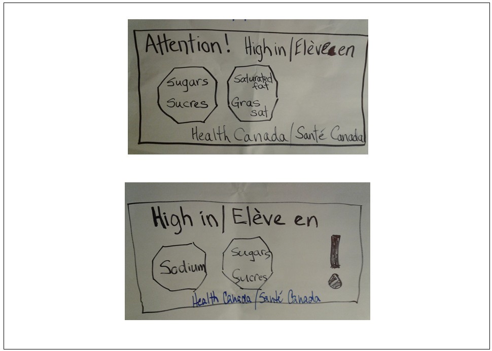
Figure 6 text description
This figure contains drawings of two front-of-package symbol designs in black marker, proposed by Dietitians of Canada. The top symbol contains the words 'Attention! High in/Elève (sic) en', with two octagons below it side by side. The first octagon contains the word 'Sugars' on top of the word 'Sucres'. The second octagon contains the words 'Saturated fat' on top of the words 'Gras sat'. Below the octagons are the words 'Health Canada/Santé Canada'. The words and octagons are enclosed in a rectangle.
The bottom symbol contains the words 'High in/Elève (sic) en'. Below this are two octagons and an exclamation mark side by side. The first octagon contains the word 'Sodium' and the second octagon contains the word 'Sugars' on top of the word 'Sucres'. Below the octagons and exclamation mark are the words 'Health Canada/Santé Canada'. The words, octagons, and exclamation mark are enclosed in a rectangle.
| Strengths | Weaknesses |
|---|---|
| N/A |
|
The question of whether or not any of the designs should be dropped or changed was posed. The following key points came out of the discussion:
- Revisions to the symbols would be subject to a short timeline. It should be possible to take the positive points heard in the discussions and design something that meets the need.
- Revisions should take into account cost considerations and concerns that the stop sign could be interpreted to mean that the food is unsafe and should not be eaten.
- The caution sign could be removed from the Health Canada proposals to make them less 'alarming', but this would take away the impact.
- Concerns about interpretation of warning / traffic symbols should not be presumed, but tested.
- Most consumers are not versed enough in nutrition to understand what the numbers mean, thus it is better to stay away from them. For those who want the information, the NFt is there.
- The alignment between the FOP labelling criteria and the public policy objective was re-emphasized.
- The public policy goal of FOP labelling is to reduce harm from chronic disease, which has both a human and economic impact. An unhealthy diet is very costly to every Canadian in the form of healthcare.
- The criteria for the FOP symbol should first and foremost reflect the public policy goal while putting in place measures to mitigate industry's concerns.
- There needs to be a clear decision on colour, either one colour or black and white, as these would be the only options that align the 'high in' criterion.
- Education is a very important component of the implementation, regardless of which symbol is selected.
Closing Remarks
Minister of Health and Assistant Deputy Minister
The Minister of Health, Ginette Petitpas Taylor, addressed the participants at the meeting. She made the following points:
- The organizations represented by those present at the meeting are essential partners with the Government in improving the health of Canadians.
- Health Canada is looking for insights into how to implement the Healthy Eating Strategy.
- Good health is fundamental to a good quality of life and is critical to Canada's prosperity as well.
- One-fifth of Canadians suffer from chronic diseases, with some now showing up in kids; type 2 diabetes has doubled over the last decade.
- The cost of chronic disease is approximately $26 billion per year.
- A ban on industrial trans fat has been announced and will reduce heart disease risk.
- In the past year, there have been consultations on updating Canada's Food Guide, restricting the marketing of unhealthy foods to children, and FOP labelling.
- There are countless FOP statements on the benefit of foods, but there is no equivalent information on foods that are high in sugars, sodium, and saturated fat.
- Discussion is very important in moving this forward and we need to get it right.
Pierre Sabourin, Assistant Deputy Minister, concluded the meeting by re-emphasizing the public health imperative, the objectives of FOP nutrition labeling, and the next steps. Mr. Sabourin indicated that participants would receive a letter inviting them to submit revised symbols that are compatible with the evidence-based criteria discussed during the meeting. These evidence-based criteria are intended to help ensure the FOP approach achieves the public health objectives and align with Health Canada's health protection legislative authority. Symbol submissions will be reviewed by Health Canada and used to form the basis of the next formal stakeholder engagement on the Health Eating Strategy, planned for November. Mr. Sabourin thanked all of the participants for their contribution as well as those who helped plan and organize the meeting.
Meeting presentations will be available on the Health Canada Openness and Transparency website.
Questions from Online Participants and Answers
In the spirit of openness and transparency, the meeting was streamed live and made accessible to interested parties who could not be physically present at the meeting. There were over 300 registered connections. Viewers could see presentations and hear discussions; a number of them sent in questions and comments. Most of the comments on symbols received from online participants were captured as part of the discussions and are reflected in this report. Below are the questions received that were not addressed during the meeting, and the corresponding responses from Health Canada.
1. Abacus data seemed to imply that Canadians have all the information they need/want. Does Health Canada have evidence that Canadians need information about nutrients of concern on the front of the package?
There is an urgent public health need to confront obesity and chronic diseases. Canadians eat too much sodium, sugars and saturated fat. This increases their risk of obesity and chronic diseases such as heart disease, diabetes and some cancers. FOP labelling is one of several initiatives that Health Canada is undertaking to help Canadians make healthier food choices. Along with improvements to the Nutrition Facts table and revisions to Canada's Food Guide, FOP labelling will provide information that consumers need to make healthier choices.
In addition, during the nutrition labelling consultations in 2014 and 2015, consumers and public health advocates expressed interest in having one government-led FOP system to help Canadians make healthy food choices.
In his presentation, Dr. David Hammond cited a study that indicated that 80% of consumers consulted would like to support government policy that would require 'high in sugars' symbols on the front of food packages.
2. Why does Health Canada expect FOP nutrition labelling to be effective at helping consumers make healthier choices?
Research has shown that information on the front of packages influences food purchases and the perception of how healthy a food is.
FOP labelling is not new. Manufacturers have been using symbols and nutrition claims-such as 'excellent source of fibre' and 'trans-fat free'-on the front of food packages for many years. FOP labelling has helped manufacturers highlight the positive attributes of food and to market their products.
Health Canada wants to ensure that the negative attributes of food products are also represented on the front of the package. This will help Canadians make informed choices.
There is evidence to support the role of front-of-package labelling in helping consumers identify healthier food options. In addition, nutrient-specific and interpretive approaches most consistently help consumers to do so.
Based on a review of consumer research studies and international experience, Health Canada concluded that a mandatory 'high in' front-of-package labelling system is the most appropriate labelling tool to help address the burden of chronic disease in Canada.
3. What can we learn from Chile's experience?
There is increasing international momentum for front-of-package as a regulatory initiative to address the global human and economic burden of chronic, non-communicable diseases. Other countries, such as Chile and Ecuador, have started implementing front-of-package warning symbols.
Chile implemented 'high in' FOP labelling in 2016. An evaluation post implementation indicated that 92.9% of consumers recognize the symbols. In addition, 91.6% of consumers said it influences their purchase in some way (choose product with less warning, don't buy, or purchase less). This study also determined that since implementation, 18% of products have been reformulated (e.g. 65% of dairy, 48% of processed meat products).
4. Will Health Canada's proposed approach say that nutrient-dense foods are unhealthy?
Many factors-such as taste, price, marketing and nutritional value-affect food choices. FOP labelling is just one tool that can help Canadians make healthier food choices when comparing similar products at the grocery store.
Within food categories, some foods would carry the FOP symbol, while others would not. For example, flavoured milk and yogurt, seasoned potato chips and regular soft drinks would carry the FOP symbol, whereas plain milk and yogurt, some potato chips and diet soft drinks would not. This would encourage consumers to choose foods without the FOP symbol more often.
5. Why is Health Canada proposing to introduce front-of-package labelling only on packaged foods, but not on foods sold behind the counter and in restaurants?
Health Canada is proposing to require front-of-package labelling on foods that have a Nutrition Facts table. Foods sold behind the counter and in restaurants are currently exempt from nutrition labelling requirements for a variety of reasons, including costs, lack of standardization of recipes (which make generating accurate nutrient values challenging)
Health Canada recognizes that this is a gap and will examine this issue in the future and continue to work with provincial and territorial counterparts to find the best way to provide nutrition information in restaurants and other food service establishments.