
Good Label and Package Practices Guide for Prescription Drugs
Download the alternative format
(PDF format, 1.34 MB, 79 pages)
Organization: Health Canada
Published: 2019-06-21
Preamble
The utmost care has been taken to ensure the accuracy of information presented in this guide. The guide reflects the information available during its development and is meant to provide initial considerations when preparing the content and design of labels and packages. It is anticipated that new research on various topics addressed in this guide will become available in the future, and revisions may be warranted to integrate such new information.
This document should be read in conjunction with the relevant sections of other applicable Health Canada regulations, guidance documents, and policies.
Organization of the Guide
The guide is divided into three parts:
Part 1 presents the objective, introduction, and scope. It also provides an overview of the process used in developing the guide.
Part 2 highlights the importance of the user's perspective. It emphasizes the need to consider the environment in which health products are selected and used. This is intended to provide a reference point for all other sections of the guide.
Part 3 addresses the specific components applicable to the design of labels and packages from a safety perspective. The section for each component presents background information followed by recommendations.
The appendices contain supplementary information to the guide as follows:
Appendix 1: Glossary
Appendix 2: Human Factors Principles and Assessment Methods Relevant to Labelling and Packaging
Appendix 3: Product-Use Process Maps
Appendix 4: Acknowledgements
All parts of the guide and its sections should be considered together, i.e., no topic is to be considered in isolation.
Table of contents
- 1 Overview of the Guide
- 2 Considering Users and Their Environments
- 3 Designing Labels and Packages for Safety
- 3.1 Introduction
- 3.2 Planning the design of labels and packages
- 3.3 Design and layout
- 3.3.1 Type style and size
- 3.3.2 TALLman lettering
- 3.3.3 Proximity and compatibility of information on the principal display panel
- 3.3.4 White space
- 3.3.5 Colour and contrast
- 3.3.6 Use of abbreviations, symbols, and dose designations
- 3.3.7 Bilingual labelling
- 3.3.8 Logo, branding, and trade dress
- 3.3.9 Permanence
- 3.4 Label information
- 3.5 Packaging
- Appendix 1 - Glossary
- Appendix 2 - Human Factors Principles and Assessment Methods Relevant to Labelling and Packaging
- Appendix 3 - Product-Use Process Maps
- Appendix 4 - Acknowledgements
- References
1 Overview of the Guide
1.1 Objective
The objective of the Good Label and Package Practices Guide for Prescription Drugs is to provide direction to sponsors, manufacturers and license holders (to be referred to as 'sponsors' within this guide) in designing safe and clear labels and packages.
It is essential that all labelling and packaging regulatory requirements be met.
The recommendations provided in this guide will aid sponsors in the organization of (a) information required by the regulations, and (b) other complementary information important to the proper identification, selection, and use of the product. The information is presented to support the design and development of labels and packages that are clear, effective, and minimize the risk of errors causing harm.
1.2 Introduction
The label and package are the first points of interaction between a health product and a healthcare professional or patient. They communicate key information about the safe and proper use of health products, and are important aids in product identification, selection and administration. The ability to perform product identification, selection and administration safely is dependent on the user being able to read and understand the information on the label.
Through the Plain Language Labelling Initiative, new Regulations Amending the Food and Drug Regulations (Labelling, Packaging and Brand Names of Drugs for Human Use)Footnote 1 have been introduced with the intention of improving the safe use of drugs by making drug labels easier to read and understand. These amendments include a requirement for the addition of contact information on the label and the submission of label and package mock-ups. The content presented in this guide will provide information that supports the objectives of the Plain Language Labelling Initiative.
1.3 Scope
This guide focuses on the inner and outer labels and packages across the following health products for human use:
- prescription pharmaceuticals;
- biologics and radiopharmaceuticals; and
- drugs that are permitted to be sold without a prescription but that are obtained or administered only under the direction of a healthcare professional (e.g., nitroglycerin, insulin, injectable epinephrine for anti-allergic purposes).
Any of these may be referred to as a "product" or "health product" in the context of this guide.
This guide is not applicable to whole blood and its components under the Blood RegulationsFootnote 2; cells, tissues and organs under the Safety of Human Cells, Tissues and Organs for Transplantation RegulationsFootnote 3; consumer health products for self-selection; disinfectant drugs; drug products used in clinical trials; active pharmaceutical ingredients; and drug products for veterinary use.
The guide complements Health Canada's Guidance Document: Labelling of Pharmaceutical Drugs for Human UseFootnote 4 and complies with the Food and Drugs Act, Food and Drug RegulationsFootnote 5.
Aspects of product labelling that are not covered include the naming of health products (refer to Guidance Document for Industry - Review of Drug Brand NamesFootnote 6), user-applied labels, product monographs, package inserts (e.g., prescribing information), and Patient Medication Information.
1.4 Content contributing to guide development
A large volume of information has been published providing direction to optimize the design and content of health product labels and packages to support safe use. This body of knowledge, along with additional research and consultation on the topic, has been reviewed and adapted to produce this guide and is inclusive of the following:
- Applicable Canadian regulations, standards, policies, and guidelines
- Health Canada risk communications applicable to inner and outer labels and packages
- Package and label changes and relevant learning from published reports of safety incidents with labels and packages identified as a contributing factor
- Aggregate analysis of error reports voluntarily submitted to the Institute for Safe Medication Practices Canada in which sponsor's labels or packages were explicitly identified as a concern or a contributing factorFootnote 7Footnote 8
- Consideration of human factors issues and principles (refer to Appendix 2, "Human Factors Principles and Assessment Methods Relevant to Labelling and Packaging")
- Applicable international regulations, standards, policies, and guidelines
- Concepts applied to labelling and packaging of health products by safety organizations (e.g., the United Kingdom's National Patient Safety Agency - now part of the National Health Service)
- Engagement of an international, multidisciplinary expert advisory panel and other relevant stakeholders and experts (refer to Appendix 4, "Acknowledgements")
2 Considering Users and Their Environments
The design of a health product should meet the user's needs within the environment of use, rather than there being an expectation that the user or the environment of use will change to fit the intended use of the health product.Footnote 9 Design the glove to fit the hand, instead of expecting the hand to fit a particular glove.
The environment of use can influence how users interact with a health product, so consideration of the environment should be incorporated into the design and evaluation of health product labels and packages.Footnote 9 From a prescription drug perspective, the environment of use can include where the product will be used (e.g., hospitals, long-term care facilities, healthcare professionals' offices, emergency transport settings), where the product will be stored, types of supporting tools and technologies (e.g., dose organizers and dispensers, medication administration records, bar-coding technology), and lighting level.
It is important that product labels and packages be designed with the user in mind and with consideration of the environment and processes in which the product will be used (stocked, selected, and administered). A recent aggregate analysis of labelling and packaging incidents involving health products offered an overview of some of the issues that users of health products have experienced.Footnote 8 The following are some of the potential contributing factors identified in that analysis:
- look-alike labelling and packaging
- prominence of trade dress and brand name
- lack of prominence of proper or common (non-proprietary) name
- lack of prominence (and lack of clarity) of expression of strength
- legibility and readability of information (e.g., type size, contrast of print against background)
- confusing layout of label
- lack of coordination between display of information and perforations on blister packs
- use of dangerous or misleading abbreviations
3 Designing Labels and Packages for Safety
3.1 Introduction
Part 3 of this guide presents information on current good practices in the design and layout of a health product label, the information contained on the label, and the design or choice of package. The topics and principles cover various contributing factors in reported medication incidents and issues identified by environmental scans of sponsors and users.
Although the various topics are presented separately within Part 3, they must be considered together to achieve a balance between standardization and differentiation (e.g., within a sponsor's product line). Standardization of product labels and choice of packages can reduce errors by reinforcing the pattern recognition on which humans rely when processing information.Footnote 10 However, the more label or package characteristics that products have in common (e.g., type style, size and colour of type, size and shape of container or package, layout of information), the more likely that products will look alike. The cumulative effect of individual label and package characteristics can result in look-alike issues that make it difficult for users to distinguish one product from another. The potential for look-alike issues should be considered during the design phase of a product's labelling and packaging. Similarly, changes to existing product labels and packages should strike a balance to prevent introduction of new look-alike issues. Achieving a balance between standardization and differentiation is particularly important to prevent (or resolve) look-alike issues that involve high-alert medications or a sponsor's higher-risk products.
In addition to all the topics discussed in the guide, sponsors are strongly encouraged to consider human factors aspects of product selection, use, and handling, as well as user testing with a risk- based approach (refer to Appendix 2, "Human Factors Principles and Assessment Methods Relevant to Labelling and Packaging"), in the design of labels and packages.
3.2 Planning the design of labels and packages
When designing product labels and packages, sponsors are strongly encouraged to undertake a number of steps. The following is an overview of the steps that sponsors can incorporate into existing product development and marketing processes:
- Consider the design of health product labelling and packaging as early as possible in the development process.
- Development of the package should begin early. Factors influencing the choice of a package should go beyond maintenance of stability, ease of manufacturing, or marketing considerations. The package design will also affect the size of both inner and outer labels.
- For products gaining approval in Canada, the sponsor may already have experience in other markets. Carefully review complaint and incident data to determine if changes are needed for the planned label or package of the health product for the Canadian market.
- Identify the users of the product and their environments of use.
- Designing a label and package for safe use requires keeping the users and the environments of use at top of mind throughout product development.
- At a minimum, review the questions in Appendix 2, "Human Factors Principles and Assessment Methods Relevant to Labelling and Packaging", to identify the users and environments of use. These questions are intended to elicit a wide range of considerations, and their answers can provide opportunities to understand factors important to safe design.
- Product-use process maps can be helpful when human factors-based user testing is planned, in that such maps will help in identifying the scope of use and the primary users. (Refer to Appendix 3, "Product-Use Process Maps" for an example.)
- Consider other products that might be used simultaneously with the product of interest, as products are rarely used in isolation.
- Consider user testing. A variety of user testing and other methods have been applied to the design and redesign of labels. (Refer to Appendix 2, "Human Factors Principles and Assessment Methods Relevant to Labelling and Packaging".)
- Prepare mock-ups of the label and package, including the outer packaging. Mock-ups can have multiple uses (e.g., user testing, focus groups).
- Use a continuous improvement approach. Review complaint and incident data to identify challenges and unanticipated label or package problems early in the design process and following marketing. Manufacturers should monitor trends and implement risk-mitigation measures to improve labels and packages. Gathering information throughout the product life-cycle is a proactive approach and can assist with package and label design.
3.3 Design and layout
3.3.1 Type style and size
Background
Illegibility of printed information is a contributing factor in health product errors.Footnote 8Footnote 11 Interactions between or changes to typographic elements on a label (e.g., type style, size, spacing, use of bold or italic, colour, contrast) can affect both legibility and comprehension.Footnote 12 Label information must be legible to users in the real-world environments or situations in which products will be used.
Recommendations
The following recommendations do not apply to trademarks, copyrighted text, and logos.
Type Style (Typeface)
- When choosing a type style, consider that different styles of the same point size do not appear the same in size.Footnote 12
(insert image fig1-eng.jpg)
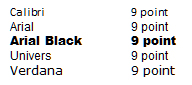
Figure 1 - Text description
This image shows the name of the font in the size specified; the fonts are Calibri 9 point, Arial 9 point, Arial Black 9 point, Univers 9 point, and Verdana 9 point.
- Use of a sans serif type style (e.g., Univers, Helvetica), that is not compressed, expanded, or decorative is preferred for key information.Footnote 13 A sans serif type style has no decorative extensions, is crisper and cleaner, and typically appears larger than a serif style of the same point size.Footnote 14 Compressed or condensed fonts may be more difficult to read, even with a larger point size.Footnote 12
- Choose a type style with adequate spacing between letters (to enhance legibility) and between words (to enhance readability).Footnote 12 Narrow letter and word spacing can cause apparent merging of words, whereas extremely wide spacing can be disruptive to the reader.Footnote 12 Adequate spacing can also reduce possible illegibility if ink were to bleed.
- Avoid using all capital lettersFootnote 12 Footnote 13 Footnote 15 Footnote 16 (exceptions: brand names, headings, and warnings that are brief may be fully capitalized). (Refer to section 3.4.3, "Critical Warnings".) The use of all capital letters reduces legibility and adversely affects readability to a greater extent than any other factor. Lowercase characters have more variation (e.g., letter shapes) in their features, which results in better legibility.Footnote 12
- Avoid the use of italic type except to emphasize a particular portion of text.Footnote 12
Type Size
- Use a type size that can be read easily by a variety of users (e.g., elderly people, those with visual impairment) in environments where products will be used (e.g., in a hospital room with low lighting). The following examples show one type style in various point sizes to illustrate that small changes in point size can affect readability:

Figure 2 - Text description
This image shows the phrase "this is Verdana 4.5 point" using Verdana font at an actual 4.5 point size; there are 5 other phrases showing different type sizes of Verdana font: 6 point, 8 point, 9 point, 10 point and 12 point.
- The largest type size possible is recommended. However, a point size less than 6 should not be used for key information.Footnote 13 Footnote 17 Key information includes the key elements (refer to section 3.4.1, "Key Elements on the Principal Display Panel") and label information required by regulations.
- For very small prescription products, such as ampoules and vials of 2 mL or less, the type should be at least 1.5 mm high.Footnote 15
- To enhance legibility when using smaller type sizes (e.g., on small containers), consider using a background colour that is significantly different from the type colour.Footnote 12 (Refer to section 3.3.5, "Colour and Contrast" for further information.)
- Type of very small size may be made more easily readable in combination with other characteristics, e.g., font, colour, white space, bolding, etc.
- The Food and Drug Regulations require that the type of the proper or common name be, at a minimum, half the size used for the brand name.Footnote 18
General Formatting
- To enhance readability, use flush left, ragged right alignment of multiple lines of text (as in this document). This form of alignment provides visual points of reference that guide the reader's eye smoothly from line to line. Since each line is either shorter or longer than the next, the eye is cued from one to the next.Footnote 12
- To enhance the readability of information, use bullet lists, with items in point form instead of complete sentences, if possible.Footnote 13
- When providing stepwise directions, use numbered lists and keep all text for each individual step on one line, if possible. This makes it easier for users to follow the instructions and enables them to find their place again if interrupted.Footnote 13
- Use contrasting characteristics (e.g., type size, weight, bolding, colour, and spacing) to help users distinguish one product from another, and to highlight important information (e.g., warnings in the directions for use) to facilitate safe use of the product, and enable the user to quickly find the information needed.Footnote 13 For example, if it is necessary to present information in paragraph form, use of bold type for key words or phrases or use of subheadings can make it easier and quicker for users to find the information they need.Footnote 13 The following example shows how bold type or subheadings might be used on a product label:
Usual Adult Dose: 75 mg (1 tablet) once daily.
Product monograph available upon request. Store tablets between 15o and 30o C. Protect from moisture.
Pharmacist: Dispense with enclosed Patient Information leaflet. - Consider the information provided in the Canadian Standards Association (CSA) standard Labelling of Drug Ampoules, Vials and Prefilled Syringes,Footnote 15 which may be helpful for selecting aspects such as type style (including character width and height), stroke ratios, and spacing between characters, words, and lines.
3.3.2 TALLman lettering
Background
TALLman lettering is a method used to assist in the differentiation of look-alike, sound-alike non-proprietary (proper or common) drug names through the application of UPPER CASE lettering to certain syllables or groups of letters within names.Footnote 9Footnote 19 TALLman lettering has typically been applied to drug names to bring attention to the points of dissimilarity between confusable names.Footnote 19 TALLman lettering may be effective because it draws attention to drug names presented in this format and can act as a warning.Footnote 20 Overuse of the technique may reduce its effectiveness as names may no longer appear novel.Footnote 21
TALLman lettering is only one of many risk mitigation strategies that can be implemented to minimize errors between confusable product names. This technique does not rely on type style, point size, or colour and can be accommodated in electronic systems; for these reasons, it has become a widely accepted method of distinguishing among drug names within healthcare practice settings.Footnote 22
The Institute for Safe Medication Practices Canada (ISMP Canada),Footnote 23 the Institute for Safe Medication Practices (US),Footnote 24 the US Food and Drug Administration (FDA),Footnote 9Footnote 24 and various other organizations around the world have supported the application of TALLman lettering for potentially confusable drug names. Footnote 22 Footnote 25-30
Recommendations
- Use TALLman lettering on product labels only if it is intended as a risk mitigation strategy for an identified safety concern, i.e., if there is an identified risk of confusion between two or more drug names with potential for serious consequences.
- Use TALLman lettering as a safety strategy, not a marketing strategy.
- To ensure that the effectiveness of TALLman lettering is not diluted and that it has the greatest possible impact, limit its use to those names associated with the potential for high risk to patient safety. These names should be identified through a risk assessment process.Footnote 29 Footnote 30
- The potential root causes for drug name confusion should be understood before TALLman lettering is considered as a potential solution. If the confusion arises from look-alike labelling or packaging, alternative differentiation strategies should be applied.
- Ensure that TALLman lettering is consistent with the ISMP Canada list of TALLman Lettering for Look-Alike/Sound-Alike Drug Names in Canada.Footnote 23
- If used, TALLman lettering should be applied only within the non-proprietary name or within the non-proprietary portion of the brand name on product labels.
- Whenever TALLman lettering is used, apply it to both the inner and outer labels, for consistency.
3.3.3 Proximity and compatibility of information on the principal display panel
Background
The Proximity Compatibility Principle specifies that all information relevant to a common task or mental operation should be displayed close together.Footnote 31Footnote 32 For example, the name, strength and dosage form are distinct but closely related elements used to identify and administer a health product and would be placed in close proximity on a product label. Conversely, the net quantity in the package is not related to this information or needed to identify and administer the product and would therefore be placed in a separate location. Confusion errors have been reported when the product strength (a numeric value) and the unit or pack size (another numeric value) were placed in close proximity.
Proximity and compatibility can be affected by other label and type attributes, such as colour, type style, and type size and weight. Use of the same colour(s), type style, point size, and markings or graphics can inadvertently link pieces of information (e.g., numeric values) even when there is physical distance between them on the label.
Recommendations
- Place items that are relevant to a common task or mental operation (e.g., health product name, strength, dosage form, route of administration) close to one another on a product label.Footnote 32Footnote 33
- Consider how the various elements of the label are presented as a whole. In addition to grouping closely related information together on the principal display panel, consider how the colour, type style, and type size and weight visually separate or connect different pieces of information. For example, if the number of tablets in a package (unit pack size) is presented in the same colour as the product strength, but has a more prominent appearance (e.g., in bold type or larger type size); the number of tablets may be misinterpreted as the strength or dose.
- When listing more than one strength on a single panel, ensure that the strength per unit is placed in close proximity to the strength per total volume.Footnote 16Footnote 33 When the total quantity per total volume is present on the principal display panel, ensure that this information is more prominent than any other expression of strength.Footnote 26Footnote 34
- List the net quantity in the package separately from, and less prominently than, the product strength. Displaying this information together (e.g., 10 mg / 7 tablets) has been a contributing factor in medication errors.Footnote 8 The number of units can remain on the principal display panel but should be separated either physically or through design features so to reduce the chance for it to be misread as the product strength.
- Avoid separating unrelated information with marks that could be misinterpreted. For example, if a point or a dash is positioned between the dose and the total volume in the container, the volume might be misinterpreted as part of the dose (e.g., "1000 units · 25 mL", where "25 mL" refers to the total volume in the container, not the strength per total volume, and might be interpreted as "1000 units per 25 mL").
- When possible, avoid placing unrelated information (including graphics) between the product name and its strength.Footnote 9Footnote 26
- To ensure that key information is legible and not subject to misinterpretation, avoid superimposing text and images (or logos).Footnote 35
- List the standard of manufacture, as applicable (e.g., United States Pharmacopeia [USP], British Pharmacopoeia [BP]), in close proximity to a product's proper name.Footnote 4
3.3.4 White space
Background
White space is an important aspect of design and requires careful consideration during the design phase. It should be used as liberally as possible to enhance the readability of health product labels,Footnote 36 so that healthcare professionals and patients can quickly find the information they need to facilitate safe product use.Footnote 13
The term "white space" does not necessarily refer to space on a label that appears white. Depending on the background colour, it may be more accurate to use another term, such as "blank space". Such white space on a health product label or package refers to any space not covered by print, markings, coloured graphics, watermarks, or other elements of the label.
White space surrounding text can create a feeling of openness.Footnote 37 It can also help readers to focus on what they are reading.Footnote 14 Importantly, it may improve readers' willingness to read and their ability to find and process the information presented, because it helps to reduce the concentration and mental workload required. Footnote 37 Footnote 38
Recommendations
- Incorporate white space as part of the design and layout of information on health product labels as early as possible in the design process. White space should be used for the following purposes:
- to frame a particular grouping of text (e.g., bulleted lists) and to separate unrelated information
- to separate one sentence from another
- to separate paragraphs (to help distinguish one idea from another)
- around headings and key information (e.g., warnings) to emphasize their importance
- Maximize the use of white space to avoid crowding information on the label when smaller type size is used. Increasing the space between lines may be especially helpful for elderly users.Footnote 14
- Avoid using a condensed type style, which reduces white space between letters and words and which can reduce legibility by causing words to merge together visually.Footnote 12
- For the labelling of drug ampoules, vials, and prefilled syringes, particularly for spacing between characters, words, and lines, refer to the CSA standard, Labelling of Drug Ampoules, Vials, and Prefilled Syringes.Footnote 15
3.3.5 Colour and contrast
Background
Colour on the inner and outer labels of health products must be carefully applied to help, and not hinder, the selection of appropriate products by users. The application of colour is just one of many factors to be taken into account in the design of health product labels and should not be considered in isolation.
People with normal colour vision are able to detect differences between similar colours only when the colours are placed side by side. Without side-by-side comparison, similar colours cannot be easily distinguished, and errors can be made if colour is the only variable used on a health product label. For example, problems may arise if different strengths of the same product are differentiated by using variations of one specific colour.Footnote 12
In addition, under less-than-optimal conditions, the ability to discern colours can be further reduced, for example, when print appears on small containers or labels, when viewing time is short (e.g., urgent situations, distractions), when a lower level of lighting is used (e.g., in a patient's hospital room at nightFootnote 39), and when colours of similar products are physically separated (i.e., not viewed together).Footnote 40
The effect of colour in label design can be affected by colour-blindness.Footnote 41-44 Certain types of colour-blindness are more common than others. Colour-blind users may have limitations in their perception of specific coloursFootnote 35Footnote 39 (e.g., red-green) or may have difficulty in reading text in particular colour combinations or on particular colour backgroundsFootnote 40.
Contrast
Contrast is a fundamental design principle that is used to help the user detect differences in what is seen.Footnote 45 It is an important factor for the readability of text, particularly on packages with a coloured background.Footnote 1Footnote 9Footnote 10 Footnote 16 Footnote 33 Footnote 35 Footnote 42-44 Footnote 46-49 For example, it has been recommended that text of a dark colour be used on pale backgrounds to ensure sufficient contrast for optimum visibility.Footnote 9 Footnote 10 Footnote 15 Footnote 16 Footnote 35 Footnote 48 Footnote 50
Colour Differentiation and Colour-Coding
Colour differentiation is generally used to highlight particular features on a product label or to help distinguish one product from another.Footnote 10Footnote 34 However, repeated use of this particular technique can lead to look-alike product labels,Footnote 10Footnote 35Footnote 46Footnote 50 which can in turn predispose users to confirmation bias (i.e., users see what they expect to see). Colour differentiation can also reduce the prominence of key information if it is not used skilfully.Footnote 15Footnote 46
"Color coding is the systematic application of color to aid in classification and identification. A color-coding system enables users to associate a color with a function."Footnote 10 Colour-coding relates to the use of consistent colours for specific products or product strengths by all manufacturers. For various reasons, many safety experts do not support the use of colour-coding:Footnote 9Footnote 10Footnote 16Footnote 35Footnote 42Footnote 51Footnote 52
- the lack of supporting evidence that it is an effective means to prevent errors,Footnote 16Footnote 51
- the known problems that have resulted from colour-coding,Footnote 9Footnote 10Footnote 51Footnote 52
- the inherent limitations of selecting identifiable colours,Footnote 35Footnote 39Footnote 40Footnote 51-53 and
- the limitations of human memory.Footnote 10Footnote 39Footnote 51
Colour-coding appears to have some benefits for user-applied labels and in specific practice areas, such as by anesthesiologists in the operating room setting,Footnote 54 but these benefits are not necessarily applicable to other users or other environments. Users should not be expected to remember and attribute meaning to particular colours, especially given the large number of different product strengths and concentrations, the thousands of drug classes and products, and the limited number of visually distinct colours.
By convention, some colours are typically recognized as conveying certain meanings (e.g., red may convey danger, orange may convey a warning, yellow may convey the need for caution).Footnote 40 Such conventions are commonly used for signage in dangerous or hazard-prone environments, e.g., for traffic signs or for containers holding hazardous chemicals.Footnote 55 Aside from these examples, subjective meanings for colour may also exist in specific populations of users.Footnote 56
Recommendations
Use of Colour
- The application of colour is just one of many factors to be taken into account in the design of health product labels and should not be considered in isolation.
- Consider the users' environments, because a given colour may appear different under different lighting conditions.Footnote 9Footnote 35Footnote 39Footnote 42Footnote 43
- Colour choices should take into account the following general principles:
- Hue: Colours opposite each other on the colour wheel (e.g., blue and orange, yellow and violet) are considered to have more contrast than colours closer together on the wheel (e.g., violet and blue, orange and red) and therefore provide greater differentiation in hue.Footnote 53Footnote 57-59
- Saturation: Fully saturated (bright) colours combined with low-saturation (dull) colours provide greater contrast than combinations of colours of a similar saturation level.Footnote 57
- Value: Colours with a low value (dark colours) placed beside or against colours of a high value (light colours) have greater contrast than colours with similar values.Footnote 53
- Use colour for the following purposes:
- to draw attention to important label information,Footnote 10 such as the name of a health product and its strengthFootnote 33
- to bring attention to or enhance the prominence of warning statementsFootnote 9Footnote 10Footnote 59
- to differentiate one product from anotherFootnote 42 or to differentiate between strengths within a product lineFootnote 42Footnote 46Footnote 51Footnote 60
- While trade dress and logos can assist in the selection process, care must be taken to appropriately differentiate products within a product line to decrease the potential for confusion.Footnote 8
- To enhance differentiation among product strengths, use a colour with a different hue, rather than a different intensity or value of the same colour.Footnote 16 For example, avoid using different shades of blue for various strengths, and instead use distinctly different colours.
- As a general principle, colour-coding of health products is not recommended.Footnote 9Footnote 10Footnote 16Footnote 35Footnote 42Footnote 51Footnote 52
- Consider using more than just colour to distinguish between products.Footnote 9 Other techniques for differentiation include colour bands, frames or key lines (i.e., boxes around text).Footnote 33
- When selecting colours for labelling and packaging, consider the potential implications of colour-blindness (e.g., avoid using both red and green together,Footnote 41 because they may not be easily distinguished by those with red-green colour-blindness). Computer simulation programs, such as Vischeck,Footnote 61 may be used to determine how colours will be perceived by individuals with different forms of colour-blindness.
- Match the styles of inner and outer package labels so that the visual appearance, including use of colour, is identical or related.Footnote 35Footnote 46This approach can help to ensure that users (re)place an inner container into the correct outer package as needed. It can also help users to identify the corresponding outer (secondary) packaging when they need information that may be available only on that outer package (e.g., directions related to a health product in a small-volume container). Such matching between a container label and its outer package or box label reduces the amount of information that needs to be processed simultaneously by the user.Footnote 62
Contrast
- Maximize the legibility of text by ensuring good contrast between text and backgroundFootnote 9Footnote 10Footnote 33Footnote 43Footnote 46Footnote 63 (e.g., apply dark text on a pale backgroundFootnote 16Footnote 42Footnote 48Footnote 49). Avoid the use of type and background colour combinations that are known to be very difficult to read (e.g., black or yellow type on a red backgroundFootnote 48).
- Use opaque labels on clear or translucent containers to ensure that type is legible and does not show through the container.Footnote 35 Ensure that sufficient clear area remains after application of the label to allow the user to view the contents of the container.Footnote 35
- If a paper label is not an option, use contrasting type ink on an opaque background on the translucent container to maintain readability.Footnote 35
- Engraving (i.e., embossing and debossing) of type onto a container may not provide sufficient contrast on its own; therefore, if such methods are used, highlight the type with ink.Footnote 16
- Ensure that any symbols required by regulations have sufficient contrast against the background colour.Footnote 18
Containers
- Graduation scales on prefilled syringes (i.e., "ready-to-use" clear containers) or oral dosing devices (e.g., oral syringes) should be easily legible. For example, use black ink on a white field of view.Footnote 15
- For blister packs, use a non-reflective material for the backing, so that information is legible.Footnote 9Footnote 26Footnote 46
- For liquids in clear containers, affix labels with colourless glues to prevent misperception of container contents as being discoloured.Footnote 15
3.3.6 Use of abbreviations, symbols, and dose designations
Background
The use of certain abbreviations (e.g., OD), symbols (e.g., μ), and dose designations (e.g., 1.0 mg) to convey health product-related information has been identified as an underlying cause of serious, even fatal errors.Footnote 64 An abbreviation may have more than one meaning and may therefore be susceptible to misinterpretation,Footnote 9 particularly if users are unfamiliar with the intended meaning. Practices and terminology may vary among different healthcare professionals and groups (e.g., pharmacists, nurses, physicians), as well as between clinical specialties, or even between patients and healthcare professionals.
Recommendations
General
- Minimize use of abbreviations, symbols, and dose designations in health product packaging and labelling.Footnote 9Footnote 64
- Avoid the use of error-prone abbreviations, symbols, and dose designations.Footnote 9Footnote 64 Refer to ISMP Canada's "Do Not Use" listFootnote 64 for further details. This list (adapted from a list prepared by ISMP USFootnote 65) takes into account medication errors voluntarily reported to ISMP Canada for which the reporter identified an abbreviation, symbol, or dose designation as a potential contributing factor in incidents causing harm or having the potential to cause harm.
- Ensure that any abbreviations used provide information that is useful and easily identifiable to the users (i.e., healthcare professionals, patients).Footnote 6
- An abbreviation should not be ambiguous or otherwise have the potential to be misinterpreted by the user. In particular, avoid abbreviations that indicate dosing schedules. (For example, "QD" may be read or misinterpreted as "QID", and "OD" may be interpreted as either "oculus dexter" [Latin, meaning "right eye"] or "once daily").Footnote 6
- Use international or national standards for abbreviations (e.g., abbreviate "milliliters" as "mL"Footnote 64).
Note: The symbol "µg" (meaning "microgram") conforms to the International System of Units (SI) and is often used in scientific literature. However, for labelling purposes, the abbreviation "mcg" should be used instead.Footnote 4 The Greek letter "µ" may be difficult to see in some print and size formats and may be misread as the letter "m" (i.e., "mg" for "milligrams", rather than the intended "µg" for "micrograms"). - The proper or common names of health products and any medicinal ingredients in the product should not be abbreviated.Footnote 4Footnote 15Footnote 16Footnote 64 Product confusion errors can result when similar abbreviations are used for multiple products (e.g., MSO4 [morphine sulfate] and MgSO4 [magnesium sulfate]).
- Whenever possible, avoid the use of abbreviations on vaccines (e.g., Tdap and DTap). Abbreviations have been identified as contributing factors in vaccine selection errors.Footnote 66
- Define abbreviations used on any product dose delivery devices provided. Ensure that abbreviations used on such devices are consistent with abbreviations used on product labels and packaging, such as label directions, outside packaging (carton labelling), containers, and any accompanying written materials.
- Comprehension testing for any new abbreviation is highly recommended. (Refer to Appendix 2, "Human Factors Principles and Assessment Methods Relevant to Labelling and Packaging".)
Route of Administration
- Express in full any uncommon route of administration (e.g., intrathecal), as it may be unfamiliar to users and use of an abbreviation may result in confusion.Footnote 26 Other abbreviated routes of administration should be explained in full at least once if used elsewhere in the labelling.Footnote 4
3.3.7 Bilingual labelling
Background
Bilingual labelling may pose challenges for the readability of inner and outer labels because of the possibility of crowding of information. Healthcare professional, patient, and consumer feedback gathered in the development of the guide highlighted the following concerns:
- ensuring adequate space for both English and French text, while preserving white space especially when space is restricted (e.g., small containers). French text tends to be slightly longer than the corresponding English
- ensuring accuracy and meaning of health product information is preserved in both languages
- ensuring standardization and consistency of formatting for bilingual text on health product labels (e.g., product name, salt forms of the drug, placement of certain pieces of information, prominence of specific information)
- recognizing subtle differences between English and French in how information is presented and interpreted (e.g., use of a period [English] or a comma [French] to denote the decimal)
Recommendations
General Principles
- Consider bilingual labelling early in the label and package development process, to accurately determine the amount of label space needed to accommodate required product information.
- Inclusion of both languages on the label (and within a technology, e.g., automated voice instructions) is preferred.
- If including English and French on the same panel where space is limited, consider how best to display key information in a consistent manner, within and across product lines. (Refer to Appendix 1, "Glossary" for definition of key information.)
Organization of Information
- For product packages or containers with multiple panels or sides (e.g., an outer box), it is preferable to dedicate an entire label panel for information in English and another for information in French.
- Where packages have only one or two panels available or packages have limited space, consider using different types of labels or innovative labels (e.g., peel-back labels) to accommodate information in both languages. Novel label formats should comply with applicable regulations and guidance documents.Footnote 1Footnote 4 (Refer to section 3.5.2, "Small Containers and Small-Volume Containers".)
- Identify commonalities in English and French for the key information, and determine if the information can be combined to save space. When information (i.e., the drug name) is the same in English and French, consider combining this, instead of repeating all details in both languages.
Expression of Strength or Concentration
- For large numbers (greater than 9999), use a thin space, rather than a comma, to separate digits into groups of three (e.g., 10 000). (Refer to section 3.4.2, "Expression of Strength".)
- Although in English a comma is frequently used to separate groups of digits in large numbers (e.g., 10,000), in French a comma may be used to denote the decimal point. The meaning of a comma may therefore be unclear for some users.Footnote 67
- According to the SI system of units, a decimal or decimal marker "shall be either the point on the line or the comma on the line" and "for numbers with many digits, the digits may be divided into groups of three by a thin space, in order to facilitate reading. Neither dots nor commas are inserted in the spaces between groups of three."Footnote 67
- Ensure that the gap between numbers is large enough to indicate that the numbers are grouped in threes, but not too large, so that the groupings will still be interpreted as representing one number.
- Consider how to standardize the display of product concentration when the unit of measure differs in the two languages (e.g., "units" in English, "unités" in French). Considering the commonalities of key information may help for combining information.
- For product packages with no distinct panels or sides (e.g., ampoules, vials), take into account the field of view available for the key information. (Refer to section 3.4.2, "Expressions of Strength", for more than one expression of strength on a label.)
- The CSA standard, Labelling of Drug Ampoules, Vials and Prefilled Syringes, also provides direction on how French and English may be applied to ampoules, vials, and prefilled syringes.Footnote 15
3.3.8 Logo, branding, and trade dress
Background
Whereas logos, trade dress and branding can assist in differentiating products from different manufacturers, incident reports have indicated that they have the potential to contribute to errors and impede the safe use of health products.Footnote 8 The following issues, among others, have been identified:
- Trade dress may be a factor in look-alike labelling and packaging, particularly for
- products from the same sponsor
- items across a product lineFootnote 8
- generic products, where there appears to be a tendency to create or standardize a look across all product linesFootnote 8Footnote 68-70
- A brand (proprietary) name may be given more prominence than the proper or common name on drug labelsFootnote 42 (i.e., beyond what is stipulated within the Food and Drug Regulations [C.01.004]Footnote 18).
- Graphic elements and "branding" text may interfere with the clear presentation of information that is important to the user.Footnote 71 In particular, these aspects of labelling may prevent differences in important information (e.g., strengths, ingredients, indications) from being clearly evident and noted at the time of selection or administration.
Issues can also arise after redesign of a well-known product label. Reasons for a redesign may include standardizing the look of products nationally or internationally,Footnote 72 fulfilling marketing purposes, or revising certain aspects of the label to help ensure that errors do not recur. Label redesign requires a balance, such that any existing positive design aspects are maintained for the benefit of users. It has been noted that "while not always feasible, it is important to retest the label designs as they are modified for various purposes, to ensure the changes cause no disruption to the system and user performance."Footnote 73
Recommendations
- Logos and trade dress on product labels should not distract the user or impede the effective communication of key information to the user.Footnote 4Footnote 8Footnote 17Footnote 42
- Strive for balance between the use of corporate trade dress and the presentation of key information on labels. While prominence of trade dress and branding may assist in locating a specific product within the retail environment, it may make it difficult for users to distinguish between different products or different strengths of the same product.Footnote 8
- Consider the amount of space required for a logo and how much space will be available for product information on the remainder of the label.
- Ensure that key information within a product line is clearly differentiated among products to avoid look-alike confusion and the potential for selection error.
- Clearly distinguish different strengths of the same health product or the presentations of different health products by the same manufacturer. Consider the use of colour, together with other elements of the label and package, such as size, shape, or features of the container closure.Footnote 8Footnote 74
- When making changes to the label or package, consider user testing before release on the market, to help reduce the potential for unintended consequences (e.g., when rebranding or adding to a product line).Footnote 33
3.3.9 Permanence
Background
The safe labelling of health products ensures that all information is readable for the duration of the shelf-life of the product.Footnote 41 It has been noted that important information on product labels may be inadvertently removed with handling and use.Footnote 75
Recommendations
- Ensure that print on products will remain legible for the entire life of the product, taking into consideration transportation and storage conditions, as well as environments of use.Footnote 41
- Consider special technologies, such as smudge-resistant paper stockFootnote 76 and inks containing adhesives, which will bond to a variety of surfaces, including plastics.
- Use inks that are resistant to isopropyl or ethyl alcohol and that will be durable enough to withstand normal handling, particularly for injectable products (e.g., ampoules, vials, prefilled syringes).Footnote 15Footnote 16Footnote 35
3.4 Label information
3.4.1 Key elements on the principal display panel
The principal display panel of a label is the first interface between the user and a health product. It is an important factor in product identification and selection. Health Canada regulations specify information that is required to appear on the principal display panel of a product (Food and Drug Regulations C.01.004).Footnote 18
Sponsors are expected to be familiar with the regulatory requirements for their particular product.
In addition to the information required by regulations, eight key elements were identified by the expert advisory panel of healthcare professionals, consumers, and regulators providing input during the development of this guide. These elements assist the user to correctly select a product and use it appropriately. These were noted to be the key pieces of information for inclusion on the principal display panel of health product inner and outer labels (see note below). They align with national and international standards and safety literature, but do not incorporate all of the information required by regulation or guidance for each type of health product. For example, the drug identification number (DIN) is required by regulation, yet is not listed among the eight key elements.
The eight key elements are:
- brand name of health product
- non-proprietary name (proper or common name) of health product
- strength, with or without total amount per total volume
- dosage form
- route of administration (other than for oral solids, such as tablets)
- critical warnings, as relevant
- population, as relevant (e.g., pediatric)
- storage instructions, as relevant
Note: It is vital to consider each specific product, its users, the environment(s) of use, and the regulatory requirements to determine which of the eight key elements may be needed to ensure safe use. (Refer to section 3.5.2, "Small Containers and Small-Volume Containers".) For example, oral liquid products may be used in environments such as hospitals or even homes where intravenous access may exist. Because it is possible for any liquid product to be injected,Footnote 77 or a suppository to be ingested, it is critical to state the intended route of administration (oral for the liquid, rectal or vaginal for the suppository) on the principal display panel of the label on such products.
For very small containers, the inner label may not have the space to include all of the identified key elements. The nature of the product will then suggest which elements are most critical for safe selection and use and should be included on the inner label taking into consideration the regulatory requirements.
Storage instructions are one of the key elements that are not addressed in a separate section of this guide. It may be relevant to include such instructions on the principal display panel if the typical storage requirement for the product is other than room temperature. For example, products that require refrigeration are less typical, and refrigeration instructions for products requiring low storage temperatures should therefore appear on the principal display panel as an alert to users. This is especially important for vaccines that require refrigeration.
3.4.2 Expression of strength
Background
Expression of strength is a key piece of information on a health product label. Unclear expression of strength, or a missing expression of strength, can impede correct selection and use of products. Individual products may be available in multiple strengths, and strength may be expressed in a variety of units; as a result, product strengths can be easily misinterpreted.Footnote 10
The following list presents examples of labelling practices that may introduce confusion because of the way in which the strength of a health product is expressed:
- presenting strength in more than one formFootnote 10 (e.g., as both a concentration and a percentage)
- using different units of measure on the same labelFootnote 9 (e.g., millimoles [mmol] and milligrams [mg])
- using different units for volumesFootnote 78 (e.g., "per mL", "per mm3", "per cc")
- presenting a variety of numbers on the principal display panel, such as the strength (in one or more expressions) and the total number of units in the packageFootnote 8
- placing the drug strength (a numeric value) and the unit or pack size (another numeric value) in close proximityFootnote 9 (refer to section 3.3.3, "Proximity and Compatibility of Information on the Principal Display Panel".)
- mismatching the volume of health product in the container with the expression of strength (e.g., where the entire content of a vial is less than 1 mL, but the strength expression on the label gives the amount of product per millilitre)Footnote 8
- placing more solution in the container than is needed to reconstitute a productFootnote 10 or more that is needed to deliver the required dose of a productFootnote 79 (i.e., overfilling the container, such that manipulation may be required to withdraw a smaller amount or to remove excess product to prepare the dose to be delivered)
- using trailing zeros (e.g., "2.0", "2.50") or naked decimals (e.g., ".2"); if the decimal point is not correctly perceived, a 10-fold over- or under-dosing error could occurFootnote 8Footnote 64
- using certain SI unit abbreviations that are prone to being misread (e.g., for "microgram", the use of "μg" rather than "mcg" may be difficult to discern in some print and size formats and could be misread as "mg"Footnote 4)
- inconsistency between the labelled product strength and the "Dosage and Administration" section of the product monograph or the prescribing information.
Other important issues related to the expression of a product's strength may increase the possibility of confusion and error. With regard to health products in the form of a salt, potencies and content of the active component can differ significantly among various salt forms. Therefore, there may be inconsistency in how information is presented and how users refer to (or understand) the strength. Users may find it difficult to distinguish between the dose of an active ingredient's salt form and the dose of the active moiety itself.Footnote 80 For example, flupenthixol is available in three salt forms, hydrochloride, acetate, and decanoate. Oral tablets are in the form of the hydrochloride salt. Injectable products are in the form of the acetate salt, where 50 mg provide 42.25 mg of flupenthixol, and the decanoate salt, where 200 mg provide 144.4 mg of flupenthixol. Thus, confusing a dose of 100 mg between the two salts would provide either 72.2 mg or 95.5 mg of the active drug, as well as having a dramatic difference in absorption rates. It is also important to differentiate between two or more formulations of the same active ingredient, especially when the doses differ significantly. Incorrect dosing due to confusion over which formulation was being used (e.g., liposomal vs. conventional amphotericin B) has resulted in serious adverse events, including death.Footnote 81
For health products requiring dilution to achieve a final concentration for use, the strength expressed on the label may differ from what is required for the final product. Unclear dilution instructions have caused medication incidents.Footnote 82 The following issues have been observed:
- Product concentration relative to the amount of diluent required for reconstitution can cause confusion, in that the final volume to be administered to a patient may differ from the volume of diluent used.
- Complexity can be added by requiring use of a specific or proprietary diluent or by requiring more than one step-such as reconstitution, followed by dilution-before the product is suitable for administration.
- Dilutions required for pediatric use of a product may differ from those required for adults. Expressions of strength that will aid the user to make appropriate calculations for the more vulnerable pediatric population are therefore important. It is ideal to have commercially available pediatric-specific formulations and concentrations available for administration to children.Footnote 83
Fractional strengths can be more error-prone and confusable, a situation that must be considered when new strengths are added to existing product lines. An example is transdermal fentanyl, which was made available as both 12.5 mcg / h and 125 mcg / h; 10-fold dosing errors have occurred because the decimal point was overlooked.Footnote 84 This problem has now been remedied by changing the displayed strength of the 12.5 mcg / h product to read "12 mcg / h". In cases like this one, the decimal point and matching digits can cause confusion; when the drug involved is a high-alert medication, such as an opioid, the effects could be significant.
Dosage forms that release or deliver an amount of product different from the total amount in the container may need careful consideration. An example is a nicotine inhaler, which contains 10 mg per cartridge but delivers only 4 mg. Such a discrepancy may cause confusion for both the prescriber and the user, because of a mismatch between how the prescribed dose is communicated and how the strength is presented on the label. Furthermore, if the available drug is interpreted as 10 mg of nicotine per cartridge, this could also result in a higher dose and an unnecessary step-up of nicotine therapy when converting from the inhaler to a longer acting transdermal nicotine patch.
Recommendations
General Principles
- Express the dose strength of a health product in an appropriate metric system unit,Footnote 15Footnote 16 except in situations where other units of measure are accepted and required, such as units of potency for biological medicinal productsFootnote 33 and percentage strength for topical preparations. Numbers without units of measure should not be used to express product strength.
- Use "mcg" rather than "μg" for "micrograms".Footnote 64
- Health Canada recommends that the abbreviation "mcg" be used.Footnote 4 The use of "µg" may be difficult to see in some print and size formats and the Greek letter "μ" might be misread as "m",Footnote 4 which can be a contributing factor to dose errors. (Refer to section 3.3.6, "Use of Abbreviations, Symbols and Dose Designations".)
- For numbers with five digits or more, separate the digits into groups of three by a thin space to help prevent misreading (e.g., 1000 mg but 10 000 mg).Footnote 67 This format is compatible with both official languages (unlike use of the comma or period) and is the format recommended by the SI systemFootnote 67 and by Public Works and Government Services Canada.Footnote 85
- Consider spacing between text characters to enhance clarity. For example, leave sufficient space around the slash character ("/") to optimize legibility, given that this character could be misinterpreted as the number "1" (one) or the letter "l" (L).
- Do not use the slash character ("/") to denote the word "or", and avoid its use for separating different pieces of information. Misinterpretation resulting in error has been reported with such uses of this character.Footnote 86
- Avoid the use of trailing zeros (e.g., "2.0", "2.50") and naked decimals (e.g., ".2").Footnote 64
- To the extent possible, ensure consistency between the units expressing the product strength and the units used for dosing instructions.Footnote 9
- Avoid placing expressions of strength near other numeric information, such as the number of units in the package.Footnote 8(Refer to section 3.3.3, "Proximity and Compatibility of Information on the Principal Display Panel".)
- Take older expressions of strength into consideration when comparable products or products of the same class are prepared for market.
- Changes to expressions of strength, particularly for critical and specialty products, may be problematic. Before changing the expression of strength of a product to different units or a different format, it is recommended to have the new label and package undergo user testing. (Refer to Appendix 2, "Human Factors Principles and Assessment Methods Relevant to Labelling and Packaging".)
Expressing Strength
- Avoid using both metric (SI) units and other units (e.g., milligrams combined with international units)Footnote 87 to express the strength of a given ingredient on the principal display panel of the label. Equivalencies may be better expressed and presented on a side or back panel.
- For dosage forms such as transdermal patches, implants, and inhalers or inhalators include the total quantity of the medicinal ingredients (per patch, implant, or inhaler) and the dose delivered per unit of time and the duration of use on both the inner and outer labels.Footnote 4
- Label the dosage form or delivery unit itself (e.g., patch, implant, cartridge) with the delivery rate of the drug (e.g., "x mg / day").Footnote 4
- Where the total quantity in the delivery unit does not correspond to the delivered dose, the total amount of drug in the unit may be presented on a side or back panel of the package, rather than on the principal display panel. This is intended to reduce confusion about dosing and to make the information readily available in the event of misuse. (Refer to section 3.5.5, "Transdermal Patches".)
Expressing Concentration
- For liquids intended for oral administration, declare the quantity of each medicinal ingredient per millilitre (e.g., 5 mg / mL)Footnote 4Footnote 33 or per usual volume to be takenFootnote 4Footnote 88 (e.g., 25 mg / 5 mL). Products that are intended for use by patients of different ages may best be labelled with the quantity of medicinal ingredient per millilitre. This allows the user to calculate the needed dose across a range of ages, with specific instructions to be provided in the product monograph. Oral dosing devices are important tools to assist in correct dosing. (Refer to subsection "Dosing Devices" in section 2.5.1, "General Packaging Considerations".)
- For small-volume parenteral products (100 mL or less),Footnote 89 declare the quantity of each medicinal ingredient per millilitre (e.g., 5 mg / mL), as well as the total amount per total volume (e.g., 20 mg / 4 mL).Footnote 4
- If the unit volume is 1 mL, there should be only one expression of strengthFootnote 89 (e.g., 5 mg / mL or 5 mg per mL).
- When the total quantity per total volume is present on the principal display panel of a label, ensure that this information is more prominent than other expressions of strength.Footnote 26Footnote 89 The total amount per total volume should be the primary expression followed by the strength per mL presented in close proximity.Footnote 34Footnote 89
- Use one or more of the techniques described in sections 3.3.1, "Type Style and Size", and 3.3.5, "Colour and Contrast", of this guide (e.g., display the information first, print the information in a larger type size, use bold type, display the information with greater contrast). For example, display "400 mg / 4 mL" more prominently than "100 mg / mL", presenting the less prominent expression within parentheses or in smaller type.
- For products intended as a single dose, in a ready-to-use format (e.g., prefilled syringes), express the strength as the quantity of active ingredient in the volume provided (e.g., 6 mg / 1.2 mL, 4 mg / 0.8 mL). The concentration per mL can be included in the product prescribing information.
- For containers with less than 1 mL total volume, express the strength as the quantity of active ingredient in the volume provided (e.g., 3 mg / 0.5 mL).Footnote 89
- Avoid using percentages to express concentration or strength when usual dosing is based on a weight or volume calculation of the amount to be administered.Footnote 9Footnote 33 The expression of strength should match the units of measure described in the prescribing information to avoid error.Footnote 9
- Avoid indicating strength in terms of a percentage or a ratio (e.g., 1:1000)Footnote 10Footnote 90 to minimize additional calculations that may be required of the user. Exceptions may be health products for which the ingredient strength is included as part of the name (e.g., local anesthetics).Footnote 33
- Epinephrine is one health product for which multiple strength expressions have been used with concentration presented in milligrams per millilitre (mg / mL) or as a ratio (e.g., 1:100 000). For local anesthetics in which epinephrine is a secondary ingredient, the epinephrine component may be expressed as a ratio (e.g., lidocaine 1% and epinephrine 1:100 000). If epinephrine is the only ingredient, the strength should be expressed as "mg / mL"Footnote 91 (e.g., 1 mg / mL) and as the total amount in the total volume (e.g., 10 mg / 10mL), as noted in a previous bullet.
- For large-volume parenteral products, including dialysis solutions, declarations in percentages or in weight per 100 mL (e.g., 1% w/v or 1 g / 100 mL) are considered acceptable, as is the total amount per total volume (e.g., 2.5 g / 250 mL).Footnote 4 The total volume in the container should also be stated somewhere on the principal display panel.
Reconstitution and Dilution
- For health products in a liquid form that require dilution before use, include a relevant warning statement (such as "Dilute Before Use") on the principal display panel of both inner and outer labels. Potassium chloride concentrate for parenteral use is one product that requires this warning on the container closure. (Refer to section 3.4.3, "Critical Warnings".)
- For products to be reconstituted or otherwise manipulated (e.g., powders requiring reconstitution for oral or parenteral administration), show the total amount of powder or dry product in the primary container on the principal display panel of both the inner and outer labels. Ensure that this number is most prominent and that it is not placed close to the expression of final strength. (Refer to section 3.3.3, "Proximity and Compatibility of Information on the Principal Display Panel".)
- For health products in a powder form that require reconstitution followed by dilution before use, include a relevant warning statement (e.g., "Acetazolamide for Injection. Dilute Before Use") on the principal display panel of both inner and outer labels.
Expressions of Strength for Pediatric Products
- For products intended for either adult or pediatric use, present the expression of strength on the principal display panel in a format that simplifies calculation of pediatric doses. Bear in mind that expressions of concentration may need to be applicable to both populations. For example, a product that is normally administered to an adult as a 1 g dose may be administered to a child as a weight-based dose (e.g., milligrams per kilogram [mg / kg]). Thus, if a vial contains 1000 mg in 10 mL (100 mg / mL), it may be better to state the primary strength expression as "1 g / 10 mL" to aid in adult dosing, with the secondary strength expression, 100 mg / mL, facilitating calculation of doses smaller than 1 g.
- For products that require different dilutions for adult and pediatric administration, a warning may be needed on a side panel to indicate the specific dilutions required to produce a ready-to-administer dose for the intended patient population.
Other
- Where different formulations, salts, drug delivery systems, or special conjugates (e.g., antibody-drug conjugates) of the same drug have significantly different dosing regimens, clearly indicate the product type on the label, in close proximity to the strength of the product (e.g., amphotericin B vs. amphotericin B liposome vs. amphotericin B lipid complex, trastuzumab vs. trastuzumab emtansineFootnote 92.)
3.4.3 Critical warnings
Background
A critical warning is one that must be highlighted and conveyed to every user before product administration, to facilitate correct product use and to prevent an error that may result in serious harm or death. Critical warnings must attract the attention of users and must create a balance between being explicit yet concise.Footnote 55Footnote 93Their goal is to ensure that users notice, read, understand, and comply with the warning message.Footnote 94 Critical warning statements are often presented framed or boxed in both the product monograph and patient information leaflets, and are commonly shown on the principal display panel of the inner and outer labels.
The design of the label and package should not convey a conflicting message to users. For example, if a topical medication is provided in a vial similar to that used for injectable products, or an inhalation medication is provided in a capsule format, a warning may not be enough to overcome the user's experience and customary handling and use of similar packages or formats.Footnote 95-98 Additional safeguards that consider human limitations, the ways in which users will interact with the product, and the environment in which this interaction occurs will likely need to be incorporated into the product design to help minimize human error.Footnote 99Footnote 100 A warning added to a label may not be sufficient to alert the user to a critical situation.Footnote 101 Ideally, the label and package will align and together will convey the product's intended use.Footnote 100 (Refer to section 3.5.1, "General Packaging Considerations".)
Recommendations
General Principles
- Refer to pertinent Health Canada regulations and policies for warning statements and symbol requirements applicable to specific products.
- Ideally, a critical warning should have the following features:
- It should appear on the principal display panel,Footnote 26Footnote 46 on both the inner and outer labels. All other warnings should appear on a side or back panel, or a reference should be made to a package insert or patient information leaflet distributed with the product.
- It should be located in an area where users will have to interact with it in the course of using the product. For multiple-use products, critical warnings should not be located in an area that would be discarded after an initial interaction.Footnote 94Footnote 102 The most noticeable and effective warnings are placed in such a way that the task is temporarily interrupted and the user must physically interact with the warning before continuing.Footnote 55Footnote 59
- It should be suitable for the intended users, taking into account the knowledge, training, and experience of those who may encounter the warning. Footnote 55Footnote 59
- Critical warnings should not be
- broken up by other information (e.g., logos, background text-graphics)Footnote 37
- placed only on the inside panel of the outer package (e.g., printed on the inside of the box)
Critical Warning Statements
- Use statements that are as brief as possible, with words that are as explicit as possible.Footnote 4Footnote 93Footnote 102-104 Critical warnings provided in this manner are effective in holding the attention of users, align with the principles of plain language, accommodate the requirements of bilingual labelling, and can assist in avoiding clutter on a label.
- Use of a signal word (e.g., "WARNING" or "ALERT") is one component of an effective warning that can help to draw attention to important information.Footnote 55Footnote 59Footnote 102Footnote 104
- If space allows (e.g., on the outer label), consider the following additional components that can help to effectively communicate the warning:
- a description of the hazard (e.g., "paralyzing agent")
- the consequence of non-compliance (e.g., "may cause respiratory arrest")
- the required or desired behaviour (e.g., "patient must be ventilated")Footnote 105
- Use affirmative statements,Footnote 33Footnote 94 such as "For Intravenous Use Only-Fatal if Given by Any Other Route." Affirmative statements are less prone to confusion than are non-affirmative statements (such as "Not for intrathecal use"), in which the word "not" may be overlooked.Footnote 9
Prominence
- Avoid presenting entire sentences in capital letters or italic type, as these formats are difficult to read.Footnote 42Footnote 46Footnote 59Footnote 106
- Use white space around a critical warning to help emphasize the information.Footnote 42Footnote 59Footnote 93Footnote 103
- Consider a combination of the following features to draw attention to a warning, as the combination may be more effective than any one attribute on its own:Footnote 55Footnote 94
- upper case letters to emphasize signal wordsFootnote 42Footnote 46Footnote 106
- large, bold printFootnote 9Footnote 10Footnote 20Footnote 106Footnote 107
- high contrast
- colourFootnote 9Footnote 10Footnote 106
- bordersFootnote 102
- box frames or keylinesFootnote 10Footnote 103
- pictorial symbolsFootnote 108
- Use colour prudently to bring attention to warnings and to differentiate warnings from other text.Footnote 9Footnote 42
- Particular colour combinations for words and background are associated with each of the three signal words: red background with white lettering for "DANGER", orange background with black lettering for "WARNING", and yellow background with black lettering for "CAUTION".Footnote 94Footnote 109 Red is typically used to communicate the highest level of hazard, followed by orange and yellow.
- Consider using red or orange, as these colours have higher hazard-association and may be associated with higher compliance by users. However, there is some controversy about the significance of the colour red, and concerns have been raised that the increased frequency of its use may dilute its effect (e.g., red text has been used on solution bags to warn about the route of administration or other aspects of product use, to highlight medication contents, and to highlight specific electrolyte contents for intravenous replacement and maintenance fluids).Footnote 8
Symbols
- Limit the use of symbols to warnings required by Health Canada and those that have demonstrated effectiveness in enhancing user understanding and product use.Footnote 65Footnote 104Footnote 110 Warning statements can be identified more quickly if they include symbols or pictures that are bold, have high contrast, are simple in form, and closely represent the intended message.Footnote 59Footnote 105
- To ensure that these criteria are met, consider user testing of new or unfamiliar symbols, particularly if the product label and package are to be used across cultural groups.Footnote 55
Labels, Caps, and Ferrules
- Critical warnings should be the only information that appears on the top (circle) surface of the ferrule or cap overseal of an injectable product.Footnote 89 If information is placed on the side of the ferrule (e.g., numbers or letters representing a lot number or a code number), it must not detract from the warning on the ferrule.Footnote 111
- Other than the critical cautionary statement(s), no other information of any type should appear on the top surface of any ferrule or cap overseal of an injectable product.Footnote 111
Product-Specific Critical Warnings
Ideally, error-prevention strategies such as the use of critical warnings on labels and packaging of a specific product are identified through user testing before they are made available on the market. The following recommendations are based on learning from medication error reporting and analysis from various jurisdictions and organizations. They represent additional improvements identified by regulators, safety organizations and experts, and other stakeholders for inclusion on the main or principal display panels (inner and outer labels) and container, as applicable.
Concentrated injectable medications that must always be diluted before administration
- Ensure that all labels have the following boxed warning: "Concentrate: Must Be Diluted Before Use".Footnote 89
- Caution statements need to be included on the product labels, but can also "appear on the top (circle) surface of the ferrule or cap overseal of a vial containing an injectable product"Footnote 89.
- Potassium chloride concentrate for parenteral use
- A black cap or ferrule on potassium chloride vials and one or more black bands above the constriction on an ampoule are restricted to use on potassium chloride for injection concentrate containers.Footnote 89
- "The cap of the container and the overseal of the cap must be black, and both bear the words: "Must Be Diluted" in readily legible type, in a color that stands out from its background OR the overseal may be of a clear plastic material through which the black cap is visible and the printing is readily legible."Footnote 112
Neuromuscular blocking agents
- Include the following statement on labels, the cap, and the ferrule of all neuromuscular blocking agents: "Warning: Paralyzing Agent" or "Paralyzing Agent".Footnote 89Footnote 113Footnote 114The warning on the label should be prominently displayed on all principal display panels.
- At a minimum, ensure that the colour of the cap and ferrule and the colour of the print for the warning meets USP requirements:
- "Both the container cap ferrule and the cap overseal must bear in black or white print (whichever provides the greatest colour contrast with the ferrule or cap colour) the words: 'Warning: Paralyzing Agent' or 'Paralyzing Agent' (depending on the size of the closure system)."Footnote 89
- Consider using a red ferrule with white lettering: "Warning: Paralyzing Agent" or "Paralyzing Agent".Footnote 113
- Consider using a red cap with white lettering: "Warning: Paralyzing Agent" or "Paralyzing Agent"Footnote 113 Alternatively, use a clear cap to allow visualization of the ferrule and its printed warning.Footnote 89Footnote 113
- Restrict use of a warning in white lettering on a red cap or ferrule (or both) to neuromuscular blocking agents.Footnote 113 A red ferrule and cap with the warning in white lettering (or clear cap) is most commonly used for neuromuscular blocking agents available in Canada.Footnote 113
- The use of colour combinations different from what is currently used for neuromuscular blocking agents in Canada (or any other change in the warning for these agents), may require user testing to prevent unintended consequences.Footnote 113
- Refer to ISMP Canada's bulletin on this topic for further information about these recommendations and additional considerations, such as providing a peel-off label for user-labelled syringes.Footnote 113
Vincristine and other vinca alkaloids
- Include the following warning on labels for these products: "For Intravenous Use Only-Fatal if Given by Other Routes".Footnote 33Footnote 115Footnote 116
- Display the warning prominently on the label.Footnote 33Footnote 116
Methotrexate for oral administration
- Ensure that labels for oral methotrexate state the following: "Check dose and frequency-methotrexate is usually taken once a week."Footnote 26Footnote 33Footnote 117
- Display the warning prominently on the label.Footnote 33
Workplace Hazardous Materials Information System (WHMIS)
WHMIS is a "national hazard communication standard", which specifies the classification of hazardous materials and requirements for the labelling of containers.Footnote 118 Some health products may fall under WHMIS regulations and suppliers are required to properly identify and label these products.
3.4.4 Expiry date
Background
Numerous variations exist in how expiry dates are expressed, including differences in the date format, the order of various details, and the grouping of information. These variations may present challenges to users. Incident reviews have shown concerns in two key areas: comprehension and readability.
Issues with Comprehension
- Representation of the year in a 2-digit format has resulted in confusion between the year and the month (e.g., "03-04" may be interpreted as either "March 2004"or "April 2003").Footnote 9Footnote 10Footnote 26
- Where only the year and month of the expiry date are shown (e.g., "2014-02" for "February 2014"), users, including patients, may not be aware that expiry occurs on the last day of the month.
- Use of a 2-digit format for both the month and the day may lead to confusion between these two elements of the date when the day of the month is 12 or below (e.g., "2015-01-09" may be interpreted as either "January 9, 2015" or "September 1, 2015").
- Where no introductory word or descriptor (e.g., EXP) is included to distinguish the expiry date from the lot number, users may confuse one for the other, particularly if these two details are placed in close proximity or side by side on the product label.Footnote 10
Issues with Readability
- Users may be unable to identify the date because of poor contrast (e.g., black print on a dark background). Embossing, particularly when there is little or no colour contrast, is a related issue that may significantly affect the ability to find and read information on a label.Footnote 10Footnote 26
- Problems may arise if the ink lacks permanence.
- Backgrounds that are shiny and reflect light may impede readability.Footnote 10
Recommendations
Enhancing Comprehension
- Include all three components of the date (year, month, day) when applicable and when space permits.Footnote 4 Where the expiry date must include the day of the month, use the 4-digit format for the year and express the month using letters (as outlined below).
- Use hyphens between the three elements (e.g., YYYY-MM-DD for year, month, and day) for added clarity.
- For the month, use the following abbreviations (which are compatible with both English and French): JA, FE, MR, AL, MA, JN, JL, AU, SE, OC, NO, DE.Footnote 4Footnote 15Footnote 16Footnote 41
Note: It is possible that "JN" will be mistakenly interpreted as "January" instead of "June"; however, this potential misinterpretation would result in a product being discarded prematurely, rather than being used beyond its expiry date, so carries no health risk. The same would apply if "MA" were interpreted as "March", instead of "May". - If the space available on a small container does not permit inclusion of all three components of the date, present the year in a 4-digit form and the month in a 2-letter form, as in the examples below.Footnote 4
- Include a descriptor before the date to alert users to the meaning of the information: e.g., "EXP",Footnote 10"EXPIRATION", "EXPIRATION DATE", "DATE D'EXPIRATION",Footnote 4 "EXP DATE", "EXPIRY", "EXPIRY DATE", or "EXPIRES".Footnote 88
Examples:
When all components of the date are applicable:
YYYY-MM-DD: 2024-OC-31
For small containers, if there is space for only the year and the month:
YYYY-MM: 2024-OC
Enhancing Readability
- Separate expiry dates from lot numbers with enough space to prevent confusion and to prevent their being read in combination as a single piece of information. When possible present expiry dates and lot numbers on separate lines.
- Use inks that will not be easily smeared or rubbed off the product or package during normal use (e.g., resistant to alcohol used for disinfection).Footnote 15Footnote 16Footnote 35 (Refer to section 3.3.9, "Permanence".)
- Avoid embossing or debossing of information that results in little or no contrast.Footnote 10Footnote 35Footnote 119 Engraving (i.e., embossing and debossing) of text onto a container may not provide sufficient contrast on its own; therefore, if such methods are used, highlight the text with ink.Footnote 16
Location
- Place the expiry date on the inner and outer labels of all products,Footnote 18 in an easy-to-locate areaFootnote 35. This can avoid the potential for information to be overlooked. For example, consider placing the expiry date on a side or back panel of the product package.Footnote 33
- Place the expiry date in an area that will not be removed or destroyed when the container is opened.Footnote 4Footnote 35
- Refer to section 3.5.4, "Blister Packaging".
Other Considerations
- When labelling a product that contains more than one item with differing expiry dates, use the shortest expiration date on the finished outer product label.
3.4.5 Lot or batch number
Background
Concerns have been described about confusion when a lot number has been misinterpreted as the expiry date or confusion caused by the lot number being combined with the expiry date.Footnote 10 Users have also reported difficulty reading the lot number on some labels. Readability is hindered when the text is embossed, when there is a lack of contrast between the text and the background, and when the printed text lacks permanence.Footnote 10Footnote 35 For some products (e.g., vaccines), the lot number is a component of the process of verification or documentation by users. In such circumstances, a readable lot number is needed to ensure complete documentation of the product's administration.
Recommendations
Reducing Ambiguity
- Use a term or an indicator word such as "Lot number", "Lot no.", or "Lot" before the lot information to alert the user to this information in the event of a recall.Footnote 4Footnote 88
- Separate lot numbers from expiry dates with enough space to prevent confusion and to prevent their being read in combination as a single piece of information. When possible present lot numbers and expiry dates on separate lines.
Enhancing Readability
- Use inks that will not be easily smeared or rubbed off the product or package (e.g., resistant to alcohol used for disinfection).Footnote 15Footnote 16Footnote 35 (Refer to section 3.3.9, "Permanence".)
- Avoid embossing or debossing of information that results in little or no contrast.Footnote 10Footnote 15Footnote 16Footnote 35 Engraving (i.e., embossing and debossing) of text onto a container may not provide sufficient contrast on its own; therefore, if such methods are used, highlight the text with ink.Footnote 16
Location
- Place the lot number on the inner and outer labels of all products,Footnote 18 in an easy-to-locate areaFootnote 35. This can avoid the potential for information to be overlooked. For example, consider placing the lot number on a side or back panel of the product package.Footnote 33
- Avoid placing lot numbers on the top (circle) surface of vial ferrules, in accordance with USP standards.Footnote 120
- Place the lot number in an area that will not be removed or destroyed when the container is opened (e.g., not on rip-off tabs or top or neck of ampoules).Footnote 9Footnote 35
- Refer to section 3.5.4, "Blister Packaging"
Other Considerations
- When labelling a product that contains more than one item, with each component having its own lot number, a new lot number may be used to represent the combination product.
3.4.6 Automated identification (e.g., bar coding)
Background
Automated identification "is the use of bar codes, radio frequency identification (RFID) and other machine-readable codes to identify, quickly and accurately, an item or process".Footnote 121 Although not a mandatory requirement in Canada, automated identification systems offer opportunities to improve the safety and efficiency of health product use at various stages of the product-use process, including procurement, inventory management, storage, preparation, dispensing, and administration.Footnote 122 Automated identification systems can also support product traceability (e.g., during recalls) and verification of the authenticity of health products as they move through the medication-use system.Footnote 121
Recommendations
- Include within automated identifiers the key information necessary to ensure appropriate selection and safe use of the product.Footnote 16 The information contained within the automated identifier should not be considered a substitute for providing all required information directly on inner and outer labels.
- Legibility and readability of key information on the label should not be impeded by the presence of automated identifiers.
- Information embedded within the automated identifier should not include anything other than approved product information. It should also be focused on the needs of users and be non-promotional in nature.Footnote 26 This recommendation applies to any type of automated identifier that appears on the label or package of a health product, including embedded QR (quick response) codes or microchips that can be read with a portable device.
- Information contained within the automated identification must comply with regulatory requirements for health product labelling. Additionally, sponsors must ensure that quality assurance processes are in place, including verification of the accuracy (e.g., the right bar code appearing on the right label) and readability of automated identifiers on health product labels. For automated identification of pharmaceutical products in Canada, consider the information and standards adopted by the Canadian Pharmaceutical Bar Coding Project.Footnote 123
3.5 Packaging
3.5.1 General packaging considerations
Background
Health product packaging is an important factor in promoting the intended and proper use of a product. The type or format of a container often gives users a cue as to the intended route and method of administration.Footnote 8 If a health product container, its format, or its appearance looks similar to that of other products intended to be handled differently, errors may occur, and serious harm may result, as in the following examples.
- Providing a topical medication in a vial format similar to that used for injectable medications may lead the user to withdraw the product into a parenteral syringe and then inadvertently inject it.Footnote 95Footnote 124
- Providing sterile water for irrigation in a flexible plastic bag may lead users to inadvertently administer it by the intravenous route. The look-alike issues in this situation include presence of an injection port on the sterile water bag and ability to connect intravenous (IV) tubing to the bag.Footnote 8
- Capsules intended for inhalation may be inadvertently swallowed.Footnote 96 Conversely, capsules intended to be swallowed may be mixed up with those intended for inhalation.Footnote 96
- Vincristine intended for intravenous infusion may be inadvertently injected intrathecally.Footnote 125 Similarly, concentrated potassium chloride intended for dilution and subsequent administration as an infusion may be inadvertently injected without dilution.Footnote 126
- A product intended to treat symptoms of menopause may be mistaken for oral contraceptives, in part because of similarities in package design.Footnote 97
Outer Packaging or Overwrap
The outer packaging or overwrap is a good medium for displaying important information about the product. It may also provide a reliable way of keeping product components together (e.g., drug, dose delivery device, and patient information leaflet).Footnote 75 However, caution must be exercised in using this type of packaging, as overwraps, outer packaging, and shipping cartons can also impede the proper identification and use of a product, as in the following examples:
- Reflective material used for the outer label or the overwrap itself may reduce the visibility of key information on the label.Footnote 35
- Products may be stored in poorly labelled shipping boxes, which may contribute to misidentification and selection errors.Footnote 35Footnote 126
Multi-Part Products
Health products consisting of multiple items (e.g., a vaccine and its diluent) to be used together can be packaged such that all components are provided in one package; alternatively, the items may be packaged separately. Errors can occur when the labelling or packaging does not support correct use of the separate components by the user, as in the following examples:
- poor labelling not clearly indicating that the product has multiple components and that all must be used togetherFootnote 127Footnote 128
- poor visibility of one of the components (e.g., obscured or not clearly visible or accessible) in the combined package, leading the user to assume that only the visible component is required (e.g., the diluent for a product requiring reconstitution was provided in a prefilled syringe, which was mistaken for a ready-to-use product; as a result, the active drug was not reconstituted, and only the diluent was administeredFootnote 127)
- lack of prominence of key information for product-specific diluentsFootnote 127
Dose Delivery Devices
Health products intended for the pediatric population are often provided as oral liquid formulations for ease of administration.Footnote 129 Some of these products are packaged with a measuring or dose delivery device intended to assist with the administration of a specific volume or dose by the patient. This presentation of the oral dose delivery device is intended to give users a way to accurately prepare and administer the dose.Footnote 33
Recommendations
General
- A number of factors can be considered when choosing a package. These include maintenance of product stability, ease of manufacturing, choice of distribution system, product security, ease of use, and even user compliance.Footnote 130
- Provide health products in a container that facilitates correct selection and use, rather than relying only on labelling features such as warnings. Well-designed packaging can help to minimize the risk of medication errors.Footnote 130
- Consider how the product will be used at the point of administration. For example, if the product will be administered intravenously, design the package and label such that the information is oriented for optimal readability when the container is hung on an IV pole.Footnote 130
- When a completely new type of container is being considered for a health product, with no market experience to draw upon, consider user testing as part of product development.Footnote 74 This is especially important when a new type of container is used for an existing product.
- If space permits, consider providing additional cues to assist the user in identifying, selecting, and using the product (e.g., use the international chemical symbol "H2O" on bags of sterile water; use a unique size and shape of container for a particular product).Footnote 10Footnote 100
Outer Packaging or Overwrap
- To improve the visibility of key information, avoid using reflective materials for overwrap (e.g., overwrap for intravenous solutions); use matte materials whenever possible.Footnote 35
- Consider printing and highlighting critical product information on shipping cartons for products that may be stored in the original shipping carton. In this situation, the information should be printed on at least three non-opposing faces of the carton.Footnote 4Footnote 35
Multi-Part Products
- Whenever possible, avoid separately packaging the different components of a multi-part product. Instead, provide and package together all components of the product that must be used to prepare and administer the dose.Footnote 127
- Create a package that, when opened, allows clear visualization of (1) all co-packaged products intended to be used concurrently, and (2) instructions for combining them. Ensure that the labels clearly identify the number of parts and how they must be combined and used.Footnote 4Footnote 74
- To prevent dilution errors, when supplying a diluent, provide it in the exact volume needed for reconstitution.Footnote 131Footnote 132
- Each component of co-packaged products that are intended to be used separately (e.g., day and night prenatal vitamins) should be packaged in separate immediate containers (e.g., blisters).
Dose Delivery Devices
- Include dose delivery devices with all liquid health products intended for oral ingestion, with dose information expressed in units of measure corresponding to the calibration of the dose delivery device.Footnote 133-135 (Refer to section 3.5.3, "Pediatric Products".)
- The dose delivery device should have a marking for the smallest recommended single dose to allow measurement of such a dose.Footnote 133Footnote 134
- The dose delivery devices should not be significantly larger than the largest single dose recommended on the product label.Footnote 134
- A dosing device should be recalibrated when changes are made to the strength of the product with which it is intended to be used.
- Provide clear and specific instructions on how to measure and administer a precise dose. The addition of drawings showing time, method, and route of administration may be helpful for some users.Footnote 136 Drawings should undergo user comprehension testing.
- Use SI and metric units for measurements on oral dose delivery devices and other label information.Footnote 9Footnote 64Footnote 137
- Use sufficient colour contrast for graduations or markings on dose delivery devices, to prevent the markings being obscured when the liquid product is added to the device.Footnote 134 For example, use black ink on a white field of view.Footnote 15
- Avoid the use of trailing zeros after decimal points ("2" not "2.0") to help avoid 10-fold dosing errors.Footnote 64Footnote 132
- Use leading zeros before decimal points ("0.2" not ".2") to help avoid 10-fold dosing errors.Footnote 64Footnote 132
- To prevent inadvertent parenteral administration of liquids intended for oral use, an oral applicator (e.g., oral syringe) provided as a dose delivery device should not accommodate a needle.Footnote 138
- Ensure that container caps used as dose delivery devices for oral liquids are of adequate size and design to not pose a choking hazard to children.Footnote 138
- For oral liquid preparations that have a narrow therapeutic window or that require dosing volumes less than 5 mL, spoons or cups are not considered acceptable.Footnote 138
3.5.2 Small containers and small-volume containers
Background
The terms "small container" and "small-volume container" are reserved for containers with obvious restrictions on the amount of information that can appear on the product label or package.Footnote 47Footnote 139 This includes special containers that are too small to accommodate a full label.Footnote 4
The use of small containers may give rise to errors because of difficulties in reading or understanding labels on the product, as in the following examples:
- lack of information about the product (e.g., absence of total dose, strength, or concentration of active ingredient, absence of reconstitution instructions)Footnote 8
- inability to easily identify vials and ampoules containing concentrated solutions of medication that must be diluted before parenteral administrationFootnote 140
- orientation of text whereby the field of view is limited by curvature of the small container (e.g., similar names of products provided in ampoules may be more easily confused if product names are printed horizontally around the circumference of the ampoule, rather than along its long axis, especially for smaller ampoule sizes of 1, 2, and 5 mLFootnote 35)
Recommendations
- Consider container size and label design in the early stages of product development.
- Consider any container not large enough to accommodate an inner label complying with C.01.004(1) of the Food and Drug RegulationsFootnote 18 to be a small or small-volume container, for which these recommendations should apply.
- Discuss with Health Canada the determination of what is acceptable as a small or small-volume container before submission of product application and as early as possible during the product development stages.
- Reserve the use of small or small-volume containers for situations where their use does not negatively influence the product's safety profile. For example, the safety benefits of providing an injectable medicine in a small volume (to limit the total amount in each container to a single dose) may outweigh the potential problems of the smaller inner label.
- To enhance readability of key information by users, consider the size and orientation of text on small containers.Footnote 35 The orientation of text should be the same as the field of view so that it is not limited by physical aspects of the small container, such as curvature.
- Consider using a larger container, larger labels, or innovative package and label designs when space is limited (e.g., use larger containers than required to accommodate the total volume of eye drops or tablets or use tag, fold-out, or peel-back labels). Novel label formats should comply with applicable regulations and guidance documents.Footnote 1Footnote 4 For the labelling of drug ampoules, vials, and prefilled syringes, consider information provided in the CSA standard Labelling of Drug Ampoules, Vials and Prefilled Syringes.Footnote 15
3.5.3 Pediatric products
Background
The pediatric population is inherently at high risk of harm from medication errors.Footnote 133 The number of preventable medication errors in this population is three times higher than among adults being treated in hospital.Footnote 141 When an error does occur, infants and children are at greater risk of harm or death from an error than are adults.Footnote 142 The following labelling and packaging factors can put the pediatric population at increased risk:
- requirement for individualized dose calculations based on age, weight (e.g., mg / kg), or body surface areaFootnote 133
- misinterpretation of labels or of markings on dose delivery devices, leading to under- or over-dosingFootnote 135
Recommendations
- If a pediatric formulation is significantly different from a similar adult product, consider making the labelling and packaging noticeably different for the two products.Footnote 136
- Design product packaging and container closures to prevent or limit children from accessing the contents.Footnote 130
- If appropriate, separate bilingual information to prevent any misinterpretation of details about pediatric products intended for children but not infants. For example, in French, the word "enfants" means "children", but this word differs by only one letter from the English word "infants".
- Provide clear and specific instructions on how to measure and administer a precise dose. The addition of drawings showing time, method, and route of administration may be helpful for some users.Footnote 136 Drawings and graphics should undergo comprehension testing. (Refer to Appendix 2, "Human Factors Principles and Assessment Methods Relevant to Labelling and Packaging".)
- If a measuring or dosing device is supplied with liquid formulations of products intended for pediatric use, the instructions provided should be consistent with the measuring device.Footnote 143
3.5.4 Blister packaging
Background
Blister packs can be manufactured in a number of configurations, including individual blister cells in a strip that is perforated to allow separation as unit doses or a sheet containing multiple doses to be used as needed or intended for a particular duration of therapy (e.g., 3 days, 2 weeks, 1 month).Footnote 9 A blister pack can be removed from its outer package, cut into smaller units, or torn along perforations. Such actions can leave the product information unclear or unavailable, thus jeopardizing safe use of the product. The following concerns have been raised about the design of blister packs:
- illegibility of drug name or strength, for reasons such as use of reflective foil and lack of contrast between type and backgroundFootnote 8Footnote 9Footnote 26Footnote 42Footnote 47
- inability to identify drug name or strength of remaining tablets, capsules or lozenges after some have been removed from the blister packFootnote 8Footnote 42
- printing of the product name and strength across two blister cells, making it unclear whether labelled strength is provided by the contents of two cells or just oneFootnote 8Footnote 71
- mismatch between display of information and perforations on a blister packFootnote 8
- reduced ability to identify the product once the blister pack has been removed from the outer packaging or box (i.e., difficulty matching the blister pack with the outer boxFootnote 42), a particular problem for consumers who have more than one health product packaged in this format
- difficulty removing the product from blister packsFootnote 144
- presentation and sequencing of doses in ways that do not match the product's approved usual dosage:Footnote 9Footnote 145
- labelling of doses with days of the week, when such labelling is not requiredFootnote 9
- numbering of blister cells in sequenceFootnote 9
- provision of more doses than needed for a usual single course of treatmentFootnote 9
Recommendations
General
- Select a blister material that will not impair legibility of key information on the blister cell. For example, foils may be unsuitable for this purpose, as their reflective nature can reduce the legibility of printed information.Footnote 26Footnote 42
- Provide the following information on each blister cell:
- proprietary (brand) name (or product name, if there is no brand name)
- established (common, proper) name or, for a drug with more than one medicinal ingredient, the brand name of the drug or health product
- strength of the health product, except where the name used is unique for a particular strength of the product (e.g., for a product with more than one medicinal ingredient)
- route of administration (other than for oral solids such as tablets)
- lot number
- expiry date
- If information cannot be placed on each blister without becoming illegible, present it in a way that prevents the drug or product name (brand name at a minimum) and strength from being detached or destroyed when any dosage unit is removed. For example, consider repetitive diagonalFootnote 26 or random display.Footnote 9 It may be acceptable to place the lot number and expiry date on one end or both ends of the blister strip.Footnote 26
- Avoid perforations, if separation of blister cells along these perforations will inappropriately break up certain information (e.g., brand name and strength).
- Design the blister pack to be consistent with product information and instructions for use:Footnote 9
- Avoid placing product information directly across two blister cells, to prevent the user from thinking that two tablets or capsules are equivalent to the dose actually provided in one tablet or capsule.Footnote 8Footnote 145
- Include only one dosage unit (e.g., one tablet, one capsule, one lozenge) in each blister cell.Footnote 9 If multiple dose units are indicated to be taken as a single dose, this should be specified in the dosing instructions.
- If perforations are used between blister cells, they should allow for separation of each individual blister from the original pack.Footnote 8 Perforations which include more than one blister cell may indicate dosing different to that intended (e.g., two cells within a perforated unit, rather than one, could be interpreted as the contents of two cells are to be taken per dose).
- Consider use of new technologies where the inner label adheres to the blister pack, so that key information remains for the duration of product use.
- In circumstances where the label could become detached during use, print key information on each blister cell.
Health Products Intended for Sequential Use (e.g., Oral Contraceptives)
- Avoid perforations on this type of blister format, as the medicine or product is intended to be taken in a specific order, and individual blisters may contain different products and product doses.
- Ensure that the legibility of the required information on the blister pack is not affected as doses are removed.Footnote 4 For example, required information may be placed in a single location that is not removed or destroyed for the duration of product use.
- Expiry Date and Lot Number:
- Ideally, print the expiry date and lot number over each blister, so that they are still legible when only the last dose remains, especially if individual blisters are detachable.
- Place the expiry date and lot number in a single location on "race-track" blister packs (e.g., oral contraceptives), such that they will not be torn during use (e.g., on the heat-sealed end of the package).
- Place the expiry date and lot number so that they are aligned between perforations, if present (i.e., printed on areas between perforations, so that the information will not be lost when individual blisters are torn away).
3.5.5 Transdermal patches
Background
The use of transdermal medications and the properties unique to this delivery system have led to errors resulting in poor patient outcomes.Footnote 146 The following general issues have been reported with the use of transdermal patches:
- Transdermal patches manufactured from a clear translucent or skin-coloured material (to make them less conspicuous when in useFootnote 146) can make it difficult to see a patch on the skin. There is a possibility of overdose if patients or their caregivers cannot visually identify an existing patch and a second patch is applied without removing the first one. Poor patch visibility can also lead to unintended drug exposure if a caregiver, child, or pet comes into contact with a patch that has fallen off or has been improperly discarded.Footnote 74 This safety risk is of particular concern with high-alert medications (e.g., fentanyl).Footnote 147
- Key information, such as the drug name and strength, should be clearly presented on the patch itself. This provision is especially important for patients who are unable to communicate their medication use and for caregivers and healthcare professionals who are unfamiliar with or have not had previous contact with the patient (e.g., emergency department staff at a hospital, emergency medical services staff). Healthcare professionals must be able to identify the contents of a patch so they can take appropriate measures with regard to that therapy (e.g., pain management, blood pressure control, smoking cessation) or potentially contraindicated therapy.Footnote 148
Recommendations
The recommendations presented here are important for any transdermal format and are especially critical for medications where severe harm could result if the patch is not seen after it is applied or if the patch falls off. Significant safety risks are associated with making patches invisible or too discrete.
- Ensure that the information required on transdermal patches is visible and legible and that the ink is long-lasting.Footnote 149
- For any text on a transdermal patch, use a colour that will ensure visibility of the patch when applied to the skin.Footnote 147Footnote 149
- Consider using a colour for transdermal patches that will further increase their visibility when appliedFootnote 147 regardless of the patient's skin tone. "Clear or translucent patches may also be difficult to find if they detach prematurely from a patient; thereby increasing the potential for secondary or accidental exposure" to the drug.Footnote 74
- Based on findings from incident reports, the following information should appear on a transdermal patch:
- brand name
- proper or common name
- delivery rate of the drug (e.g., "X mg / hour")
Appendix 1 - Glossary
Active ingredient: "means a drug that, when used as a raw material in the fabrication of a drug in dosage form, provides its intended effect." (Food and Drug Regulations, Section C.01A.001Footnote 18)
Aggregate analysis: see "Multi-incident analysis"
Brand name (Drug): "means, with reference to a drug, the name, whether or not including the name of any manufacturer, corporation, partnership or individual, in English or French,
- that is assigned to the drug by its manufacturer,
- under which the drug is sold or advertised, and
- that is used to distinguish the drug" (Food and Drug Regulations, Section C.01.001Footnote 18)
Close proximity: "means, with reference to common name, immediately adjacent to the common name without any intervening printed, written or graphic matter" (Food and Drug Regulations, Section B.01.001Footnote 18)
Common name: "means, with reference to a drug, the name in English or French by which the drug is
- commonly known, and
- designated in scientific or technical journals, other than the publications referred to in Schedule B to the Act" (Food and Drug Regulations, Section C.01.001Footnote 18)
Confirmation bias: a phenomenon that "leads an individual to 'see' information that confirms their expectations, rather than to see information that contradicts expectations." (Human factors and substitution errors. ISMP Can Saf Bull. 2003;3(5):1-2.Footnote 150)
Critical incident: "an incident resulting in serious harm (loss of life, limb, or vital organ) to the patient, or the significant risk thereof. Incidents are considered critical when there is an evident need for immediate investigation and response. The investigation is designed to identify contributing factors and the response includes actions to reduce the likelihood of recurrence." (Davies J, et al. Canadian Patient Safety Dictionary. 2003Footnote 151)
Critical Warning: A critical warning is one that must be highlighted and conveyed to every user before product administration, to facilitate correct product use and to prevent an error that may result in serious harm or death.
Drug: "includes any substance or mixture of substances manufactured, sold or represented for use in
- the diagnosis, treatment,mitigation or prevention of a disease, disorder or abnormal physical state, or its symptoms, in human beings or animals,
- restoring, correcting or modifying organic functions in human beings or animals, or
- disinfection in premises in which food is manufactured, prepared or kept;" (Food and Drugs Act, Section 2Footnote 5)
Drug in dosage form: "means a drug in a form in which it is ready for use by the consumer without requiring any further manufacturing." (Food and Drug Regulations, Subsection C.01.005(3)Footnote 18)
Expiration date or Expiry date: "means the earlier of
- the date, expressed at minimum as a year and month, up to and including which a drug maintains its labelled potency, purity and physical characteristics, and
- the date, expressed at a minimum as a year and month, after which the manufacturer recommends that the drug not be used." (Food and Drug Regulations, Section C.01.001Footnote 18)
Font: "A complete set of characters in one design, size, and style. In traditional metal type, a font meant a particular size and style; in digital typography a font can output multiple sizes and even altered styles of a typeface design." (Carter R, et al. Typographic design: Form and communication, fifth edition. 2012Footnote 12)
High-alert medications: "drugs that bear a heightened risk of causing significant patient harm when used in error." (Institute for Safe Medication Practices. c2015Footnote 152)
Human factors engineering: "the discipline concerned with understanding how humans interact with the world around them. It draws upon applied research in many areas, such as biomechanics, kinesiology, physiology, and cognitive science, to define the parameters and restraints that influence human performance. This knowledge can be used to design systems so that they are compatible with human characteristics. Conversely, if systems are not compatible with human characteristics, performance can be adversely affected." (Institute for Safe Medication Practices Canada. Failure mode and effects analysis (FMEA): A framework for proactively identifying risk in healthcare. Version 1. 2006Footnote 153)
Immediate container: "means the receptacle that is in direct contact with a drug" (Food and Drug Regulations, Section C.01.001Footnote 18)
Inner label: "means the label on or affixed to an immediate container of a food or drug" (Food and Drug Regulations, Section A.01.010Footnote 18)
Key Elements: For the purposes of this guide, eight elements were identified by the expert advisory panel as being the key pieces of information for inclusion on the principal display panel of a health product label. These elements assist the user to correctly select a product and use it appropriately. They are intended to complement international regulatory recommendations and align with national and international standards and safety literature. They do not incorporate all of the elements required by regulation or guidance for various types of health products. For example, the drug identification number (DIN) is required by regulation, but is not listed among the eight key elements.
Key Information: For the purposes of this guide, key information includes the key elements (refer to section 3.4.1, "Key Elements on the Principal Display Panel" for further information) and label information required by regulations.
- Label: "includes any legend, word or mark attached to, included in, belonging to or accompanying any food, drug, cosmetic, device or package" (Food and Drugs Act, Section 2Footnote 5)
- Legibility: Ease of identifying each letter or character; affects the readability of words and sentences.
Lot number: "means any combination of letters, figures, or both, by which any food or drug can be traced in manufacture and identified in distribution" (Food and Drug Regulations, Section A.01.010Footnote 18)
Main panel: see "Principal display panel"
Manufacturer or distributor: "means a person, including an association or partnership, who under their own name, or under a trade-, design or word mark, trade name or other name, word or mark controlled by them, sells a food or drug" (Food and Drug Regulations, Section A.01.010Footnote 18)
Medication error: see "Medication incident"
Medication incident: "Any preventable event that may cause or lead to inappropriate medication use or patient harm while the medication is in the control of the healthcare professional, patient, or consumer. Medication incidents may be related to professional practice, drug products, procedures, and systems, and include prescribing, order communication, product labelling/packaging/nomenclature, compounding, dispensing, distribution, administration, education, monitoring, and use." (Institute for Safe Medication Practices Canada. Definitions of terms.Footnote 154)
Microgram: one-millionth of a gram, 1 x 10⁻⁶ gram.
Mock-up: In the context of medication labelling and packaging, a full-colour, actual-size copy of the labels and a colourrepresentation (e.g., photograph) of the packages intended to be used for the sale of the drug, including all presentation and design elements, proposed graphics, fonts, colours, and text (with a place holder for expiry date, DIN, and lot number).
Multi-incident analysis: "a method for reviewing several incidents at once instead of one by one, by grouping them in themes (in terms of composition or origin) … This method of analysis can generate valuable organizational and/or system-wide learning that cannot be obtained through the other methods." (Canadian Incident Analysis Framework. 2012Footnote 155)
Non-proprietary name: describes the drug substance. International Non-proprietary Names are unique, universally applicable, and globally accepted names. A non-proprietary name is the proper name of an ingredient (or the common name if the ingredient has no proper name). (Food and Drug Regulations, Section C.01.001Footnote 18)
Outer label (Drug): "means the label on or affixed to the outside of a package of a food or drug" (Food and Drug Regulations, Section A.01.010Footnote 18)
Package: "includes anythingin which any food, drug, cosmetic or device is wholly or partly contained, placed or packed" (Food and Drugs Act, Section 2Footnote 5)
Parenteral use: "means administration of a drug by means of a hypodermic syringe, needle or other instrument through or into the skin or mucous membrane" (Food and Drug Regulations, Section C.01.001Footnote 18)
Plain Language: "is a clear writing style designed to be easy to read and understood by the intended audience. It includes how information is organized and displayed within a space, such as the use of white space, fonts, 'active' instead of 'passive' voice of instructions, design elements and color. (Guidance Document: Questions and Answers: Plain Language Labelling RegulationsFootnote 156)
Point: "A measure of size used principally in typesetting … It is most often used to indicate the size of type or amount of leading added between lines." (Carter R, et al. Typographic design: Form and communication, fifth edition. 2012Footnote 12)
Point size: "the approximate distance from the top of an uppercase letter to the bottom of a lowercase letter with a descender (for example, the bottom of a 'j')." (Singer JP, et al. Manufacturer's guide to developing consumer product instructions. 2003Footnote 157)
Principal display panel (also referred to as "main panel"): "means
- in the case of a container that is mounted on a display card, that part of the label applied to all or part of the principal display surface of the container or to all or part of the side of the display card that is displayed or visible under normal or customary conditions of sale or use or to both such parts of the container and the display card,
- in the case of an ornamental container, that part of the label applied to all or part of the bottom of the container or to all or part of the principal display surface or to all or part of a tag that is attached to the container, and
- in the case of all other containers, that part of the label applied to all or part of the principal display surface." (Consumer Packaging and Labelling Regulations, Section 2Footnote 158)
Proper name (Drug): "means, with reference to a drug, the name in English or French
- assigned to the drug in section C.01.002,
- that appears in bold-face type for the drug in these Regulations and, where the drug is dispensed in a form other than that described in this Part, the name of the dispensing form,
- specified in the Canadian licence in the case of drugs included in Schedule C or Schedule D to the Act, or
- assigned in any of the publications mentioned in Schedule B to the Act in the case of drugs not included in paragraph (a), (b) or (c)" (Food and Drug Regulations, Section C.01.001Footnote 18)
Proprietary name: see "Brand name"
Readability: "Readability refers to how easy a piece of writing is to read and understand." (Plain Language Commission. Readability ReportsFootnote 159)
Root cause analysis: "an analytic tool that can be used to perform a comprehensive, system-based review of critical incidents. It includes the identification of the root and contributory factors, determination of risk reduction strategies, and development of action plans along with measurement strategies to evaluate the effectiveness of the plans." (Canadian Patient Safety Institute. Canadian Root Cause Analysis Framework. 2006Footnote 160)
Security package: "means a package having a security feature that provides reasonable assurance to consumers that the package has not been opened prior to purchase." (Food and Drug Regulations, section A.01.010Footnote 18)
Substitution error: an error where the wrong product is selected instead of the intended product.
Le Système international d'unités (The International system of units, also known as the "SI"): "consists of a set of base units, prefixes and derived units:
- The SI base units are a choice of seven well-defined units which by convention are regarded as dimensionally independent: the metre, the kilogram, the second, the ampere, the kelvin, the mole, and the candela.
- Derived units are formed by combining the base units according to the algebraic relations linking the corresponding quantities. The names and symbols of some of the units thus formed can be replaced by special names and symbols which can themselves be used to form expressions and symbols of other derived units.
The SI is not static but evolves to match the world's increasingly demanding requirements for measurement." (Bureau International des Poids et Mesures. The International System of Units (SI), 8th edition. 2006.Footnote 67)
TALLman lettering: the application of upper case lettering to certain syllables or groups of letters within look-alike, sound-alike names as a method to assist in their differentiation.Footnote 22 This technique should be specifically applied to non-proprietary (proper or common) drug names. In order to demonstrate the concept of using capital letters within a word, "TALLman" is used in this guide.
Trade dress: "any material quality of a product's packaging or physical appearance that serves a branding function."Footnote 161 This includes "the manner in which a company packages, wraps, labels, a drug or biologic product including the use of colour schemes, sizes, designs, shapes, and placements of words or graphics on a container label and/or carton labeling."Footnote 9
Type size: is commonly measured in points. See "Point" and "Point size".
User: group or individual who will use a health product in the sponsor's original container with its original label. Users can be identified through product use mapping and can include a sponsor's internal staff as well as users across the supply chain, including the point of administration of a health product.
White Space: "the 'negative' area surrounding a letterform" (Carter R, et al. Typographic design: Form and communication, fifth edition. 2012Footnote 12). Such white space on a product label or package refers to any space not covered by print, markings, coloured graphics, watermarks, or other elements of the label
Appendix 2 - Human Factors Principles and Assessment Methods Relevant to Labelling and Packaging
Human Factors: An Overview
Human factors engineering is a discipline concerned with understanding human characteristics and how humans interact with the world around them.Footnote 154 These characteristics and interactions can be referred to as "human factors". The discipline draws upon applied research in many areas (e.g., cognitive science, physiology, kinesiology, biomechanics) to define the things that influence human performance. This knowledge can then be used to design processes, systems, or objects that humans use or interact with so that performance is enhanced and errors are minimized.
It is important that product labels and packages be designed with the user in mind and with consideration of the environment and processes in which the product will be used (stocked, selected, and administered). Users are not designers, and designers are not users.Footnote 162 Although it is the designers who are primarily responsible for the design process, consideration should be given to involving users in all aspects of product design from the outset. In particular, designers must go beyond simply asking users what they may need or want.
Label and package designs may also benefit from ongoing review, also known as iterative designFootnote 163 Making stepwise changes to a label or package design and tracking the rationale for each design change can help to optimize the design process. Part of the process can include asking the following questions. Is the information on the label grouped in a manner that will be understood by the user? What information is most prominent? What does the container tell the user about how the product is to be used? Does the product's appearance and how the information is presented infer the appropriate meaning to the user?
The following subsections present sample questions that can be used to define users and environments of use.
Users
Most products will have multiple types of users with different visual acuity, underlying diseases or conditions, and the number of health products already being used. Each category of user will have different requirements. To optimize safety, label and package design features may need to accommodate these differing requirements. Ideally, testing should involve novice users (people with little to no experience or knowledge of the product), occasional users (people with limited previous experience, who may not recall details of previous use), transfer users (people whose previous experience involves only similar health products, not the product in question), and expert users (people with extensive experience and knowledge of the product under consideration).Footnote 164
- Will the product be used by patients with or without help from healthcare professionals?
- Which healthcare professionals, if any, will be involved in using the product (e.g., naturopathic doctors, nurses, pharmacists, physicians, respiratory therapists)?
- What age groups of patients are expected to interact with the health product?
- Should problems with vision (e.g., partial sightedness, deficiencies in colour perception) be considered in product design? Visual capacity may be particularly relevant for products intended to treat eye problems or support eye care, as well as for products for conditions in which vision may be compromised (e.g., diabetes mellitus). Computer software can be used to process digital images of health product labels and packages to simulate the effects of common colour deficiencies.
- How knowledgeable is the typical user (e.g., doctor, nurse, technician, caregiver, patient)?
- What characteristics might the users have that could affect their ability to use the product correctly (e.g., physical strength, dexterity, coordination, vision, hearing, memory, disease state, mental clarity, ability to swallow, tolerance of medications that are unpalatable or are difficult to swallow or ingest)?
- How simple or complex is it to use the product, i.e., are multiple steps or excessive manipulation needed to use the product?
- What critical tasks are users expected to perform simultaneously?
Environments of Use
Health products may be used in hospitals, long-term care facilities, healthcare professionals' offices, dialysis centres, other free-standing care centres, retail pharmacies, dispensaries, specialty pharmacies, emergency transport settings, and the patient's home. Although all interactions with health product labels and packages will ideally occur in optimal environments, health products are often used and stored in poorly lit rooms with multiple high stress variables contributing to the complexity of choosing and using a product.
- What are all the possible environments where users may interact with the health product?
- Are similar products already being used within these environments? If so, is their mode of use similar to that of the proposed product?
- Have there been errors with similar products in the environment?
- What is the expected lighting level in locations where the product is likely to be selected and used?
- Could the choice of colours and contrast negatively impact the ability to select and use a product in low-light environments?
- Where is the product stored?
- Is the product typically stored in multiple locations?
- What other types of products may be stored in close proximity?
- How is the product stored? Does the way it is stored affect the orientation of the label?
- Are there storage limitations (e.g., temperature stability, light sensitivity)? If so, could they affect how the product is stored?
- How busy or distracting is the environment?
- Is the user expected to perform other tasks while interacting with the product?
- What tools and technologies (e.g., automatic dispensing cabinets, medication administration records, bar-coding technology) are already in use in the environment, and will the design of the proposed health product be suitable?
Any form of assessment, whether internal or external, requires a good understanding of who the users are, how the product will be used, the environments in which it will be used, and how users will interact with various aspects of the product, such as the container, the inner and outer labels, the packaging itself, and dosing devices.
User Testing
What Is User Testing?
User testing refers to a broad set of methods for assessing usability, identifying problems experienced by users, and developing solutions to eliminate or reduce the consequences of these problems. User testing simulates or mimics the circumstances of product use to provide a realistic view of how the label and package function within the intended environments. User testing is not quality assurance testing, nor is it market research. User testing is performed under controlled conditions to determine whether people can accomplish specific goals with the product or system of interest.
How Can User Testing Help?
User testing can help to determine whether the intended users can safely and effectively perform the critical tasks involved in selecting and using the health product or whether they will make errors, have difficulty, or be unable to use the product at all. This is especially important for high-alert products.
User testing can be used to discover more specific information about users' experiences with a product and can help to identify problems beyond the general principles outlined in this guide.
When Should User Testing Be Considered?
Although not mandatory, sponsors are encouraged to consider user testing in label and package design in the following situations:
- new label or package design (e.g., design that is novel or not normally associated with the product)
- additions to a product line (e.g., addition of an extended-release formulation)
- changes to a currently marketed product (e.g., new packaging configuration, new indication of use, new delivery system, new target population)
- significant changes to layout or colour of a label (e.g., changes that may affect readability or reorganization of key information)
- change in drug status (e.g., from prescription to non-prescription) critical safety issues (e.g., fatal if given by the wrong route of administration)
- post market safety issues with the product label or package
User testing carries certain costs, however these up-front investments are often much lower than the economic costs of correcting poorly designed packages and labels that increase the risk of serious harm after the products have been released on the market. Well-designed packages and labels improve user satisfaction and can ultimately cost less for a wide variety of reasons.
User Testing Methods
Information and links are provided below to a number of methodologies that may be used to assess labels and packages. With higher levels of risk, additional and more rigorous testing methods are typically recommended. Development of product-use process maps are an integral component of these methodologies.
Failure Mode and Effects Analysis
Failure Mode and Effects Analysis (FMEA)Footnote 74Footnote 153 is a type of proactive risk assessment that can be used to systematically evaluate product-related hazards and points of risk within the broader system where a product will be used (users, environments). It represents a way to identify and prioritize these risks, identify strategies to mitigate or address problems or potential errors (e.g., to reduce the probability of occurrence of the error, to reduce the severity of consequences of an error, or to increase the likelihood that the error will be noticed), and evaluate the mitigation strategies.
Comprehension TestingFootnote 75Footnote 165-169
Comprehension testing assesses user understanding of the communication elements of a label based on language, layout and graphics.Footnote 170 It should ideally be applied to all key messages on product labels.Footnote 75 Comprehension testing involves having an interviewer show the health product or a mock-up to participants and asking them to state the meaning of the label's content (e.g., abbreviation). The interviewer then asks additional questions to assess any discrepancies between intended and interpreted meanings and to identify potential solutions to these discrepancies.
Cognitive WalkthroughFootnote 153Footnote 171-173
Cognitive walkthrough involves guiding a small number of users through a process or task, often early in the design process, to examine mental activities and challenges experienced.Footnote 171Footnote 172 It can be used as part of an FMEA and can be applied in any setting.Footnote 153
Cognitive walkthrough can be used to assess health products that have a narrow therapeutic index, those that are contraindicated in specific populations, and to assess critical warning messages.
Users walk through the assigned tasks, "thinking out loud" as they do so, to allow the investigator to gain a detailed understanding of users' expectations and challenges. Potential design solutions identified through the cognitive walkthrough should then be applied to improve the design of health product labels and packages.
An accurate understanding of the situation, achieved by involving users in their own environments (either real life or "high-fidelity simulations"), will enhance the value and benefit of findings of the cognitive walkthrough.
Usability Evaluation
Usability evaluation (also called simulated-use testing or user testing) is a systematic way of collecting data from representative participants in realistic situations. It involves having users perform specific tasks as part of a scenario while data are collected to identify potential errors or challenges. Similar to the scenarios for a cognitive walkthrough, the scenarios for usability evaluation provide context. A set of tasks is then assigned to be performed by participants. Scenarios are developed on the basis of user consultation, the product-use process map, and direct observation.
User testing can include cognitive walkthroughs with enactment of scenarios that replicate as closely as possible the real product-use process, or components of that process. Verbal protocol analysis can be used, whereby participants are instructed to think aloud during the scenarios and vocalize all thoughts and difficulties encountered.Footnote 174 Information collected can include user feedback (e.g., satisfaction surveys, interviews), task analysis (e.g., number of steps in the process), and task performance measures (e.g., training time, completion time, number of steps that cause confusion, number and nature of errors made by users).
Experiment: Memory TasksFootnote 175-177
Information recall tasks can be performed to assess how label design affects a participant's memory of information presented on the label. Experiments involving memory tasks can be used to assess labels and packages of products with a risk of severe harm or death if administered in error or given by the wrong route, as can occur with high-alert medications.
Experiment: Selection Tasks
Health product selection tasks can be used to assess or compare performance as affected by label or package design. This method has been used to compare existing labels against redesigned drug labels,Footnote 178 to assess the comprehension of common abbreviations,Footnote 179 and to determine whether inclusion of an additional sponsor logo will affect drug selection.Footnote 73
Appendix 3 - Product-Use Process Maps
Product-use process maps outline where and how a product will be used, according to its indications and who will potentially come into contact with it. They are intended to provide a complete and accurate understanding of how the product will be used, the environments of use, and how users will interact with it (e.g., with the container closure, container label, packaging and package labels, dose delivery devices) to identify and make decisions about using the product.
Product-use process maps can be helpful when human factors-based user testing is planned, as such maps will help in identifying the scope of use and the primary users.
An example of a product-use process map is presented below. Selection and administration are the key points in the process where users interact with products (specifically with the label and the package). In the example below, these points of interaction are presented in red italic text.
Figure 3 - Text description
Oncology professional in hospital
Sample Medication-Use Process Map for an intravenous antineoplastic drug
This example shows a Sample Medication-Use Process Map for an intravenous antineoplastic drug. The map has 3 columns. The left column lists the steps of prescribing, transcription and documentation, dispensing, administration, and monitoring. The middle column shows the flow of events for scenario 1 of the medication use process. The right column shows the flow of events for scenario 2 of the medication use process.
Prescribing
Oncology professional in hospital
Two scenarios:
- Scenario 1 - Writes order into patient's chart or
- Scenario 2 - Enters order into patient's electronic chart.
- The flow of each scenario is described separately.
Scenario 1
Transcription / Documentation
There can be two flows:
- Ward clerk or nurse enters order into Medication Administration Record, MAR or
- Copy of order is sent to pharmacy and the pharmacy technician enters order into pharmacy computer patient profile.
Dispensing
From the pharmacy computer patient profile, pharmacist reviews order and confirms transcription by the pharmacy technician
- The next 3 steps are written in red italics on the map.
- Pharmacy assistant or technician then selects and prepares medication
- Pharmacist or pharmacy technician checks medication
- Medication is distributed to patient care area
Administration
- Nurse reviews medication order and confirms MAR transcription made by the ward clerk or other nurse
- Nurse administers medication to patient. This step is written in red italics on the map.
Monitoring
Clinicians assess patient's response to the medication; results are reported and documented
Scenario 2
Transcription / Documentation
There can be two flows:
- The order is electronically transmitted to pharmacy, or
- The order is electronically transmitted to electronic Medication Administration Record, eMAR
Dispensing
- Pharmacist reviews electronic order
- The next 3 steps are written in red italics on the map.
- Pharmacy assistant or technician selects and prepares medication
- Pharmacist or pharmacy technician checks medication
- Medication is distributed to patient care area
Administration
- Nurse reviews medication order and confirms the eMAR
- Nurse administers medication to patient. This step is written in red italics on the map.
Monitoring
Clinicians assess patient's response to the medication; results are reported and documented
Note: Information presented in red italicized text highlights the processes involved in selection and administration-key points in the process where users interact with products.
Appendix 4 - Acknowledgements
Expert advisory panel members:
This guide was prepared with the collaboration of ISMP Canada. A special thank-you is extended by Health Canada and ISMP Canada to other members of the expert advisory panel for their direction, input, and support for the guide:
- Canadian Anesthesiologists' Society
- Canadian Association of Naturopathic Doctors
- Canadian Nurses Association
- Canadian Pharmacists Association
- Canadian Society of Hospital Pharmacists
- CSA Group
- European Medicines Agency, London, UK
- Healthcare Human Factors, Centre for Global eHealth Innovation, University Health Network, Toronto, ON
- Institute for Safe Medication Practices (US)
- Medicines and Healthcare Products Regulatory Agency, United Kingdom
- Medicines Evaluation Board, The Netherlands
- Patients for Patient Safety Canada
- Therapeutic Goods Administration, Australia
- U.S. Food and Drug Administration
References
Where possible and applicable, references have been sourced from publicly available Internet sites.
- Footnote 1
-
Government of Canada. Food and Drugs Act. Regulations amending the Food and drug regulations (labelling, packaging and brand names of drugs for human use). Canada Gazette [Internet]. Ottawa (ON): Public Works and Government Services Canada; 2014 Jun 13 [archived 2014 Jul 2; updated 2014 Jul 3; cited 2014 Nov 22].
- Footnote 2
-
Government of Canada. Blood regulations [Internet]. Ottawa (ON): Department of Justice, Canada; 2013 Oct 9 [updated 2014 Oct 23; cited 2014 Nov 19].
- Footnote 3
-
Government of Canada. Safety of human cells, tissues and organs for transplantation regulations, Interpretation [Internet]. Ottawa (ON): Health Canada; 2004 [cited 2014 Oct 23].
- Footnote 4
-
Government of Canada. Guidance Document - Labelling of pharmaceutical drugs for human use. [Internet]. Ottawa (ON): Health Canada; 2015 Jun 13 [cited 2016 May 14].;
- Footnote 5
-
Government of Canada. Food and Drugs Act (R.S.C., 1985, c. F-27) [Internet]. Ottawa (ON): Department of Justice, Canada; 2014 Nov 6 [cited 2016 Mar 6].
- Footnote 6
-
Government of Canada. Guidance document for industry - Review of drug brand names [Internet]. Ottawa (ON): Health Canada; 2014 July 2 [cited 2014 Aug 27].;
- Footnote 7
-
Institute for Safe Medication Practices Canada. Labelling and packaging: an aggregate analysis of medication incident reports. ISMP Can Saf Bull [Internet]. 2013[cited 2014 Jul 1];13(9).
- Footnote 8
-
Institute for Safe Medication Practices Canada. Labelling and packaging: an aggregate analysis of medication incident reports. Project report [Internet]. Toronto (ON): The Institute; 2013 Sep 14 [cited 2014 Aug 18].
- Footnote 9
-
U.S. Department of Health and Human Services, Food and Drug Administration. Center for Drug Evaluation and Research (CDER). Guidance for industry: safety considerations for container labels and carton labeling design to minimize medication errors (draft guidance) [Internet]. Rockville (MD): The Administration; 2013 Apr [cited 2014 Jan 20].
- Footnote 10
-
Cohen MR, editor. Medication Errors. 2nd ed. Washington (DC): American Pharmaceutical Association; 2007.
- Footnote 11
-
Institute for Safe Medication Practices. Acute Care - ISMP Medication Safety Alert. Administering just the diluent or one of two vaccine components leaves patients unprotected [Internet]. Horsham (PA): The Institute; 2014 May 22 [cited 2014 Aug 18].
- Footnote 12
-
Carter R, Day B, Megs P. Typographic design: Form and communication, Fifth Edition. Hoboken (NJ): John Wiley & Sons, Inc.; 2012.
- Footnote 13
-
Government of Canada. Designing marketplace labels of domestic class pest control products [Internet]. Ottawa (ON): Health Canada; 2011 Jun 16 [cited 2015 Jan 8].
- Footnote 14
-
Canadian Public Health Association and National Literacy and Health Program. Good medicine for seniors: Guidelines for plain language and good design in prescription medication [Internet]. Ottawa (ON): The Association; 2002 [cited 2015 Jan 8].
- Footnote 15
-
Canadian Standards Association Group. CAN/CSA-Z264.2-99 - Labelling of drug ampoules, vials, and prefilled syringes. A national standard of Canada. Etobicoke (ON): The Group; Oct 1999 [reaffirmed 2004].
- Footnote 16
-
Canadian Society of Hospital Pharmacists. Drug packaging and labelling: Guidelines for manufacturers. Ottawa (ON): The Society; 2001.
- Footnote 17
-
U.S. Department of Health and Human Services. CFR - Code of Federal Regulations Title 21, Volume 4, Part 201 [Internet]. Silver Spring (MD): U.S. Food and Drug Administration; 2014 Apr 1 [cited 2015 Jan 8].
- Footnote 18
-
Government of Canada. Food and Drug Regulations [Internet]. Ottawa (ON): Minister of Justice; 2015 Jun 3 [cited 2016 Mar 6].
- Footnote 19
-
Institute for Safe Medication Practices Canada. Application of TALLman lettering for drugs used in oncology. ISMP Can Saf Bull [Internet]. 2010 Nov 11 [cited 2015 Jan 10];10(8):1.
- Footnote 20
-
Filik R, Purdy K, Gale A, et al. Labeling of medicines and patient safety: Evaluating methods of reducing drug name confusion. Hum Factors. 2006;48(1):39‐47.
- Footnote 21
-
Emmerton L, Rizk MF. Bedford G, et al. Systematic derivation of an Australian standard for Tall Man lettering to distinguish similar drug names. J Eval Clin Pract. 2015 [cited 2015 Oct 31];21(1):85-90.
- Footnote 22
-
Institute for Safe Medication Practices Canada and Canadian Association of Provincial Cancer Agencies. Medication safety for drugs used in oncology. Drug labelling and the application of TALLman lettering. Project report [Internet]. Toronto (ON): The Institute; 2010 Nov 8 [cited 2015 Jan 10].
- Footnote 23
-
Institute for Safe Medication Practices Canada. Application of TALLman lettering for selected high-alert drugs in Canada. ISMP Can Saf Bull [Internet]. 2015 [cited 2015 Nov 6];15(10).
- Footnote 24
-
Institute for Safe Medication Practices. FDA and ISMP lists of look-alike drug names with recommended tall man letters [Internet]. Horsham (PA): The Institute; c2011 [cited 2014 Feb 22].
- Footnote 25
-
National Patient Safety Agency and the Helen Hamlyn Research Centre. Design for patient safety. A guide to the design of electronic infusion devices [Internet]. London (UK): National Health Service; 2010 Mar [cited 2014 Feb22].
- Footnote 26
-
Medicines and Healthcare products Regulatory Agency. Best practice guidance on the labelling and packaging of medicines [Internet]. London (UK): The Agency; 2015 Nov [cited 2016 Mar 9].
- Footnote 27
-
Metules T, Bauer J. JCAHO's Patient Safety Goals, Part 2: Preventing med errors. Mod Med [Internet]. 2007 Jan 1 [cited 2014 Feb 22].
- Footnote 28
-
Joint Commission. Sentinel event alert: Safe use of opioids in hospitals [Internet]. Oakbrook Terrace (IL): The Commission; 2012 Aug 8 [cited 2016 Mar 6].
- Footnote 29
-
Health Quality & Safety Commission New Zealand. Tall man lettering list. Report [Internet]. Auckland (NZ): The Commission; 2013 Dec [cited 2014 Feb 22].
- Footnote 30
-
Australian Commission on Safety and Quality in Health Care. National tall man lettering list [Internet]. Sydney (AU): The Commission; 2011 [cited 2014 Feb 22].
- Footnote 31
-
Rothrock L, Barron K, Simpson TW, et al. Applying the proximity compatibility and the control-display compatibility principles to engineering design interfaces. Hum Factors Ergonomics Manuf. 2006;16(1):61-81.
- Footnote 32
-
Wickens CD, Carswell CM. The proximity compatibility principle: its psychological foundation and relevance to display design. Hum Factors. 1995;37(3):473-494.
- Footnote 33
-
International Medication Safety Network. Position Statement: Making medicines naming, labelling and packaging safer [Internet]. Horsham (PA): The Network; 2013 [cited 2014 May 25].
- Footnote 34
-
Pennsylvania Patient Safety Authority. Drug labeling and packaging - looking beyond what meets the eye. Patient Safety Advisory [Internet]. 2007;4(3):1-6 [cited 2016 Mar 6].
- Footnote 35
-
National Patient Safety Agency and the Helen Hamlyn Research Centre. Design for patient safety. A guide to labelling and packaging of injectable medicines [Internet]. London (UK): National Health Service; 2008 May [cited 2013 Dec 10].
- Footnote 36
-
U.S. Department of Health and Human Services. Food and Drug Administration. Center for Drug Evaluation and Research. Guidance for industry: Labeling OTC human drug products using a column format [Internet]. Silver Spring (MD): The Administration; 2000 Dec [cited 2014 Feb 25].
- Footnote 37
-
Medicines and Healthcare products Regulatory Agency [Internet]. Best practice guidance on patient information leaflets. London (UK): The Agency; 2014 Dec 29 [cited 2016 Apr 28].
- Footnote 38
-
Frase LT, Schwartz BJ. Typographical cues that facilitate comprehension. J Educ Psychol. 1979;71(2):197-206.
- Footnote 39
-
Institute for Safe Medication Practices. Acute Care - ISMP Medication Safety Alert. How colorful is too colorful when it comes to patient safety? Will color-tinted IV tubing help? [Internet]. Horsham (PA): The Institute; 2009 Jul 30 [cited 2014 Feb 22].
- Footnote 40
-
Green M. Human Factors. SBFAQ Part 2: Color Discrimination [Internet]. Toronto (ON): Visual Expert; c2004 [cited 2014 Feb 22].
- Footnote 41
-
Government of Canada. Labelling guidance document - Natural Health Products Directorate. Version 2 [Internet]. Ottawa (ON): Health Canada; 2006 Aug [archived 2013 Jun 24; cited 2013 Nov 24].
- Footnote 42
-
National Patient Safety Agency and the Helen Hamlyn Research Centre. Design for patient safety. A guide to the graphic design of medication packaging. 2nd ed. [Internet]. London, (UK): National Health Service; 2007 [cited 2014 Jan 8].
- Footnote 43
-
Australian Government, Department of Health, Therapeutic Goods Administration. A guide to labelling drugs and poisons in accordance with the Standard for the Uniform Scheduling of Drugs and Poisons [Internet]. Symonston (Australia): The Administration; 2007 Oct [cited 2016 Apr 28].
- Footnote 44
-
Cole B, Harris R. Caution: coloured medication and the colour blind. Lancet [Internet]. 2009 Aug 29 [cited 2016 Mar 6];374(9691):720.
- Footnote 45
-
Dair C. Design with type. Toronto (ON): University of Toronto Press; 1967.
- Footnote 46
-
Quality Review of Documents Group, European Medicines Agency. QRD recommendations on pack design and labelling for centrally authorised non-prescription human medicinal products. Draft [Internet]. London (UK): The Agency; 2011 Mar 10 [cited 2014 Feb25]. EMA/275297/2010.
- Footnote 47
-
Australian Government. Department of Health, Therapeutic Goods Administration. TGA medicine labelling and packaging review. Consultation paper. Version 1 [Internet]. Symonston (Australia): The Administration; 2012 May [cited 2016 Mar 6].
- Footnote 48
-
Bix L, Lockhart H, Cardoso F, et al. The effect of color contrast on message legibility. Journal of Design Communication [Internet]. 2003 [cited 2014 May 22];5.
- Footnote 49
-
Canadian National Institute for the Blind. Clear print accessibility guidelines [Internet]. Toronto (ON): The Institute; 2006 [cited 2014 Feb 12].
- Footnote 50
-
Equipment and Facilities Committee, American Society of Anesthesiologists. Statement on the labeling of pharmaceuticals for use in anesthesiology [Internet]. Schaumburg (IL): The Society; 2004 Oct 27 [amended 2015 Oct 28; cited 2016 Mar 6].
- Footnote 51
-
Filiatrault P, Hyland S. Does colour-coded labelling reduce the risk of medication errors? Can J Hosp Pharm [Internet]. Ottawa: Canadian Society of Hospital Pharmacists; 2009 [cited 2014 Feb 22]; 62(2):154-156.
- Footnote 52
-
Institute for Safe Medication Practices. Acute Care - ISMP Medication Safety Alert. A spectrum of problems with using color [Internet]. Horsham (PA): The Institute; 2003 Nov 13 [cited 2014 Feb 22].
- Footnote 53
-
Zwimpfer M. Colour, Light, Sight, Sense. West Chester (NY): Schiffer Publishing Ltd.; 1988.
- Footnote 54
-
Canadian Standards Association Group. CAN/CSA-ISO 26825-10 - Anaesthetic and respiratory equipment - User-applied labels for syringes containing drugs used during anaesthesia - Colours, design and performance. Etobicoke (ON): The Association; 2010 [adopted ISO 26825:2008, first edition, 2008 Aug 15].
- Footnote 55
-
Wogalter MS, Conzola V, Smith-Jackson T. Research-based guidelines for warning design and evaluation. Appl Ergon [Internet]. 2002 [cited 2014 Mar 20];33: 219-230.
- Footnote 56
-
Green M. Human Factors. SBFAQ Part 5: Using Color Effectively [Internet]. Toronto (ON): Visual Expert; c2004 [cited 2016 Mar 6].
- Footnote 57
-
Itten J. The Elements of Colour. New York (NY): Van Nostrand Reinhold; 1970.
- Footnote 58
-
Edwards B. Colour: A course in mastering the art of mixing colors. New York, (NY): Jeremy P. Tarcher/Penguin a member of Penguin Group (USA) Inc.; 2004.
- Footnote 59
-
Institute for Safe Medication Practices. Acute Care - ISMP Medication Safety Alert. Your attention please… Designing effective warnings [Internet]. Horsham (PA): The Institute; 2006 Aug 24 [cited 2014 Feb 22].
- Footnote 60
-
Hellier E, Tucker M, Kenny N, et al. Merits of using color and shape differentiation to improve the speed and accuracy of drug strength identification on over-the-counter medicines by laypeople. J Patient Saf. 2010;6(3):158-164.
- Footnote 61
-
Department of Psychology, Stanford University. Vischeck [Internet]. Stanford (CA): Stanford University [modified 2009 Apr 21; cited 2014 Feb 22].
- Footnote 62
-
Sweller J. Cognitive load during problem solving: effects on learning. Cognitive Sci. 1988 [cited 2014 Sep 6];12:257-285.
- Footnote 63
-
Russell-Minda E, Jutai J, Strong G, et al. Clear Print: An evidence-based review of the research on typeface legibility for readers with low vision [Internet].Toronto (ON): Canadian National Institute for the Blind; 2006 Apr [cited 2014 Feb 12].
- Footnote 64
-
Institute for Safe Medication Practices Canada. Eliminate use of dangerous abbreviations, symbols, and dose designations. ISMP Can Saf Bull [Internet]. 2006 [cited 2014 Jul 18];6(4):1-3.
- Footnote 65
-
Institute for Safe Medication Practices. ISMP's list of error-prone abbreviations, symbols and dose designations [Internet]. Huntingdon (PA): The Institute; [cited 2015 Mar11].
- Footnote 66
-
Institute for Safe Medication Practices. Acute Care - ISMP Medication Safety Alert. Adacel (Tdap) and Daptacel (DTaP) confusion [Internet]. Horsham (PA): The Institute; 2006 Aug 24 [cited 2014 Jan 14].
- Footnote 67
-
Organisation Intergouvernementale de la Convention du Mètre, Bureau International des Poids et Mesures. The International System of Units (SI), 8th edition [Internet]. Sèvres (FR): The Bureau; 2006 [cited 2014 Apr 24].
- Footnote 68
-
Institute for Safe Medication Practices Canada. System vulnerabilities across the spectrum of care: another mix-up between choral hydrate and potassium chloride. ISMP Can Saf Bull [Internet]. 2005 [cited 2014 Aug 23];5(7):1-2.
- Footnote 69
-
Institute for Safe Medication Practices Canada. Positive response from manufacturer to your reports. ISMP Can Saf Bull [Internet]. 2007 [cited 2014 Aug 23];7(7):2.
- Footnote 70
-
Institute for Safe Medication Practices Canada. Patient report of insulin mix-up shared. ISMP Can Saf Bull [Internet]. 2007 [cited 2014 Aug 23];7(6):1-2.
- Footnote 71
-
2010 drug packaging review: identifying problems to prevent errors. Prescrire International [Internet]. 2011 [cited 2015 Jan 15];20(117):162-165.
- Footnote 72
-
Institute for Safe Medication Practices Canada. Alert: Recent change in rituximab (Rituxan®) labelling leads to reports of mix-ups. ISMP Can Saf Bull [Internet]. 2008 [cited 2014 Aug 23];8(1):4.
- Footnote 73
-
Bojko A, Buffardi K, Lew G. Eye tracking study on the impact of the manufacturer's logo and multilingual description on drug selection performance. Proc Hum Factors Ergonomics Soc Annual Meeting. 2006; 50(1):1112-1116.
- Footnote 74
-
U.S. Department of Health and Human Services, Food and Drug Administration. Center for Drug Evaluation and Research (CDER). Guidance for industry: Safety considerations for product design to minimize medication errors. Draft guidance [Internet]. Rockville (MD): U.S. Food and Drug Administration; 2012 Dec [cited 2014 Mar 1].
- Footnote 75
-
2011 drug packaging review: too many dangers and too many patients overlooked. Prescrire International [Internet]. 2012;21(127):133-138.
- Footnote 76
-
Prescription bottle labeling simplified. Adhesives & Sealants Industry. 2006;13(12):19.
- Footnote 77
-
Shah-Mohammadi A-R, Gaunt MJ. Oral medications inadvertently given via the intravenous route. Pa Patient Saf Advis. 2013 [cited 2015 Feb 1];10(3):85-91.
- Footnote 78
-
Kenagy JW, Stein GC. Naming, labeling, and packaging of pharmaceuticals. Am J Health Syst Pharm. 2001;58:2033-2041.
- Footnote 79
-
U.S. Department of Health and Human Services, Food and Drug Administration. Center for Drug Evaluation and Research (CDER), Center for Biologics Evaluation and Research (CBER). Draft Guidance for Industry - Allowable excess volume and labeled vial fill size in injectable drug and biological products. Silver Spring (MD): Center for Drug Evaluation and Research, Food and Drug Administration; 2015 Jun [cited 2016 Mar 6].
- Footnote 80
-
Institute for Safe Medication Practices Canada. Labelling of iron products. ISMP Can Saf Bull [Internet]. 2009 April 21[cited 2013 Aug 27];9(3):1.
- Footnote 81
-
Institute for Safe Medication Practices. Acute care - ISMP Medication Safety Alert. Urgent drug safety message. Medication errors with certain lipid-based drug products [Internet]. Horsham (PA): The Institute; 1998 Aug 18 [cited 2015 Jan 11].
- Footnote 82
-
Canada Vigilance Program. Healthy Canadians. Recalls & alerts. Jevtana (cabazitaxel) - Potential for medication errors during preparation leading to overdose - for healthcare professionals [Internet]. Ottawa (ON): Health Canada; 2014 Jan 10 [cited 2014 Feb 26].
- Footnote 83
-
Joint Commission. Preventing pediatric medication errors. Sentinel Event Alert [Internet]. 2008 [cited 2014 Jul 24];39.
- Footnote 84
-
International Medication Safety Network. Medication incidents related to the use of fentanyl transdermal systems: An international aggregate analysis [Internet]. Horsham (PA): The Network; 2009 Oct [cited 2014 Aug 21].
- Footnote 85
-
Translation Bureau, Public Works and Government Services Canada. Termium Plus®. The Canadian Style. 5 Numerical Expressions [Internet]. Ottawa (ON): Public Works and Government Services Canada; 2015 Oct 15, c2016 [cited 2016 Mar 6].
- Footnote 86
-
Institute for Safe Medication Practice Canada. Reported confusion with insulin syringe labelling. ISMP Can Saf Bull [Internet]. 2014 [cited 2015 Jan 11];14(5):3-4.
- Footnote 87
-
Adapted from: International Medication Safety Network. Position statement - Making medicines naming, labelling and packaging safer [Internet]. Horsham (PA): The Network; 2013 [cited 2014 Feb 22].
- Footnote 88
-
Australian Government, Department of Health, Therapeutic Goods Administration. Therapeutic Goods Order No. 69 General requirements for labels for medicines [Internet]. Symonston (ACT): The Administration; 2014 Jul 14 [cited 2016 Apr 28].
- Footnote 89
-
United States Pharmacopeial Convention. USP 38. General Chapters: <1> Injections. Labels and Labeling. Rockville (MD): The Convention; 2015.
- Footnote 90
-
Wheeler DW, Carter JJ, Murray LJ, et al. The effect of drug concentration expression on epinephrine dosing errors. Ann Intern Med. 2008;148:11-14.
- Footnote 91
-
Pending United States Pharmacopeia and National Formulary (USP39-NF34), as presented in: Update on Proposed General Chapter <7> Labeling; 2013, Generic Pharmaceutical Association [Internet] [cited 2016 Jan 5].
- Footnote 92
-
Canada Vigilance Program. Healthy Canadians. Recalls & alerts. Kadcyla (trastuzumab emtansine) and Herceptin (trastuzumab) - Potential risk for medication error due to name confusion - For health professionals [Internet]. Ottawa (ON): Health Canada; 2013 Oct 9 [cited 2015 Jan 15].
- Footnote 93
-
Wogalter MS, ed. Handbook of warnings. Chapter 11, Purposes and scope of warnings [Internet]. Mahwah (NJ): Lawrence Erlbaum Associates; 2006 [cited 2015 Jan 15]; p. 3-9.
- Footnote 94
-
Rogers WA, Lawson N, Rousseau GK. Warning research: an integrative perspective. Hum Factors. 2000;42(1):102-139.
- Footnote 95
-
Institute for Safe Medication Practices Canada. Alert: Fatal outcome after inadvertent injection of epinephrine intended for topical use. ISMP Can Saf Bull [Internet]; 2009 [cited 2014 Feb 19];9(2):2.
- Footnote 96
-
Institute for Safe Medication Practices Canada. Incidents reported with Spiriva capsules and inhalation device. ISMP Can Safety Bull [Internet]. 2009 [cited 2014 Mar 2];9(10):3-4.
- Footnote 97
-
Institute for Safe Medication Practices Canada. Alert: Samples of Angeliq (drospirenone and estradiol-17β) mistakenly provided as birth control. ISMP Can Saf Bull [Internet]. 2010 [cited 2014 Aug 21];10(10);1-2.
- Footnote 98
-
Institute for Safe Medication Practices Canada. Take care with Clear Care cleaning and disinfecting solution for contact lenses. ISMP Canada SafeMedicationUse Alert [Internet]. 2010 [cited 2014 Feb 19];1(2):1-2.
- Footnote 99
-
Institute for Safe Medication Practices Canada. Epidural medications given intravenously may result in death. ISMP Can Saf Bull [Internet]. 2006 [cited 2014 Jan 12];6(7):1-2.
- Footnote 100
-
Institute for Safe Medication Practices Canada. Enhanced sterile water label paves way for national standard. ISMP Can Saf Bull [Internet]. 2003 [cited 2014 Jan 12];3(6):1-2.
- Footnote 101
-
U D, Hyland S. Pharmacists' role in preventing medication errors with potassium chloride. Can J Hosp Pharm [Internet]. 2002 [cited 2015 Jan 15];55(4):278-280.
- Footnote 102
-
Hellier E, Edworthy J, Derbyshire N, et al. Considering the impact of medicine label design characteristics on patient safety. Ergonomics. 2006;49(5-6):617-630.
- Footnote 103
-
Callan J, Gwynne J. Human factors principles for medical device labelling [Internet]. Rockville (MD): Center for Devices and Radiological Health, Food and Drug Administration; 1993 Sep [cited 2014 Feb 17]. FDA Contract No.: 223-89-6022.
- Footnote 104
-
Steward DW, Martin IM. Intended and unintended consequences of warning messages: A review and synthesis of empirical research. Journal of Public Policy & Marketing. 1994;13(1):1-19.
- Footnote 105
-
Wickens CD, Lee JD, Liu Y, et al. An introduction to human factors engineering. New York (NY): Addison-Wesley Educational Publishers Inc.; 2004.
- Footnote 106
-
Enterprise and Industry Directorate, European Commission. Guideline on the readability of the labelling and package leaflet of medicinal products for human use. Revision 1 [Internet]. Brussels (Belgium): The Commission; 2009 Jan 12 [cited 2014 Feb 25].
- Footnote 107
-
U.S. Department of Health and Human Services, Food and Drug Administration, Center for Drug Evaluation and Research (CDER), Center for Biologics Evaluation and Research (CBER). Guidance for industry: Warnings and precautions, contraindications, and boxed warning sections of labeling for human prescription drug and biological products - Content and format [Internet]. Silver Spring (MD): The Administration; 2011 Oct [cited 2015 Jan 15].
- Footnote 108
-
United States Pharmacopeial Convention. USP Pictograms, 2015 [Internet]. Rockville (MD): The Convention; 2015 [cited 2015 Jul 26].
- Footnote 109
-
Peckham G. Product safety labelling: Harmonization of U.S. international standards is on the horizon [Internet]. William Mitchell law review. 2000 [cited 2016 Mar 6];27(1):Article 6.
- Footnote 110
-
United States Pharmacopeial Convention. Recommendations to the Safe Medication Use Expert Committee by the Health Literacy and Prescription Container Labeling Advisory Panel, May and November 2009 [Internet]. Rockville (MD): The Convention; 2010 [cited 2015 Jan 15].
- Footnote 111
-
United States Pharmacopeial Convention. General Chapter <1> Injections. Section on Labeling and Cap Overseals. To be printed in USP 34-NF 29 (November 1, 2010). Official on December 1, 2013 [Internet]. Rockville (MD): The Convention; 2010 Nov [cited 2015 Jan 15].
- Footnote 112
-
United States Pharmacopeial Convention. USP 38.USP Monographs: Potassium Chloride for Injection Concentrate. Labeling. Rockville (MD): The Convention; 2015.
- Footnote 113
-
Institute for Safe Medication Practices Canada. Neuromuscular blocking agents: sustaining packaging improvements over time. ISMP Can Saf Bull [Internet]. 2014 [cited 2014 Aug 17];14(7):1-5.
- Footnote 114
-
Institute for Safe Medication Practices Canada. Neuromuscular blocking agent labelling and packaging initiative. ISMP Can Saf Bull [Internet]. 2006 [cited 2014 May 20]; 6(2):2.
- Footnote 115
-
World Health Organization. Information Exchange System. Alert No. 115 [Internet]. Geneva (Switzerland): The Organization; 2007 Jul 18 [cited 2014 Jul 20]. Document No.: QSM/MC/IEA.
- Footnote 116
-
United States Pharmacopeial Convention. White Paper. USP's role in patient safety [Internet]. Rockville (MD): The Convention; 2009 Sep 23 [cited 2014 Feb 20].
- Footnote 117
-
Medicines and Healthcare products Regulatory Agency. Additional warning statements for inclusion on the label and/or in the leaflet of certain medicines [Internet]. London (UK): The Agency; 2012 Jul [cited 2016 Mar 6].
- Footnote 118
-
Government of Canada. Workplace Hazardous Materials Information System (WHMIS) [Internet]. Ottawa (ON): Health Canada; 2015 [cited 2014 Sep 9].
- Footnote 119
-
Lohiya S. The variable location, content, and legibility of expiration dates on medicine containers [Letter]. J Am Board Fam Practice [Internet]. 2004 [cited 2014 Aug 27];17(4):395-397.
- Footnote 120
-
United States Pharmacopeial Convention. Proposed revisions to the Labeling on Ferrules and Cap Overseals of general chapter <1> injections [Internet]. Pharmacopeial Forum. 2010 [cited 2016 Apr 28];36(1).
- Footnote 121
-
Healthcare Quality Directorate, Department of Health, National Health Service. Coding for success - Simple technology for safer patient care [Internet]. London (UK): The Service; 2007 Feb 16 [cited 2014 May 15].
- Footnote 122
-
Expert Group on Safe Medication Practices, Council of Europe. Creation of a better medication safety culture in Europe: building up safe medication practices [Internet]. Strasbourg (France): The Council; 2006 [cited 2014 May 15].
- Footnote 123
-
Institute for Safe Medication Practices Canada. Canadian pharmaceutical barcoding project. Designing a national strategy for healthcare [Internet]. Toronto (ON): The Institute; c2000-2015 [cited 2016 Mar 6].
- Footnote 124
-
Health Canada. Healthy Canadians. Recalls & alerts. Adrenalin (epinephrine chloride 1:1000) intended for topical use - Risk of inadvertent injection - For healthcare professionals [Internet]. Ottawa (ON): Health Canada; 2010 Aug 17 [modified 2013 Mar 7; cited 2014 Aug 26].
- Footnote 125
-
Institute for Safe Medication Practices Canada. Published data supports dispensing vincristine in minibags as a system safeguard. ISMP Can Saf Bull [Internet]. 2001 [cited 2014 Aug 25];1(1):1.
- Footnote 126
-
Institute for Safe Medication Practices Canada. Concentrated potassium chloride: A recurring danger. ISMP Can Saf Bull [Internet]. 2004 [cited 2014 Feb 19];4(3):1-2.
- Footnote 127
-
Institute for Safe Medication Practices Canada. Administration of product-specific diluent without medication. ISMP Can Saf Bull [Internet]. 2010 [cited 2014 Jan 12];10(7):1-3.
- Footnote 128
-
Institute for Safe Medication Practices. Acute Care - ISMP Medication Safety Alert. Safety Brief: Diluent vial looks like drug vial [Internet]. 2012 Aug 23 [cited 2015 Jan 15].
- Footnote 129
-
Yin SH, Wolf MS, Dreyer BP, et al. Evaluation of consistency in dosing directions and measuring devices for pediatric nonprescription liquid medications. JAMA [Internet]. 2010 [cited 2014 Jul 25];304(23):2595-2602.
- Footnote 130
-
WHO expert committee on specifications for pharmaceutical preparations. WHO technical report series 902. Thirty-sixth report. Annex 9. Guidelines on packaging for pharmaceutical preparations [Internet]. Geneva (Switzerland): World Health Organization; 2002 [cited 2013 Dec 20].
- Footnote 131
-
Lee M. Manufacturer's packaging. Safe use from a medication error perspective. Panel 3 [Internet]. Horsham (PA): Med-Errs; 2010 Jun 24 [cited 2014 Dec 18].
- Footnote 132
-
Institute for Safe Medication Practices. Acute Care - ISMP Medication Safety Alert. ISMP action agenda: Jan-Mar 1999 [Internet]. 1999 Apr 21 [cited 2015 Jan 15].
- Footnote 133
-
Levine SR, Cohen MR, Blanchard NR, et al. Guidelines for preventing medication errors in pediatrics. J Pediatr Pharmacol Ther [Internet]. 2001 [cited 2016 Apr 28];6:427-443
- Footnote 134
-
U.S. Department of Health and Human Services. Food and Drug Administration. Center for Drug Evaluation and Research. Guidance for industry: Dosage delivery devices for orally ingested OTC liquid drug products [Internet]. Silver Spring (MD): The Administration; 2011 May [cited 2014 Feb 20].
- Footnote 135
-
Millonig MK. Pharmacist CE Lesson. Reducing OTC pediatric dosing errors: What the pharmacist needs to know. CE Drug Store News [Internet]. 2012 Nov/Dec [cited 2016 Mar 6].
- Footnote 136
-
World Health Organization. WHO Expert Committee on Specifications for Pharmaceutical Preparations. WHO Technical Report Series 970. Forty-sixth Report. [Internet]. Geneva (Switzerland); 2012 [cited 2016 Jun 06].
- Footnote 137
-
Institute for Safe Medication Practices. 2016-2017 Targeted medication safety best practices for hospitals [Internet]. Horsham (PA): The Institute; c2016 [cited 2016 Mar 6].
- Footnote 138
-
European Medicines Agency. Draft guideline on pharmaceutical development of medicines for pediatric use. Report No.: EMA/CHMP/QWP/180157/2011 [Internet]. London (UK): The Agency; 2011 May [cited 2014 Feb 20].
- Footnote 139
-
Pest Management Regulatory Agency, Health Canada. Guidance for designing peel-back and multi-component labels of domestic class pest control products [Internet]. Ottawa (ON): Health Canada; 2011 Jun 16 [cited 2015 Jan 21].
- Footnote 140
-
ASTM D4267-07, Standard specification for labels for small-volume (100 mL or less) parenteral drug containers. West Conshohocken (PA): ASTM International; 2007 [cited 2013 Dec 12].
- Footnote 141
-
Cohen MR, Blanchard N, Frederico F, Magelli M, et al. Draft guidelines for preventing medication errors in pediatrics. J Pediatr Pharm Pract. 1998;189-202; referenced in: Levine SR, Cohen MR, Blanchard NR, et al. Guidelines for preventing medication errors in pediatrics. J Pediatr Pharmacol Ther [Internet]. 2001 [cited 2016 Apr 28];6:426-442.
- Footnote 142
-
Hughes RD, editor. Patient safety and quality: An evidence-based handbook for nurses. Chapter 15, Pediatric safety and quality [Internet]. Rockville (MD): Agency for Healthcare Research and Quality; 2008 Mar. Chapter 15, Pediatric safety and quality; [cited 2015 Jan 21]; [30 pages].
- Footnote 143
-
Bureau of Gastroenterology, Infection and Viral Diseases. Therapeutic Products Directorate. Health Products and Food Branch, Health Canada. Guidance document. Nonprescription oral paediatric cough and cold labelling standard [Internet]. Ottawa (ON): Health Canada; 2009 Feb 6 [cited 2016 Mar 6].
- Footnote 144
-
van Geffen EC, Meuwese E, Philbert D, et al. Problems with Medicine Packages: Experiences reported to a Dutch reporting system. Ann Pharmacother. 2010;44(6):1104-1109.
- Footnote 145
-
Institute for Safe Medication Practices. Unsafe Tylenol packaging. ISMP Medication Safety Alert! 2005 Apr 7 [cited 2013 Dec 12]; 10(7):1-2.
- Footnote 146
-
Lee M, Philips J. Transdermal patches: high risk for error? Drug Topics. 2002:54-55 [cited 2015 Jan 21].
- Footnote 147
-
Institute for Safe Medication Practices Canada. Analysis of international findings from incidents involving fentanyl transdermal patches. ISMP Can Saf Bull. 2009 [cited 2014 Jan 2]; 9(10):1-2.
- Footnote 148
-
Institute for Safe Medication Practices Canada. Alert: Generic fentanyl patches. ISMP Can Saf Bull. 2006 [cited 2014 Jan 9];9(10):3.
- Footnote 149
-
U.S. Food and Drug Administration. FDA requiring color changes to Duragesic (fentanyl) pain patches to aid safety-emphasizing that accidental exposure to used patches can cause death. Drug Safety Communications. 2013 Sept 23 [cited 2015 Jan 21].
- Footnote 150
-
Institute for Safe Medication Practices Canada. Human factors and substitution errors. ISMP Can Saf Bull [Internet]. 2003[cited 2013 Nov 13];3(5):1-2.
- Footnote 151
-
Davies J, Hebert P, Hoffman C. Canadian patient safety dictionary. Ottawa (ON): Royal College of Physicians and Surgeons of Canada; 2003 [cited 2014 Nov 27].
- Footnote 152
-
Institute for Safe Medication Practices. ISMP High-alert medications [Internet]. Horsham (PA): The Institute; c2016 [cited 2016 Mar 6].
- Footnote 153
-
Institute for Safe Medication Practices Canada. Failure mode and effects analysis (FMEA): A framework for proactively identifying risk in healthcare. Version 1. Toronto (ON): The Institute; 2006.
- Footnote 154
-
Institute for Safe Medication Practices Canada. Definitions of terms [Internet]. Toronto (ON): The Institute; c2000-2015 [cited 2015 Jan 21].
- Footnote 155
-
Incident Analysis Collaborating Parties. Canadian Incident Analysis Framework [Internet]. Edmonton (AB): Canadian Patient Safety Institute; 2012 [cited 2015 Jan 21]
- Footnote 156
-
Government of Canada. Guidance Document - Questions and Answers: Plain Language Labelling Regulations for Prescription Drugs [Internet]. Ottawa (ON): Health Canada; 2015 Apr 30 [cited 2015 Nov 6].
- Footnote 157
-
Singer JP, Balliro GM, Lerner ND. Smith TP, editor. Manufacturer's guide to developing consumer product instructions. Washington (DC): Consumer Product Safety Commission; 2003 Oct [cited 2015 Jan 21].
- Footnote 158
-
Government of Canada. Consumer Packaging and Labelling Regulations [Internet]. Ottawa (ON): Department of Justice, Canada; 2014 Jan 29 [cited 2016 May 17].
- Footnote 159
-
Plain Language Commission. Readability reports [Internet]. London (UK): The Commission [cited 2014 Sep 28].
- Footnote 160
-
Canadian Patient Safety Institute, Institute for Safe Medication Practices Canada, Saskatchewan Health. Canadian Root Cause Analysis Framework: A tool for identifying and addressing the root causes of critical incidents in healthcare. Edmonton (AB): Canadian Patient Safety Institute; 2006 Mar.
- Footnote 161
-
Lanham Act §43(a), 15 U.S.C. §1125 (2010); as quoted in Greene JA, Kesselheim AS. Why do the same drugs look different? Pills, trade dress, and public health. N Engl J Med. 2011;365(1):83-89.
- Footnote 162
-
Nielsen J. Usability Engineering. San Diego (CA): Academic Press; 1993.
- Footnote 163
-
Nielsen J. The usability engineering life cycle. Comput. 1992;25:12-22.
- Footnote 164
-
Horton W. Designing and writing online documentation: hypermedia for self-supporting products, 2nd ed. New York (NY): Wiley; 1994.
- Footnote 165
-
Brass EP, Weintraub W. Label development and the label comprehension study for over-the-counter drugs. Clin Pharmacol Ther. 2003;74(5):406-412.
- Footnote 166
-
American National Standards Institute. American national standard for criteria for safety symbols. ANSI Z535.3. New York (NY): The Institute; 2002.
- Footnote 167
-
Enterprise and Industry Directorate General. European Commission. Guideline on the readability of the label and package leaflet of medicinal products for human use [Internet]. Brussels (BE): The Commission; 2009 Jan 12 [cited 2016 Mar 6].
- Footnote 168
-
Medicines and Healthcare products Regulatory Agency. Guidance on the user testing of patient information leaflets [Internet]. London (UK): The Agency; 2005 Jun [cited 2016 Apr 28].
- Footnote 169
-
Shaver ERF, Wogalter MS. A comparison of older vs. newer over-the-counter (OTC) nonprescription drug labels on search time accuracy. Proc Hum Fact Ergon Soc Annu Meet. 2003;47(5):826-830.
- Footnote 170
-
Government of Canada. Data requirements for switching medicinal ingredients from prescription to non-prescription status [Internet]. Ottawa (ON): Health Canada; 2014 May 1 [cited 2015 Nov 29].
- Footnote 171
-
Lewis C, Polson P, Wharton C, et al. Testing a walkthrough methodology for theory-based design of walk-up-and-use interfaces. Proceedings of the ACM CHI 90 Human Factors in Computing Systems Conference. 1990;235-242.
- Footnote 172
-
Polson P, Lewis C, Rieman J, et al. Cognitive walkthroughs: a method for theory-based evaluation of user interfaces. Int J Hum Comput Stud. 1992;36:741-773.
- Footnote 173
-
Nielsen J, Mack RL, editors. Usability inspection methods. New York (NY): John Wiley and Sons; 1994. Chapter 2, Heuristic evaluation. Chapter 5, The cognitive walkthrough method: A practitioner's guide.
- Footnote 174
-
Ericsson A, Simon H. Protocol analysis: verbal reports as data. Cambridge (MA): The MIT Press; 1993.
- Footnote 175
-
Wogalter MS, Vigilante WJ. Effects of label format on knowledge acquisition and perceived readability by younger and older adults. Ergonomics. 2003;46(4):327-344.
- Footnote 176
-
Estes WK, Taylor HA. A detection method and probabilistic models for assessing information processing from brief visual displays. Proc Natl Acad Sci U S A. 1964;52(2):446-454.
- Footnote 177
-
Buffardi K, Bojko A, Israelski E. Tachistoscopic study on the impact of net quantity and dosage strength proximity on dosage strength recognition in prescription drug labels. Proc Hum Fact Ergon Soc Annu Meet. 2007;51(11):730-734.
- Footnote 178
-
Bojko A, Gaddy C, Lew G, et al. Evaluation of drug label designs using eye tracking. Proc Hum Fact Ergon Soc Annu Meet. 2005;49(11):1033-1037.
- Footnote 179
-
Shultz J, Strosher L, Nenshi Nathoo S, et al. Avoiding potential medication errors associated with non-intuitive medication abbreviations [Internet]. Can J Hosp Pharm. 2011 [cited 2015 Jan 21];64(4):246-251.