
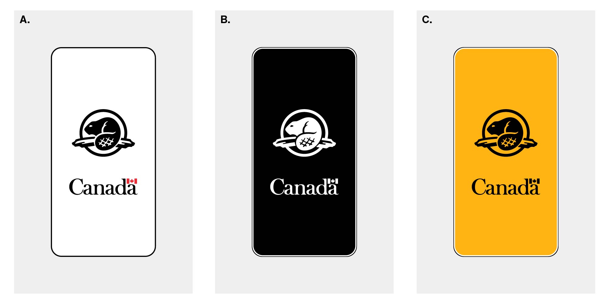
Mobile applications: Design Standard for the Federal Identity Program
The official symbols must be applied to mobile applications (apps). A mobile app is installed locally on a mobile device, such as a smartphone or a tablet.
See Core elements and How to present the official symbols for details about colour, sizing, and other aspects of using the symbols.
-
App icons
The mobile app icon:
- is the image that identifies an app in mobile app stores and on the Canada.ca mobile centre
- appears on the user’s device
- launches the app when the icon is selected
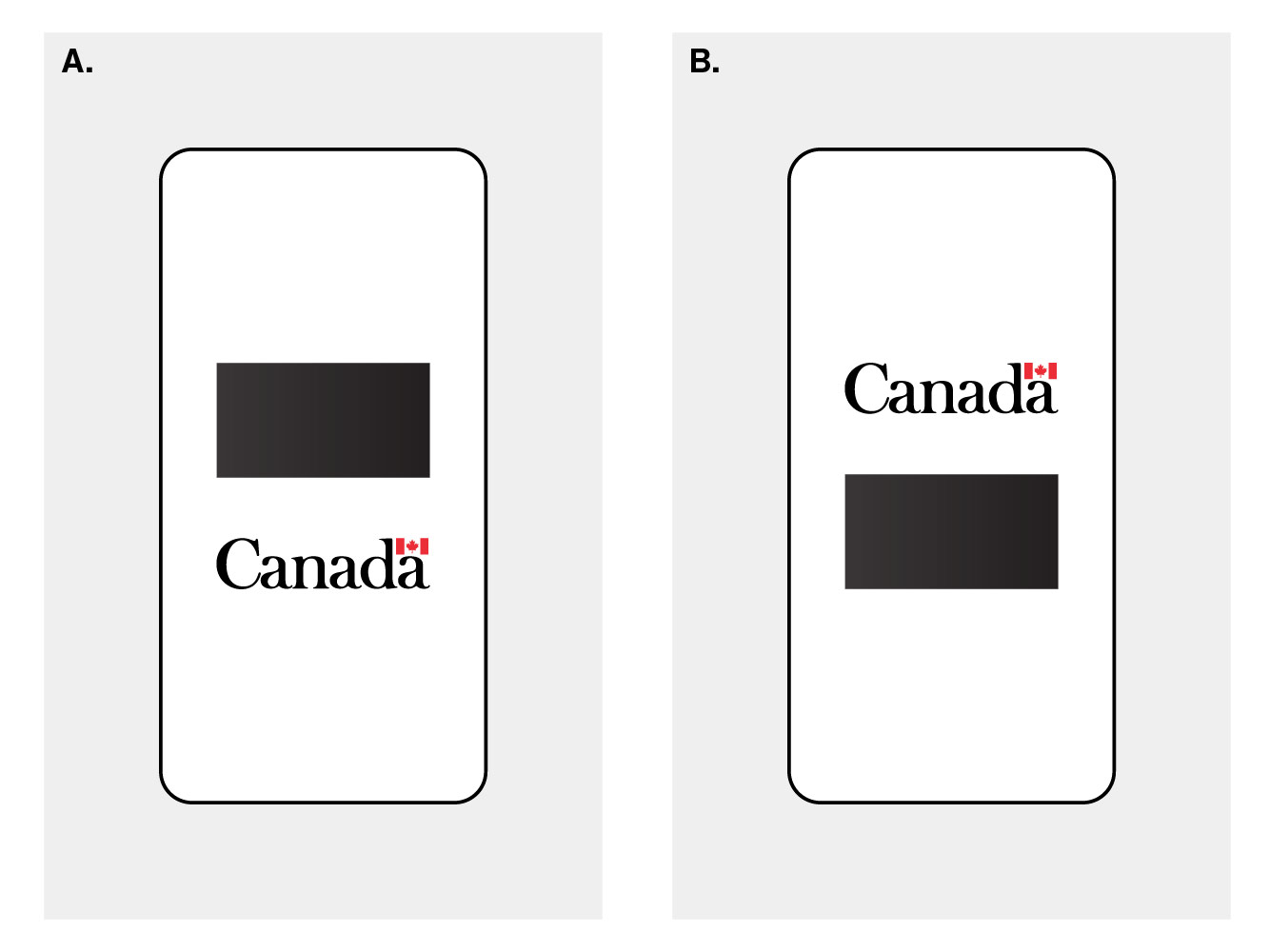
In a square icon, the Canada wordmark must:
- be in its standard colours (FIP red flag symbol, black type)
- be 80% of the width of the icon
- be positioned in the bottom 35% of the icon
- have 10% clear space from the bottom edge of the icon
- be horizontally centred in the space that it occupies
In a circular icon, the Canada wordmark must:
- be in its standard colours (FIP red flag symbol, black type)
- be 60% of the width of the icon
- be positioned in the bottom 35% of the icon
- have 15% clear space from the bottom edge of the icon
- be horizontally centred in the space that it occupies
A design of the department’s choosing occupies the remaining 65% of the square or circular icon.
Departments must ensure that the Canada wordmark is not clipped when masking is applied to the app icon by the mobile operating system. Radial corners will vary depending on the operating system.
Figure 1. Progression of creating a square icon for a mobile app. From left to right: A. template for square icon; B. icon shown with masking applied by the mobile operating system; C. example of a final app icon with a creative design.
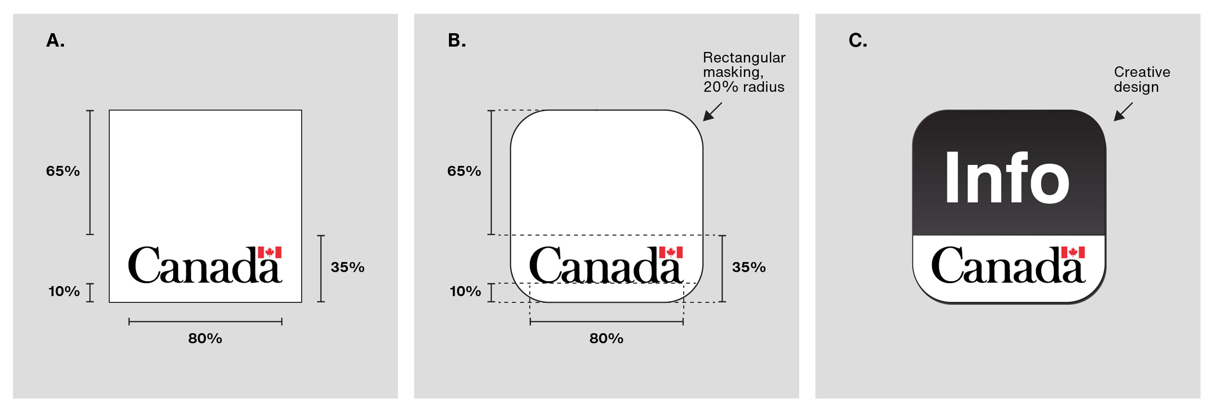
Figure 1 - Text version
Image A, left
Initial design of a square icon for a mobile app that includes the Canada wordmark only. The Canada wordmark:
- is in its standard colours (FIP red flag symbol, black type)
- is 80% of the width of the icon
- is positioned in the bottom 35% of the icon
- has 10% clear space from the bottom edge of the icon
- is horizontally centred in the space that it occupies
Image B, centre
Initial design of a square icon for a mobile app:
- The Canada wordmark is positioned as described in Image A
- Masking is applied to the icon, with a corner radius of 20%, in this example
Image C, right
Example of a finalized square icon for a mobile app:
- The Canada wordmark is positioned as described in Image A
- Masking is applied to the icon as described in Image B
- A creative design appears above the Canada wordmark, occupying the top 65% of the icon. The design has a dark grey background and the word “Info” is in white
Figure 2. Progression of creating a circular icon for a mobile app. From left to right: A. template for a circular icon; B. icon with masking applied by the mobile operating system; C. example of a final app icon with a creative design.
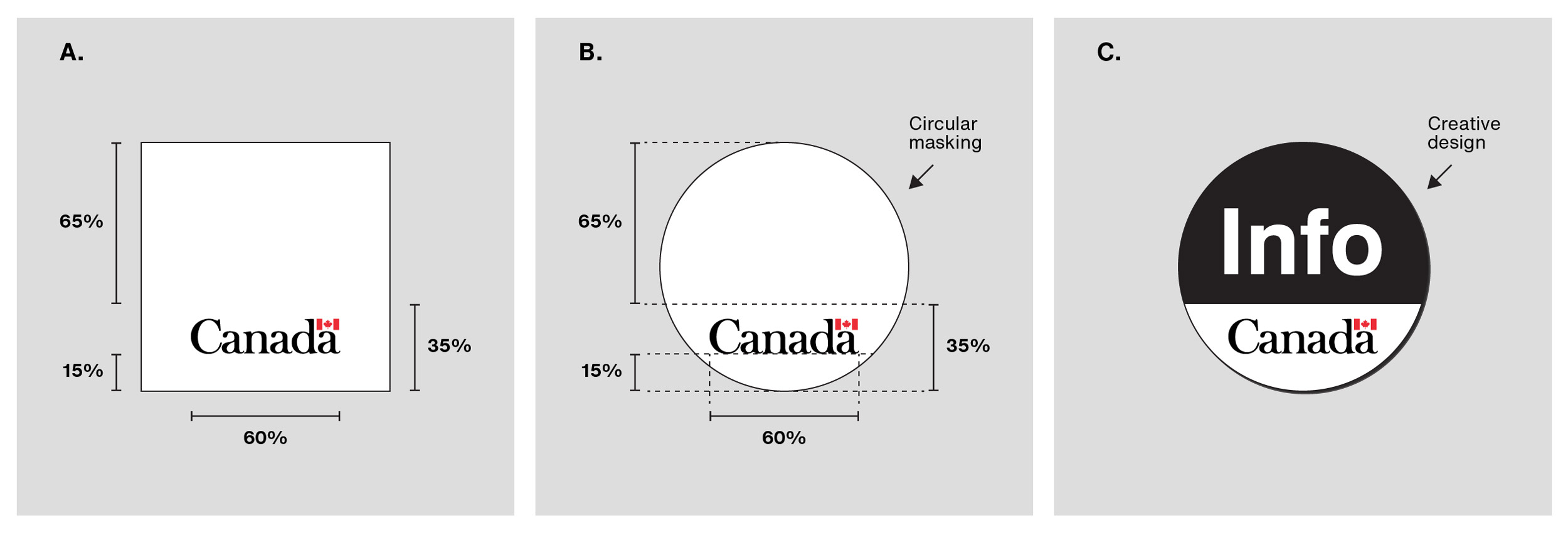
Figure 2 - Text version
Image A, left
Initial design of a circular icon for a mobile app that includes the Canada wordmark only. The Canada wordmark:
- is in its standard colours (FIP red flag symbol, black type)
- is 60% of the width of the icon
- is positioned in the bottom 35% of the icon
- has 15% clear space from the bottom edge of the icon
- is horizontally centred in the space that it occupies
Image B, centre
Initial design of a circular icon for a mobile app:
- The Canada wordmark is positioned as described in Image A
- Masking is applied to the icon, creating a circular shape
Image C, right
Example of a finalized circular icon for a mobile app:
- The Canada wordmark is positioned as described in Image A
- Masking is applied to the icon as described in Image B
- A creative design appears above the Canada wordmark, occupying the top 65% of the icon. The design has a dark grey background and the word “Info” is in white
-
Launch screens
The launch screen is the initial screen that displays while the mobile app is opening.
The launch screen must include the Canada wordmark.
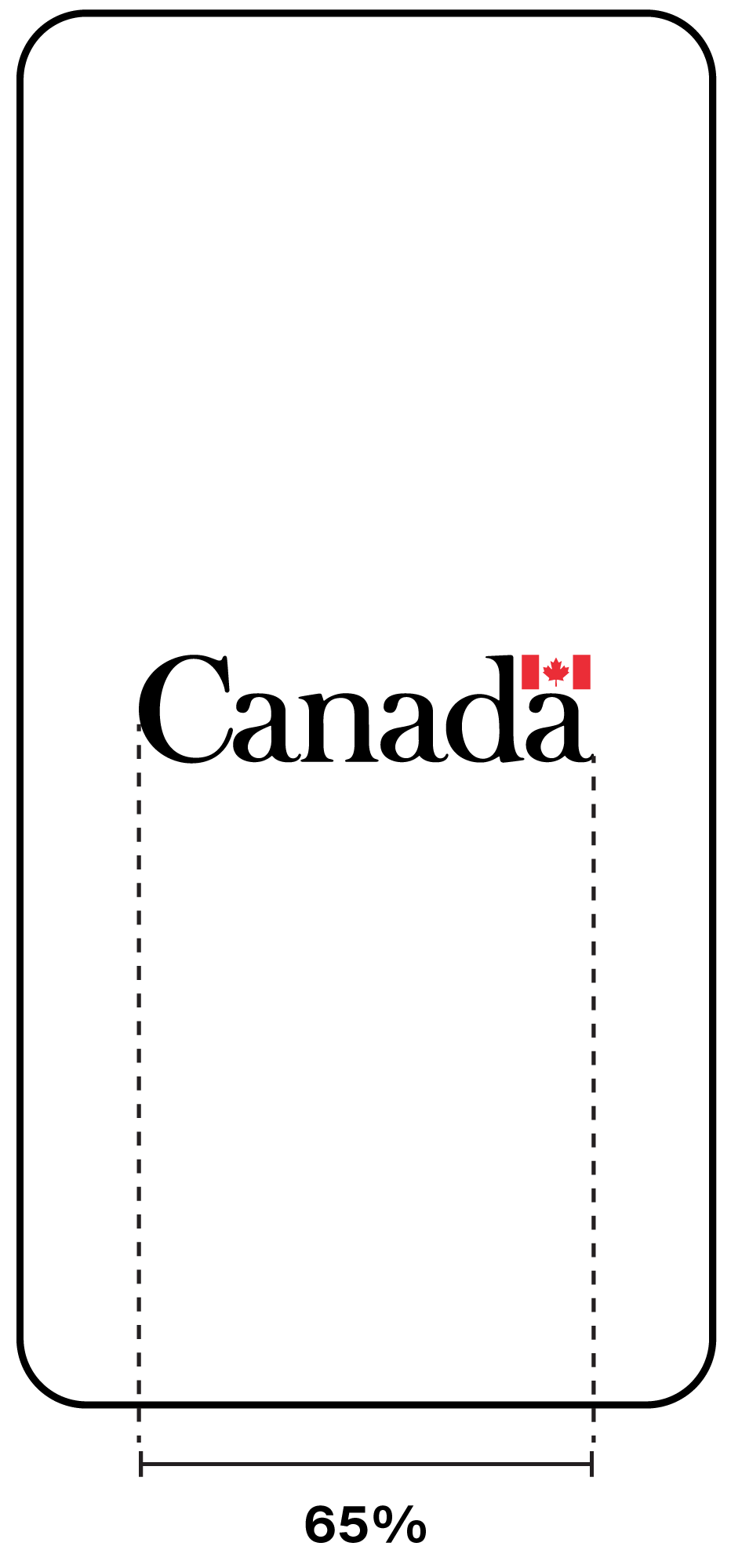
Launch screen displays Canada wordmark only
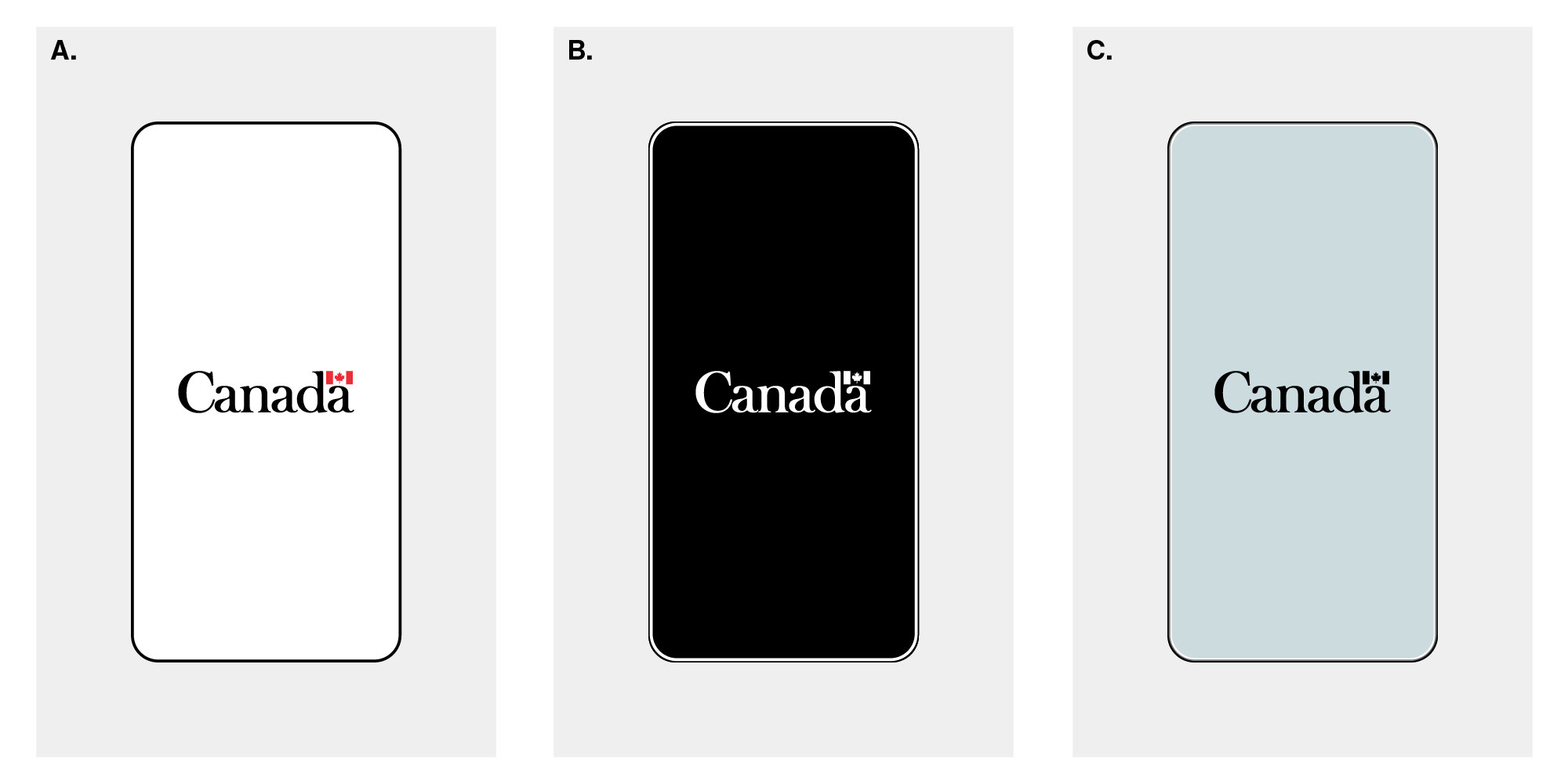
When the launch screen displays the Canada wordmark only (see Figure 3), the wordmark must be:
- 65% of the width of the launch screen when the device is in “portrait” mode
- in its standard colours or in all black or all white for higher contrast with the background colour
- centred
Figure 3. Size and layout of the Canada wordmark on launch screens that display the wordmark only
Launch screen displays Canada wordmark and other elements
When the launch screen displays the Canada wordmark and other elements, such as text, the wordmark must be:
- 65% of the width of the launch screen when the device is in “portrait” mode
- in its standard colours or in all black or all white for higher contrast with the background colour
- centred horizontally
- either above or below all other elements
- grouped together with all other elements and the entire grouping is centred
-
Post-launch screens
Post-launch screens are screens that appear after the launch screen.
The Canada wordmark is not required on post-launch screens since the government’s identity already appears in the app icon and on the launch screen.
A text reference to the Government of Canada or the applied title of the department should be included on post-launch screens, where appropriate, for example in privacy notices, terms and conditions, information about the app and contact information.
-
App stores
When publishing a mobile app on third-party distribution platforms, departments must:
- list the department by its applied title as the publisher of the app
- include a reference to the “Government of Canada” in the app store description
Supporting tools
Looking for another product
Find a product using the filter.
| Category | Products |
|---|---|
| Ads | Search engine marketing (SEM) ads, paid advertising, static ads, video ads, animated ads, audio ads |
| Awards | Long service awards, departmental awards, certificates |
| Exhibits and events | Roll-up banners, backdrops, podium signs, press conferences, live-streamed events, participating or attending an event |
| Mobile applications | App icons, launch screens, post-launch screens, app stores |
| Motion graphics | Animated text or images, animated effects |
| Partnering (technical specifications) | Federal contributions, fair acknowledgement, sponsoring arrangements |
| Personnel identification | Department-issued clothing, ID cards |
| Podcasts | Cover art, artwork for individual episodes, podcast listings and descriptions |
| Printable products and static graphics | Publications, posters, infographics, presentations, graphics shared on social media, images |
| Promotional items | Novelties, mementoes |
| Signage (technical specifications) | Primary signs, operational signs, project signs, tactile signs |
| Social media | Avatars, text identifiers, official social media accounts, icons |
| Stationery (technical specifications) | Letterhead, envelopes, business cards |
| Text messages | Text messages sent by or on behalf of the Government of Canada, emergency alerts |
| Vehicles (technical specifications) | Markings on ground, air, marine vehicles |
| Videos | Films, audio-visual, multi-media presentations and productions |
| Websites | Public-facing websites, internal sites, intranets, extranets, password-protected sites, web applications |